Your Ultimate Guide To Modern KPI Reports – Examples & Templates

We live in a world rich with data, and for businesses looking to streamline their processes, monitor various areas of performance more accurately, and understand their audience on a deeper, more personal level, collecting, analyzing, and leveraging this wealth of insights is critical for success. KPI reporting steps in as a critical element of achieving organizational objectives.
Moreover, with so much information available from an ever-growing range of sources, how do you make sense of this information – and how do you extract value from it? An effective means of doing this is by utilizing KPI reporting tools.
Here, we’ll explore the KPI report meaning, look at how to create successful reports and consider the dynamics of a business-boosting KPI report template.
Let’s start by considering what KPIs are and what they mean in a business context. Or, in other words, answer the questions, “What is a key performance indicator (KPI)?” and “What is KPI reporting?”
What Is a KPI?
KPI is a value measured to assess how effective a project or company is at achieving its business objectives. In other words, KPIs provide organizations with the means of measuring how various aspects of the business are performing in relation to their strategic goals.
On a fundamental level, KPIs provide critical performance-based information that enables an organization, and its stakeholders, to understand whether or not it’s on track and thus take action accordingly. Here, you can find different lists of KPI examples classified according to their function and industry, which helps in narrowing down and selecting the most critical points you need.
After you've selected the right ones, you can create an extensive KPI dashboard and ensure your department and business strategy are on the right track.
Whether utilizing HR KPIs or any other department and industry, it is crucial to understand these basic definitions so that the creation and analysis can improve a company's bottom line.
Now that we’re up to speed on what a KPI is in an organizational context let’s look at an official KPI report meaning.
What Is a KPI Report?
A KPI report is a management tool that allows companies to monitor and analyze their most important key performance indicators (KPIs) in real-time. Professional KPI reporting helps businesses reach their goals by identifying strengths, weaknesses, and trends in the data.
Typically presented as an interactive dashboard, this kind of report provides a visual representation of the info associated with your predetermined set of key performance indicators.
A KPI dashboard presents critical insights in a logical, digestible format that makes it easy to extract important information and act upon it retrospectively as well as in real time. Fundamentally, this kind of report is a strategic tracking method that will provide a window to your business’s most essential activities.
Why Are KPI Reports Important?
You know the meaning, now let’s look at the role of these reports in the modern business age. As mentioned, we live in a data-driven era, and to win on today’s commercial battlefield, making informed decisions based on digital insights (KPI data) is a must if you want to thrive today, tomorrow, and long into the future. Here are the key reasons these types of reports are so important in the modern business age.
Setting powerful targets and benchmarks: Measurable dashboards are important as they empower businesses to set meaningful goals and benchmarks, the kind which will help them improve, evolve, scale, and become more adaptable in an ever-changing digital landscape. By setting and measuring KPIs and customizing them through a report, you will gain a wealth of insights into your business, from customer behaviors to financial inefficiencies and content performance.
Gaining greater vision: In addition to setting solid benchmarks, a key performance indicator-based dashboard will also help you identify hidden patterns that will ultimately propel your business forward. All of these relevant metrics, when organized in intuitive and visual reporting dashboards, will not only allow you to spot patterns as they unfold but drill down into historical data and make the strategic tweaks and changes that can ultimately make or break your business.
Better collaboration and communication: Visual performance-based metrics are far more accessible to everyone in the business (not just technical staff), making them invaluable tools for optimizing performance. When everyone can use data to their advantage, silos break down, and communication thrives - which, in turn, will accelerate your business growth.
KPI Reports Examples And Templates
Now that we’ve examined the definition and put the value of key performance indicators under a microscope let’s provide a set of examples to visualize the power of KPI reporting. Here are 18 hand-picked KPI reports examples that are specific to some of the most critical areas of any modern business: financial, management, procurement, operations, customer service, manufacturing, HR, and sales. If you want to know how to measure KPIs, these examples will serve as a comprehensive roadmap.
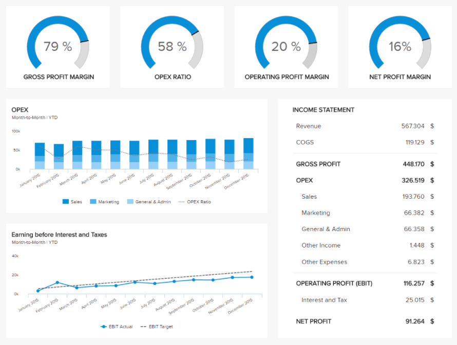
1. Financial profit and loss KPI report example
The first of our KPI reports examples is financial. Profit and loss are the two most essential factors in any organization’s bottom line. This particular financial report example, visualized on a comprehensive fiscal dashboard, provides a digestible overview of a business’s income statement from revenue to net profit, fortified with appropriate performance ratios.
**click to enlarge**
The monetary loss and profit dashboard hone in on gross profit margin, OPEX ratio, operating profit margin, and net profit margin, offering a host of bespoke information at your fingertips.
By monitoring this financial KPI report on a consistent basis, you’ll gain a panoramic insight into your business’s overall financial performance and be able to take measures to improve areas you deem to be weak while also capitalizing on areas of strength – essential metrics for any business looking to grow their profits and report KPIs that are critical in the financial industry or department.
KPIs used:
- Gross profit margin percentage:
This KPI is quite straightforward: a higher margin will mean you retain more income from your sales dollars. In essence, it shows how effective your operational processes are, and if you're reporting KPIs within the finance industry or department, this is one of the most critical to include and monitor regularly.
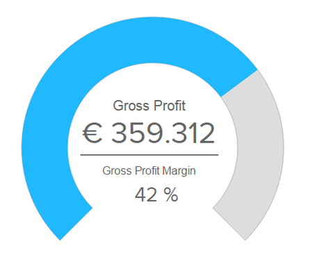
To calculate this KPI, you need to deduct the costs of all sold goods or services from your total revenue and divide it by the sales revenue.
- Operating profit margin percentage:
To fully take advantage of financial key performance indicator reporting, you must monitor the operating income. It will show you the earnings before interest and tax, also known as EBIT, expressed in a percentage. It won't include tax effects or investments, so if you want to calculate it, you need to divide the operating profit by your sales revenue.
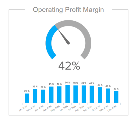
The sample KPI report above focuses on profitability, the operating profit margin is expressed in a clear percentage, but you can immediately see the development.
- Operating expense ratio:
Operational effectiveness is another important metric that finance professionals need to take into account in order to improve and increase the company's profitability.
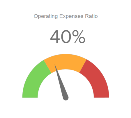
In a simple gauge chart, where colors serve as a kind of traffic light, you can instantly spot if your operating expenses are in a healthy ratio to the total revenue or if you need to adjust your operational costs. Essentially, if your operating expenses are low, the more profitability you can reach.
2. Employee performance dashboard
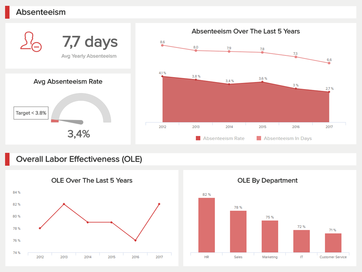
The next of our dynamic KPI reports examples is an employee dashboard that is talent-centric, as it offers a balanced mix of KPIs designed to benchmark employee performance over specific timeframes. This perfect storm of visual knowledge helps HR managers monitor rates of absence while drilling into essential performance-based areas, including training costs, overtime worked, and overall productivity.
**click to enlarge**
By working with this most valuable of KPI reports, HR managers can offer support, training, and mentorship exactly where it’s needed while making informed strategic decisions to boost engagement and productivity levels across the board.
KPIs used:
- Absenteeism rate:
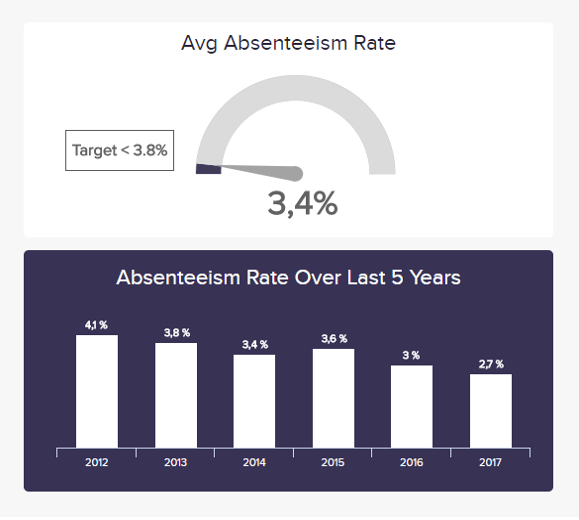
Not everyone knows this, but rates of absenteeism have a strong correlation with employee engagement and motivation. This highly visual employee performance KPI gives a clear-cut snapshot of absenteeism over a five-year period, offering vital insight into overall staff motivation while providing the tools to find the root of the issue and nip any productivity-reducing roadblocks in the bud. It’s an essential KPI report metric for any HR data analytics process.
- Employee productivity:
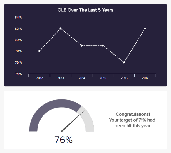
Another essential HR metric for your KPI reporting, is employee productivity drills down deeper into staff output, providing an accessible snapshot of your Overall Labor Effectiveness (OLE) over a specified period. Taking many dimensions into account, this effective metric showcases how long your team has been productive in conjunction with sales levels and production output. Displayed as a chart as well as a percentage, this KPI allows you to compare productivity from month to month or year to year at a glance and take definitive measures to improve your OLE sustainability.
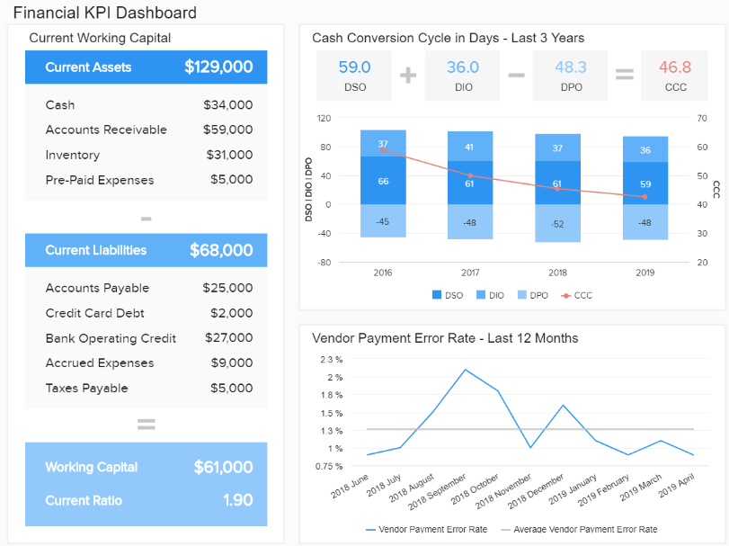
3. Financial KPI reporting template
At the heart of every successful modern business lies a cohesive, well-managed, and data-driven financial department. Our second financially-based KPI report sample, the financial dashboard, offers a comprehensive overview of every area of your organization’s monetary activities, both internal and external.
**click to enlarge**
Powered with cutting-edge financial analytics software, this KPI report template dashboard exists to answer essential questions centered on liquidity, invoicing, budgeting, and the general financial stability of your business.
Broad, balanced, and insightful, this dynamic reporting tool offers the ability to drill down into aspects of your company’s financial health by working with KPIs, including working capital, cash conversion cycle, budget variance, and more.
KPIs used:
- Working capital:
This KPI report sample doesn't show a ratio or proportion but a straightforward number of dollars that remain after you deduct the current liabilities from current assets. A visual representation looks like this:
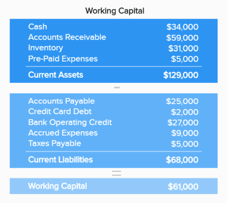
It's a simple table that will show you the operational effectiveness of your organization and short-term financial health, as obligations and debts are current liabilities that are due within a year.
- Cash conversion cycle:
The cash conversion cycle should be included in KPI monitoring and reporting since it's a critical component of evaluating how efficient the management processes are, meaning how long it takes to convert the inventory resources into cash flows from sales.
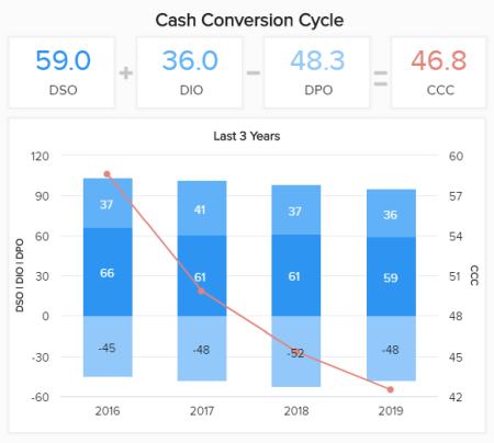
In our visual above, you can see that the cycle is getting shorter as the years pass by, which is a clearly positive sign, and the company should keep up the good work. The lower the cycle, the better the management and operational processes are. If, in any case, the cycle starts growing, it would make sense to make an additional analysis and find the cause. By using modern online data visualization, all these calculations are presented in an intuitive, visual way, where you don't need to scroll through endless rows and columns of a traditional spreadsheet.
- Vendor payment error rate:
Processing invoices are also an important element in the financial department or organization that deals with issuing invoices and paying creditors, suppliers, or vendors. The errors need to be taken into account as sometimes can happen that the accounts payable department issues an invoice to the wrong entity, for instance
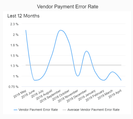
The point is to keep the percentage of errors within the minimum values possible - that way, invoices are paid on time, they contain accurate metrics, and the relationship between companies becomes stronger. Otherwise, disputes can happen, which is not in anyone’s interest. We have seen how detailed financial graphs can serve as a self-service reporting KPI solution since all of our samples are easily automated and delivered with real-time data. In essence, you don't need to perform or update information manually but let the BI dashboard software do the hard work.
4. Manufacturing cost management dashboard
Next in our list of modern KPI reporting examples, we look at the cost management manufacturing dashboard. This powerful reporting tool is essential for any business that creates its own products in-house, with a balanced mix of insights that will keep your costs and turnover on target consistently.

**click to enlarge**
In an asset-heavy sector, keeping a firm grip on your unit and maintenance costs as well as your productivity and return rates, is essential. Split into definitive sections, this most essential of KPI report examples will ensure you keep your maintenance activities on track while keeping your return on investment (ROI) consistently healthy.
KPIs used:
- Unit costs:
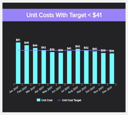
A priceless manufacturing management KPI, the unit costs provide a panoramic snapshot of the various outgoings associated with a single product or item. Taking into account elements, including equipment, material, and warehousing, this insightful metric will allow you to access and analyze specific pockets of your manufacturing processes and reduce any unnecessary costs. This is a money- and resource-saving metric for any modern manufacturing-focused business.
- Return on assets (ROA):
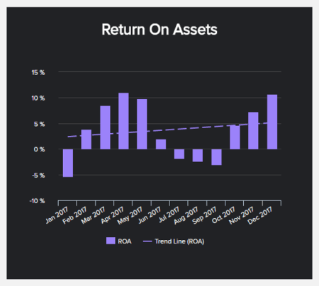
Your ROA is among the most critical manufacturing metrics, as it gives you a working gauge of your organization’s ability to make a profit from the goods you make and sell.
With a highly digestible graph- and chart-based design, this KPI will give you a clear indication of how effectively you’re using your assets to generate revenue based on the earnings you’ve made from the capital you’ve invested. Tracking your ROA and aiming to increase your percentage will ultimately optimize your manufacturing processes for accelerated growth and success.
- Maintenance costs:
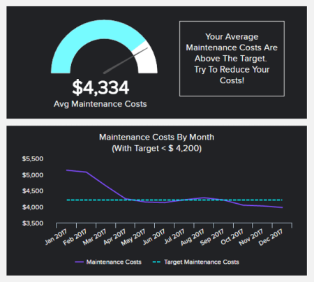
This cost-centric KPI tells you exactly how much your equipment sets your business back in terms of regular running and maintenance. By tracking this metric frequently, you can work to a target cost, refining your efforts to keep your machinery and tools running smoothly while identifying any budget-sapping costs.
Whether it’s a defective piece of machinery or a consistent lack of maintenance response, this KPI will empower you to identify the issue swiftly and take effective measures to drive down overall costs, preserving the productivity of your entire operation in the process.
5. Management KPI report template
This management-centric KPI dashboard focuses specifically on total revenues in addition to consumer-based revenues while providing vital insights that will help you set informed sales targets for your organization.
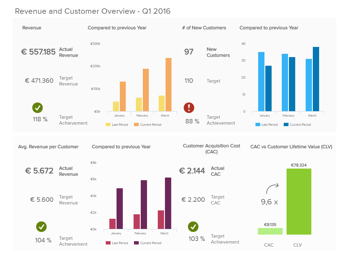
**click to enlarge**
Offering visual details on customer acquisition costs, CLV, and sales targets, on this management dashboard, you will be able to make intelligent managerial forecasts, spot trends, and understand where you need to improve processes within the business—a priceless KPI tool for those in senior management roles across a range of sectors and industries.
KPIs used:
- Customer acquisition costs:
One of the most crucial metrics deals with sales data and expounds on the costs of acquiring a new consumer. The costs usually vary based on your specific industry, but this KPI report on the business you should definitely include in your reporting processes.
As we can see in the visual, the costs are represented at a glance with a simple gauge chart, but you can also see a graphic development over a particular period.
- Customer lifetime value:
When you want to create a dashboard KPI reporting practice, including predicting the potential value of the relationship between a consumer and the company is another critical component of successful metrics management. The issue is that nobody can actually predict 100% how long this relationship will last. Therefore, it would make sense to state it as a periodic value (6 months, 12, or 24, e.g.).
The visual above shows us a quick overview of the average numbers and how long the relationship lasts, while the bottom part depicts the development.
- Sales target:
General management is usually interested in whether goals are being met or whether there are issues in the process. Sales target is one of them, but you can also set goals for each management metric separately.
This is one of our KPI reporting examples that expounds on achieving predefined targets and is depicted in comparison with the overall sales revenue. The point is to reach the target and examine further if you're lagging behind.
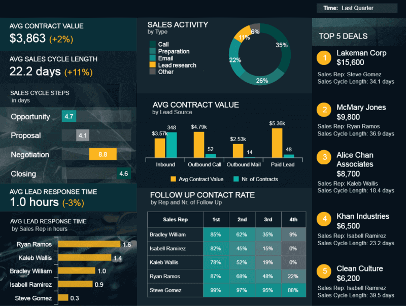
6. Sales performance dashboard
In the commercial world, sales cover a broad spectrum, and to ensure you meet your targets while cementing growth, collecting the right intelligence is essential.
This KPI report format offers an ideal overview of the progress of your sales department, drilling down on sales KPIs such as sales growth, sales targets, ARPU, CAC, and CLV.
**click to enlarge**
By providing a detailed visualization of every aspect of your sales portfolio, this report empowers sales managers to take a full snapshot of their sales operations without losing any insights, enabling them to create an extensive sales report.
Here it’s possible to take an overall glance at your sales performance or analyze specific pockets of intel to your advantage, increasing metrics like CLV and average revenue per unit as a result.
KPIs used:
- Sales growth:
An important sales chart to include in your reporting schedule, the sales growth will show you whether your business is developing steadily or needs further adjustments.
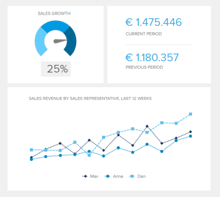
Tracking this metric is important for any sales professional or manager that needs to deliver fresh revenue and ensure sustainable development. In the visual above, we see the comparison between periods and the development of sales representatives within the last 12 weeks.
- ARPU:
The average revenue per unit demonstrates how much revenue you generate from your consumers from all your sales. The goal is to keep the ARPU rising, but if you see that it’s getting higher compared to the acquisition costs, additional adjustments should be made.
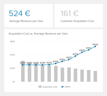
In our example above, we can see that ARPU is steadily increasing, which is a positive indicator of growth. It could mean that you’re closing deals with bigger companies or consumers, for example.
Other critical metrics, such as the CLV, sales target, and acquisition costs, we have explained in our management KPI report solution above since they are also important to look at from a general management point of view.
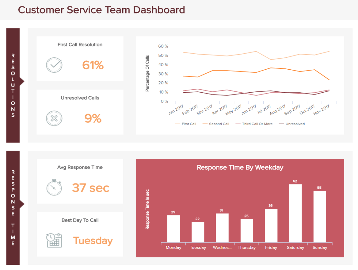
7. Customer service team dashboard
In today’s information-rich, hyper-connected digital age, consumers demand an exceptional level of service from brands across industries. Only the best will do—no exceptions, no compromises.
**click to enlarge**
Our interactive customer service dashboard is a KPI report sample packed with invaluable intel that exists to streamline your service department and meet your customers’ needs head-on.
This KPI reporting template, equipped with a wealth of weekly and monthly service performance visualizations, is the perfect tool for responding to any potential service issues in real time while making strategic tweaks geared toward long-term success. With call resolution and response times, as well as agent performance insights and issue number calculations on the menu, you have everything you need to become more responsive, efficient, and valuable from a front-line, consumer-facing perspective.
KPIs used:
- Average response time:
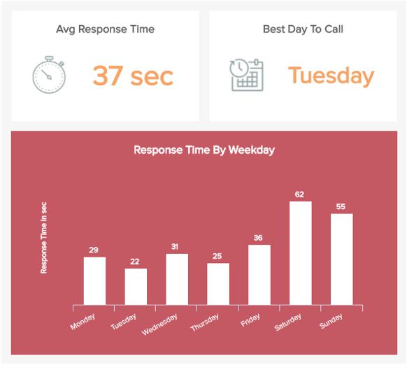
This is an essential KPI reporting example as it empowers you to measure how long your customers are on hold according to weekdays. By gaining access to this valuable information, you can see exactly where performance rates increase as well as dwindle, responding with service-boosting strategies to drive your response times down (and keep them there).
- Top support agents:
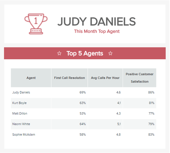
Your service agents are the beating heart of your entire department. To ensure you offer a consistently seamless level of support, monitoring individual performance with precision is essential.
This service-based KPI report metric allows you to drill down into specific performance levels, gaining an understanding of which agents are performing the best. Gaining this knowledge will empower you to reward agents that are showing consistently high levels of performance while supporting those in need of motivation or additional service training.
- First call resolution (FCR):
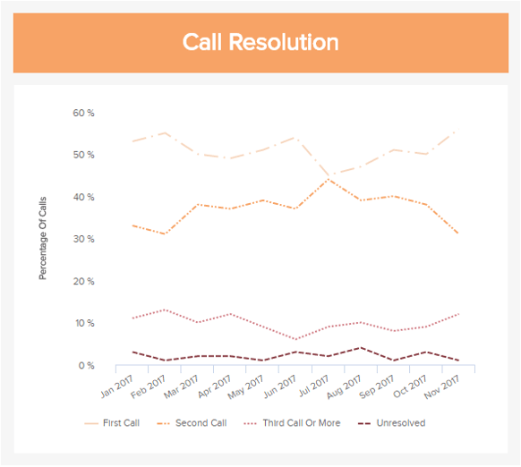
Call resolution is an essential customer service KPIs for any thriving or growing customer service department. Here, you can view how successful your service team is at getting to the root of your consumers’ issues upon the first contact. The better your FCR, the more productive and effective your support levels. If you notice a negative trend emerging, you can take tactical measures, including mentoring, workshops, or structural changes.
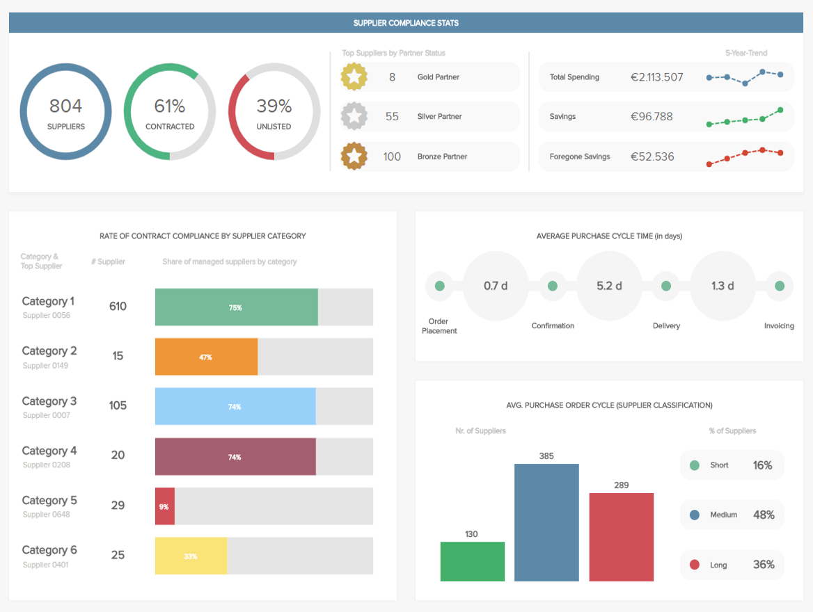
8. Procurement KPI dashboard
Your procurement initiatives are essential to the ongoing productivity and success of your entire organization. One snag in the chain, and you run the risk of losing precious minutes and money while damaging your brand reputation.
**click to enlarge**
Our procurement KPI report presents a balanced mix of metrics to ensure your activities are consistently fluent, cohesive, and compliant. Designed to make your procurement analytics process as informative and streamlined as possible, this is a KPI reporting template that will enable you to fortify your supplier relationships, tighten up your cycle times, and avoid any unnecessary procurement issues.
KPIs used:
- Compliance rate:
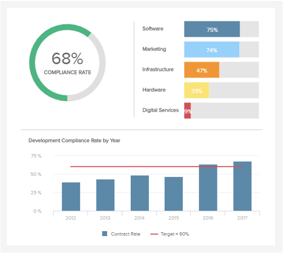
This accessible compliance rate visualization allows you to set and benchmark your compliance levels as a whole and according to different branches or suppliers. As a result, you can tackle any emerging compliance issues head-on while assessing your existing relationships using informed info to guide your decisions.
- Number of suppliers:
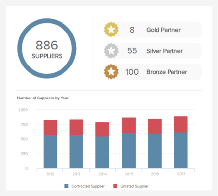
As somewhat of an evolutionary element in a KPI report, the number of suppliers will assist you in meeting every one of your procurement needs with a mix of partners that will keep your chain protected, efficient, and fluent always. Here, you can examine how many suppliers your business acquires within a period, explore the value of each relationship, add extra suppliers to the mix, or “trim the fat” to reach an optimal level.
- Purchase order cycle time:
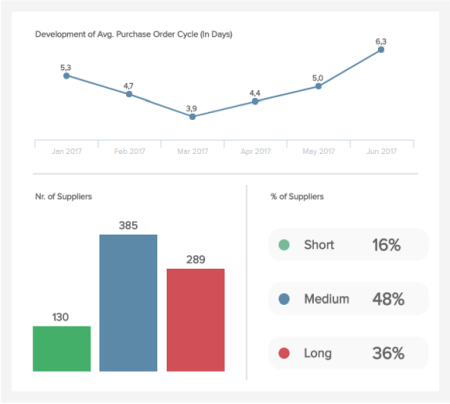
The next KPI reporting example covers the end-to-end ordering journey. Our purchase order cycle time KPI is armed with the visual information you need to analyze and ultimately condense or streamline your processes. By doing so, you will make your overall procurement activities extra efficient, allowing you to focus on a wealth of other business-boosting strategies and initiatives.
9. SaaS executive dashboard
For SaaS businesses looking to thrive in the digital age, our dedicated KPI dashboard is essential. By focusing on the three most critical areas relevant to any SaaS-based organization at an executive level – customers, recurring revenue, and costs – you’ll be able to foster the continued growth and evolution for ongoing success in your field.
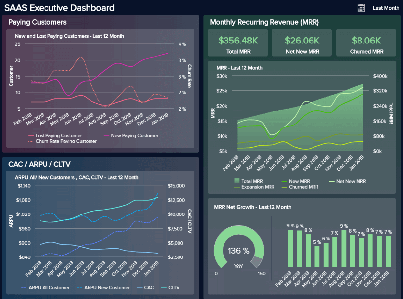
**click to enlarge**
The KPIs included within this KPI reporting example offer a detailed view of each of these key areas. This powerful reporting tool assists in the fluid and proactive management of your SaaS organization as a whole.
From customer acquisition costs to churn rates, lifetime value, and beyond, this digestible dashboard is the go-to tool for SaaS business seniors and a KPI report in full form that expounds on the most critical aspects of a business.
KPIs used:
- MRR:
The monthly recurring revenue is the beating heart of a SaaS company. It gives seniors a “checkup” of the pricing plans and predictable revenue that a SaaS business expects in a given month. In essence, this KPI reporting template needs to be included in the fiscal aspect of strategizing “recurring” components and enables you to predict the state of business in the future.

**click to enlarge**
10. Sales conversion dashboard
One of the best ways to grow your business is by increasing your conversion rates. Of course, there are a number of stages to closing a sale, from gaining and nurturing leads to prompting a conversion – and this particular KPI dashboard allows you to look at each critical stage of the process in detail.
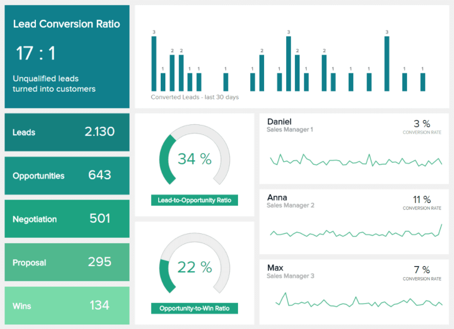
**click to enlarge**
Through a series of comprehensive insights and lead-based details, this KPI report sample will empower you to streamline your sales processes, enhance your sales strategy, and increase your all-important conversion rate result, which you can also see in more detail on our sales dashboard template.
KPIs used:
- Lead-to-opportunity ratio:
This metric is the first element to examine in your sales funnel. To ensure optimal real-time KPI performance monitoring, the lead-to-opportunity ratio should be high on your list. It will assist you in determining whether you’re on track with your revenue goals, and based on that, you can manage your marketing and sales team much better.
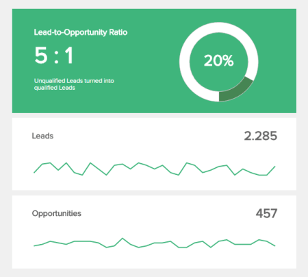
In the example above, you can see a clear overview of the ratio and, below that, the exact number of leads and opportunities within a timeframe. You can use this visual as a monthly or weekly KPI report. It depends on your preferences and strategies.
- Opportunity-to-win ratio:
Showing how many of your qualified leads result in closing a deal or signing a contract is essential in your sales funnel. Modern online data analysis tools enable you to easily analyze and derive insights, as we can see in the example below:
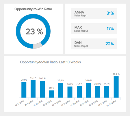
We quickly see the percentage, and the efficiency of the team while, at the bottom of the visual, you can quickly see the behavior of the KPI in the last 10 weeks.
- Lead conversion rate:
The conversion ratio should be stable, and this number can vary greatly between industries and functions. In some industries, a conversion rate of 1% is a success, while others can reach 10% and also record success. The goal is to find a baseline and compare it with the industry benchmarks.
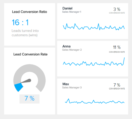
The goal is to grow your conversion rate or keep it stable. If you notice that it’s decreasing, you need to start asking questions and digging deeper into the reasons because no conversions could cause serious business damage.
11. HR recruiting dashboard
Sourcing and maintaining the right talent for your organization is crucial to your ongoing success. Without a clear-cut analytical strategy, not only do you risk hiring the wrong people for your business, but your staff turnover rates will skyrocket. That’s why you need a recruitment-based HR dashboard for your hiring efforts.
**click to enlarge**
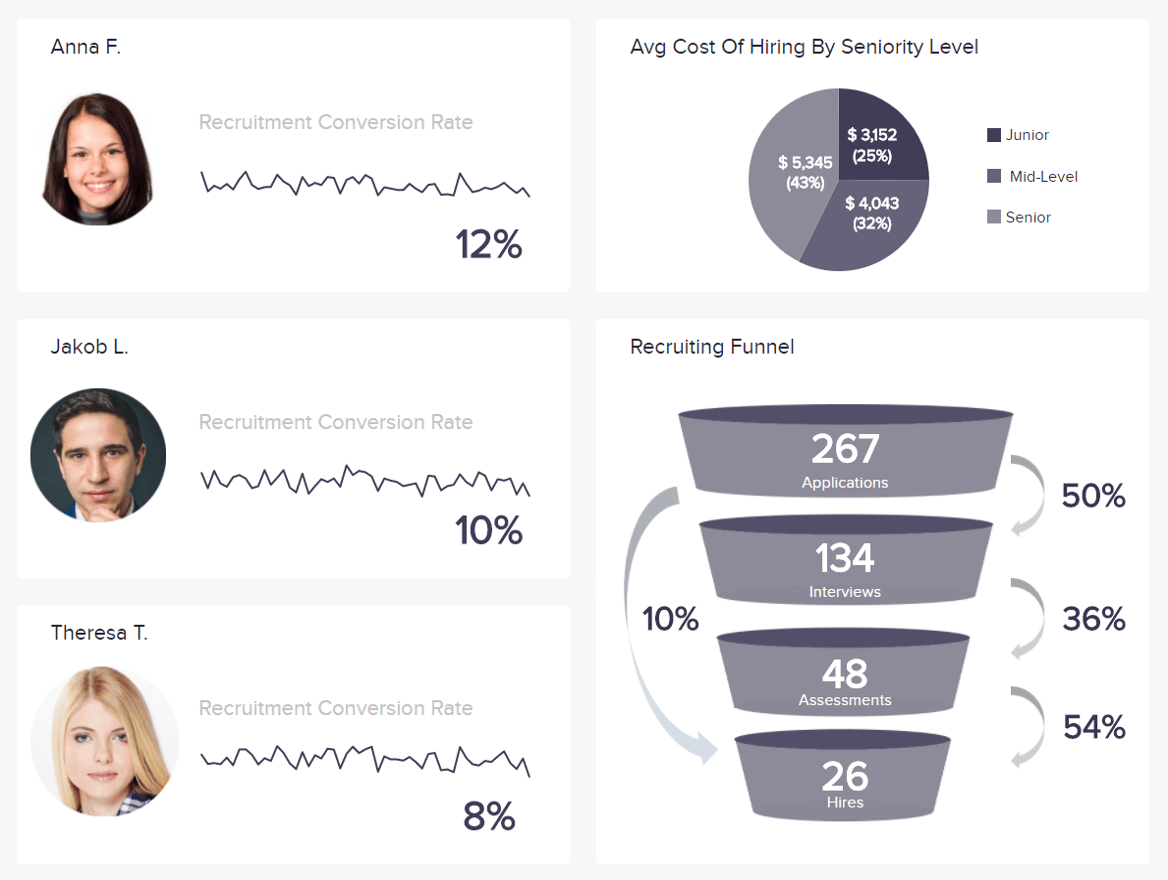
Populated with a cohesive mix of highly-visual recruiting metrics, this invaluable KPI reporting template will give you all the information required to gain a deeper understanding of your recruiting funnel, hiring costs, and talent acquisition conversion rates. Working with these KPI reporting metrics will empower you to make better hiring decisions while streamlining your entire recruiting process for maximum success.
Metrics used:
- Cost Per Hire
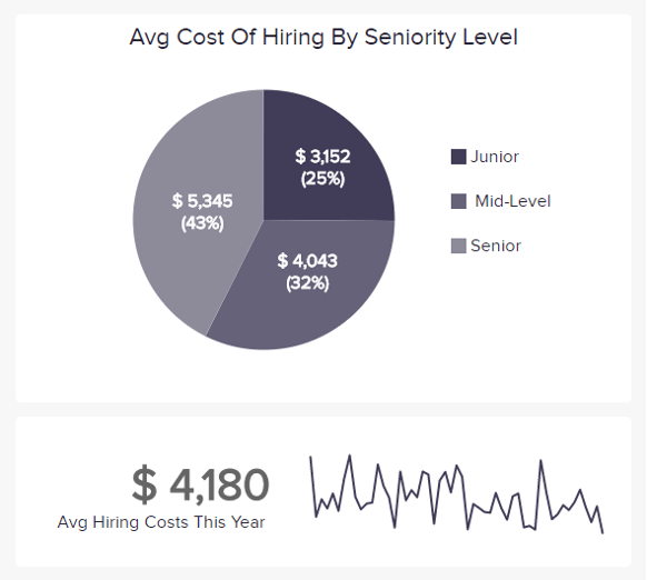
This particular KPIs report metric will give you a clear-cut indication of the number of resources you dedicate to hiring new candidates based on the level of seniority. Tracking this key HR metric will let you get to grips with how much it costs to hire quality candidates while helping you to understand the value of your hires based on other key performance indicators based around staff turnover and performance rates.
- Recruiting conversion rate
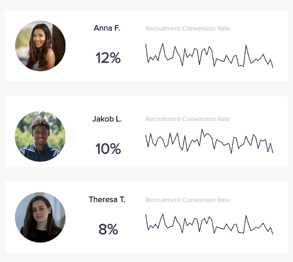
An essential addition to any recruitment KPI report template, this conversion rate metric is designed to offer a visual representation of your HR staff members’ hiring performance. By seeing how many applicants your HR executives turn into successful candidates, you can take targeted measures to reduce unnecessary recruitment while earning a better return on investment (ROI) from your talent-sourcing efforts.
- Time To Fill
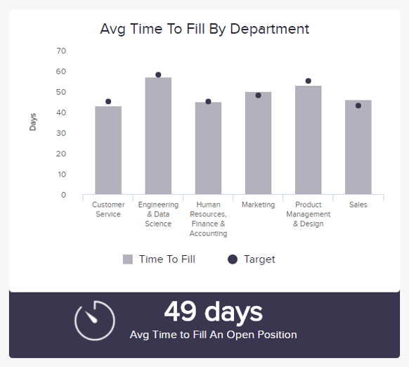
As an HR or recruitment professional, time to fill is a metric that you need in your KPI performance report. Broken down into each key department, here you can view exactly how long it takes you to hire a new employee. By setting a benchmark for each department, you can uncover any inefficiencies stunting your hiring processes and create an informed strategy to reduce hire times while making more valuable recruiting decisions.
12. Transportation dashboard
If you deal in tangible goods or services, having an efficient end-to-end transportation strategy is key to your ongoing organizational growth.
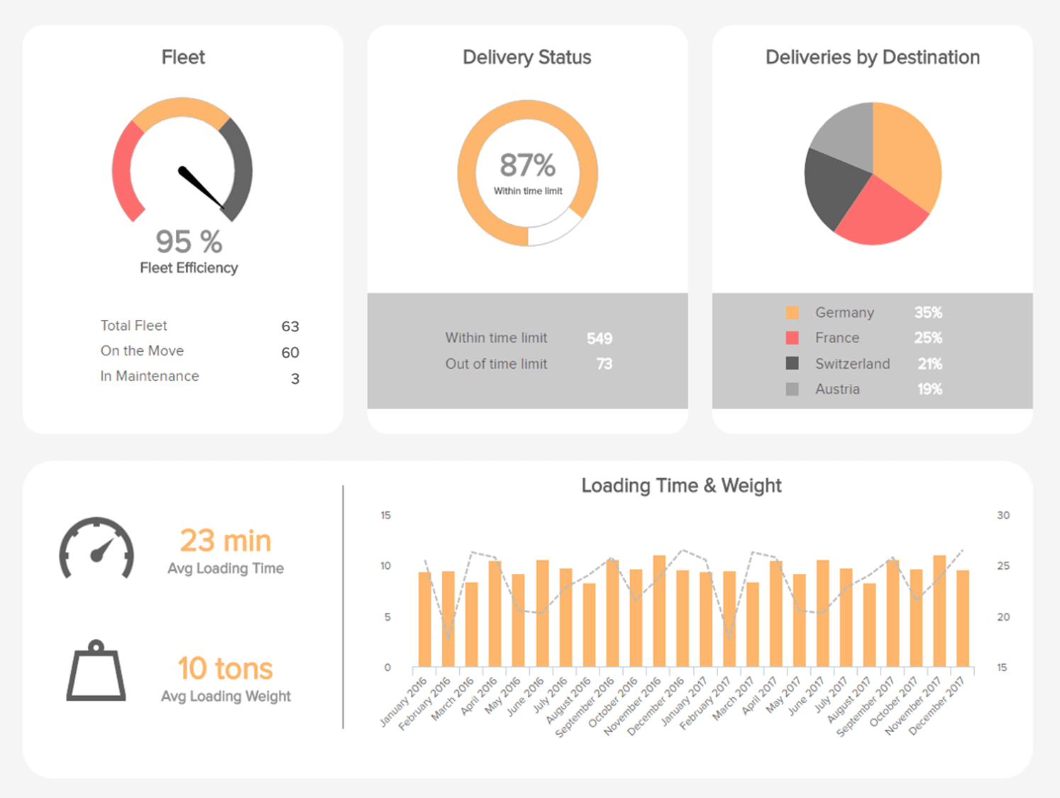
**click to enlarge**
An invaluable KPI reporting and analysis for scaling organizations, our transportation dashboard offers a panoramic view of your feet' efficiency, delivery status, destinations, and load statistics—everything you need to keep your transportation chain well and truly on track.
Metrics used:
- Delivery Time
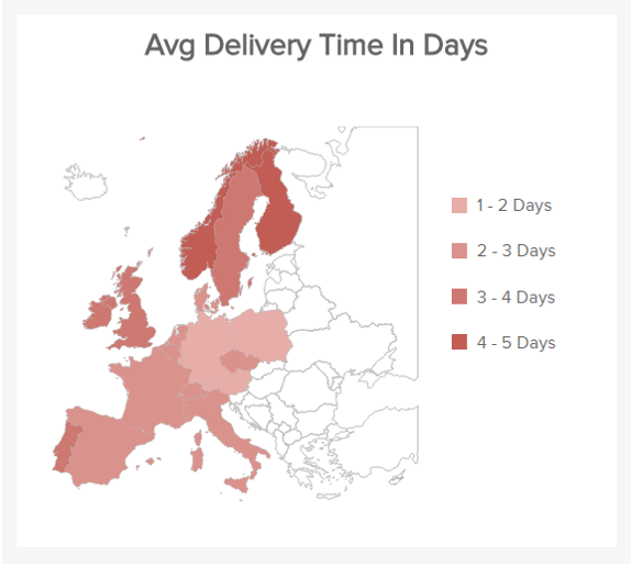
A KPI reports sample with a striking geographic visual. Here, you can view your delivery times in detail according to route or region. In doing so, you can manage consumer as well as supplier expectations by offering a more accurate breakdown of delivery timelines while consistently meeting expectations.
- Transportation Costs
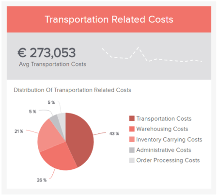
Presented as a digestible pie chart, this handy KPI report example metric offers a precise breakdown of the costs related to transportation. By regularly tracking this key logistics metric, you can see exactly where you can afford to reduce unnecessary costs while maintaining a top-quality service.
13. Marketing performance dashboard
One of our most valuable KPI report examples for brand awareness, our marketing dashboard, will optimize your promotional campaigns and strategies.
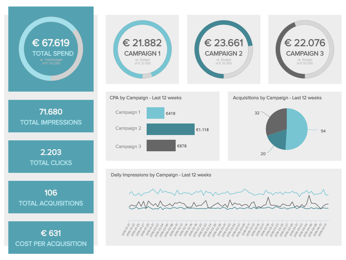
**click to enlarge**
Offering deep-dive insights, this marketing KPI report will help you earn a healthy ROI from your marketing activities across channels and touchpoints.
Here you will gain a vivid insight into the campaigns and content that resonate with your audience the most while getting a handle on costs as well as how you can drive them down while still making an impact.
Metrics used:
- Click-Through Rate (CTR)
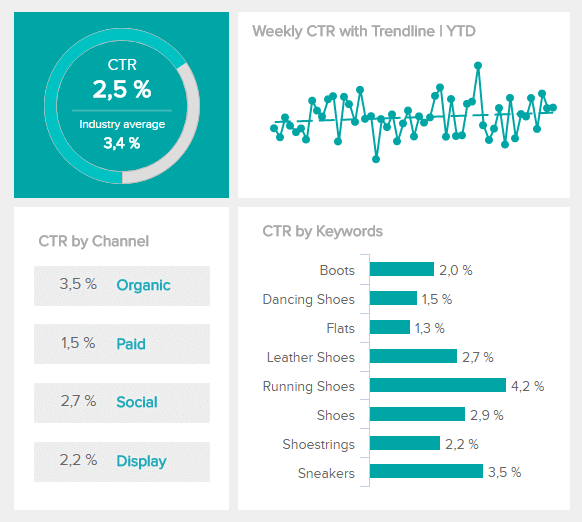
As a marketer, CTR is an essential branch of data as you can discover how many users physically click through on an ad, article, blog post, email, or piece of promotional content based on a range of factors. Analyzing this metric regularly will allow you to see which channels, keywords, or campaigns are yielding the best results and update your strategy to further boost your CTR.
- Cost-Per-Click (CPC)
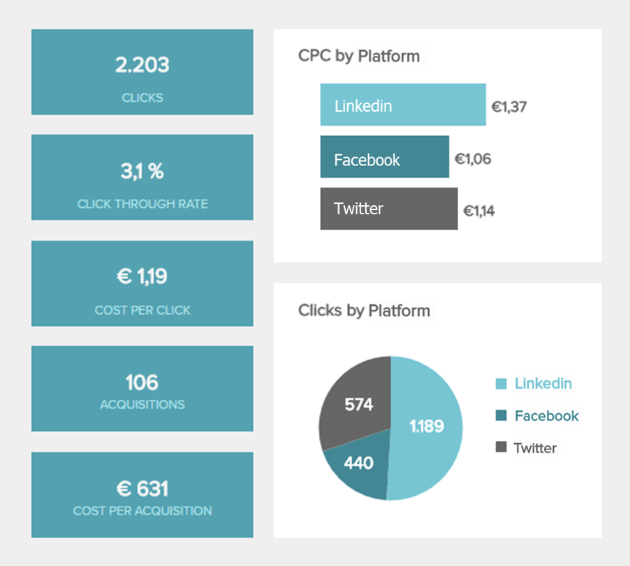
An excellent addition to a marketing-based monthly KPI report or weekly dashboard, CPC is an essential piece of knowledge as it will help you optimize the ROI of your various campaigns. The aim here is to reduce your CPC gradually to make your campaigns or promotions as impactful as possible.
- Cost-Per-Acquisition
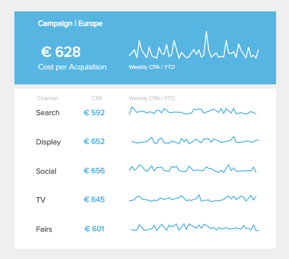
This marketing data visualization is essential to your ongoing performance management strategy as it offers an accessible breakdown of how much it costs to gain new consumers per channel. Having regular access to this information will ensure you can optimize your acquisition costs while enjoying continual consumer growth.
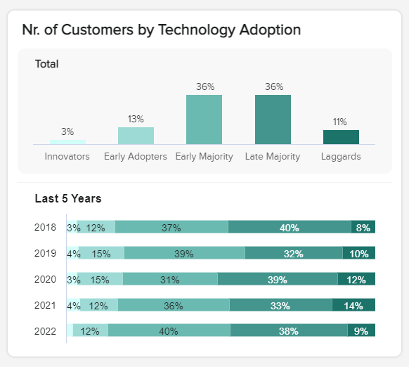
14. Customer demographics dashboard
KPI reports exist to provide a deeper level of context and insight into a specific organizational process, department, or function - and our market research dashboard is no exception.
**click to enlarge**
If you want to improve your loyalty and retention rates, knowing your consumer demographics is vital. By accessing this treasure trove of demographics-based visuals, you will get a practical understanding of the kind of strategies and tactics that will strike a chord with specific segments of your audience.
This incredibly interactive dashboard will help you get under the skin of your core consumer segments, providing the tools to offer products, services, and content that meets their exact needs.
Metrics used:
- Customers by gender
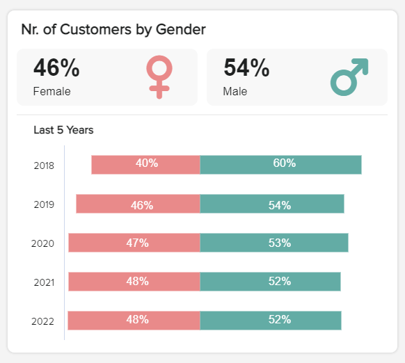
A KPI reporting software metric that will help you trace and measure the gender share of your customer base over the months and years, here you can analyze your brand image and messaging as well as what you offer to ensure you’re being inclusive and unbiased - which is bad for business.
- Customers By Education Level
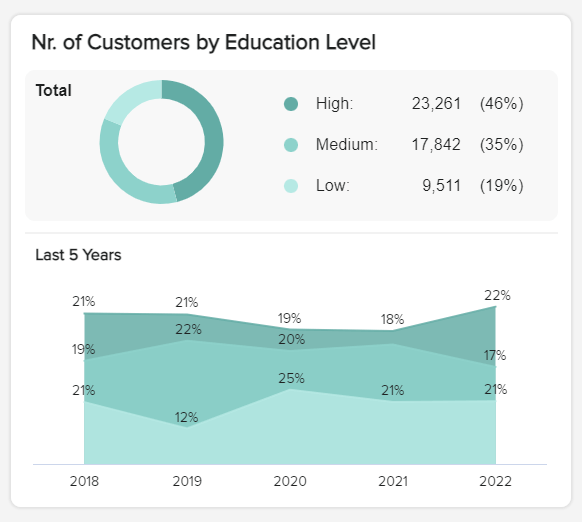
With an insightful market research visualization, here you can drill down into the education level of your customer base with a simple glance. Tracking this metric frequently will allow you to see if your customers’ education level has increased, decreased, or remained the same over time so you can tweak your messaging and strategies accordingly.
- Customers By Tech Adoption
A vital visualization for any market-researched-based KPI reporting process, knowing your customers’ level or status of tech adoption will also help you update your products, services, or messaging to meet their particular needs. Measure this regularly, and you will ensure your new product or service launches offer the best possible experience for your customers.
- Customer Age Groups
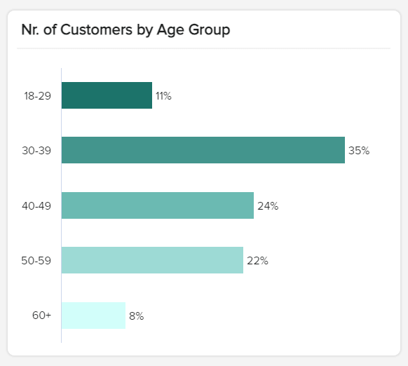
Displayed as an easy-to-navigate bar chart, this age-based key performance indicator will give you a full breakdown of your existing customers’ age bracket or generational status (Baby Boomer, Millennial, Gen Z, etc.). Armed with these facts, you can see where to place your efforts and resources to cement existing loyalty or enter exciting new markets.
15. Cyber security dashboard
In our hyper-connected digital age, keeping your company fortified from the threat of cybercrime should be at the top of your priority list.
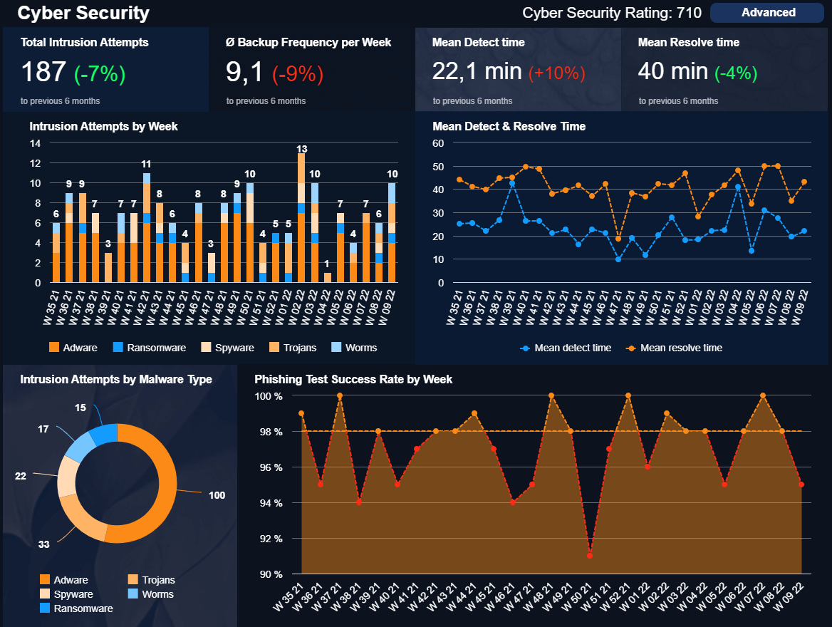
**click to enlarge**
Cybercrime costs the world economy 1% of the World’s GDP - that’s a staggering figure. To keep your organization safe and ensure it thrives in the long term, working with a cybercrime-based IT dashboard is essential.
With a balanced mix of visuals designed to help you track potential malware attacks, phishing test success rates, resolution times, and more - here you have everything to ensure you nip any potential threats in the bud.
Metrics used:
- Mean Time To Detect (MTTD)
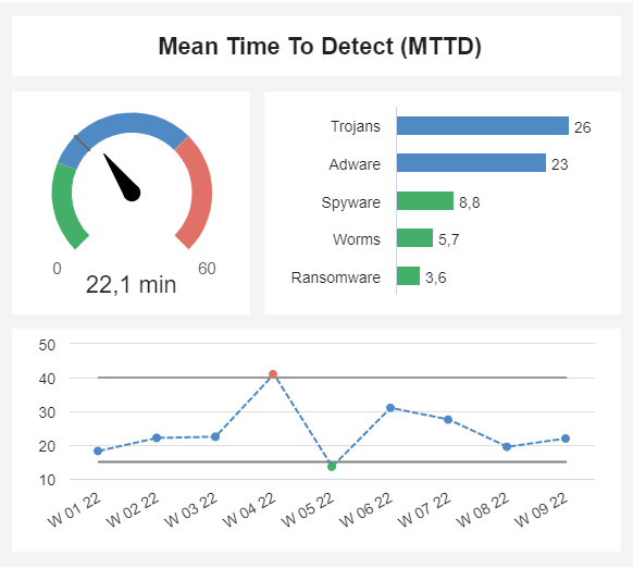
This KPI reporting examples metric will give you the tools to track how long it takes you to detect different types of attacks. Tracking this visualization will ensure that you can nip any potential disasters in the bud and, ultimately, save hours, money - and organizational devastation.
- Phishing Test Success Rate

A trend-based metric that will showcase your employees’ abilities to detect potential phishing attacks will prove pivotal in making sure every department of your company is as water-tight as possible. If you discover any notable dips or troughs, you can take action to provide improved training and guidance.
- Cybersecurity Rating
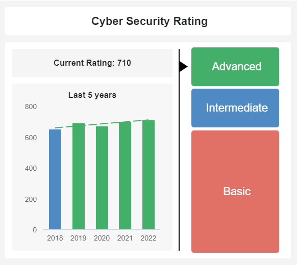
This incredibly useful metric will give a swift idea of how your cybersecurity management strategy is based on three key ratings. Here you can work with a mix of additional cybersecurity metrics to analyze the progress of your strategy according to tech or industry changes. If you notice your rating is dwindling, you can take action before the problem gets out of hand.
16. HR diversity dashboard
Meeting diversity, equity, and inclusion (DE&I) goals has become a top priority for organizations as they build more inclusive workplaces. One way to visually track your progress is to leverage the HR diversity dashboard.

**click to enlarge**
Creating a diverse workforce is easier said than done. It requires proactiveness and a keen understanding of your workforce’s current mix of genders and ethnicities, along with the roles they fill. This allows HR professionals to recognize where gaps exist and how they can make progress toward DE&I goals.
Visually tracking applicants and current employees as they relate to diversity provides insights at a glance. Share quick findings with key stakeholders and gain data-driven proof of how your company is upholding its mission of a diverse workplace.
Metrics Used:
- Gender Ratio by Department
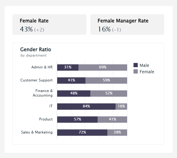
Placing more women in traditionally male-dominated roles is a core part of DE&I initiatives. This KPI tracks gender ratio by department (e.g., admin & HR, IT, sales & marketing) to illustrate where gender imbalances exist. These insights give leaders a sound starting point to identify potential biases and create more opportunities for gender equality.
- Gender Diversity by Role
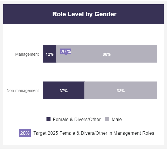
Diversity applies across all levels of an organization. The gender diversity by role metric tracks the share of males vs. females in various roles, specifically leadership titles. By understanding the gender balance of power within an organization, decision-makers can set realistic targets to close gender gaps and track their progress along the way.
- Female to Male Ratio
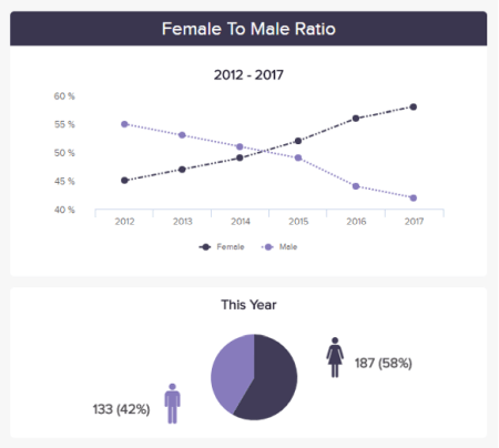
Closing gender gaps in the workplace can’t happen unless you have a balanced workforce, to begin with. Gender diversity can provide a powerful standalone metric that shows you’re in the right position to move other DE&I initiatives forward.
17. COO KPI scorecard
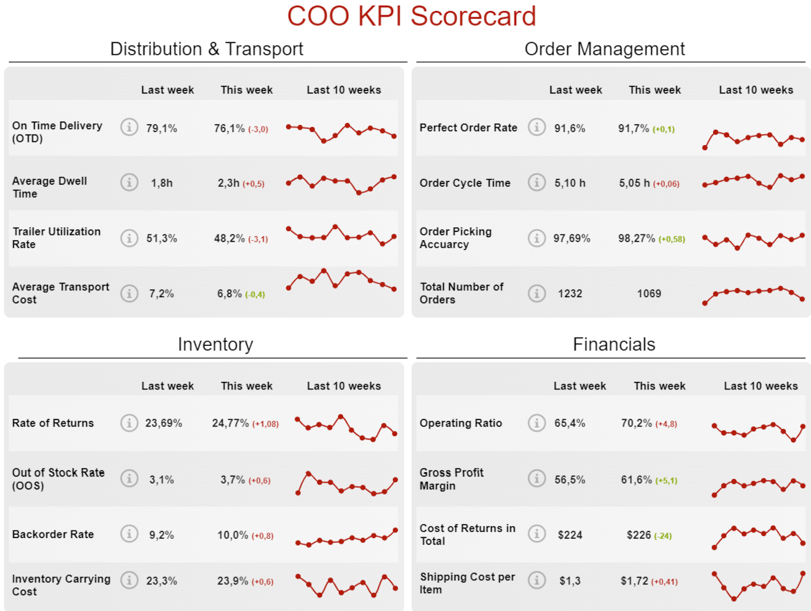
**click to enlarge**
The scorecard format offers an organized, highly valuable view into multiple metrics at once. This format proves especially beneficial for time-constrained executives. The COO KPI scoreboard is designed specifically for operational metrics and includes a 360-degree view of KPIs related to distribution and transport, order management, inventory, and financials. Metrics show a side-by-side comparison of the current week and the prior week, along with trends over the last 10 weeks. These instant insights can help COOs make more informed decisions at key moments and react to negative trends before they spiral out of control.
Metrics Used:
- Dwell Time
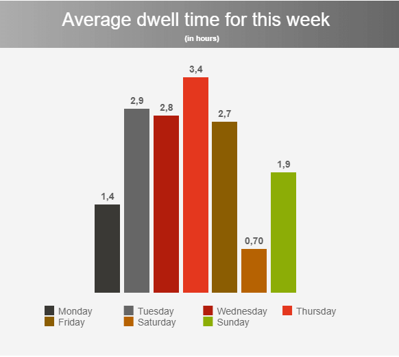
Dwell time refers to how long a driver spends waiting in the warehouse before items are unloaded or loaded and ready for transport. The higher the dwell time, the less efficient the entire supply chain. Multiple factors can be responsible for dwell times, such as complex or heavy orders, high order volumes, or detailed check-in processes. Tracking dwell time allows COOs to identify and rectify potential problems to streamline loading and unloading procedures.
- Trailer Utilization Rate
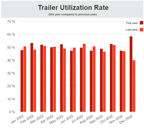
This metric tracks the amount of space being utilized in your trailers each month. Every bit of space in a trailer that goes unused is an opportunity for revenue loss. Tracking this metric ensures the best use of your trailer space, which can have a positive impact on fuel costs, mileage, vehicle wear and tear, and labor costs.
- Order Cycle Time
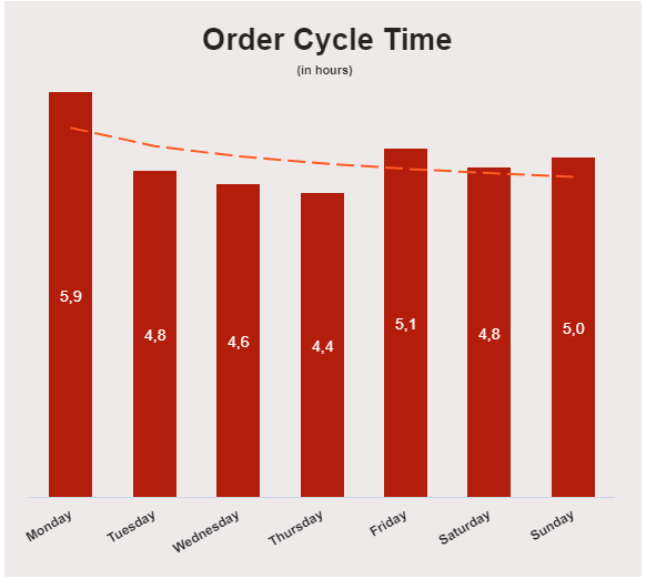
Order cycle times have a direct correlation to customer satisfaction, making it one of the most important metrics to track in a logistics dashboard. This metric reveals how long it takes to ship an order, giving you greater insights into your supply chain efficiency. Long order cycles or anomalies can surface potential bottlenecks, especially if you can pinpoint where these delays occur.
18. Zendesk digital assistant dashboard
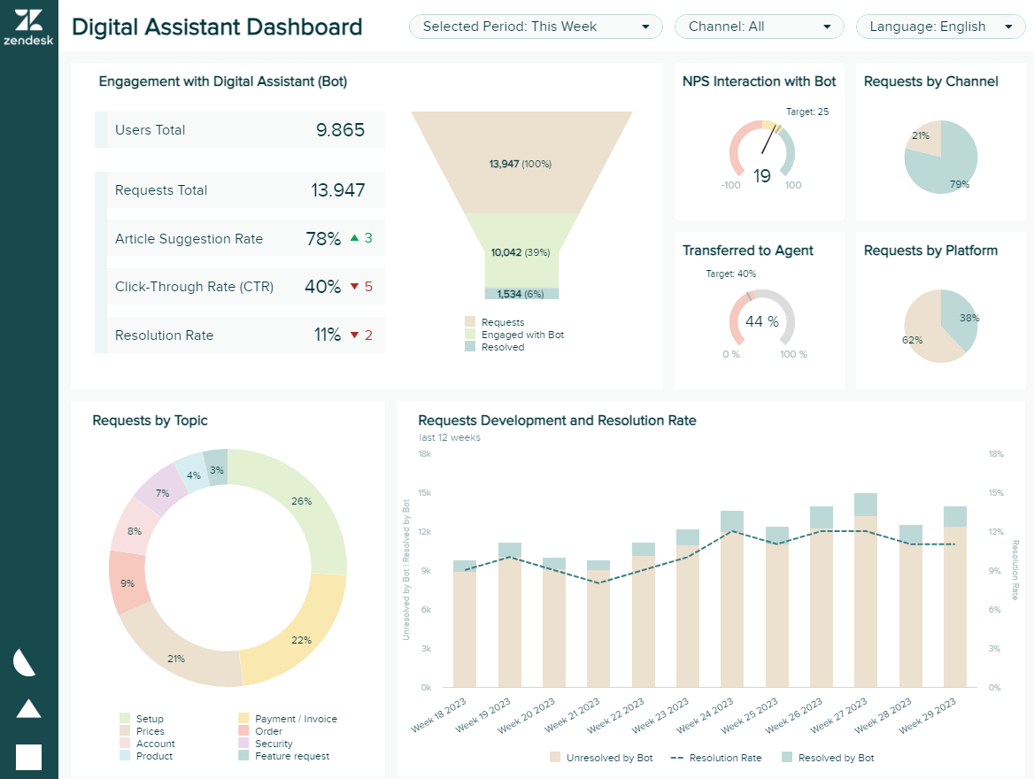
**click to enlarge**
Zendesk has become a leading name in customer service management systems for businesses across industries. In the age of AI tools such as chatbots, Zendesk continues to flex its power and capabilities. Harnessing key metrics from all customer service channels is critical to business success, which is why the Zendesk digital assistant dashboard takes into account new ways that businesses are connecting with customers.
This Zendesk dashboard offers insights into how customers engage with your digital assistants. View interactions with chatbots, the percentage of queries the chatbot resolves, requests by topic, click-through rates from bot-suggested content, and more.
Metrics used:
- Digital Assistant Engagement Rate
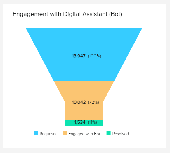
The anchor of the Zendesk digital assistant dashboard, engagement rate, helps shape all other metrics in this dashboard. Digital assistants can’t perform other tasks on your behalf unless people are initiating engagement. Requests show the total number of people who experience an issue. A percentage of those will initiate contact with the bot, and a portion of those will have their full request solved by your digital assistant. Understanding these engagement rates will allow you to gauge your assistant’s effectiveness and deliver greater value to the customer.
- Digital Assistant Referral Rate
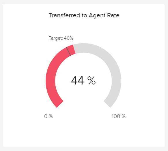
Chatbots can’t solve all customer needs, which is why they have the ability to refer customers to human agents. This percentage is called the Referral Rate and indicates how many queries the chatbot is unable to solve or understand. Businesses should compare referral rates with the underlying reasons for the referral to understand the true effectiveness of their chatbots.
- Digital Assistant Resolution Rate
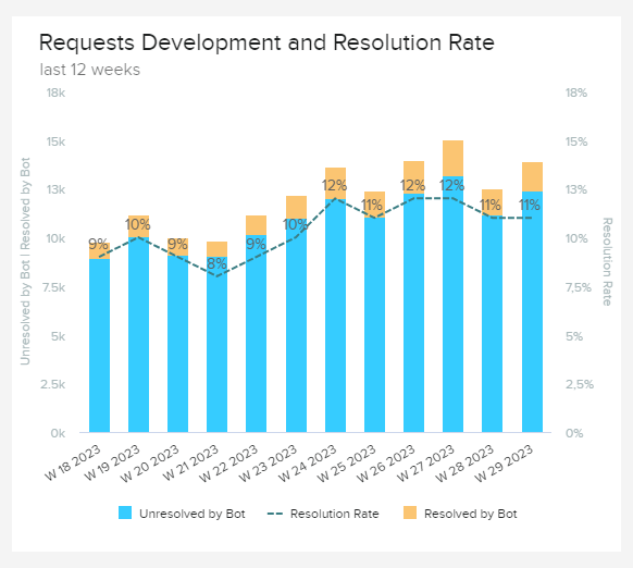
Chatbots can significantly reduce demand on human agents, streamline customer service, and increase satisfaction. Tracking the percentage of resolutions completed by chatbots compared to the total number of inquiries demonstrates the value of digital assistants. Digging deeper into the specifics of unresolved requests, companies can determine additional ways to train their digital assistants and harness the true power of what their technology is capable of.
We have provided 18 valuable examples of how to present KPIs in different business functions, and now we will focus on the creation of such reports and provide basic tips and tricks.
How Do I Prepare a KPI Report?
These reports are interactive, dynamic, and tailored to the individual user, department, or organization depending on their operational needs, strategies, aims, goals, and objectives. They are customizable and thus offer a powerful means of drilling down deep into very specific pockets of information. Picture procurement metrics – you need to know if suppliers fulfill your demands, their capacity to respond to urgent demands, costs of orders, and many other indicators to efficiently track your company's performance. But you need to know what to consider when preparing your report.
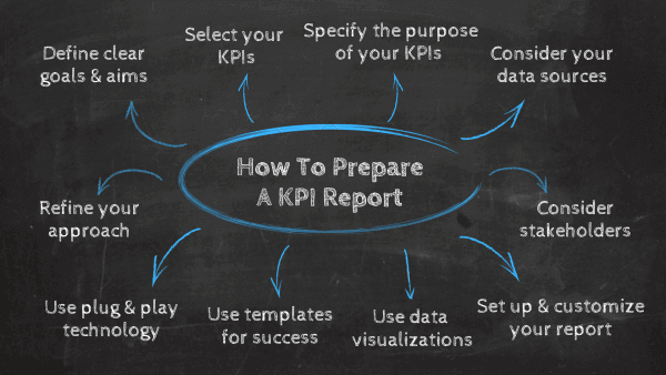
When considering how to create a KPI report, it’s important to understand that for optimum success, you must follow a process.
Before we continue, here’s a quick summary of essential KPI reporting best practices:
- Define your strategic business goals and consider your stakeholders.
- Select KPIs that will track and assess the performance and specify the purpose of each indicator.
- Consider your data sources.
- Set up a report you can visualize with an online dashboard.
- Purposely select the types of graphs and charts you use.
- Create a template and use intuitive software to improve efficiency.
- Refine your approach.
Now, to help you on your path to data-driven enlightenment, here’s a more detailed explanation of each of these points:
1) Define your business aims & goals
Every business, depending on its size, sector, and core objectives, will have its own set of KPIs dedicated to different disciplines within the organization. To understand which KPIs will prove to be the most valuable to your business, you should sit down with key stakeholders and discuss your business aims, goals, and objectives in an open, collaborative environment.
In doing so, you’ll gain a panoramic perspective of where to aim your efforts, as well as the metrics and insights that are worth measuring for success. This will form the foundations of your ultimate reporting success.
2) Select your KPIs
Once you’ve defined all of your organization's most critical goals, the next stage in your reporting journey will be selecting the key performance indicators you want to work with according to your ongoing initiatives and strategies.
Fortunately, in the digital age, a wealth of invaluable KPIs exist to assist growth in a number of areas, from marketing and accounts to customer service, fulfillment, and beyond.
Also, explore our guide to KPI management and learn from a host of helpful best practices.
3) Specify the purpose of each KPI
Creating an effective KPI report requires purpose. Truth be told, there are a lot of metrics and indicators you can report on, but that doesn’t mean everything deserves a place in your report. It’s essential to choose only the KPIs that connect to your initial objectives and will help leaders make decisions based on the data they see.
Specifying the purpose of each KPI within the report adds context and value to the data you’re sharing. Months or years later, it can be difficult to remember why a particular KPI was included in your reporting, along with its significance in the bigger picture and what the data will help the decision-maker do.
4) Consider your data sources
The next stage in the process boils down to taking a detailed look at your data sources.
Today’s dashboards consolidate all of your data, with the help of data connectors, from various platforms or sources, working with your assigned KPIs to deliver the insights you need for growth, improvement, and sustainable success. As such, performing an audit of your data sources is essential.
Before physically creating your data dashboard, you should consider which data sources align with your business objectives and which will best suit your KPIs. Anything that is surplus to the requirement should be disabled or omitted from use.
By doing this, you’ll streamline your efforts and ensure that your reporting dashboard only serves up the insights worth analyzing. In practice, for example, that means that accounting reports should correspond with specific fiscal data you need to generate insights.
5) Consider your stakeholders
Your KPI report is for someone. Make sure that everything contained in the report is relevant to their needs, interests, and decision-making power.
Know who will be using the report, what their role is within the organization's context, and how they will be using the report. For example, is this person making changes on a strategic level or an operational level? Will you need multiple reports or sections to appeal to multiple stakeholders?
Understanding this information early in the process will inform the rest of your KPI reporting design.
6) Set up and customize your report
Once you have decided which KPIs you’d like to work with and examined your key data sources, you’ll be ready to set up a report and customize it to your requirements.
The most effective way to collate and manage your performance indicator is through KPI software, as it will empower you to create comprehensive summary reports from various metrics and visualize them through powerful dashboards. Of all the available data visualization mediums, the dashboard is the most effective, efficient, and easy-to-navigate format.
Moreover, once you’ve set up user access, your reports, your key performance indicators, and tailored the look, feel, and functionality of your reports to your preferences, you’ll be able to gain swift 24/7 access to your most valuable data through the medium of desktop, tablet, or smartphone.
To help you with your creation and customization efforts, here’s a comprehensive guide to data dashboard design principles for your reading pleasure.
7) Drill down into data visualization
Data visualization is a powerful concept and one that is pivotal to reports of any shape or size. Through data visualization, you can extract value from your most important data at a glance, tell a story with your metrics or insights, and share critical information with others inside or outside your organization in a way that is digestible as well as inspirational.
8) Create a template for repeatable success
In the past, reporting has been a labor-intensive, cumbersome process because of the multiple data sources and details involved. Today’s technology makes it easy to create repeatable processes for reporting, helping you save man-hours and removing some of the guesswork.
This step is easier once you’ve created your first report. After laying the groundwork and knowing which KPIs you want to report on, you can turn your report into a template that allows you to plug in new information for future reports.
9) Use plug-and-play technology to support your reporting process
Data sourcing is the core pillar of KPI reporting. It’s also arguably the most resource-consuming part of the process. To simplify how you find and add data to your reports, use plug-and-play dashboards that capture the details you want to report on.
Taking screenshots of these dashboards in as much or as little detail as you like will add instant color to your reports and help to put your findings into greater perspective for stakeholders.
10) Refine your approach
Business needs change. New services or processes may be added, which means your KPI reporting is likely to evolve. Consider these reports an evolving document that requires refinement. This ensures you’re continuing to capture relevant information for decision-makers and will present the most important details needed to drive real improvements throughout the organization.
The best way to do this is to have a regular schedule for reporting and maintenance. This way, leaders can anticipate the release of new reports. Report creators can also avoid having bloated reports by focusing on the most important KPIs that are relevant during that reporting period.
Our additional post on how to make a dashboard will help you take your decision-making to the next level and offers a wealth of particulars on crafting, developing, and presenting your company’s reports.
Key Takeaways KPI reports
We’ve looked at how to prepare a KPI report, and now, let's take a look at some key takeaways and industry studies.
Experts predict that by 2025, around 175 Zettabytes of data will be generated annually. Moreover, within just five years, the number of smart connected devices in the world will amount to more than 22 billion – all of which will produce colossal sets of collectible, curable, and analyzable data, claimed by IoT Analytics in their industry report.
After asking the question, “What is a KPI report,” and exploring the KPI reporting meaning in greater detail, understanding how to make them, and looking at real-world examples, it’s clear that these invaluable tools offer a wealth of insights into critical areas of any business. Reports like this provide the means to set viable goals, work towards progressive benchmarks, and leverage a wealth of invaluable information to your advantage.
Whether you’re looking to focus on manufacturing KPIs or tinkering with your logistics analytics, a powerful KPI dashboard will provide a foundation for all your operational and strategic needs and development.
By knowing how to create a report and present your most valuable performance-centric information in a logical, visually engaging format, you’ll develop seamless processes, evolve your decision-making, improve internal communication, and, ultimately, push yourself ahead of the pack.
To find out more about common KPI reports examples dedicated to disciplines from management to marketing, you can take a look at our business dashboards examples and templates.
To benefit from everything that an online dashboard software can offer your business and start creating your own reports, take on our 14-day free trial!