Customer Service Dashboard examples
A customer service dashboard is a modern solution to monitor all relevant customer KPIs in an easy and accessible way. It is relevant for customer support agents, team leader and C-level executives at the same time and helps to generate a 360-degree customer view as well as to improve the service team performance.
Customer service managers, professionals, and agents have evolved into data-driven employees that need to monitor and evaluate customer service KPIs and generate insights regularly to improve the relationship with customers as well as ensure business growth. With the help of modern customer analytics software, the team will be able to perform basic and advanced analysis, learn from generated information on the spot, and create a modern customer service report focused on critical metrics that ensure accurate data analysis, and the best possible outcomes for your business.
Here we will present the top 5 customer service dashboard examples focused on various functions within the department:
Customer Service Team Dashboard - Customer Satisfaction Dashboard - Customer Support KPI Dashboard - Service Quality Dashboard - Customer Retention Dashboard
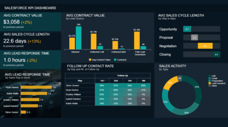
Customer Service Team Dashboard
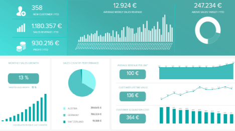
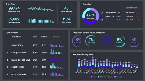
 <
<
Customer service (CS) is a part of every company’s unit and plays an important role in their image. Providing exceptional customer service means that your teams are surpassing customers’ expectations, who often set the bar high: it is hence highly important for your business to track the metrics that will reach these expectations with the help of professional customer service dashboards. For example, try leveraging user feedback insights from customers to further improve the level of service you provide to them, whether that’s through feedback collected on your agents and your knowledge base, or the quality of content around products and services.
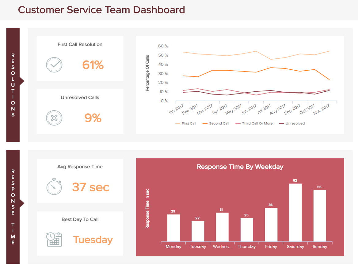
Above we have a customer service dashboard focusing on a team’s performance on a daily and monthly basis. It is divided into two parts each analyzing an aspect of their work. The first element on the top left concerns the resolutions: how many calls are resolved on the first occasion a caller reaches an agent? How many are resolved on the second, or third occasion, and how many remain unresolved? Tracking this will give you an idea of the efficiency of your team in addressing the customers’ issues. The first call resolution (FCR) is a highly important KPI as it gives the first (and as we know, usually most important) impression of your customer service. When people reach your support team, they are likely to have a problem and already feel like they are wasting some time: managing to efficiently answer their request and resolve their issue will give them a positive image and they will be much less likely to rant on social media afterwards. This is why the higher you keep this metric, the better it is. Another essential element you should track on this and any other helpdesk dashboard template, to keep your customers satisfied and not irascible on the phone, is naturally the average response time. The longer we wait, the more impatient we become: maintaining it low will save you money and reputation. A third of the callers will hang up after one minute on hold, and two-thirds after 3 minutes.
You can see displayed on this customer service dashboard the response time per day of the week. If you want to reduce that average response time, you should evaluate the number of issues you receive on a daily or monthly basis. Knowing your solicitation rate lets you plan ahead and adjust the staffing needs and schedule. More agents available will considerably reduce the response time, even if it momentarily increases the costs – the price incurred will anyway be paid back thanks to better retention rates.
To decrease the average response and increase your FCR rate, what you can do is provide good training to your agents, share scripts, customer surveys, and clear processes. Having a knowledge base gathering all the questions, issues and tickets answered day after day is also a best practice: there is no need to reinvent the wheel, when a specific problem comes back; you have it in your base and any agent can access it and read the solution addressing the problem, which saves a great deal of time.
Finally, track additionally a certain number of metrics personally for each of your agents: first call resolution, average calls per hour, customer feedback… That will help you measure their efficiency and success and spot out who is meant to become a manager and who might need some more training. It is key however to measure that performance in the long run and not on a daily or weekly basis. The randomness of calls might give an unlucky agent a lot of angry callers who irrationally write bad reviews for totally unrelated reasons.
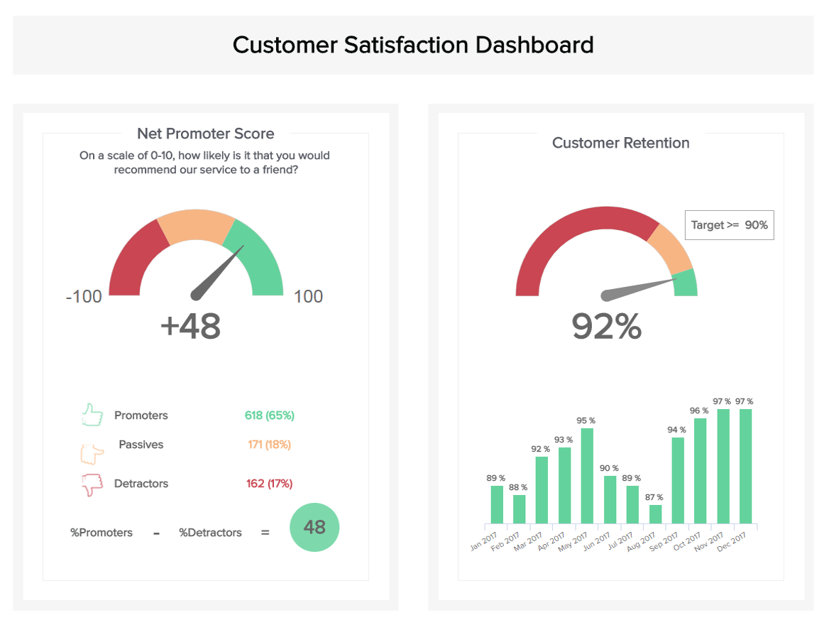
Customer satisfaction remains a top priority for today’s businesses. Countless studies have shown that easy access to information and support makes people love a brand, and often they are willing to pay more if they know they will have a solid service experience. Some metrics play an essential role to measure the pulse of a company’s customer service efficiency, while others are more evaluating if a brand has a customer-centric approach. Our second customer dashboard will examine this second type of metrics.
That said, this customer satisfaction dashboard example displays in first the net promoter score (NPS). This KPI evaluates the power of your referrals by simply asking one question: “on a scale from 1 to 10, how likely is it that you would recommend our service to a friend?”. Then, you need to separate the figures into three groups: detractors gave from 1 to 6 on the scale; passives gave 7 or 8, while promoters gave a 9 or a 10. Then, simply deduce the percentage of promoters by the percentage of detractors, and you will have your NPS score. This will give you an idea of how customers interact and see your brand. To have a better feeling about your score, you can compare it with your competitors’ score, if you happen to know them. Having a good NPS score demonstrates good customer loyalty, and is also highly correlated to business growth.
Similarly, the customer effort score asks a simple question that provides insights into the customer experience. Indeed, knowing how much effort your clients put into reaching out for help is a great indicator of the quality of services. Tracking the difficulty of reaching out to support teams will always keeping a focus on what matters to keep a good reputation. Monitoring this KPI on a customer care dashboard, alongside other more “qualitative”, less data-oriented metrics, can help you increase your clients’ satisfaction. Asking for written feedback on pain points users may have encountered, and sending short satisfaction surveys at the end of a call or email exchange will bring valuable information from within, which should be used to improve your customer service. To learn more about bits and pieces of these metrics, we suggest you read our guide on customer satisfaction metrics.
Both of the metrics we analyzed above directly impact the second KPI displayed on our dashboard: customer retention. As we all know, loyalty plays an important part in a business’ success: people who had a positive experience come back after their first purchase and are likely to come back again, but also to recommend your brand. Besides, retaining a customer is less expensive than starting again the whole acquisition funnel from scratch and trying to acquire new ones. The costs you are saving here can be re-invested in channels that are more in need, like an overstaffed support team whose average response time to calls or emails keeps on growing at the same pace as the number of unsatisfied customers. Set a target retention rate to reach and implement measures to achieve it.
No matter your role in the support team – agent, manager, or VP – checking your customer support dashboards on a regular basis will help you do your job better. By keeping track of specific performance indicators, you can identify your strength and weaknesses, various opportunities, and room for improvement.
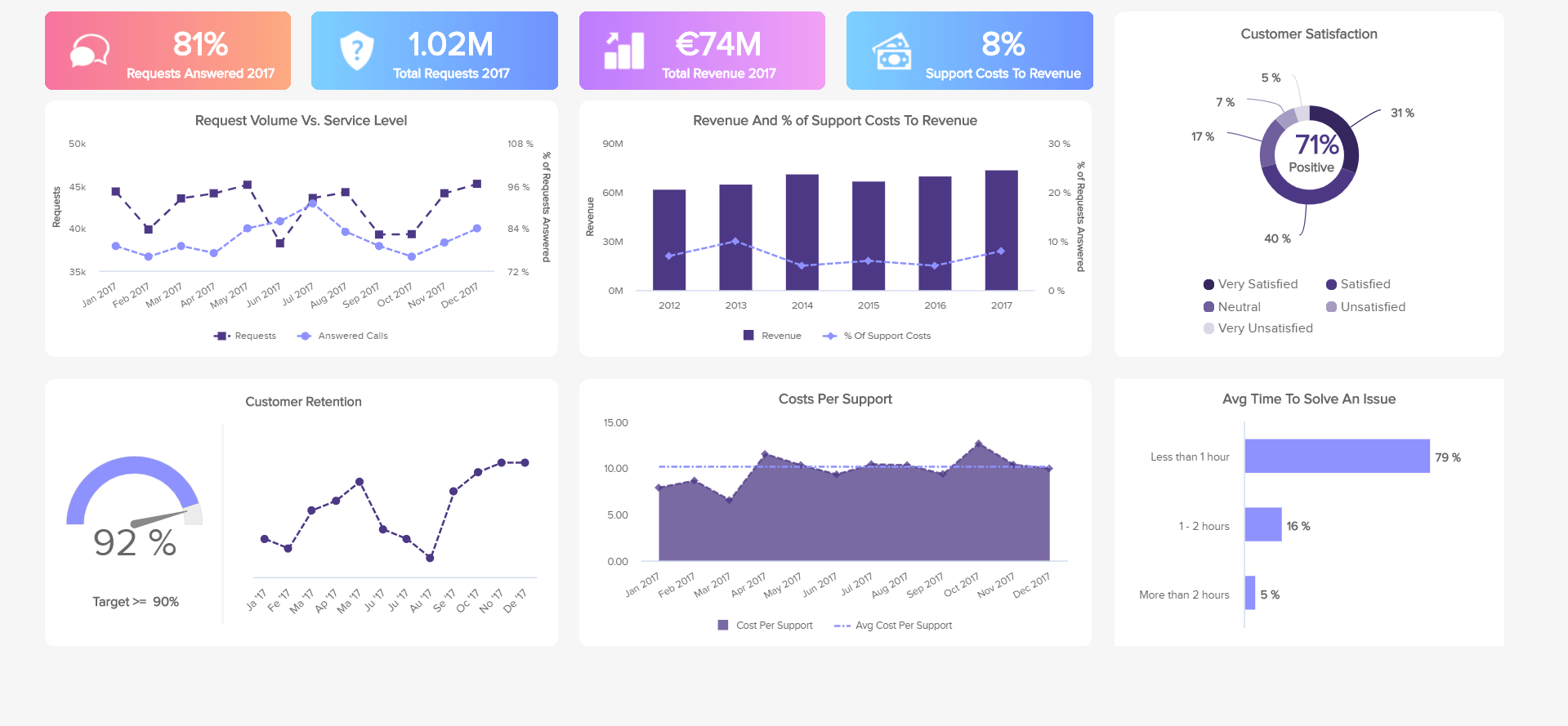
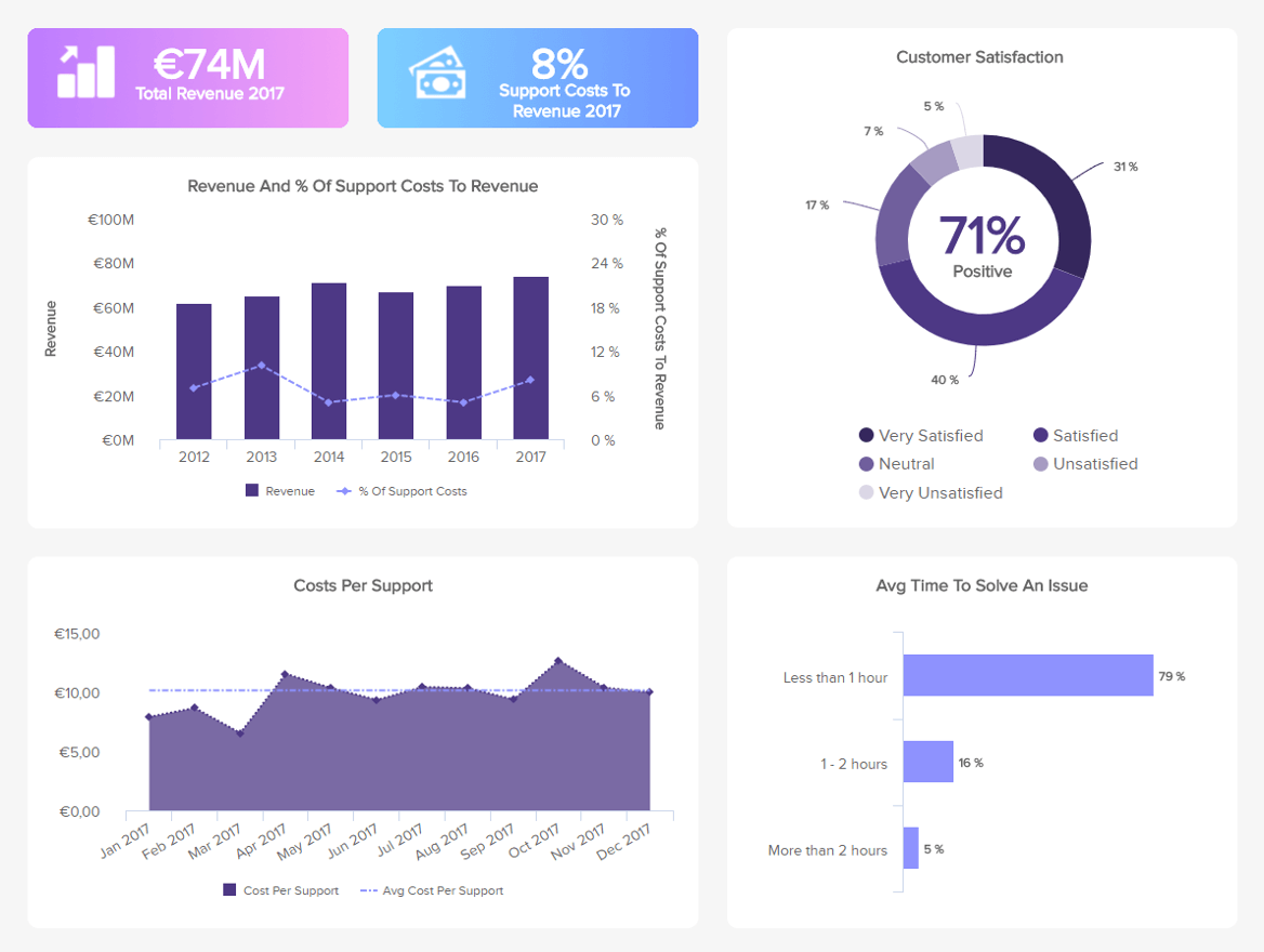
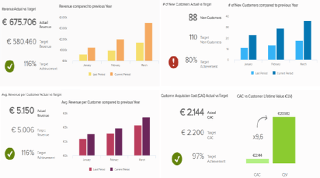
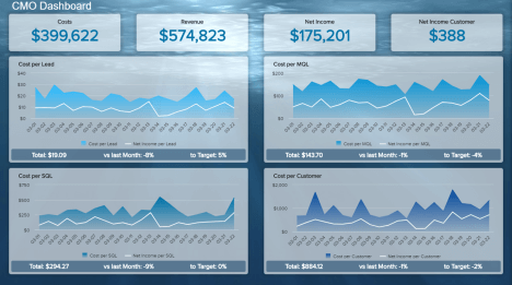
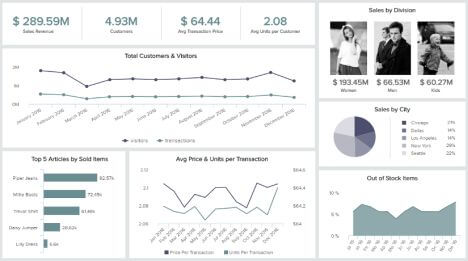
Our next customer support dashboard example is dense and tracks a lot of metrics that are common to a helpdesk dashboard as well as customer satisfaction or even a customer service KPI dashboard. It is a medley of KPIs intended for managers who need a general overview of their service in one glance. The first two indicators at the top provide figures that will be detailed underneath: the total revenue generated and the average percentage of costs to the revenue.
Measuring the percentage of costs in comparison to your revenue gives you an idea of how much you invest in your support teams relative to the revenue you generate. It is of course a good thing to invest in it because it will be paid back thanks to greater retention rates. Seeing how it evolves is also another way to find if you are investing your money in the right departments: overstaffing the support team for no apparent reason will increase operational costs and won’t bring a good return on investment. A correlated metric you can measure to help you with that is the cost per support over time: after you set a target (like the average cost measured over the year before), if you witness an abnormal increase, it is necessary to investigate the reasons.
These costs are directly influenced by the bottom-right metric displayed on the support dashboard: the average time to solve an issue. The longer it takes, the fewer issues are resolved and the more it costs your company. Needless to say that this will also affect the average response time that we saw earlier, and that means customers that tend to be more grumpy and rant, so your reputation might suffer. Take the time you need to address the issues in the best and most efficient way possible. But trying to do it faster thanks to proper training, knowledge bases, efficient processes or scripts is a best practice.
Finally, and this is what every business aims for, our support dashboard template displays the most important of all KPIs: customer satisfaction. You can measure it with simple, short questions surveys at the end of calls, emails exchange, or directly on your app, to evaluate your support service quality in the eyes of your customers. When they recognize the efforts a brand is making, their loyalty follows, and so does sustainable business growth.
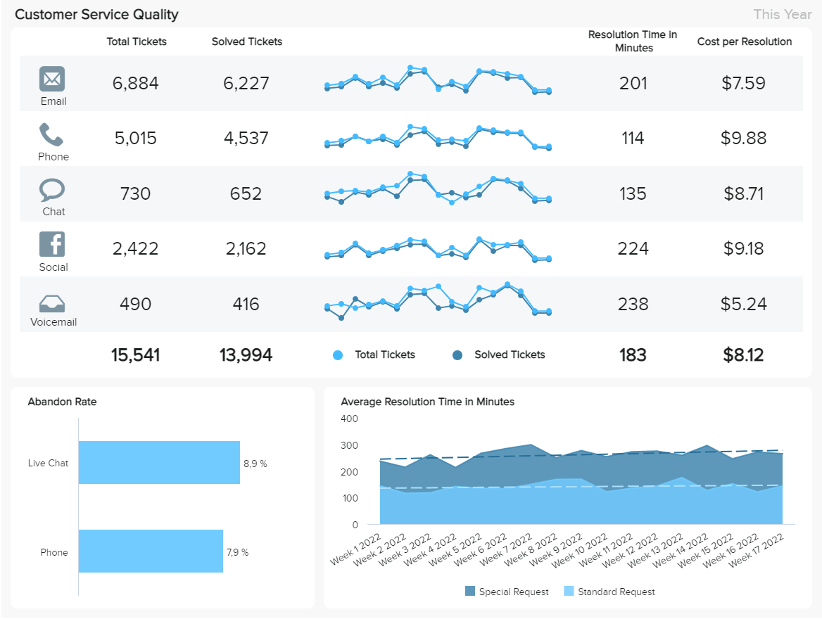
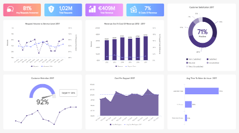
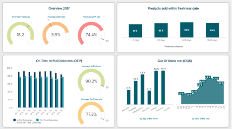
Our next example is fully focused on the quality of support your business is providing on 5 communication channels: email, phone, chat, social media, and voicemail. The dashboard has a weekly focus and it can be used to extract useful conclusions regarding the performance of your team as well as your support strategies.
Starting at the left side of the dashboard, we get a detailed overview of the NPS for the different communication channels (open live version to see the NPS section). This is useful information as it tells you which channel is performing best for customers and which one needs improvement. In this case, we can see that email and voicemail are the worst evaluated ones, this could be because they do not involve interaction with a support agent, making it more difficult to solve issues quickly. On that same note, the abandon rate is another satisfaction indicator that is useful to track as it measures the percentage of clients that abandon a call or communication without being able to resolve their issue.
To complement this information, you get detailed insights into each channel with metrics such as the total tickets, solved tickets, average resolution in minutes, and cost per resolution. This data will help you dig deeper to find the reasons for the poor or satisfactory performance of the different channels and optimize them to guarantee a quality service. For example, going back to the worst performing NPS, you see that email is the channel with the most tickets. Therefore, it is not good to have a low NPS for it. This could be because the resolution time is high compared to other channels such as the phone, which is the second one with the most tickets. The same thing happens with voicemail, even though it is the channel with the least tickets, it is also the one that takes the most to resolve issues, making it the worst performing one.
The cost per resolution is another interesting KPI to look into. In an ideal world, you want to spend the least money with the highest level of fulfillment. However, this is not always the case, and tracking your costs per resolved ticket can shine a light on a number of situations. For instance, you can have great satisfaction levels but higher costs than you expected or can afford, or low contentment levels and high costs. If any of these two happen, it is necessary to make decisions, especially when you use multiple channels to communicate with clients.
Last but not least, the template offers a deeper view into the average resolution time tracked by week and divided by special requests and standard requests. Naturally, a standard request will take less to be solved as businesses usually have predefined processes for them while special requests might require more steps and more time to be solved. To compare the performance of the two, the chart includes a trend line that represents the acceptable resolution time. If you see that a week is higher than expected then it is necessary to look into it and learn from what happened.
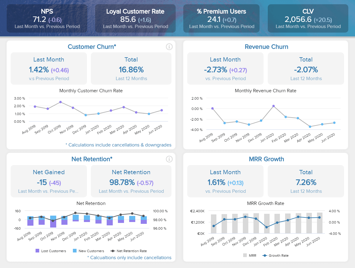
Customer retention is the backbone of modern and successful businesses, especially the ones that want to save their resources from acquiring new customers, which is, oftentimes, much more expensive than retaining them. By keeping the customers satisfied, the results will follow: the churn will minimize, and profit will increase. To effectively monitor all the bits and pieces of data and optimize your strategies according to the laws of business, a customer retention dashboard will help. You can also open this dashboard in full-screen mode in order to see more details.
In our example, on top of the dashboard, you can see a clear overview of the NPS, loyal customer rate, the percentage of premium users, and the CLV. We would like to stress that this dashboard keeps its focus on a SaaS business, but you can simply adjust it according to your specifics. Continuing on the center part of this customer retention dashboard example, we can see the details of the customer and revenue churn. In this case, the customer churn is represented on a simple visual that shows a quick overview of the last month’s and year’s performance, followed by a line chart where the development is represented over a longer period. We can see that come months caused a higher churn than others, which, subsequently, also affected the revenue churn on the right. These calculations include cancellations and downgrades because both are equally important in the churn analysis process and both cause business consequences.
On the right side, the revenue churn is similarly organized and provides details on how it affected the business revenue. It’s an important metric, especially for a SaaS business, since it will tell you how well you perform in retaining customer revenue. In our example, you can see the development over a longer period and spikes in January. That could mean a number of things such as users didn’t prolong their contract due to cutting down costs, downgrading their plan, or simply announcing bankruptcy. The point is to dig deeper and find out why. The lower part of our customer dashboard template focuses on net retention and MRR growth. The net retention is also depicted through a longer period but you can also see the at-a-glance comparison between last month and the previous period. That way, you can immediately spot the number of lost and retained customers. The net retention chart shows an overview of the lost and new customers, and a line of the net retention rate that follows both numbers. These calculations only include cancellations so you have a clear picture of how many customers have decided to terminate the partnership and learn from it to improve in the future.
Finally, the MRR growth is clearly one of the most important parts of this dashboard that rounds up this data-story with the numbers of the recurring components within your subscription model. In this case, it made sense to include the net and new MRR, expansion, and churn MRR to get the detailed growth and generate a complete picture.
Now it’s your turn to take our customer dashboard examples as a roadmap, and start creating your own. These valuable analytical tools will provide you with the necessary knowledge to provide your customers with the best support possible while skyrocketing your loyalty rates and profitability.in the process. Whether you’re an agent, manager or VP, with datapine, you have the opportunity to visualize your data with a few clicks, and try our dashboard software for a 14-day trial, completely free!
Setup only takes one minute. No credit card required!