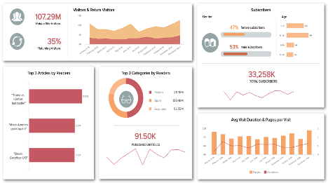
Fast Moving Consumer Goods Dashboard examples
A FMCG dashboard is a real-time analytics tool that helps to cover high demands, optimize procurement and selling strategies as well as meet financial goals by taking into account the specific requirements of common fast-moving consumer goods such as food or beverages.
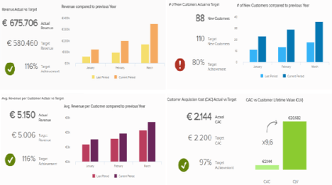
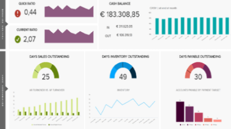
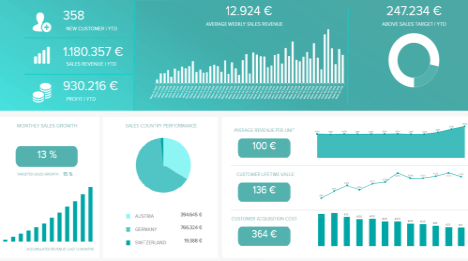
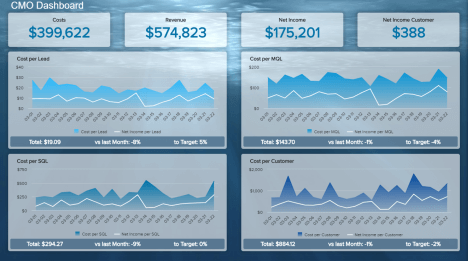
Let's take a look at these 3 FMCG dashboard examples: FMCG KPI Dashboard - FMCG Financial Dashboard - Consumer Goods Dashboard.
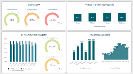
FMCG KPI Dashboard
Open FMCG KPI Dashboard in Fullscreen

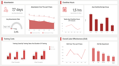
Managing all the moving parts of your supply chain can be a nightmare, all the more when the products at stake are of the fast-moving goods category. Our first FMCG KPI dashboard provides an overview of all the metrics tracking the operationality of your business inventory and processes. Like everything in the fast-moving goods industry, these indicators have to be measured over short time periods.
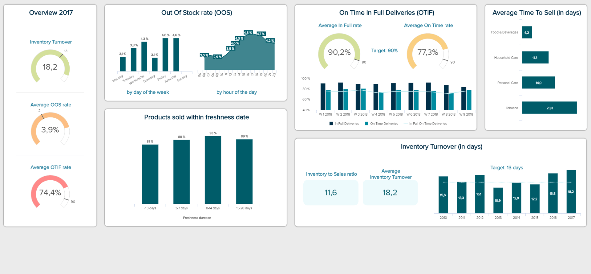
The first metrics displayed on this dashboard give an at-a-glance status of the year 2017, with gauge charts illustrating three metrics that will be further detailed. Both of the Inventory Turnover and the Out of Stock rate are over the pre-set target; however, the average OTIF rate remains far below, with a score of 74,4% compared to a 90% goal. Efforts need to be done in this area. The OTIF, acronym for On-Time In-Full delivery, refers to the performance of deliveries from a customer point of view: the right product was delivered in the right quantity and to the right quality standards, at the right place and on time. When looking at this KPI in detail, we see that the average of products delivered in full (90,2%) is way higher than those delivered on time (77,3%), which is also higher than the overall delivered both on time and in full (74,4%).
Moving on to the next metric of this FMCG KPI dashboard, we will look at stockouts. Calculating your Out of Stock Rate gives you an accurate vision of the state of your inventory. For a fast-moving goods business, this is all the more crucial that any “long” stockout will have tremendous and immediate repercussions on your sales. Not only will you loose on sales, but customers who are facing repeated stockout on a product will switch to another store permanently. Besides, studies have shown that 80% of the out of stocks items were actually out of shelves, meaning that the problem is mainly shelves replenishment and not a total shortage in inventory. By implementing efficient staffing measures in the matter, you may increase your overall sales.
The metric displayed underneath, Average Time to Sell, echoes the second one – the percentage of products sold within the freshness date. Both are important metrics for fast-moving goods companies, as the sales cycle time is very short and that they are subjected to other constraints such as expiration dates and sanitary rules. This is a metric important for the procurement department and for the cash-flow management. You can compare these times between various categories, but the inherent perishable nature of food will always make it lower than tobacco for instance. What you should be aware of is the amount of product you manage to sell within the freshness date, and increase that figure as much as possible to avoid waste and unsold inventory. Unsold inventory impacts the carrying costs since it needs to be stored and managed, increasing the overall costs. However, this is always a trade-off between availability and potential losses: is your strategy to have every vegetable and fish available on a Saturday at 21h, when you close at 22h, or would you rather have a 100% selling rate – meaning that you would run out of the product at some point? That is usually the main difference between a discounter and a premium supermarket.
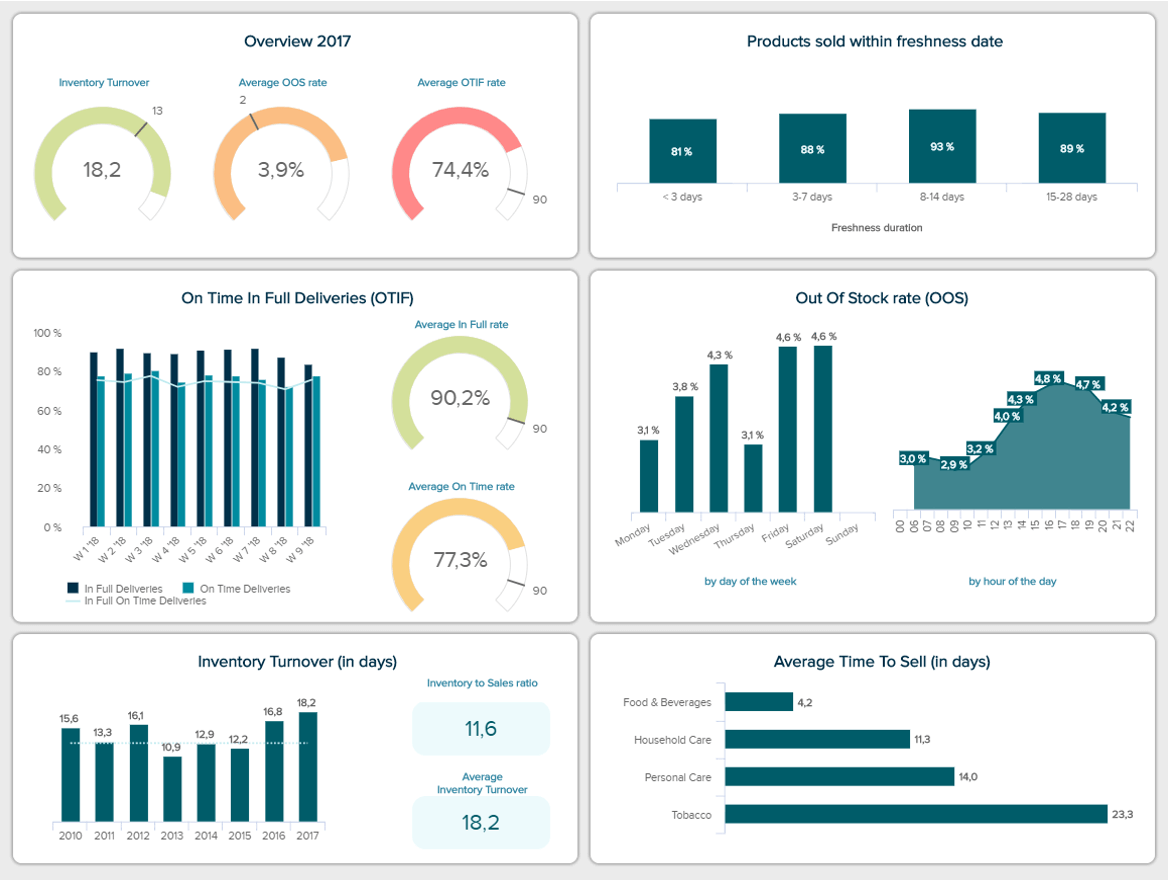
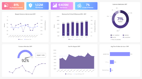
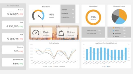
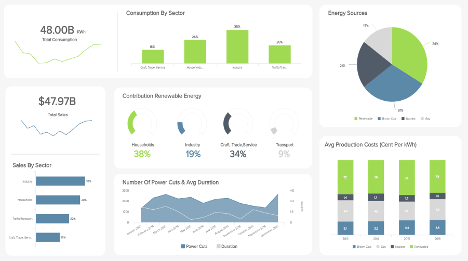
Our second FCMG dashboard example analyzes the finances of the company. The top banner displays three main KPIs: total net sales, total supply chain costs, and the average cash-to-cash cycle for the year 2017. The three of them are analyzed into more details underneath.
The Total Supply Chain Costs, adding up to €9,5 million, are broken down per category, with their proportion. The biggest budget item are the warehousing costs, with €2,4M. They are followed by the transport (€2,2M), the carrying costs of inventory (€1,9M), customer service (€1,1M) and inventory management (€1M). The supply chain costs are calculated for each category by subtracting the profits and the costs to serve to the total sales. It can be interesting to compare the total supply chain costs to the sales, to see how much you are spending on the supply chain relatively to how much you bring in. If you realize that the percentage spent on the supply chain is too high, you can figure out means to save some costs. However, do not cut costs without a meticulous analysis beforehand: reducing here may increase the costs somewhere else, which in the end is a waste of time and energy. A best practice however is to compare this percentage to the industry average, set a target and aim at staying below that line. For instance, on the dashboard, the costs as a percentage of sales are compared to the previous period; they are this year of 8,3% or 1,2 more than in 2016. Investigate the reasons behind such increase (that might come from new equipment or hires, that are expensive at first but become a competitive asset afterwards), and see if you need to implement new methods to avoid another increase.
Next to these first metrics, we have a detailed Cash-To-Cash Cycle, sometimes also referred to as cash conversion cycle (CCC). The Cash-to-Cash cycle represents the time cash is tied up in the main cash-consuming and producing areas: inventory, payables and receivables. This is a metric expressed in days, calculated by adding up receivable and inventory days, to which you subtract the payable days. This is helpful if you want to determine how much cash you need to fund ongoing operations. Generally, the lower the number, the better. On our dashboard aside we see that the cycle goes from 48 days down to 39, which is a substantial progress and smoothens operations. It means that now, the company’s cash is held only 39 days in inventory – that translates effective sales and efficient money collection.
Finally, the Carrying Costs of Inventory are detailed according to their nature: storage, service, admin, etc. We see that the risk, with 36,7% and the freight (29,2%) are the most important holding costs. They are calculated as a percentage of the inventory value, and represent all the costs induced to hold and store inventory over a period of time. Knowing how much these costs represent, businesses know how much profit they can make on their current inventory.
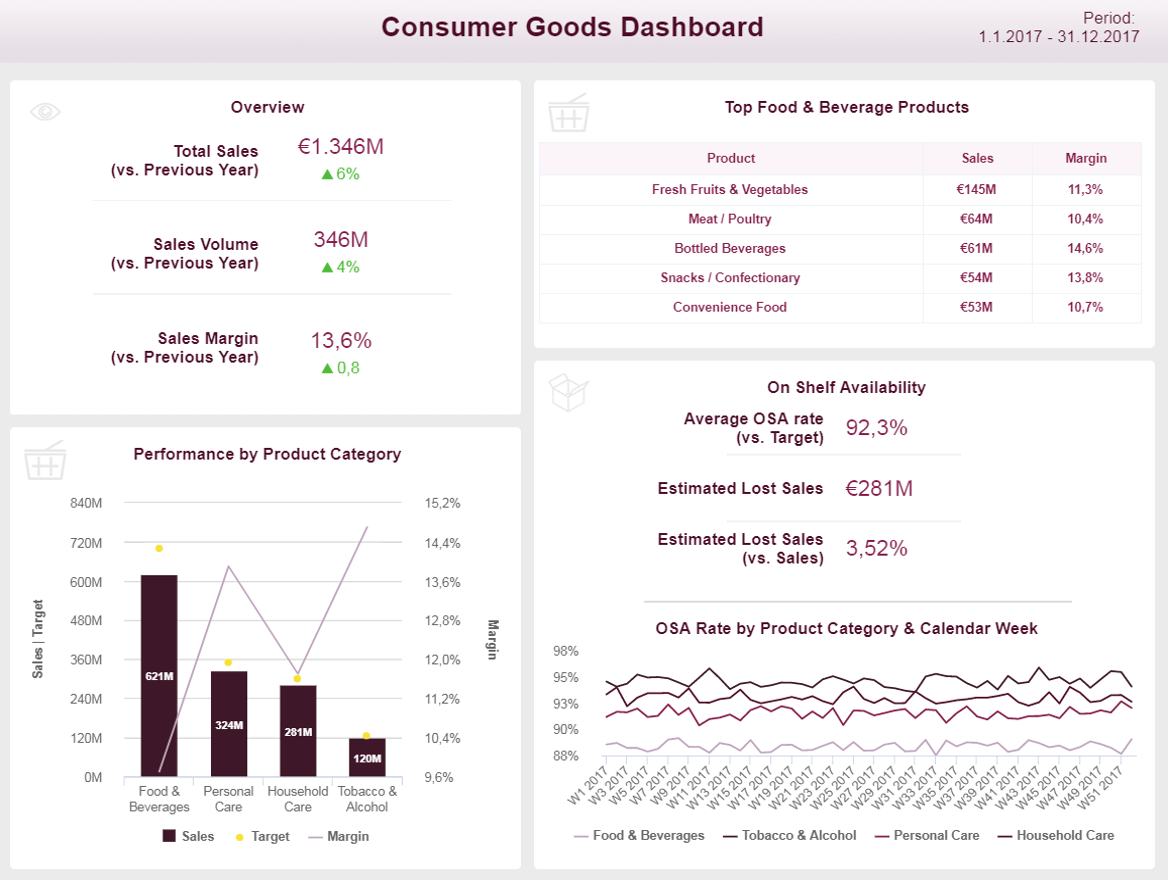
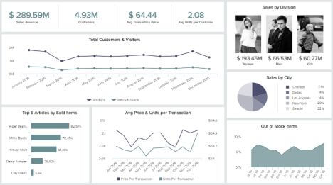
Our final FMCG dashboard template is more from a single supermarket point of view. We have an at-a-glance image of the products sold and available in the store, and how each product category performs.
The overall sales are on the increase by 6% compared to the previous year. The sales volume and sales margin are also both increasing. The sales margin tells you how much of every dollar put in sales actually stays within your business as gross profit, after accounting for the costs of a product sold. It gives an idea of the profitability of your products, that you can compare like it is done on the chart below: food and beverages have a very low sales margin in general, while personal care products and alcohol and tobacco have larger sales margins (14 to 15%). However, as it is often the case, products with lower margins, that usually are cheaper, have a much higher total sales volume. Comparing that sales volume to the target you pre-set is a best practice to see if you are still on track with your goals; and if not, assess the reasons behind that.
You can also find on this dashboard the On-Shelf Availability (OSA), that evaluates the percentage of time an item is displayed on a shelf for shoppers to be bought, where they expect it to be and at the moment they want to buy it. The OSA is an important metric that should be monitored and improved, because unavailability often leads to frustrated customers who will change to another store. OSA is linked to another KPI mentioned earlier, the Out-of-Stock rate, as we have seen that on of the main problem for ‘stockouts’ was not an empty or inaccurate inventory, but a lack of shelves replenishment. You need implement efficient measures that address any out of shelf item: some stores do not hesitate to invest in surveillance technology with cameras monitoring the OSA and send alerts to the store managers when products are going out of shelf, or are found in the wrong place. By decreasing your OSA, you can decrease the estimated figure of lost sales, which is a substantial win. But just like with the time to sell, the on-shelf availability cannot always be of a 100%, otherwise it means that not all your inventory is sold, and it incurs other costs (like the carrying costs).
When you are a distributor or a fast-moving consumer goods trader, the use of dashboards to manage your day to day operations will relieve you from a lot of stress. Having all the information in real-time at your fingertips makes the store management, the supply chain overview as well as the financial decisions much easier. You dig into your analytics without struggle, and extract the actionable insights you need to bring your activity a step forward.
Setup only takes one minute. No credit card required!