Management Dashboard examples
A management dashboard is a tool used to present all important management KPIs in a single place, share insights with c-level executives in an efficient way, and empower the management to make fast and data-driven decisions based on the latest information.
Let's discover 4 management dashboards: Management KPI Dashboard - Financial Overview Dashboard - Investor Dashboard - SaaS Management Dashboard.
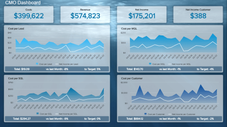
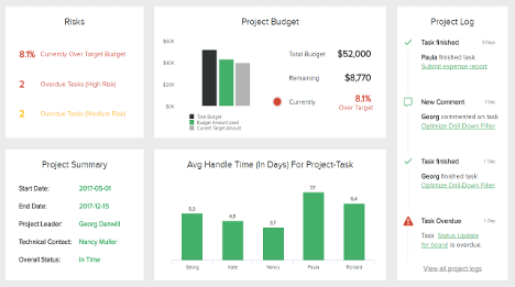
Management KPI Dashboard
Open Management KPI Dashboard in Fullscreen

Management dashboards are extremely useful when strategic decision-making processes need to summarize often complex data and turn them into actionable insights and reports. This can be easily done by using a reporting software that will enable CEOs detailed visibility of business performance across main metrics with factual and real-time data. The information gained will empower high-level managers to get a clear picture of their organization, identify business opportunities, determine what kind of KPI management improvements are needed, and, consequently, generate more revenue and profit. We have prepared 4 main management dashboard templates that you can use for developing a sustainable business and outperform your results.
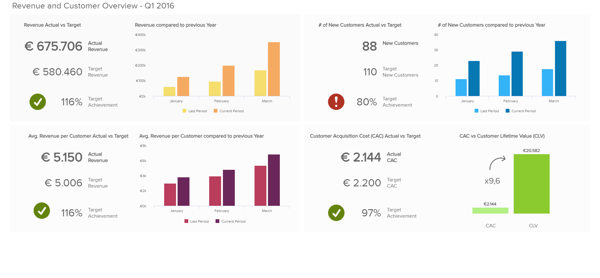
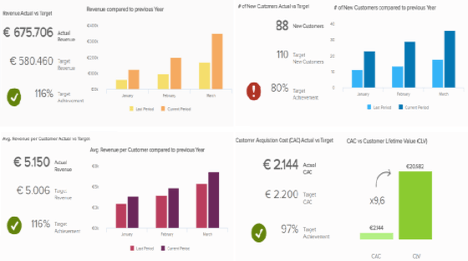
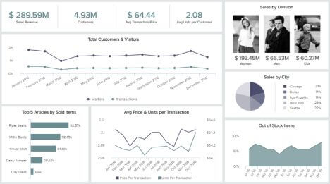
Our first management dashboard example focuses on revenue in total as well as on a customer level, plus the cost of acquiring new customers. It delivers this information by providing you with information regarding total revenue and average revenue per customer, as well as statistics relating to the number of new customers and customer acquisition cost (CAC).
One of the most important KPIs for each manager is the actual revenue generated within a certain period, compared to the company’s target revenue as well as an overview of how the revenue has developed during the last months. As can be seen on our first management dashboard template, there are simple and easy to understand visualizations relating the actual revenue against target revenue; this information is given numerically for an effective and comprehensive picture of your operations. For most revenue indicators, the net revenue is used excluding VAT charged to customers. Often, comparing the revenue within a certain period to the same period of the previous year provides a good indication of how the business has developed; that’s why our management KPI dashboard above gives a heads-up display of revenue comparisons against the previous year for more effective business monitoring. It is evident that a successful business must meet their target revenue goals, however, the real-time visualizations in this management dashboard are critical to constantly monitor your situation and address any discrepancies. By developing a comprehensive management report, these metrics can be easily implemented with intelligent alarms that will notify you if things go wrong.
We’re continuing with the average revenue per customer that gives insights about the success of up-selling and cross-selling activities or the overall value that a product or service generates for the customer. Also, pricing has a major influence on this metric. The average revenue per customer is directly connected to the customer lifetime value (CLV), an important metric for investors and the overall success of the business model. The proper calculation of the customer lifetime value includes all future revenues minus the cost of generating these revenues, discounted by a defined interest rate, taking into account upselling and customer churn.
At the bottom of this management dashboard example, you find visualizations of the customer acquisition cost (CAC). This KPI includes all marketing and sales expenses that occurred during the acquisition process and essentially portrays the average cost of gaining a new customer. CAC is another very important figure for investors; combined with the CLV, it shows if a business model is working or not. A basic rule is that the CLV must be higher than the cost of winning a customer, because if more money is being invested into gaining new customers than their patronage is paying off, it is not worth the effort and your business efforts are better used elsewhere.
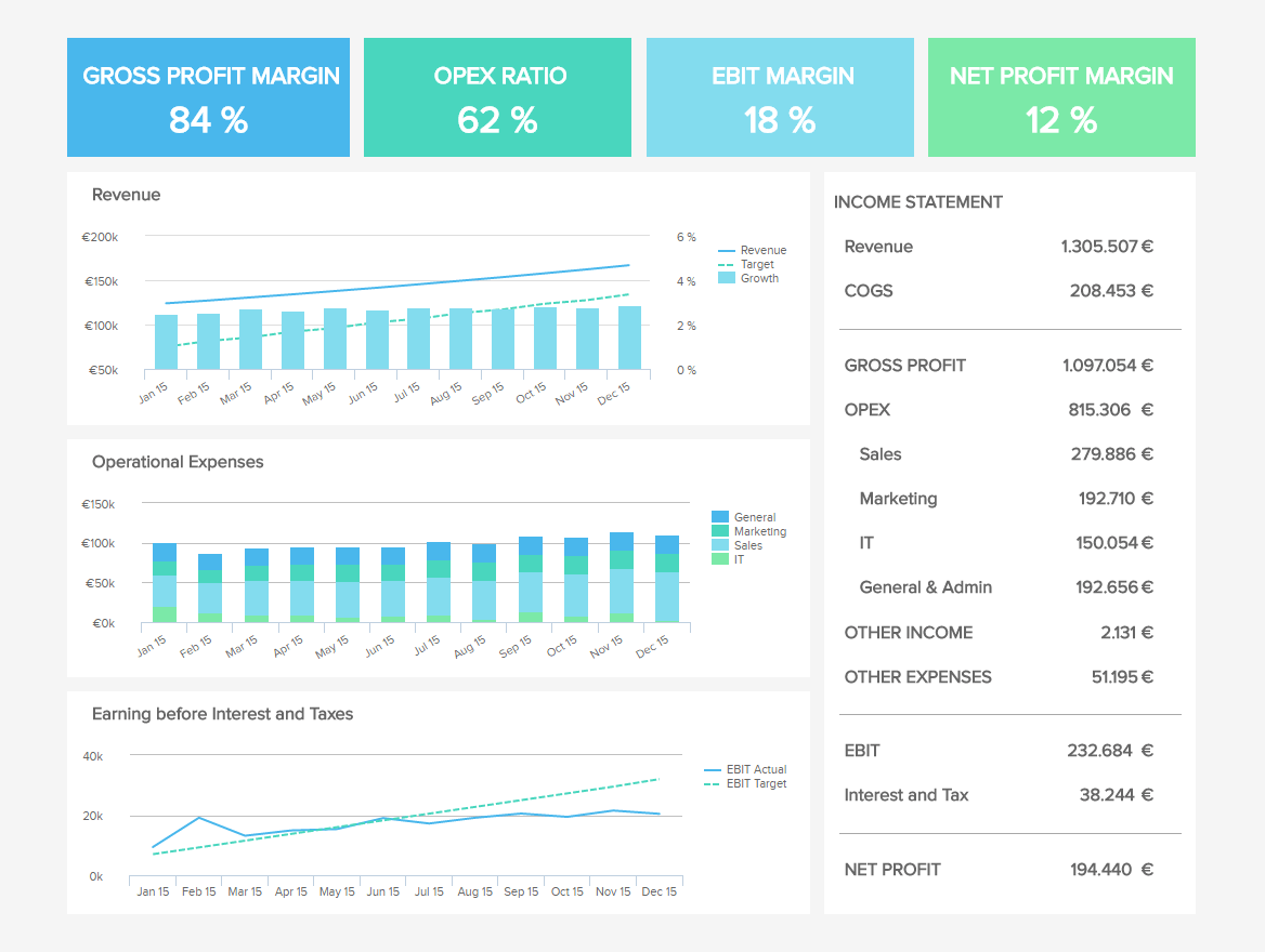
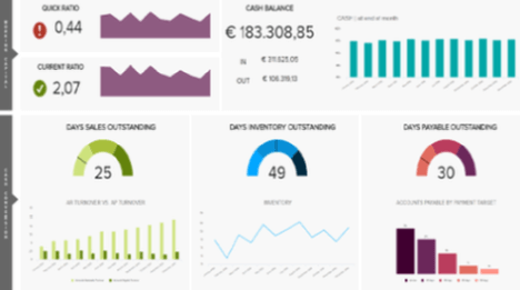
Our second management dashboard example shows an overview of the financial performance KPIs every (finance) manager should measure. The management dashboard template highlights the gross profit margin, operational expenses (OPEX) ratio, earnings before interest and taxes (EBIT) margin, and net profit margin, as well as indicating revenue, OPEX and EBIT over time and giving a numerical breakdown of the accompanying income statement. Next to the fundamental metrics such as revenue and revenue growth, it is important to have a look at the cost structure and how it can be optimized; with this information at your fingertips, ensuring a steadfast and operation-sensitive management plan over your business is easy and effective.
Most of the KPIs in this sample dashboard can be calculated based on the information in the income statement; there are a few base measurements that are used to calculate ratios, indices and reveal information that would otherwise remain hidden. On the dashboard, the gross profit margin indicates how many cents out of every dollar earned remain after accounting for all direct costs associated with the production of goods or delivery of the service; this shows how much money remains in the bank after gaining revenues and taking into account necessary expenditures on products or services. It is a staple measure of a company’s performance.
Subtracting the operating expenses, divided into the often-used categories general & administration, marketing, sales and IT represents the EBIT or operating profit. The EBIT margin (EBIT/revenue) is an important KPI to measure how profitable your business model is and indicates what is left over from your revenue after paying for all operational cost. Using this management dashboard template, you will have immediate access to monitor the fluctuations in the EBIT, as well as other revenue measures, and not miss a beat in monitoring the success and health of your business endeavor.
Net profit margin measures your profit after subtracting all operating expenses, depreciation, interest and taxes as a percentage of total revenue. Net profit margin, as well as EBIT margin, are frequently used to compare the operational and overall performance of a company within the industry average.
This is one of our management dashboard examples that provide an eagle-eye overview of the most important dollars your company is earning (and spending) while giving you interactivity levels you could never find in static spreadsheets or traditional presentations.
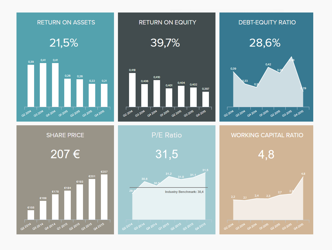
For most managers, it is not only important to keep track of the company’s operational KPIs, but also to calculate and communicate high-level metrics about the overall company situation; this information is essential to keep track of as key investors may make or break a company’s success. This management dashboard example, the investor relations dashboard, shows selected key figures that a shareholder would be interested in before having a look at the operational metrics. It shows the return on assets, return on equity, debt-equity ratio, share price, price-earnings ratio, and working capital ratio. Each of these metrics is critical in its own way and if these measures are not kept under control, there is no chance of gaining investor interest. Let’s take a closer look at them.
The return on assets (ROA), for example, measures how efficient the company’s assets are used to generate profit by depicting the ratio between money earned and assets. It also serves as an important indicator to compare how efficiently you deploy the available resources in comparison to other companies in your industry and how your ROA changes over time.
The return on equity (ROE) indicates how much profit you generate with your shareholder’s investments. This is another key figure to report to potential and new investors and also very often used for benchmarking purposes; a high ROE is invaluable in securing future investors whose primary concern is finding the best and safest return on their investments.
The debt-to-equity ratio directly connects the ROA to the ROE. The more debt the company has, the lower the equity compared to the total amount of assets available and thus the higher the ROE compared to the ROA. Using our management dashboard template for investor relations, this information is at your fingertips, allowing you to stay one step ahead of the competition, make real-time adjustments and prepare for any eventualities.
The price-earnings (P/E) ratio is a good indicator of the valuation of a company by measuring its current share price relative to its earnings per share (EPS). The P/E ratio is used to evaluate if the valuation of a share is higher or lower than the industry average or shares from competitors.
The probably most important and most closely watched number for investors is the share price. The higher the increase in share price, the more money your shareholders have earned already by investing in your company. Monitoring the share price is the first line of call in finance and is a near-complete indication of the success of a company; the higher the share price, the more valuable the company. Keep tabs on your share price, amongst other metrics, as a means of monitoring your business operations and maintaining an efficient management practice over your growing business.
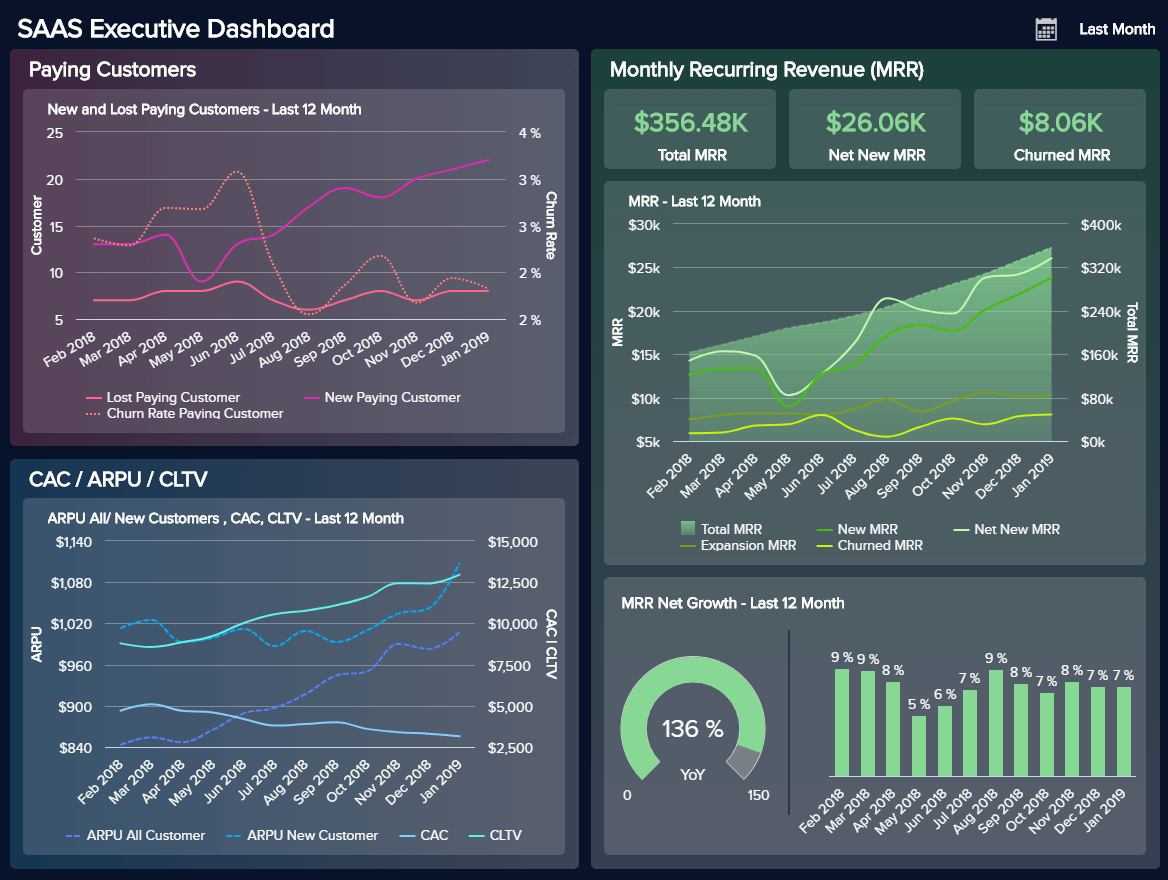
Our last of our 4 management dashboard templates focuses on the executive level of a SaaS company. The 3 most major areas that any serious (SaaS) business should focus on are the customers, recurring revenue, and costs. By consolidating all MRR and account data, any SaaS company can get a birds-eye view of their critical business metrics across past, present, and future data. This kind of scope lets executives develop a hyper-awareness needed to become and stay profitable. Let’s take a deeper look at our SaaS management dashboard.
The first section focuses on paying customers, lost, and churn rate. Ideally, you want to keep the number of paying customers as high as possible, and the churn rate as low as possible. This dashboard focuses on information from last month, but to get a more clear and detailed perspective, we have divided these data in a line chart that expounds on the last year. You can see that the number of lost customers is kept under 10 with each passing month, and the amount of paying customers steadily increases throughout the year. An absolute benchmark of a yearly churn rate (the rate at which customers cancel their contract) would be 5-7% which translates to a monthly rate of roughly 0,5%, but the point is to lower it as much as possible since, at the beginning of starting a business, it can get much higher. This is also a hard-discussed topic in the SaaS industry since most businesses have way higher churn rates. The point is, if you see spikes in your churn rate, examine what happened and adjust your strategies accordingly.
Our next stop is the monthly recurring revenue (or MRR). This is the most significant section for a SaaS business to monitor since you need (and must) generate an increasing monthly income to be able to grow. The MRR basically measures the predictable revenue a company expects in a given month. To calculate the standard MRR, you need to divide the total MRR with the number of customers (contracts). This just gives you a rough overview, but for greater details, you need to take a closer look at the new MRR, churned and expansion MRR to be able to identify concrete bottlenecks. For example, you don’t upsell enough so you have to face a low expansion MRR or if you lose some important customers that are responsible for a big amount of your MRR, your churn MRR will skyrocket, even if you maybe just lost 3 customers in total. On this management dashboard example, you can see all these metrics in a neat visual format, and directly conclude that the company is steadily growing, and the net growth in the last year was 136%. Not bad at all.
We finish our management dashboard template with customers acquisition costs and average revenue per unit. The average revenue per unit (ARPU) is equivalent to the total revenue divided by the average units (customers, users) during a set period. The customer lifetime value (CLTV) is the number of dollar you expect to earn from a customer over the course of your relationship, minus the customer acquisition cost (CAC). You can either increase CLTV by lowering the CAC or boost your ARPU or, in a perfect world, do both. To see the full scope of this dashboard, you can open it in full-screen mode.
We have shown how healthy and steady management of a company should look like, various management dashboards used in different areas, and what kind of key metrics should you focus on to grow your business and create sustainable progress. Remember to track your metrics on a regularly basis and always compare your results with previous periods and concrete targets. By using a professional business dashboard, you will be able to set intelligent alarms that will inform you of any business anomaly that occurs, which you act upon immediately. To create your own dashboard or use our templates, start our free, 14-day trial!
Setup only takes one minute. No credit card required!