Market Research Dashboard examples
A market research dashboard is an efficient way to present survey results of market research studies to stakeholders or clients. It is an interactive approach that empowers to ask and answer multiple questions at the same time by using interactive dashboard features.
Market researcher have been working with data since before data-driven businesses became the norm. Through offline data gathering techniques, they created static market research reports that were then presented in the form of endless PowerPoint presentations. However, with business world becoming more competitive by the minute, static reports where not enough to cover the immediate demand of data insights. That said, in the past few years, and with the rise of modern market research analytics tools, the industry has mutated to an online environment with real-time access to customer’s behaviors, habits, and preferences. With the help of modern dashboard technology, agencies and in-house teams can get a centralized view of their most relevant market research KPIs and present them in an interactive and intuitive format.
Let's explore these 4 market research dashboard examples covering topics like brand analysis, product innovation, customer satisfaction & demographics:
Brand Analysis Dashboard - Product Innovation Dashboard - Customer Satisfaction Dashboard - Customer Demographics Dashboard
Brand Analysis Dashboard
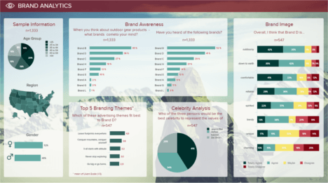
Open Brand Analysis Dashboard in Fullscreen

The use of dashboards in market research is a big asset agencies and companies can take advantage of. The abundance of questions, survey, and data collected makes it complex and long to analyze when presented on static PowerPoint slides, as it is still too often the case. Visualizing one or multiple questions at once and their respective findings, parallelizing and comparing surveys, samples and brands is easier, more interactive and faster than ever before.
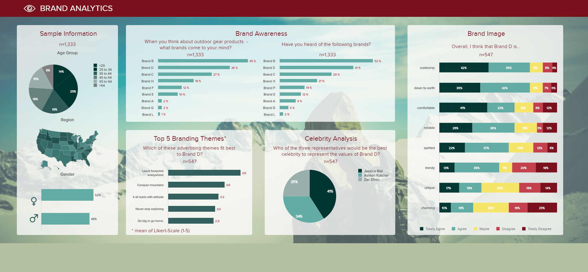
That is what our first market research dashboard allows us to do: visualizing the answers of a brand analysis survey, by providing us in a first time with some information about the sample studied, on the left: 1,333 people interviewed across the United States, 52% of which are females, and 48% males. Their age distribution is rather equal, with around 15 to 25% in each age group – only people over 64 years old are less represented, being 8% of the respondents.
The top part of this dashboard looks at the brand awareness towards various company names in two ways: the first one solicits active brand recall, by asking the interviewees which name they think about when it comes down to outdoor gear products. Brand B is obviously the most famous, with 45% of them naming it. Starting with an open question and letting people think by themselves of brand names is a good way to collect raw, unbiased answers. It lets you know about where each brand stands in the mind of people, and how visible they are to the average consumer, passionate about outdoors activities or not. The following question appeals to their knowledge, where you provide them with a list of names and ask whether they know them or not. This is important to ask that question afterwards so that they don’t get influenced by names they already read. Usually, the percentages for each name in this question are higher than for the first one, as it doesn’t require active thinking but instead a simple brand recognition.
The following metric displayed on this market research dashboard is focusing on one part of the sample: the 41% who said they knew brand D, ie. 547 people. It asks the interviewees their opinion on some advertising themes that would fit the brand the best by ranking them from 1 to 5. It is an interesting way to get an outsider point of view about the image reflected by the brand. You will find out the impression consumers have of it. Likewise, you can ask the sample group which celebrity they would imagine representing the brand: that way, you see what type of public figure or personality people associate with it. This gives material to reflect on whether the brand awareness campaigns were rightly performed and headed in the way you wanted them to.
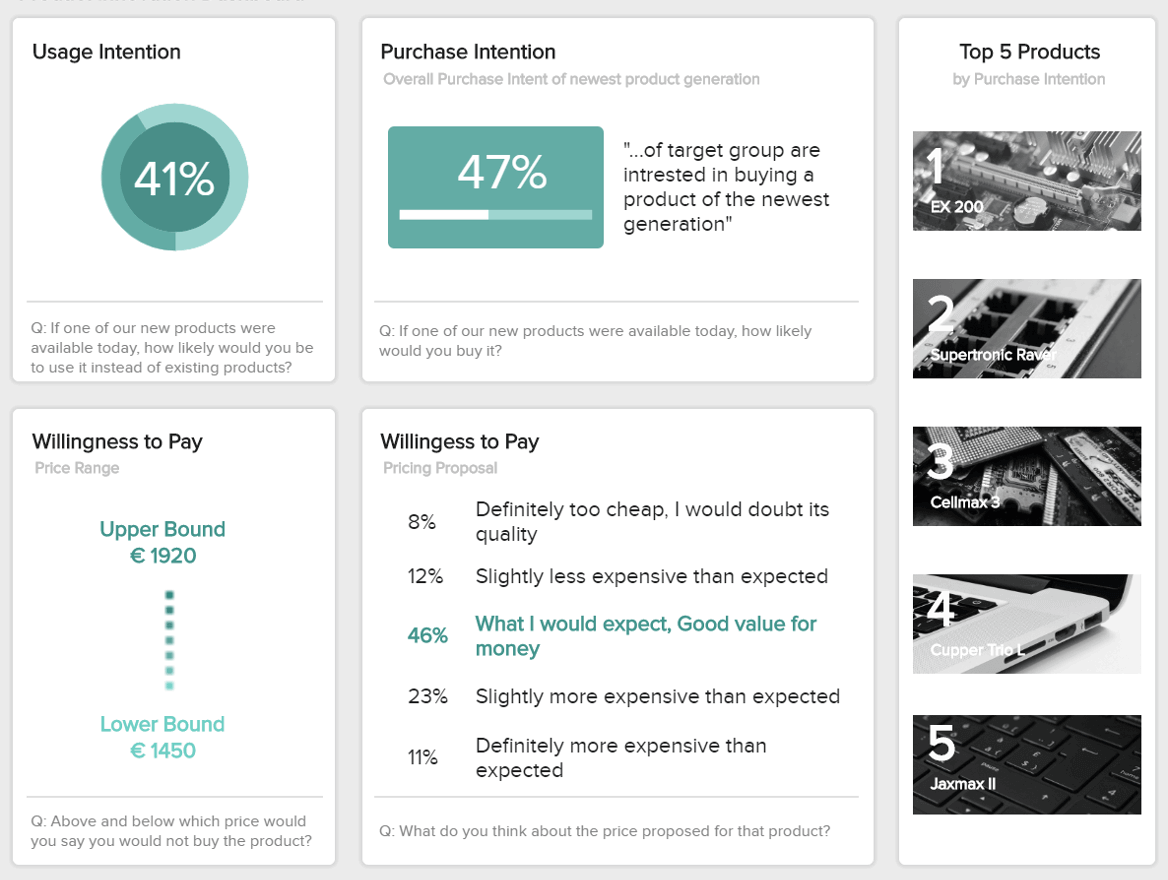
Our second market research dashboard focuses on product innovation in particular. It is a good dashboard to get insight for future product development, pricing decisions and future market potentials.
First metric available concerns the usage intention of the sample surveyed. It answers the question, “how likely would you use one of our new products instead of existing ones, if it was available today?”. This is a good primary feedback on a new product you want to launch, to know how the market would receive it. If very low enthusiasm is generated, it might translate a lack of added value compared to an old or a competitor’s one.
Likewise, the purchase intention brings the consideration a step further, by asking a target group if they would actively buy such product. Marketers use this metric to make decisions towards and already-existing or a new product, and to predict future sales. However, you cannot take it at face value because that remains an intention: sales rely on other external factors that you cannot always control, like the stress and tiredness of the consumer on the moment, the queue at the cashier, the availability of the product on shelf, or the access to a store adviser, the time of the month and financial resources, etc. The higher this value, the better, as it tells you that your target market responds positively to it, and that you can continue its development and commercialization on the right path.
Finally, we have the willingness to pay (WTP). This metric provides you with a price range within which consumers would buy your product without it being too low to be trusted, or too high for what it is. It helps you fix a correct price for it, but also to scrutinize production costs so that they don’t get too high and prevent any profit to be made. The WTP is also a context-sensitive metric, influenced by other factors at the moment of purchase: for instance, people are more likely to pay a higher price for a massage-service in a luxury spa resort than at the massage chain stores at the mall. To push your analysis a bit further, you can present a price to the interviewees and ask how they feel about it: is too expensive for what it is? Too low to trust a good quality? In-between? From there, draw the conclusions that will orientate your pricing strategy.
On the right side of this dashboard, you can see the top 5 products ranked by purchase intention: they are the ones you should focus your attention on.
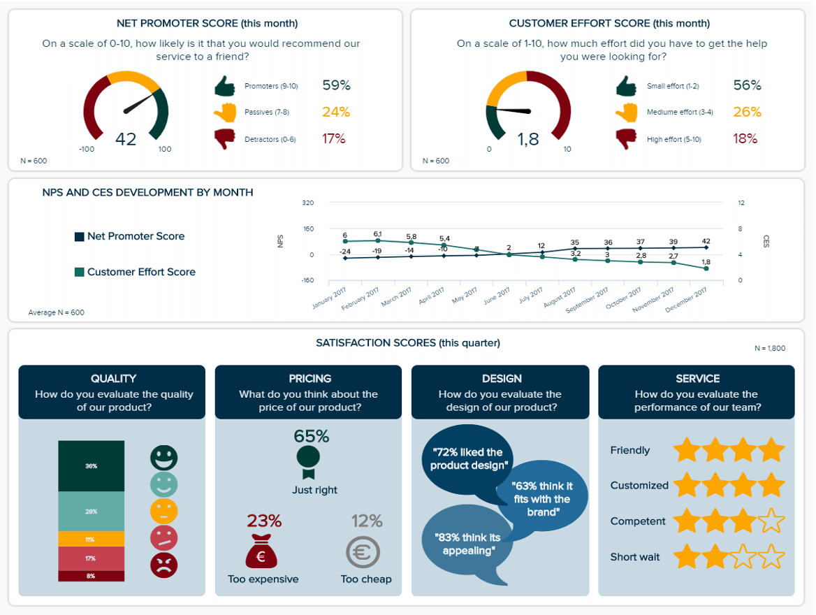
Our next market research dashboard doesn’t use a sample of surveyed people regardless of their background, but instead interrogates the already existing customers and their experience with a certain brand. First metric displayed evaluates customer loyalty, by asking them how likely they would recommend a product or service to other people on a scale from 0 to 10. The Net Promoter Score (NPS) classifies the answers from 0 to 6 as detractors, 7 to 8 as passives and 9 to 10 as promoters; from there, it subtracts the percentages of passives and detractors to that of promoters. The NPS highly depends on the industry; there are a lot of benchmarks showing the industry average, the highest and lowest scores, to which you can compare yours and from which you can set a target.
The Customer Effort Score (CES) measures the experience a consumer has with a brand, by asking them how difficult it was for them to get the help they wanted. This difficulty is ranked from 1 (easy) to 10 (hard), and can be calculated as an average or you can overtake the NPS calculation: percentage of high level effort minus percentage of low level effort. The purpose is to keep that figure low, so as to avoid frictions in the customer experience. It is very useful to spot unseen bottlenecks that need to be solved.
Below these scores, a chart compares the NPS and CES development over the year 2017. This illustrates well how hand in hand both of these metrics go: while the customer effort score decreases, meaning that the user experience gets better, the net promoter score goes up, meaning they are more and more likely to recommend the brand.
Finally, you find underneath the customer satisfaction broken down into four different aspects to evaluate: the quality of the product, the pricing, the design and the customer service. The customer satisfaction metric is something that you want to track on a regular basis and that you have to improve all the time. This is one of the most important indicators of a brand’s quality, and will also impact the net promoter score – unsatisfied customers not only don’t recommend, but they also advise against a buying there. Besides, 90% of unhappy clients will not purchase again from you, which means that you lose a lot of the money you put into hardly acquiring new customers. A satisfied client is often enough a returning client, which is less expensive and brings more profit. Tracking this metric over time with a predefine target is a best practice.
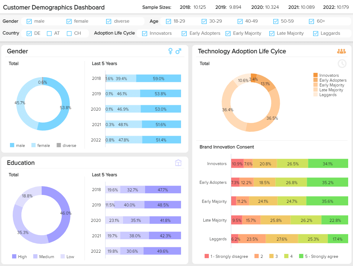
Tracking demographics data is fundamental for any modern business that wants to boost its loyalty and engagement rates. Getting detailed insights about its client’s behaviors, interests, and others can help companies generate targeted products, services, advertising, and experiences that will make the organization grow in the long run. To put all of this into perspective, our final example is a demographics dashboard focusing on the results of a customer survey performed over the past 5 years by a technology manufacturing company.
The value of this market dashboard template lies in its interactivity. At the top of it we get various filtering options that can be applied to help you visualize only the data that you need. This way, you can analyze specific segments or client’s profiles and use them to answer key questions or support important discussions. Paired to these filters, we get the sample size of each year. When it comes to a research report, the sample size should always be available at a glance and it should be as high as possible to make the results statistically significant. Let’s dive into the example a bit more.
The template starts by displaying 4 important demographic KPIs: gender, age, education, and household income (open full version to see all). Each of them shows a pie chart with the total results of the past 5 years as well as a breakdown of each year. This is fundamental information as it can tell the company a clear buyer profile. Tracking this data in time can also help them find new potential target groups. For instance, here we can see that female client’s increased exponentially over the past 5 years reaching almost half of the total. If this is something that interests the researchers, they can always filter the entire report by female respondents and get deeper insights into their average age, education, etc. and generate a complete profile.
Moving on to a more technical research part, we have the technology adoption cycle. This cycle describes customer’s behaviors when it comes to adopting a new technology or product. Based on the results, the surveyed individuals are divided into 5 categories: innovators, early adopters, earl majority, late majority, and laggards. Innovators being the ones that are always eager to try new things and laggards being the ones that are most reluctant to change. That said, neither laggards nor innovators represent the majority of the population. Naturally, the ones in the middle (early majority and late majority) occupy the highest percentage of the sample size. These are people that are skeptical about adopting new technologies, they often try them after other people have, and care more about the benefits of the product instead of the popularity of it. As mentioned, this is a technology company, therefore, there is an interest in targeting client’s closest to innovation.
Last but not least, we get insights into the brand innovation consent. This data is a complement of the technology adoption cycle as the individuals have already been divided based on the same criteria. Here, clients were asked the question “do you find our company innovative?”. As seen in the chart, the top 3 most innovative segments have a majority of “strongly agree”, this is positive for the company as it means they would turn to them when it comes to adopting new technologies.
As we have seen all along these market research dashboards, displaying in parallel several performance indicators that often influence each other - and being able to compare them easily is a great advantage of modern, interactive dashboards. Market research collects huge amount of data, that is also now going online and becomes real-time data; static PowerPoint presentations can't keep up the pace, and can't keep on being used. The high interactivity level offered by dashboards is an asset that facilitates your analyses and presentations: you can use interactive filters that let you easily switch between brand A, B or C to analyze, without needing a single slide for each of them (see again our first dashboard example). Everything is available on one dashboard and easily readable. Dashboards enable you to study effortlessly your data thanks to smart visualizations, and you can share them with a simple link: no need to burden mailboxes with static slides that get lost among all the others. Besides, for tracking studies, like the monthly monitoring of the NPS, CES and the satisfaction of your existing customers, you just need to add the new data and your dashboards get automatically updated – no need to create a new PowerPoint presentation.
Setup only takes one minute. No credit card required!