How To Make Stunning Dashboards & Take Your Decisions To The Next Level

If you want to convey crucial information to decision-makers as easily and effectively as possible, you need to embrace the power of interactive dashboards and learn how to create a dashboard.
A business dashboard offers at-a-glance insights based on key performance indicators (KPIs) and is an intuitive and visually pleasing way to consume data. Unlike early predecessors, they give presenters the ability to engage audiences with real-time data. They also offer a more dynamic approach to presenting data compared to PowerPoint's rigid, linear nature or the numbers-without-a-story approach of Excel. At datapine, we believe the goal of each interactive dashboard you create should be better, faster, and stronger decision-making while telling a story.
In other words, how to tell the best possible story and how to create a dashboard to support your narrative?
Here, we will discuss how to create a dashboard that speaks to your target audience while exploring some inspiring examples generated with dashboard creation tools.
Without further ado, let’s get going with expert tips to build your own dashboard.
How To Create A Dashboard - 15 Best Practices
The dashboard creation process will only prove effective if everything you do is geared toward connecting with your audience.
When you tell a story, you must consider the audience and adapt your narrative accordingly. The same applies to creating a dashboard, which means that before you do anything else, you should outline the needs of your users.
So, before you start, you should consider:
- What decisions will the end-user conduct based on the data?
- How familiar are they with the data or KPIs?
- How much context do they already have?
For instance, a live dashboard for your stakeholders who want a monthly report is bound to look different from an in-depth sales performance dashboard that your sales team needs to access on the fly. And if you’re looking to build a dashboard to outline return on marketing investment (ROMI), your visualizations, design, and metrics would be very different from those featured in a marketing channel engagement report.
Now, we will focus on essential tips and best practices to follow when creating dashboards, starting with defining your audience.
1. Define Your Dashboard Audience And Objective
Sit down and take a beat to complete answers to the following 6 questions. Trust us – any energy you invest up-front in your creation process will be richly rewarded later. Whoever will use it will greatly appreciate the effort you put into making it relevant to their lives and focused on the essentials. Even if you’re just creating this dashboard for your use, answering the following questions will give you the valuable foundation you need.
a) Who are you trying to help?
Remember that the ultimate goal is making your life or the life of someone in your organization easier. With that in mind, it’s wise to base all of your decisions on your audience so that you can truly know how to create a dashboard that is useful for them.
So – who is the person or group of people that will be actively using it? If it’s yourself (and only you), then you can skip the rest of this step. However, if more people than yourself will use it, write down their roles in the company now. Ideally, write down a specific person that you personally know so that you can picture them in your mind as you go through the rest of this process. Don’t go any further in the creation process until you have written down the person (either in name, job title, or both) who will be your audience.
b) What do they do daily?
Another way to think of this question is: what are the daily tasks this person performs that are essential to their job?
This is a more concrete way of defining someone’s role within your organization. You want to be super specific here – the daily life of a sales agent who has to get all their own leads is quite different from the daily work of a sales agent who has all their leads supplied to them. And the daily life of the sales manager in charge of all the sales agents is still more different. These differences in daily tasks will result in different goals and KPIs.
Don’t go any further in the creation process until you have written down at least 2-3 (if not more) of the daily tasks that the users absolutely must do to fulfill their role.
c) What goals are they trying to reach?
Do they care about making more sales and getting new leads? Do they care about helping their staff get more sales and leads? Are they hoping to manage customer support calls more effectively? Do they want to get more social reach on the blog posts your company is putting out?
These are just a small set of the many, many goals that a dashboard can help your team reach. If it is intended more for a C-suite or shareholder audience, they might have goals like:
- Looking at the company’s cash flow situation at a glance.
- Examining how the company’s revenue numbers are doing this quarter compared to last year’s quarter.
- Looking at the total digital advertising spent and the revenue.
Don’t go any further in the creation process until you have defined 1-3 goals your user really cares about. Obviously, you can’t peer into their head, so take an educated guess. Or, if you want to upgrade your approach a bit, reach out to the person for whom you are creating the dashboard and ask them what their goals are.
d) What KPIs, if measured, will help them reach their goals?
Now that you know your user’s role, daily essential tasks, and goals, we can look at some KPIs that will assist in tracking them. This step can be much easier if you simply ask your user or if you have intimate knowledge of their job. If you don’t, you risk creating a dashboard that nobody uses, wasting your time. If you don’t have the ability (or desire) to ask your end-users what KPIs are valuable to them, our KPI examples and templates will give you a pretty good idea of what benchmarks you can use.
e) How are they currently viewing these KPIs?
Now, the final question: how is your user viewing his KPIs right now, and what are the pain points associated with that way of seeing them?
Maybe they are using an Excel doc, and it’s getting way too big and unwieldy. Maybe they are using their CRM software, but it’s not really designed for that purpose. Whatever the case, you want to know this – because if you don’t know how to make a dashboard that is better than their existing KPI measurement method, you’ll have wasted your time. Ideally, you create a dashboard that is easier to use and more focused (less cluttered) than their current approach. In the rest of this post, you’ll learn how to do just that.
f) How can I use storytelling to put my KPIs into context?
When it comes to creating dashboards that not only speak to your audience but also enable you to develop your organization in a number of vital areas, telling a compelling story (or giving your user the tools to tell others a compelling story) with your data is essential. Yes, to get results, storytelling should become a primary focus.
With better access to data than ever before and improved data mining tools, we’re able to recover A LOT of types of data. However, even though we love data, we can’t (and shouldn’t) display all of these types.
The goal should be to avoid drowning the user in a data tsunami while providing the top information available to get the actionable insights they need. And, your KPIs will allow you to develop a narrative with your insights - one that helps to improve the decision-making process while streamlining the company.
If you have the capability, consider building an interactive KPI dashboard, using your KPIs to guide your storytelling design efforts. In doing so, you’ll empower your audience to explore the data for themselves and, through filtering or other controls, can add value by providing deeper context.
Interactive visualizations are especially relevant when you have a broad target audience. Newcomers to the topic can still spot trends and learn the basics, while experts in the field can drill down deeper into the data for more insight.
2. Ensure Your Data Is Clean And Correct
After you have identified your audience and objectives, you’ll take a closer look at your data. This step is important as it's the backbone for building a dashboard that will not only tell a story but also ensure that the story is correct and has proper building blocks in place. You need to identify where you will get the right data to reach the goals that you already defined (see our point no. 1). There are countless data sources that you need to consider, but they all depend on which scenario you are working on.
Additionally, you might want to consider sources from outside your department because they all have the potential to provide you with invaluable insights. In practice, that means that sales and marketing work together, so you need to connect the data from both departments, whether it's Salesforce, Google Analytics, or Facebook. To assist you in the process, you can read our extensive guide on data analysis questions.
Another critical point to consider alongside the source of your data is the proper data quality management (DQM) strategy. Your data should be clean, accurate, consistent, complete, and compliant with your company's procedures. You should also think about automating this process as much as possible so you don't waste additional time. If you don't consider DQM, your data will be of low quality, and your analysis and dashboards will follow.
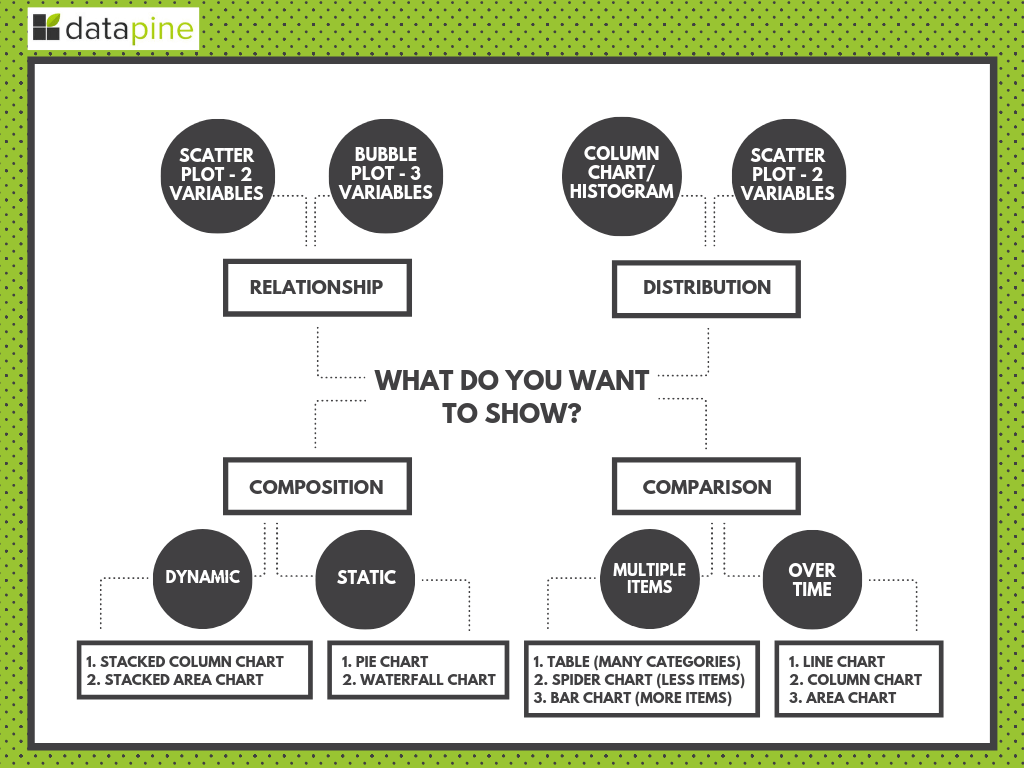
3. Select The Right Chart Type For Your Data
How to build a dashboard that has the right types of graphs and charts for your KPIs? This question is another essential one that cannot be avoided. Hereafter, you can read a quick recap of the most common types of charts used and when to use each one:
Bar Charts – Perhaps the most common misconception about charts is that more is better. Bar Charts are a simple and effective way to look at cohort analyses, comparisons, and trends.
Pie Charts – These charts are often the subject of controversy. Data visualization guru Edward Tufte writes, “pie charts are bad and that the only thing worse than one pie chart is lots of them.” No matter how you feel about pie charts, the only instance you should use them is when you need a graph representing the proportions of a whole when the total of your numbers is 100%. Use sparingly.
Line Charts – A Line Chart is an effective graph formed from a series of data points connected by the eponymous line. They are often used to show developments over a period and identify trends.
Tables – Tables are great for detailed information with different units of measure, which may be difficult to represent easily in a graph or chart.
Gauges – This type of graphic typically displays one or more values using indicators and appropriate metrics. They are often used to highlight a specific KPI that needs attention.
Area Charts – Area charts are awesome for multiple data series with part-to-whole relationships or individual series representing a physically countable set.
For a more detailed look at chart types and to understand which are the most appropriate for what you are trying to convey, you can check out this chart suggestion guide:
**click to enlarge**
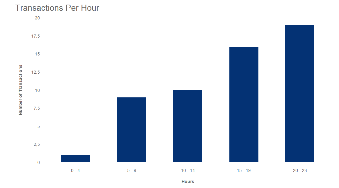
If we want to look at chart types in action, let’s go over how to make a dashboard that includes a chart that looks at the number of transactions per hour and see what works and what doesn't.
When using a bar chart, the data is presented in comparable groups, which makes more sense to the human eye, and the use of only one color doesn’t distract from the data:
Now, let’s take a look at the same transactions per hour through the lens of a pie chart. With this chart, we are unable to glean any useful insights. Not only are there too many values in the dimension, but these numbers do not make parts of a whole:
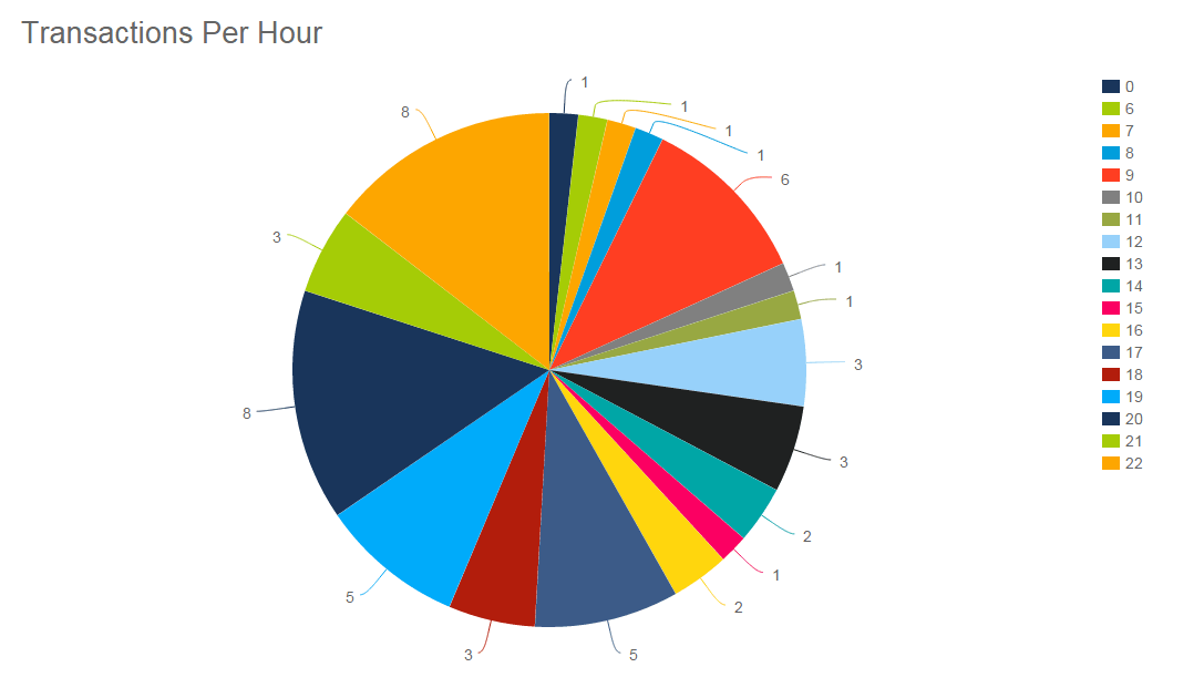
We can see in these examples above how choosing the right chart has a major impact on presenting data. Therefore, you should keep this in mind all the time.
4. Avoid Being Misleading
Anyone dealing with data loves to create dashboards. These analytical tools have democratized data in a way that was never seen before. Now, while dashboards are accessible and easy to understand if they are not generated correctly, the data in them can be misleading. Misleading with data visualizations is a practice that has been used for decades in the media and politics to manipulate the masses. Of course, this is an unethical practice that needs to be avoided at all costs during your dashboard generation process. To help you do so, here are a few situations that you should be aware of:
Only including positive results: Singling out positive or well-performing KPIs can lead to a very misleading analysis. Bad results are a part of the performance; including them to learn and improve is fundamental. If someone looking at the dashboard only sees the good performance, then he or she will be misled into believing that everything is going great. The important thing is to stay focused on the general goals of the analysis and include the data that will allow you to extract the most accurate and useful conclusions.
Providing context: On the same note as including only positive results, not providing context to your data is another way in which your analysis could become misleading. A common case in which this could happen is when showing a data trend going up or down without providing a longer period to understand if this is positive or negative. To avoid this from happening, ensure that the bigger picture is always included so the data can be accurately put into perspective.
Confusing causality: Another unintentional or intentional way in which your data can become misleading is by misuse of axes. This happens when, instead of starting the axis on 0, it starts on a specific value that makes a slight change in the data seem a lot more dramatic than it actually is. We talk about this in more detail in our misleading statistics blog post, so we recommend you take a look to avoid incurring this bad practice.
5. Give Your Numbers Context
Expanding on the point above, when generating a dashboard, context is key to success. Providing a bigger picture of the data allows for a better understanding and analysis outcome. For example, imagine you are building a social media dashboard, and you include a box that says “58 new followers in the past 30 days”. If someone looks at this number, they can be happy about the follower increase and the strategy being implemented to target new people. However, if you provide some context and realize that the previous period had 300 new followers, the 58 no longer look that positive. In this case, providing context to your numbers can lead to an improved decision-making process and better outcomes. By giving context to the followers' metrics, the user can understand that something is not going well with the strategy and dig deeper to find the reasons.
6. Don’t Forget About Color Theory
We could write books on color theory, but luckily, that has already been done. For a great resource for which colors work together better and which emotions they convey, check out this comprehensive guide on color for designers.
One thing to consider when selecting your colors is that roughly 8% of men and 0.5% of women are colorblind. The vast majority of people who fall into this category are what is called color-impaired. This means that they can perceive color but cannot distinguish different shades of that color.
Colorblind readers can perceive changes in brightness, for the most part, just like you can. For example, you can switch from dark brown to bright green, not from dark brown to dark green.
Avoid overlapping shades of colors that have similar brightness values. For an example of what not to do, take a look at the example below: the reds and pinks totally clash, making it not only ugly but unusable for color-blind readers:
You have to be careful when choosing the colors for your dashboard, but the rule of thumb is to select 2, a maximum of 3, and stick to them across the board.
7. Build a Balanced Perspective
When we say “build a balanced perspective,” what we mean is: that when you create a dashboard, you should present a mix of past, predictive, and real-time data to communicate your message.
By now, you have a solid understanding of how to pick the right visualizations for your dashboard and how to approach selecting the KPIs to tell your story. To bring everything together and create a panoramic view, you should present critical data that offers a clear-cut snapshot of past trends, insights that offer a projection of future outcomes, and real-time data that shows what’s happening at the moment.
Having a balanced mix of data-driven insights will significantly improve your decision-making in a host of key areas, empowering your users to develop key initiatives that will drive the company forward while helping you to get ahead of the competition.
Adding filters and functionality to your dashboard will make it easy for your users to analyze, arrange, and view your balanced mix of data while maintaining the integrity of the design. The right data dashboard software will also allow you to create these types of customizations without any technical knowledge.
8. Use Predefined Templates
Since we cover customization in our other points, here we will focus on utilizing predefined dashboard templates. If you use professional online dashboard software like datapine, there are some perks you can look for when building dashboards, and templates are one of them.
Templates are designed to help users quickly use predefined styles, layouts, and charts. For example, in datapine, you can simply select the desired template, and the software will generate a visual independently. If you want to know the quickest and best way to build a company dashboard, predefined templates might be worth investigating, especially if you don't have time to create one from scratch or you don't want to design anything on your own.
Templates are a great way to not only save man-hours but also inspire you to adjust the existing layout and implement your company's touch. When using such online data visualization tools, you will have the possibility to create stunning dashboards and have your data all in one place.
9. Take Advantage Of Interactivity
If you want to know how to make a data dashboard even more advanced, you might want to consider interactivity. These features will help you drill deep into your data and do so in seconds whenever important business questions arise.
Interactive dashboards are effective because they provide you with invaluable possibilities to manipulate your data as you go. From powerful drill-downs to chart zooms and widgets, these features will enable you to interact with each set of information that is visualized.
Advanced dashboard software has built-in interactive features that will help you leave spreadsheets behind while building a powerful dashboard that is not crowded with information but, on the contrary, provides clean and sharp visuals that can be analyzed on a deeper level on the fly.
The goal of interactivity is to build dashboards that will help you simplify analytical processes, making them more user-friendly while also providing answers to questions immediately. If your dashboard is interactive, you have more possibilities to keep your data simple yet powerful. To help you more, check out this video:
10. Include Advanced Technologies
With so much information out there, being able to rely on advanced technologies in an accessible way is a plus when it comes to creating a dashboard. datapine’s dashboard designer offers advanced technologies such as predictive analytics and artificial intelligence to take your analysis one step further.
On one hand, predictive analytics tools enable users to analyze current and historical data and generate accurate predictions of what is likely to happen in the future. This technology is very useful as it allows you to prepare your strategies and resources accordingly. On the other hand, with the help of machine learning and AI, your dashboards can also include intelligent data alerts. These alerts are programmed to notify users when a predefined goal is reached or when an anomaly occurs. This eliminates the pain of manually checking the data to see if anything changed, significantly improving the dashboard usage experience.
11. Ensure Your Dashboard Is Mobile-Optimized
We live in a hyper-connected digital age where we have access to information 24/7. Mobile technology means that we’re free to connect, campaign, analyze, and produce wherever we may be in the world. If you create dashboard designs that aren’t optimized across devices, you’re not using them to their fullest potential.
Remember to optimize the end results for mobile devices when you create dashboard designs. Mobile dashboard design greatly differentiates from a bigger screen, such as a desktop or TV dashboard, as you have much smaller space and different screen dimensions. Professional dashboard tools will help you to adjust your desktop designs quickly and seamlessly.
Fortunately, in our tech-driven era, any professional dashboard creator will allow you to scale your dashboards to mobile screens—and tweak the functionality accordingly—with ease, compared to Excel or PowerPoint, where you don't have that option.
“Everything is designed. Few things are designed well." - Brian Reed, front-end developer and musician
12. Follow These Essential Design Basics
Next, we’ll look at how to make dashboard design work for you. Digital dashboards are only effective if you get the design just right. Let’s examine the practices that will cement your success on an ongoing basis.
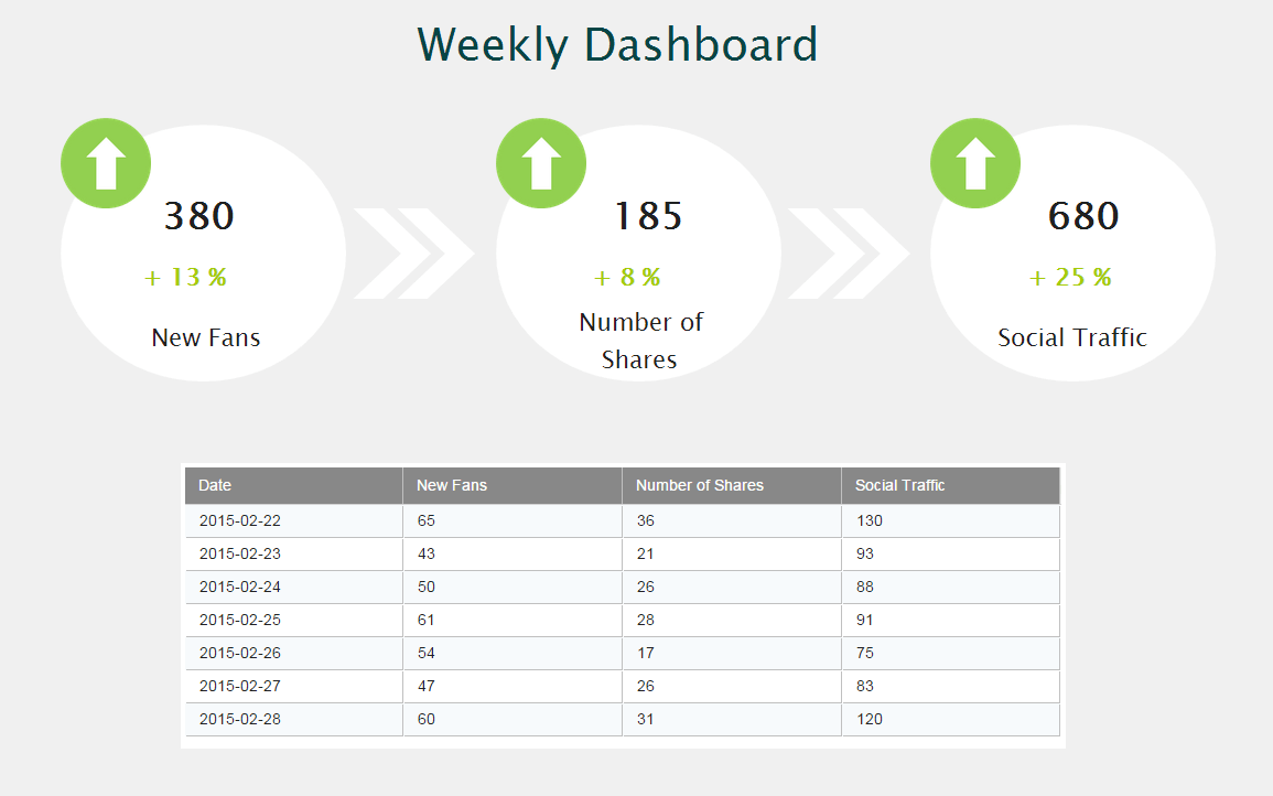
When understanding this process, it is critical to strategically place the charts. The goal is to arrange the data in a manner that fits the way it’s used. The most important data, including the takeaways and main KPIs, should be prominently displayed at the top. Data that needs to be compared must be arranged with that comparison in mind.
A good example is where the KPIs are prominently displayed at the top of the page, followed by the supporting data. Your eye automatically travels to the most important information. Below, you see a really basic dashboard just to demonstrate it:
**click to enlarge**
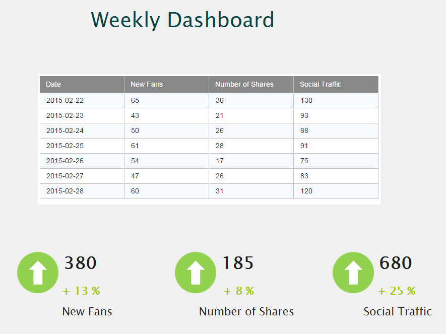
Now, let’s look at a bad example. The one below starts with a data table, and the most important numbers are hidden at the very bottom. The KPIs aren’t presented in a way that shows a logical flow:
**click to enlarge**
This information on design is just scratching the surface, however. If you want to dive deeper, be sure to check out our post on dashboard design principles.
Now, to ensure you create dashboard designs that work for you, let’s summarize with some general rules of thumb of what to do and avoid:
DO’S
- DO build dashboards that focus on the needs of your audience.
- DO keep your visuals as simple, clean, and minimalist as possible while including all of the most important KPIs necessary.
- DO ensure that your final dashboard is better than your audience’s previous method of viewing their KPIs.
- DO tell a story, as stories are easily understood by the human mind.
DON’Ts
- DON’T clutter your dashboard with too much data. This is the number one rule to follow! Too much data = too hard to use = waste of time.
- DON’T use colors that are very similar in brightness to your main colors – color-blind people won’t be able to see your visuals well.
- DON’T use a “one size fits all” approach. Create each one with specific people and needs in mind.
- DON’T use pie charts except in cases where you are showing parts of a whole.
These are just some general rules of thumb – for more information on the best practices you should use, check out our post on BI dashboard best practices.
13. Customize Them
Another best practice to follow to create stunning dashboards is to customize them. This means tweaking the appearance based on the business, client, or audience's colors, logo, and font. While this might not sound like such an important thing, being able to brand your dashboards can make the analysis process a lot more engaging for businesses and employees. Just remember to follow the design best practices that we mentioned previously and avoid using too many colors or a font that is hard to read. Simplicity is key when it comes to building effective dashboards.
14. Ask For Feedback And Repeat
The final step in your process is also critical since you need to know whether the dashboard is well received or if there are some additional points that you need to rework. Asking for feedback is essential if you want to continually improve.
Some ideas might include that you simply watch how the users interact with the dashboard and explore the data on their own. That way, you will have a chance to immediately identify points that users find confusing or hard to understand. You can also ask the user to think out loud so that you know how they interact with the data and possibly help them to become faster if needed. If you have a larger base of users, you don't have to meet with each separately. It would make sense to communicate with team representatives, and afterward, you can check in with the entire team, possibly midway through the project.
At this point, communication and cooperation with the team are critical. You might also keep in mind that it’s okay to push back on unrealistic requests, especially if they don't correspond with the objectives of the dashboard. Perhaps the team has simply forgotten about them, or perhaps the end goal has evolved.
15. Think of Security
Protecting your data is a top priority. Not only are companies bound by strict compliance regulations like GDPR, but it’s also ethical and financially sound to safeguard your customers, employees, stakeholders, and proprietary business intel.
The World Economic Forum believes cyberattacks are a top 10 threat to global stability. The United States alone saw over 1,800 security breaches in 2022, exposing more than 422 million records. With each breach potentially costing millions of dollars in damages, it’s essential that companies take their role of data privacy and protection seriously.
Data privacy extends to every piece of technology in your company, including your dashboarding software. With a constant risk of cyberattacks and costly data breaches, businesses must do everything possible to protect sensitive data—including thoroughly vetting any technology or vendor before implementing new solutions.
At datapine, we understand the risks are high, which is why we embed multiple safeguards in our systems. We take a continuous approach to monitoring and improving our security and invest in enterprise-grade security layers used by some of the world’s most trusted banking systems. We also comply with German data laws and provide physical security to our data centers, including 24/7 access control protection, video surveillance, and alarms.
Security should never be treated as an afterthought. Ideally, you will put the same level of thought and effort into overseeing your dashboard security as we have in developing robust systems and processes that safeguard your information.
Now that you know how to create a powerful and secure digital dashboard, let’s take a look at real examples that are built respecting these best practices.
How To Create Dashboard Designs That Get Results - See Examples From Various Industries
Now that we’ve explored the essential elements of dazzling data dashboards, let’s consider how to make one by looking at real-world examples.
These data-driven examples will provide additional context while demonstrating the importance of customizing your efforts to your audiences’ or users’ needs when considering building a dashboard that gets results.
1. Logistics Industry
When looking at this logistics analytics dashboard, two KPIs immediately stand out: average loading time and average loading weight:
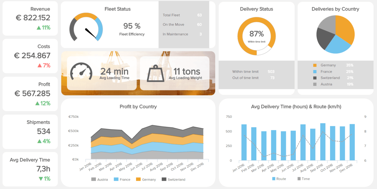
**click to open in full-screen mode**
While there is plenty of other information, it avoids too much clutter by using large images and by not cramming a bunch of stats on the page. Revenue, cost, and profit numbers are easily seen due to their upper left corner positioning and their large size, along with green and red numbers to show trends. The fleet status and delivery status KPIs are very easily seen as well. Finally, there is more detailed information available in the “profit by country”, “deliveries by country”, and “average delivery time (hours and route)”. This is a great example of a well-executed dashboard with all relevant logistics KPIs, but our next one is even better.
2. Procurement Example
Procurement is an important function in many companies, and this example shows the quality of procurement processes in order to decrease costs and save time.

**click to open in full-screen mode**
This procurement dashboard shows a clear flow of metrics focused on quality, an essential part of global procurement departments. Such a dashboard aims to improve supplier relationships, generate better contracts, and establish a data-driven environment.
On the left side, we can see clear stats about the quality KPIs compared to the previous month. The green and red colors clearly show if there was a negative or positive growth that will, ultimately, affect your bottom line. On the right side are sections dedicated to the return cost analysis, supplier quality rating, and project analysis. These sections tell a more detailed story about the performance of suppliers and spend under management. Such procurement analysis is critical for evaluating which supplier has more positive results and what you can do to negotiate future contracts.
3. Human Resources Department
One of the most critical departments of a company, human resources, has developed into a data-driven function that needs to look at numbers as much as people. That's why a modern HR dashboard helps professionals look at different data touchpoints and ensure a great candidate experience and positive professional development.
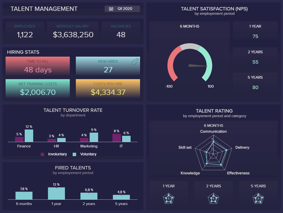
**click to open in full-screen mode**
This example has talent data as its focal point for the year's first quarter. A simple overview of the number of employees, monthly salary, and vacancies are clearly expressed on the top left part, while hiring stats, turnover rate, and fired talents are right below. These visuals can tell you which departments have the highest turnover, and HR professionals can dig deeper into the reasons for and future improvements in their HR analytics processes.
The right part has two main areas: talent satisfaction expressed as NPS and talent rating. These metrics help to assess a company's atmosphere and give a base for HR professionals to investigate and brainstorm on how to increase satisfaction but also understand the quality of employees and potential improvements.
If you want to dig deeper into the recruiting process, we suggest you read our guide on recruitment metrics.
4. Media Dashboard Example
This digital media dashboard is clean and well-designed. It’s clearly optimized to show three of the most important metrics for the web traffic of a media company:
- Unique visitors
- Top viewed articles by visitors
- Total email subscribers
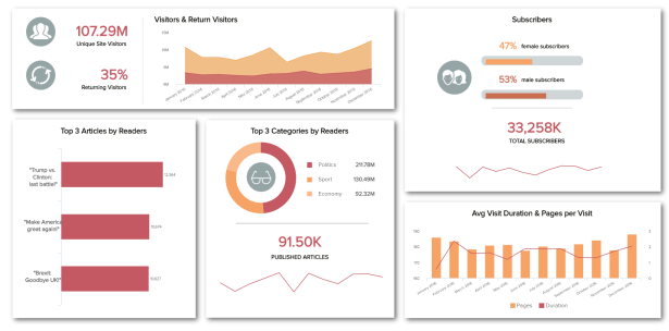
**click to open in full-screen mode**
In terms of white space, clean layout, and providing useful data without overwhelming the user, this is one you want to learn from. A simple white background and the most important charts are emphasized with stronger colors and clearly expressed metrics that tell a digital media data story. With such a dashboard, everyone in the team can access clear and real-time information, leaving spreadsheets behind and automating the reporting processes.
5. Financial Dashboard Creation
Our financial dashboard is an excellent example if you’re mulling over how to create dashboard designs to represent your business’s core financial activities.
This particular template becomes a powerful tool for any organization, regardless of sector or industry, that needs a stable snapshot of its ongoing financial health. Operating with financial KPIs such as working capital, quick ratio, and budget variation, this dynamic tool is a masterclass in how to build a dashboard for your finance department.
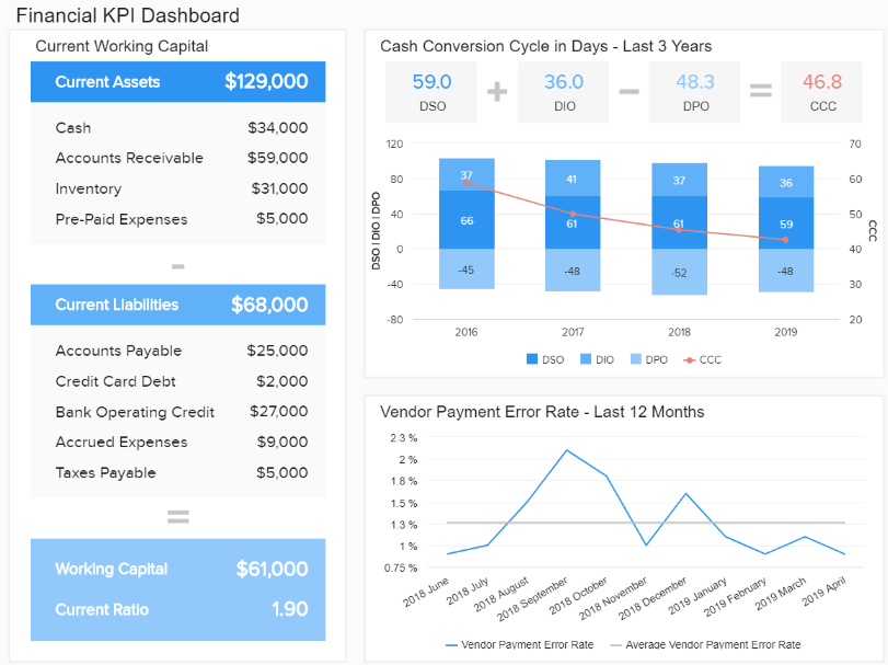
**click to open in full-screen mode**
In our example above, you can gain quick access to insights that will help you streamline your financial processes and ultimately boost your bottom line. As you can see, color-coded bar charts offer a swift snapshot of your cash conversion cycle. In contrast, tables and line charts offer the perfect balance of trends, data, and insights that encourage improved decision-making and business intelligence.
You can see more tips and tricks for building a financially healthy environment in our financial graphs article.
6. Marketing CMO Example
The next example in our ‘how to make a dashboard’ guide comes in the form of our CMO template. In today’s increasingly competitive digital age, marketing intelligence has never been more critical. If you’re a CMO, you’ll likely come under enormous pressure to push your business’s promotional efforts forward.
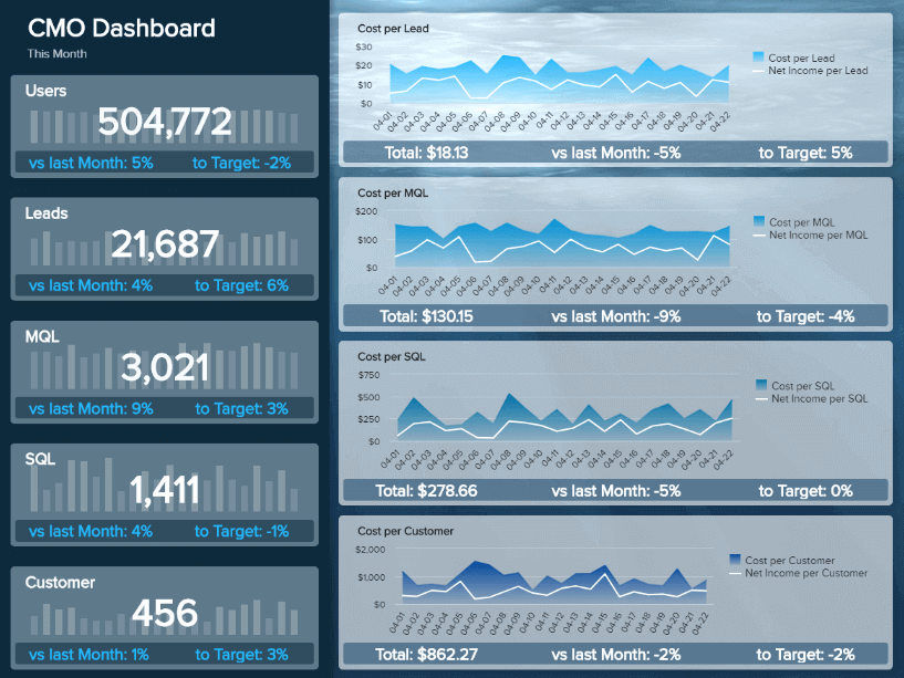
**click to open in full-screen mode**
Our dedicated marketing dashboard above features a balanced mix of KPIs that will help you make your campaigns more efficient while boosting your marketing return on investment (ROI) exponentially.
Here, you can drill down into insights such as your average cost per lead, sales performance trends based on your targets, traffic, MQL & SQL ratios, and more.
The digestible design of our CMO dashboard means that extracting marketing KPIs and key insights at a glance is more than feasible. Plus, the series of focused line charts on the right side of the page, coupled with the clear-cut numeric information to the left, means that comparing metrics, spotting trends, and communicating figures with your team will take minimal time. It will also prove to be a stress-free experience.
7. Retail Sales & Order
The rise of eCommerce has opened up the realm of retail to a world of possibilities, empowering brands to sell their products to prospects across channels and touchpoints. But more opportunity means more data to handle.
For retailers of all shapes and sizes, our retail dashboard is designed to improve internal processes while maximizing sales on a sustainable basis:
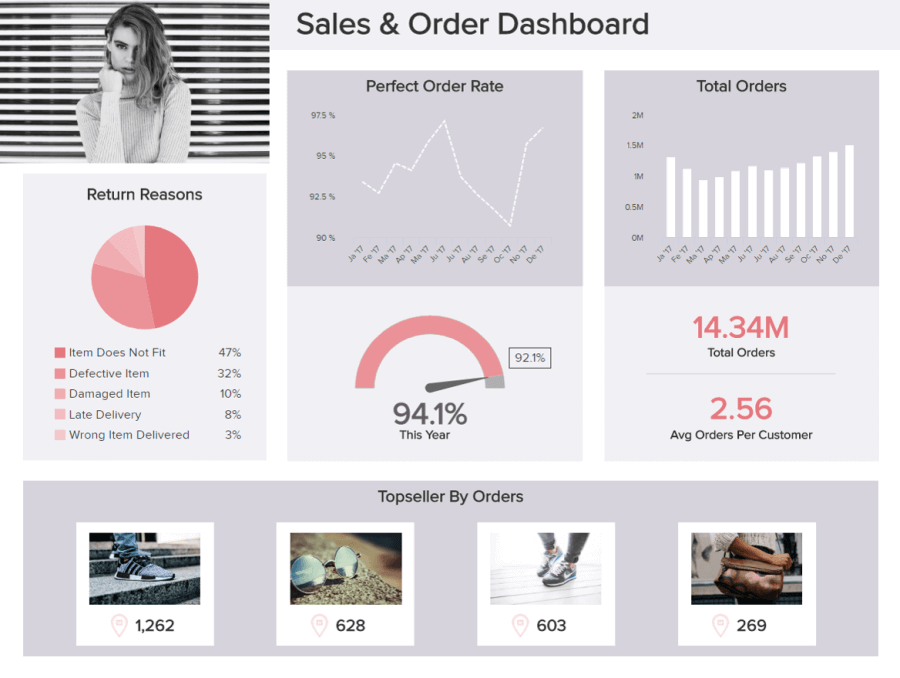
**click to open in full-screen mode**
Retail is an incredibly fast-paced sector, and if you want to know how to create a dashboard that gets results, this template is the answer. Here, you can break down your retail analytics according to different regions, examine order status at a quick glance, and even curate the reasons items are returned to implement improvements to your service and fulfillment strategy.
With an optimal color scheme, a logical layout, and the perfect mix visualization, including pie charts to represent order return reasons and bar charts to communicate order trends over specific periods—plus easy-to-absorb image-based information—this is the essential toolkit for any ambitious retailer looking to make their mark in the digital age.
8. IT Dashboard Building For Cybersecurity
Cybersecurity is a threat to businesses of all sizes. With data breaches and attacks becoming increasingly common, the need for a well-thought-out strategy and a medium to track relevant security metrics becomes critical. With that in mind, our IT dashboard for cybersecurity provides businesses with the perfect overview of fundamental security KPIs, such as the total intrusion attempts and the meantime to detect and resolve, among others.
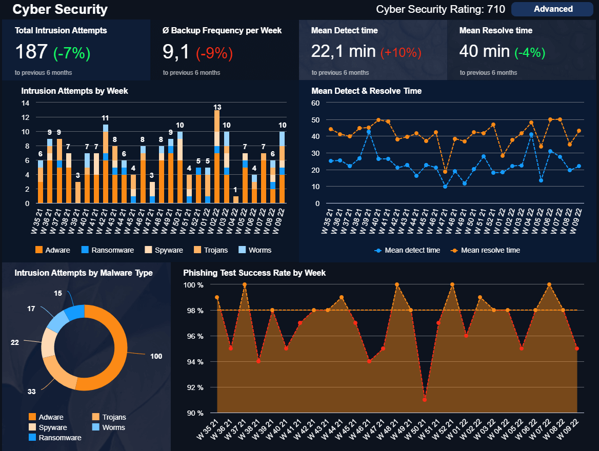
**click to open in full-screen mode**
The dashboard creation process, in this case, was made to provide its users with information at a glance. The metrics on top are compared to the previous six months with the colors red and green to indicate if the development is positive or negative. Likewise, the mix of a dark blue background with strong orange for the charts makes the data easy to understand and not tiring to look at.
Armed with useful security metrics, making a dashboard allows the IT department to spot common intrusion attempts and their frequency, optimize how long it takes to detect them, solve them, and test how equipped employees are to identify attacks. Enabling them to assess the organization's overall cybersecurity strategy and ensure that it is at its best.
9. Customer Service Dashboard Creation
Arguably, one of the most important areas for any organization is the customer service department, which gathers a lot of data from different sources. Visualizing all this information together in a professional customer service dashboard is a benefit that will set the organization apart from its competitors.
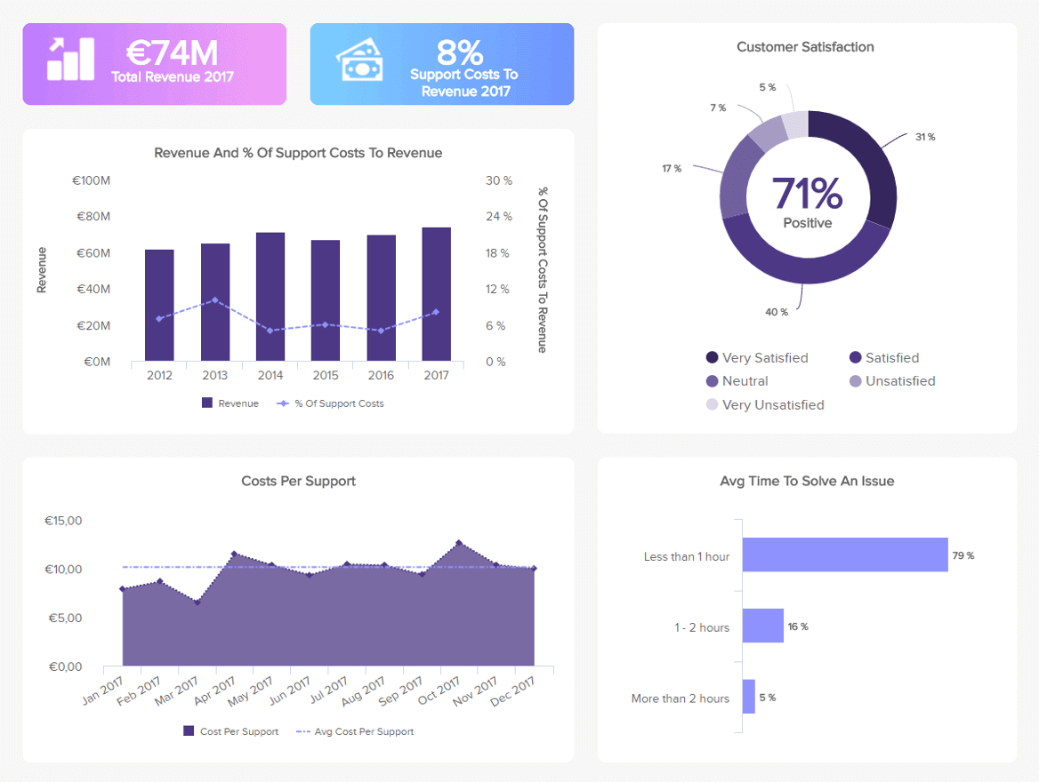
**click to open in full-screen mode**
With a mix of relevant financial metrics, such as the total revenue and costs, as well as some operational metrics, such as the average time to solve an issue and the customer satisfaction score, this insightful online dashboard creation provides the perfect summary to understand the overall performance of the department. The ultimate support goal is to keep customers satisfied and happy at the lowest cost possible; therefore, being able to compare both areas is invaluable.
As mentioned before, one of the requirements for building effective dashboards is to provide context to the data. This is applied in the example above, where the revenue and costs are tracked for the past 5 years. This is useful information as it puts the current performance into perspective.
10. Hospital KPI Example
Managing a hospital is no different than running a business. Financial and operational aspects need to be closely monitored to ensure patients are getting the quality of care they need and expect. Our healthcare dashboard below is the perfect tool for efficient facility management across all departments and areas.
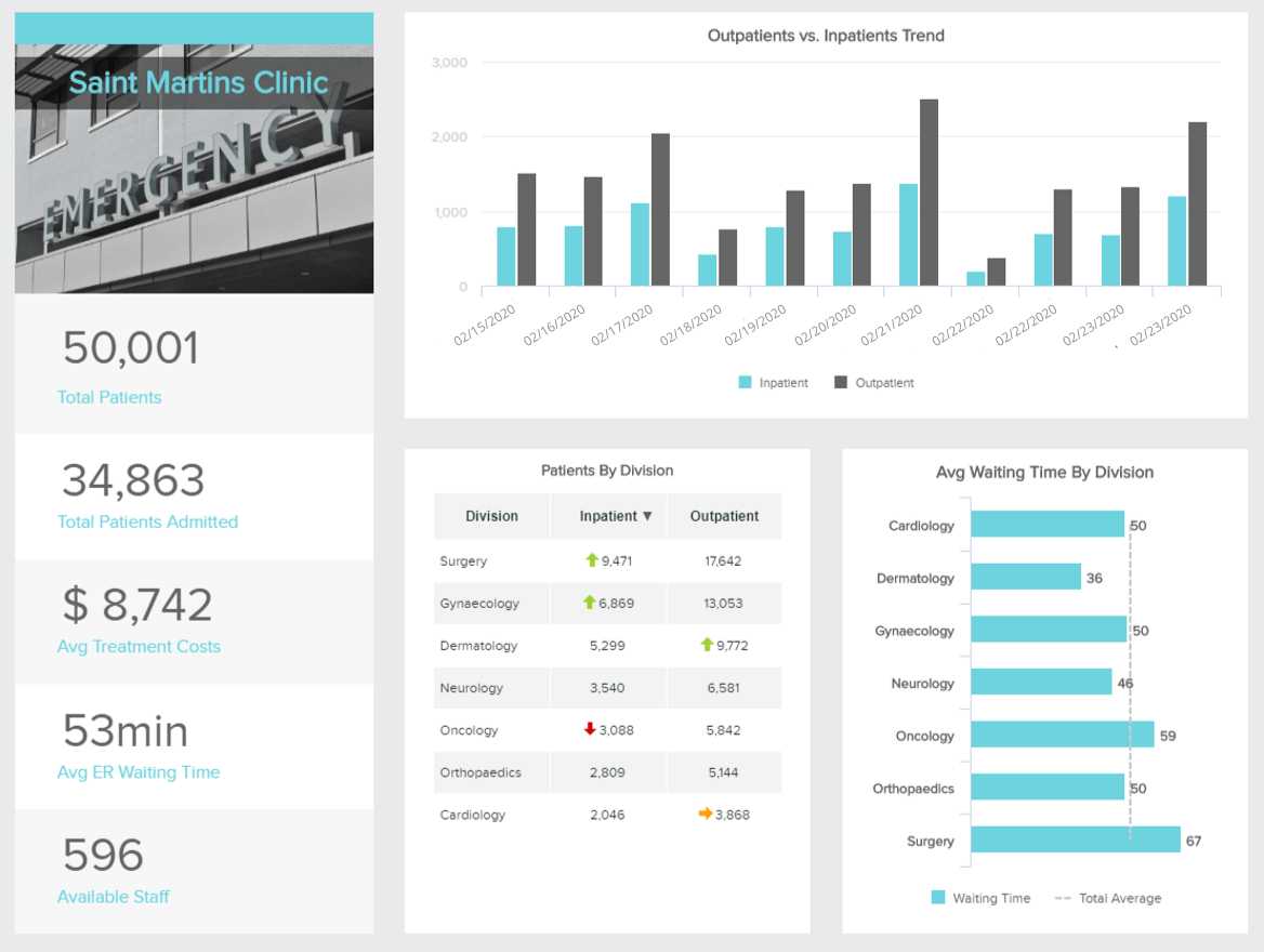
**click to open in full-screen mode**
In this case, the dashboard creation process was thought out based on usability. The left side includes quick metrics such as the total patients, average ER waiting time, available staff, etc. By looking quickly at this section, users can understand if everything is going as expected. The right side offers some of these metrics in more detail in case extra insights are needed. For example, the patients by division table with red, green, and yellow arrows let us quickly understand if a division is overcrowded. This information can be complemented with the average waiting time by division to understand the performance of a specific department. If the average time is too high and outpatients are low, then a stuffing issue might need to be tackled.
11. Production Dashboard For Manufacturing
Our following example of how to create a dashboard is for manufacturing. The value of this template lies in its real-time nature. As a manufacturing company, you need to ensure that production is running as expected so you can meet deadlines and avoid bottlenecks.
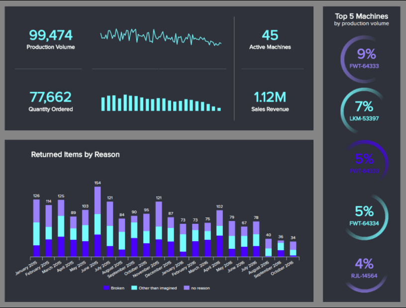
**click to open in full-screen mode**
With that in mind, our manufacturing dashboard includes metrics such as the production volume, return items by reason, quantity ordered, and the top 5 machines by production volume. By looking at these metrics in real-time, manufacturers can spot common return issues and optimize them to keep them from happening again, monitor the performance of machines to ensure production is going as planned, and get a quick overview of revenue generated—definitely a valuable tool for monitoring daily operations.
12. Customer Satisfaction Dashboard
Probably one of the most important areas for any business offering a product or service, customer satisfaction is the best indicator to track how customers feel about the organization and the experience it provides. Our template below, generated with dashboard creation software, is designed to offer a complete view of satisfaction in areas such as quality, pricing, design, and service.
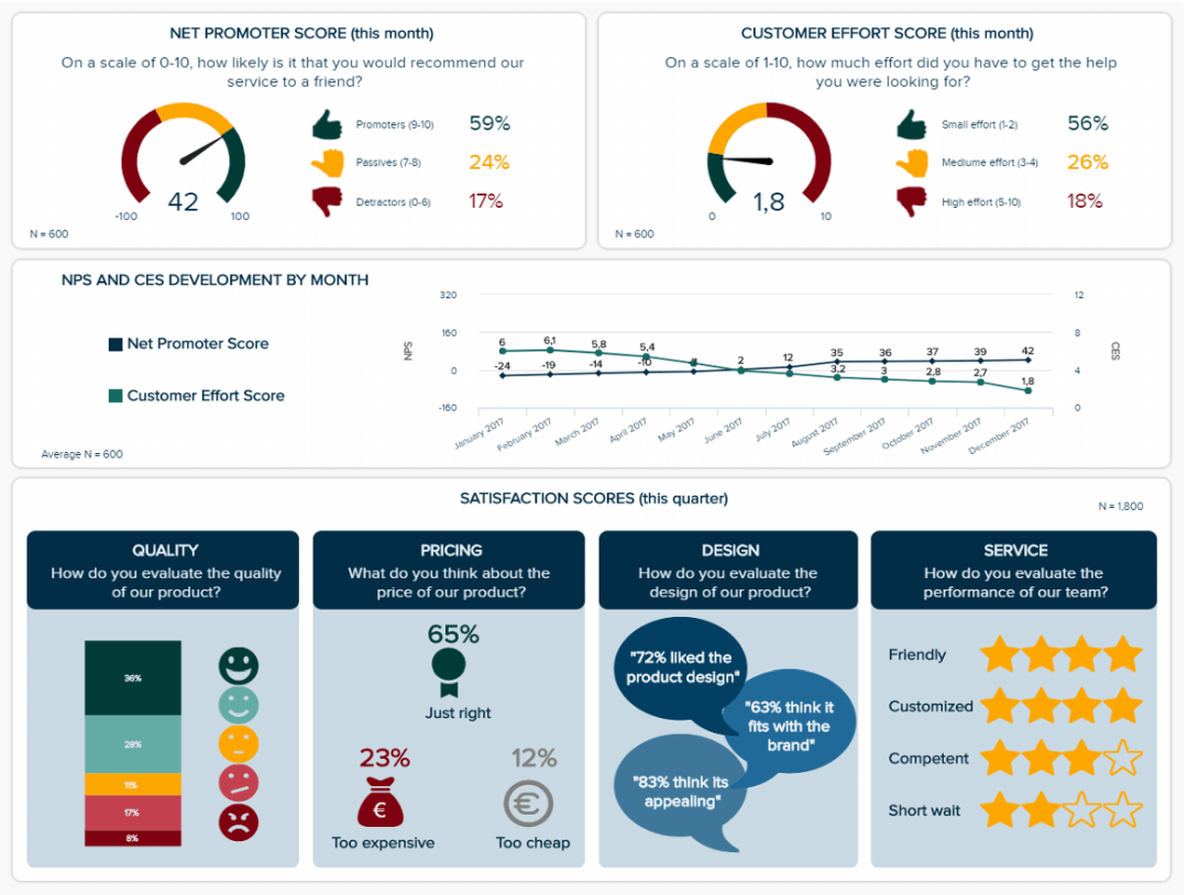
**click to open in full-screen mode**
One of the reasons this example is so great is that it contains various icons that ensure the data is understandable and more accessible for anyone looking at it. Offering this interactive view to the audience makes the analysis process more engaging and facilitates the decision-making process.
13. Market Research Dashboard
Market research used to be a lengthy and involved process, where teams would spend weeks and months collecting data to review. Once the data is organized and ready for review, there’s a chance that the data is no longer relevant or reliable. Market research dashboards change the game by providing real-time insights at a glance, leading to easier analysis and faster decision-making.
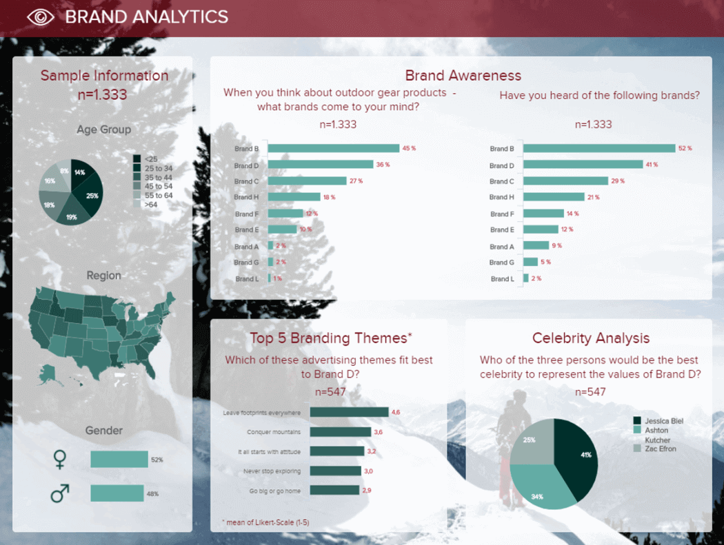
**click to open in full-screen mode**
With this template, users can automatically turn data from surveys, samples, brand analyses, and other collection efforts into visuals. Our brand analysis questions help you see how your brand awareness stacks up. Customers can answer questions about the brands that come to mind regarding a certain product or service (an excellent choice for collecting unbiased answers) or choose the brands they recognize from a provided list.
The market research dashboard above also collects insights about audience sentiments regarding a brand’s advertising. Ensuring that any advertising themes or creative align with the customer’s perception of the brand can be critical to enhancing brand recall and awareness, along with maintaining aligned values. This also gives in-house teams the chance to see whether brand awareness campaigns are being executed effectively.
14. Management KPI Dashboard
Managers make multiple business decisions daily, and having the right intel at the right moments can ensure those decisions are made confidently. Using a management KPI dashboard helps managers make decisions faster by turning complex data into simple visuals. Rather than spending precious time pouring over reports, fact-checking data, and crunching numbers, leaders can get a clear picture of their organization’s performance in real-time across the main facets of the business.
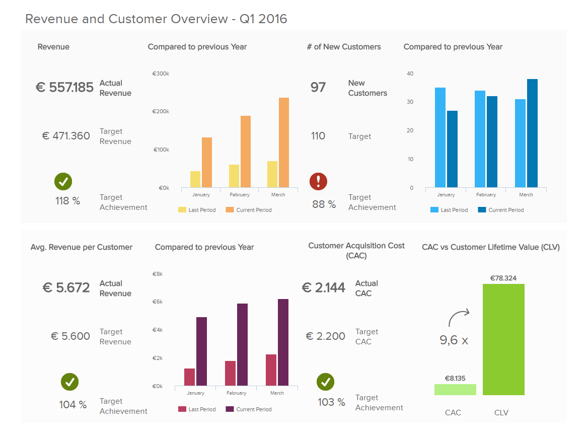
**click to open in full-screen mode**
Our management dashboard focuses on revenue and customer data to show business opportunities. New customers mean more revenue, so having a breakdown of total revenue, the number of new customers and customer acquisition costs will help managers align this data with company targets. Managers can dig deeper into the data to see revenue and customer information within a certain period. This makes it easy to compare revenue this month vs. the same month a year ago or see how revenue trends are developing throughout the quarter. These metrics will be monitored in real time on an ongoing basis, and users can set alerts to be notified when significant changes occur.
15. Energy Management Dashboard
Energy companies know that not all energy is created equal. You service multiple types of customers, from the average household to energy-hungry manufacturing facilities and always-open hospitals. Each type of customer has unique requirements and usage patterns, and each type receives energy differently. With energy production costs affecting everything from budgets and payroll to the price you charge your customers, the right data helps to maintain a healthy business. That’s why having an energy dashboard provides high value to your organization.
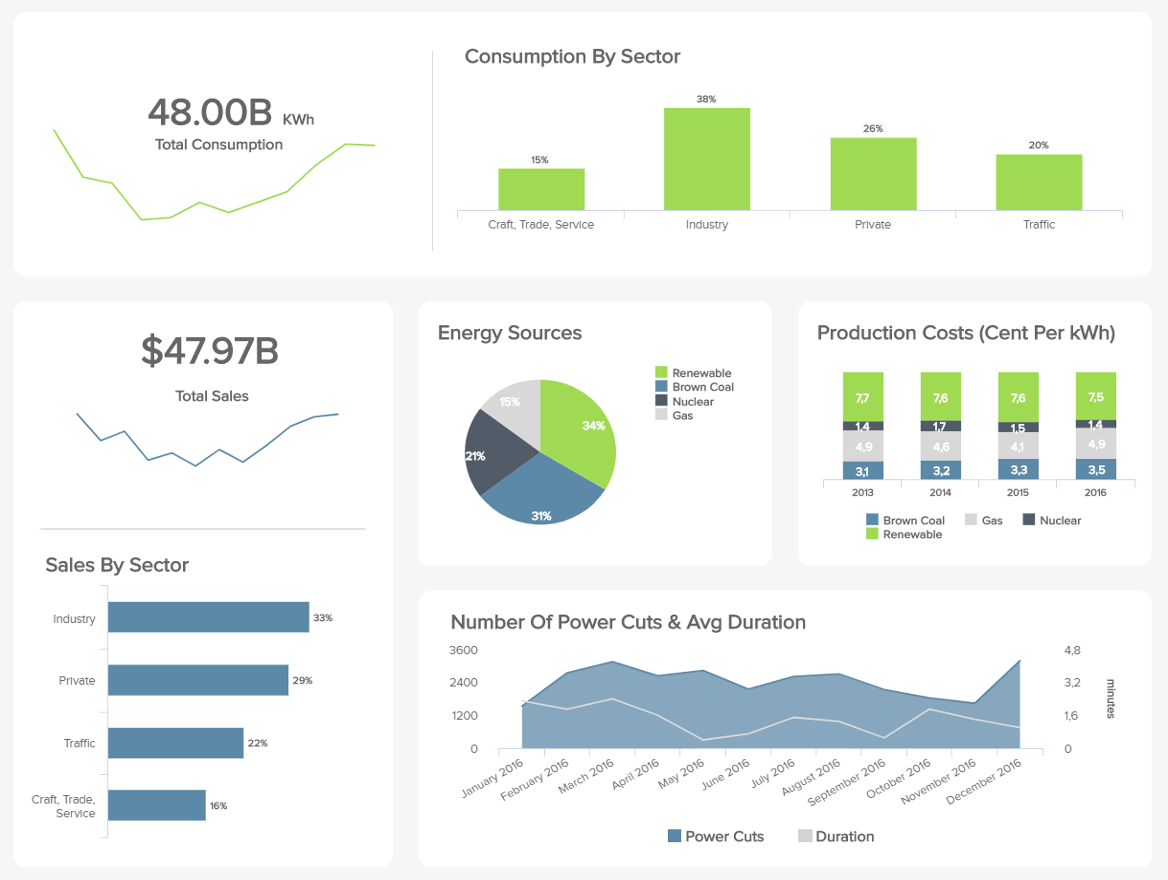
**click to open in full-screen mode**
In this example, managers can view energy consumption by sector, showing which types of customers require the most energy. You can also get a bird’s eye view of total energy needs and total sales, which shows whether your energy demands align with the revenue you’re bringing in. Breaking down your information by sector can also help you improve your production and delivery.
Seeing trends on a rolling 12-month basis will help you plan for potential spikes in demand or when staffing needs might change. One other unique feature of this dashboard is the ability to see and track renewable energy, especially as more companies initiate strategies to conserve energy and go green. This data shows who is seeking alternative energy sources and how these trends change over days, weeks, months, and years.
16. Consumer Goods Dashboard
Our final example represents the operations of a fast consumer goods company, such as a supermarket. With multiple products sold at any given moment, it’s essential for managers to know what product categories are available in each store, which ones are selling, and how customers are buying in those categories throughout the year.
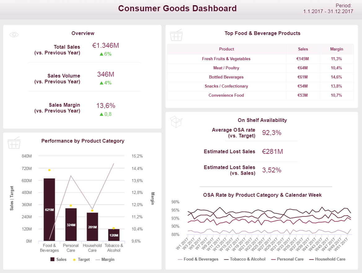
**click to open in full-screen mode**
In our FMCG dashboard, managers can see total sales, sales volume, and sales margin in a single view and compare those figures to the previous year. Sales managers can dig deeper into this data to look at specifics for each product category and better understand their sales.
For example, some categories, like food and beverage, have relatively low sales margins. However, other categories, like personal care items, have much higher sales margins. It’s insufficient to look only at general sales margins, as food and beverage items tend to sell at much higher volumes and can contribute significantly to your bottom line. Dashboards like the example above break it down into easy-to-digest visuals so you can gain a contextual understanding of your consumer goods sales.
“Data scientists are involved with gathering data, massaging it into a tractable form, making it tell its story, and presenting that story to others.” – Mike Loukides, editor, O’Reilly Media
Dashboarding Common Challenges & Mistakes
Making the most of your dashboarding isn’t just about creating the dashboard itself. It’s also about spotting pitfalls that could skew your numbers or render your processes less effective. Let’s explore some common challenges of dashboard creation and how to avoid them.
Overcrowding Your Dashboard
Too much information on a single screen can overwhelm users, making it difficult to extract meaningful insights. Aim for simplicity and clarity in design, focusing only on the key insights your end users need to know. Using white space and following the other design tips we shared above will help you benefit more from your dashboards.
Not Making Time For Testing
We’ve already stressed the importance of checking your data for quality and accuracy. The other part of this step is to test how the data is delivered to your dashboards and the results they display. You might have all the right data, which might be accurate and up-to-date, but if there’s a problem with how data flows between sources, you might not obtain the most accurate insights. Regularly test each feature and each data source so you can trust you get the full story.
Not Having A Clear Purpose
If a dashboard lacks a clear objective or doesn’t address the users’ needs, it can lead to confusion and render it less effective. datapine simplifies how dashboards are created and leveraged. However, users still need to understand their purpose and, most importantly, how to use the data they collect to make essential decisions.
Not Providing User Training
Not all dashboards are created equally. While they are made to be user-friendly and offer quick insights without poring over complex reports and spreadsheets, there’s still a learning curve on how to read and use the data.
Dashboards should tell a story and guide the user through insights. Without a narrative or context, data can lose its impact and be less actionable. Without proper documentation or a user guide, users might struggle to understand how to navigate or interpret the data. This is important not only at the outset of a new dashboard but also as new users come into your organization. A proper documentation guide or even a one-sheeter can provide all the context a new user needs to get up to speed and start making the best use of their data.
Ignoring Business Needs Changes
Building a dashboard that cannot adapt to changing needs or evolving data sources can make it obsolete. Your business is a dynamic environment with products, services, and people constantly on the move. Consumer needs change, markets fluctuate, and business locations open and shutter. Your tools should be flexible enough to accommodate these changes, especially regarding the type of data you collect. Design your dashboards flexibly to accommodate future changes and ensure you always know where your business stands.
How To Create A Stunning Dashboard - Summary & Final Thoughts
Throughout our guide on how to develop a dashboard from a concept into a living, breathing, business-boosting reality, we’ve mentioned the importance of considering your audience, telling a story, and following best design practices, whether you need to visualize supply chain metrics or present comprehensive financial data to the relevant stakeholders.
By following these essential dashboard design tips and elements while taking inspiration from our practical examples, you can create dashboards that help you gain more comprehensive access to your most important data and boost internal communications and initiatives. Getting help from modern online BI tools that empower even non-technical users to manage large volumes of data will substantially increase productivity and knowledge.
Dipping your toes into your data or shooting in the dark isn’t enough in the information age. To win tomorrow's commercial battlefield, you must squeeze every last drop of value from your business data—and effective digital dashboards are the way to do just that. There’s no better moment than now to start building your future.
With stunning visuals, advanced chart options, interactive functionality, and secure real-time data, modern dashboard design software like datapine has revolutionized how you can report data.
Our interactive dashboards combine the level of power and flexibility that will pull your KPIs together, empowering you to run a better, more data-driven business. Learn how to build your own dashboard. No prior experience is required. Don’t miss your chance and try datapine for a 14-day trial, completely free.