
BI Dashboard Best Practices How to take advantage of state-of-the-art BI dashboards
Professional Business Intelligence Dashboards
Table of Content
1) What is a business intelligence dashboard?
2) What are the key benefits of a BI dashboard?
3) Top 15 BI dashboard best practices
4) Common BI dashboard Challenges
5) Real world BI dashboards examples
6) Conclusion & Guidance
It’s often said that knowledge is equal to power. While it isn’t possible to apply this statement in a universal sense (and, in fact, it’s somewhat cliché), the notion does serve to highlight an important truth regarding today’s digital world: consumer values are continually evolving. Data has never been more readily accessible. Approaches to communication are changing, and success in today’s technology-driven world correlates directly to the quantity rather than the quality of one’s information — metrics relating to the company, the client, the competitor, and the market. But IT departments no longer hold exclusive access to information. With BI dashboards, the knowledge is spread across the company, empowering every user to create their own, interactive reports, utilizing data visualization, and spreading the knowledge with internal and external stakeholders.
Informed decision-making ultimately leads to greater access, opportunities, and technological advancement. Very often, the most important factor in determining success comes down to who engages in factual and informed decision-making and who follows hunches and suppositions. But what is one strategic business intelligence (BI) mechanism that is absolutely necessary in the digital age? A BI dashboard. How can you create one? Thanks to specific business intelligence dashboard best practices.
Here, we’ll talk about the importance of working with a professional business intelligence dashboard while outlining the 12 most essential best practices for success. These practices are developed by our experience as a BI provider working with hundreds of customers over the years and we’ve decided to share our extensive experience of conducting successful analytics projects across the globe.
To put theory into practice, we will also present a hand-picked selection of real-world business intelligence dashboard examples based on different business goals or disciplines, created with a powerful BI dashboard creator that you can use for your own business needs. But first, let’s give a bit of background of the terms we use and the benefits they provide.
1) What Is A Business Intelligence Dashboard?
A business intelligence dashboard is an analysis tool that displays critical business data in a central location. Armed with interactive data visualizations, BI dashboards enable companies to track their performance and optimize strategies to achieve their goals.
They are basically a tech-driven approach used to analyze and visualize data in an actionable way. Business intelligence dashboard design consolidates charts and graphs on a single screen, giving the reader a big picture of the situation it is assessing. BI dashboard tools don’t have a fixed, determined nature and adapt to the needs of the people building it by displaying the metrics relevant to their function, industry or platform. Below you can find a professional BI dashboard example:

Such dashboards can have a lot of different features, mainly having a customizable interface, a certain level of interactivity and the possibility to pull data in real-time from multiple sources. By enabling the user to visualize otherwise complex and heavy raw data, they simplify the data processing for our brain and give readers an at-a-glance overview of the past, current, and future performance.
These kinds of cutting-edge analytics solutions fuse the essential aspects of traditional business intelligence dashboards with their signature commitment to the user experience. Gone is pre-requisite SQL knowledge; absent are the myriad of complex equations and language that makes sense to only the most experienced and qualified IT specialists. In its place comes a dashboard designed for use from the ground up – robust, accessible enough for an intern with no prior training, and powerful enough for a CEO with years of frontline experience under their belt. From measuring budgetary efficiency, and determining market trends, to understanding consumers – modern BI tools allow digital age businesses to easily identify the key performance indicators driving today’s markets.
2) What Are The Key Benefits Of A BI Dashboard?
The purpose of a BI dashboard is to help business users make better-informed decisions by letting them gather, consolidate, and analyze their data – and of course, visualize it in a meaningful way. They aim at simplifying a complex analysis of huge amounts of information, to avoid missing any trend or pattern. Often enough, they are overlooked or unspotted in an infinite table of numbers and figures, and the potential of such data remains untapped.
BI dashboards organize data cohesively while alleviating any potential clutter that can arise when working with complex sets of information while applying advanced intelligence tools to your various strategies. Using highly visual representations and tools, you can produce graphs, charts, and other powerful visualization instruments that empower you to interpret the data and transform it into actionable insights that will benefit your company in many ways. To outline the unrivaled value of creating such a dashboard, here are the primary benefits of utilizing them:
Trend identification: They empower businesses across sectors to identify and analyze positive trends related to a wealth of business activities while isolating and correcting negative trends for improved organizational efficiency.
Increased efficiency: For the best results, decision-making should always be based on the right data — and a business analytics dashboard will allow you to achieve this. They improve efficiency by providing relevant real-time insights, allowing you to make informed, accurate decisions that will catalyze your success.
100% Accuracy: To take advantage of your competition, it is also important to have accurate data in planning, analysis, and reporting. This is achieved by real-time access, which can provide instant access into how your business performs on an operational or strategic level. If all employees are informed at the right time and the at right moment, guesswork is completely eliminated, thus creating substance for making informed decisions.
Interactive data visualization: As more data sources emerge, there is a strong need to compile a centralized point of access where it can be presented in a clean way, with instant insight. Traditional spreadsheets such as Excel have become so crammed that making a business decision can end up in indefinite scrolling and searching for the right information. Since humans process visual content much faster than written text, graphics are becoming the standard for modern presentations. And not just ordinary graphs and charts, but interactive reports, visualizing every step of a business process, predicting outcomes and providing business users with instant, actionable insights.
Self-service features: It’s possible to implement modern self-service BI easily and without the need for specific technical IT skills. As a result, this offers company-wide access to invaluable performance metrics that people can share swiftly, providing a level of agility and mobility that traditional data processes simply cannot match.
Enhance communication: With interactive features, there is no need to rely on static reports or email communication. These powerful analytical solutions can be easily shared with colleagues, managers, clients, and any other relevant stakeholders to keep everyone informed and engaged with the latest developments. This will make communication more efficient while also enhancing collaboration and a data-driven culture in the business.
Accurate forecasting: Being able to predict future outcomes is another great benefit. By analyzing your historical and current data to find patterns and trends, predictive analytics technologies provide a pick into the future in several areas. Through this, you can get accurate forecasts about things like product demand and plan your production and strategies ahead.
Real-time insights: In order to make the smartest strategic decisions you need the latest data available. BI dashboards do just that by providing real-time information as soon as it is available. There is no need to go through infinite databases and manually update everything. With just a few clicks you get the latest results available for accurate decision making.
Freedom & flexibility: Expanding on our previous points, the centralized and completely portable nature of a dashboard for business intelligence means that it’s possible to access and analyze invaluable insights from a multitude of devices 24/7, wherever you may be in the world. This level of freedom and flexibility translates to increased productivity and enhanced business intelligence consistently — one of the key ingredients of success.
Advanced data analyst tools come in all shapes and sizes. Each available analytical solution plays a different role in maximizing value creation, from mining and spreadsheets to local information systems. To help you squeeze every drop of value from your BI efforts and ensure optimal BI dashboard design for specific strategies or goals, we’ll explore the top 15 best practices you can implement.
3) Top 15 BI Dashboard Best Practices To Follow
As mentioned, these best practices refer to methods and techniques made and recommended by our expertise from working on hundreds of BI projects with customers worldwide to get the maximum value out of your dashboards and reports. These 15 key BI considerations hold all of the facts you need to hit the ground running with your newfound data-powered organizational strategies, including practical advice on business intelligence dashboard design.
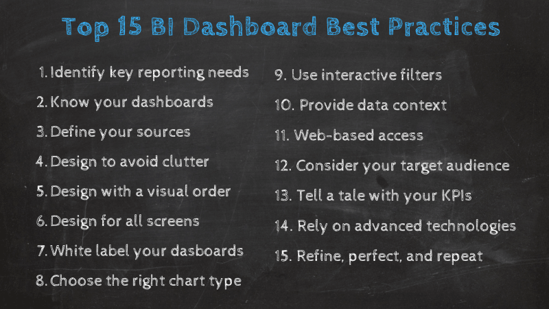
1. IDENTIFY YOUR REPORTING REQUIREMENTS
As you would do for any type of reporting – management, financial, marketing, etc. – the first thing you need to clarify is the “Ws”: why do you need to report, and to whom? Next, list all the stakeholders involved, as well as the decision-maker and end-users. Once your target audience is defined, you will have a better idea of what will be on your dashboard.
Indeed, knowing who your readers will be will help you focus on specific aspects of the data that are relevant to them, to their needs, which matches their expectations and technical skills. To do so, you can schedule phone or face-to-face interviews with different stakeholders to consolidate all of their reporting requirements.
When this is done, it will be much easier for you to choose from lists of KPIs that will fit your audience the better. Remember that the purpose of a BI dashboard is to clearly see your business reality so that you can make the right decisions at the right time. The data analysis questions you’ll ask will provide a framework and allow you to focus on specific aspects of your performance – and that’s when the KPIs come in. Pick the ones that translate the status of your company best and measure the evolution of your process towards your goals.
2. KNOW YOUR DASHBOARDS
Before selecting your tool, knowing what types of dashboards are available is important. Once you understand each type, you can make an informed decision regarding the purpose and implementation of your dashboard. Remember, informed decision-making for maximum ROI is the whole point!
Strategic: The strategic one aggregates key organizational health indicators and help C-suite executives identify opportunities for organizational expansion. They detail an organization’s general health, not for the purposes of a complete analysis, but to provoke future thought and further independent analysis. The analyses are not overly complex and typically include more general data aggregations compared to other solutions.
Analytical: The analytical type is engineered to provide detailed analyses pertaining to trends (the what, the why, the how). Analytical solutions emphasize measuring data variables in relation to time (week, month, year, etc.). An example would be to conduct an analysis of supply chain management, together with product sales, over a designated period of time to determine what trends, mutually dependent factors, and potential strategic consequences exist (if any). A great analogy for analytical dashboards would be that of a general medical practitioner. They may not be an expert in a specific medical field, but can effectively monitor the body’s overall health by comparing current symptoms to what would be an ideal state of health. This is exactly the role of analytical dashboards. As they consider a multitude of different measurables for aligning goals with performance, they tend to be complex and highly focused.
Operational: Where analytical dashboards monitor the overall health of an organization, the operational ones focus on KPIs. They will vary depending on the industry and audience (sales, marketing, finance, etc.), but they will always monitor the real-time operations of an organization or entity. Rather than analyze the general health of an organization (or “body”), operational dashboards will specialize in monitoring the functionality (and deviations) of various KPIs (or “organs”) that exist within an entity. As they provide real-time information, they tend to contain less complex data.
Tactical: A reporting tool typically used for mid-level management, a tactical dashboard is incredibly analytical and drills down deep into several key areas of a company’s internal processes. They offer a great deal of insight into weekly trends and metrics and are pivotal in improving internal communication and formulating mid to long-term strategies across departments from marketing and finance right the way through to human resources.
3. DEFINE THE NEEDED DATA SOURCES
Once you’ve identified your key requirements and the type of BI dashboards you will use, it is time to think about the information you will put on them. With the rise of self-service BI tools, the amount of internal and external sources from which businesses are gathering their data is growing. Now, with all that information in hand, you need to define what is actually valuable for your analysis and general goals. Gathering useless data is not only a waste of time and resources but can also make you make misleading decisions based on wrong facts.
A good practice is to use the sources that will bring value to your specific goals tracking process. This can involve several departments and external processes. To not get overwhelmed with all of it, BI tools offer professional data connectors to put together all your most relevant sources in a unique location. With the help of this technology, you no longer need to think about manually updating your data sources; your latest results will be available as soon as they come up.
4. DESIGN DATA TO AVOID CLUTTER
Once you have given thought to and selected the sources you will use, you should begin focusing on concise and effective design. While an “easy on the eyes” design scheme may appear tempting, effective communication should always be your number one priority.
It is a major fallacy to assume that what you think is a more visually appealing dashboard will communicate more effectively with your audience. Communication is a science, and BI dashboard design should reflect quick, concise, and clear fact-based communications. One of the unfortunate tendencies of data professionals in the digital age is the self-defeating habit of overburdening audiences with clutter. This is why you should follow the 5-second rule, which states that your dashboard should provide the relevant information in about five seconds.
While its forms vary, the inherent nature of clutter will likely always remain the same… it will occupy cognitive space within the mind of the audience, and yet, simultaneously fail to have any substantive or beneficial impact. Not only will clutter fail to impact an audience positively, but it will also create the appearance that data is more complex than its true nature. Therefore, to avoid clutter, you must identify clutter. A great guide to identifying the characteristics and forms of clutter is the Gestalt Principles of Visual Perception. The Gestalt school of Psychology defined these six principles (discussed below) as the main principles outlining basic human interaction and order creation within the context of visual (i.e., data) stimulation. Let’s briefly take a look at each principle.
Proximity: The principle of proximity dictates that we will likely group elements together based on their location or “proximity.” This principle allows for the manipulation of perception through well placed and cleanly grouped data.
Similarity: The principle of similarity dictates that we will likely group comparable elements together. This essentially means that from the visual perspective of the audience, similar colors, shapes, and fonts are expected to be grouped together. When applied to client communications, this principle can assist with the removal of unnecessary data elements.
Closure: The principle of closure refers to our propensity to “close the gap” and create complete elements. This concept applies even when portions of shapes and figures are missing.
Enclosure: The principle of enclosure dictates that if elements are controlled by a visual border or shading, we will tend to see the objects and elements as unique groups. This principle can be employed as a foundation for graphical data presentation, like prior principles.
Continuity: The principle of continuity dictates that if separate linear elements are positioned within one another, we will tend to integrate all of the parts of the elements. Individual lines will then be viewed less as separate and more as a continuation of one central element.
Connection: The principle of connection dictates that our visual pairings are often strongest when there is an actual linear tie. That is, rather than associating elements via color, shape or spacing, we will use a direct lineal connection to establish the foundation for our visual relationship with data.
5. DESIGN DATA WITH A CLEAR VISUAL ORDER
One of the most influential factors impacting dashboarding analysis is the subconscious desire to achieve visual order. Disorder begets disorder, and if we fail to appreciate the value of a clean and clear data presentation, our data disorder will ultimately result in dashboard disorder. Let’s take a look at the elements of a well-ordered dashboard, engineered for visual success.
Consistent Alignment: Ideal data alignment for dashboarding purposes is likely to be determined on a case-by-case basis. A good default rule is to have your most informative data positioned in the upper left (the upper left corner of the page is likely a leading candidate for informative text). Knowing what to place and where is as important as knowing what not to place. Therefore, a second general rule is to avoid ALL temptation to put diagonal elements and fill patterns. Diagonal data elements, especially those linear in nature, add little benefit while significantly reducing alignment efficiency.
White Space: Does white space equal wasted space? No! More is not always better. White space is a design term used to reference space within a presentation that is not allocated to any specific element. It is a space void of all images, colors, texts, data, and other visible page elements. You should be keen to take advantage of the proven benefits of both “active” and “passive” white space (i.e., intentional, and unintentional). Benefits include enhanced design and balance, enhanced readability, the appearance of sophistication as well as prioritized data elements.
Use of Contrast: Contrast should be viewed as closely related to white space. Both originate from the same family tree, but each one brings its own unique properties and features. You can, and should, experiment with contrast and white space together. When combined, they have the potential to create an incredible one-two visual punch. More often than not, the contrast will be applied via a change in the data color scheme. This change, likely to be focused on a “point of emphasis” element, is intended to draw the viewer’s attention to a specific and important data detail. Simple color and design variations will enhance the information gathering process and allow for an efficient, focused, and comfortable data experience.
6. DESIGN FOR ALL SCREEN SIZES
As you’ve learned by now, the design process accounts for a huge portion of the success of a BI dashboard. We’ve already covered some key practices you should follow to generate efficient designs, but there is another relevant factor to consider. We are talking about device optimization.
With remote work becoming the new norm after the pandemic, the digital solutions used by businesses to manage their daily operations must adapt to the different screens and devices that employees use aside from desktops (such as tablets or mobile). In that regard, it is important to generate exclusive designs corresponding to the screen size. For instance, a mobile dashboard is small and can only display a couple of high-level metrics; therefore, it is critical to select only the most valuable information as the analytical scope is reduced. Another aspect to consider is the sizing of buttons. Consider some users can have bigger fingers and might have trouble navigating through the data.
7. WHITE LABEL YOUR DASHBOARDS
When implementing BI in your organization, being able to engage employees with the tools and processes is always a challenge. A good practice to make it more friendly and engaging for everyone is white labeling your BI dashboards. White label BI is a technology that enables users to customize the look and feel of their dashboards with their font, colors, and logo. This way, employees will be able to work in a familiar environment, and your reporting efforts will look way more professional when presenting findings or results to external stakeholders or clients.
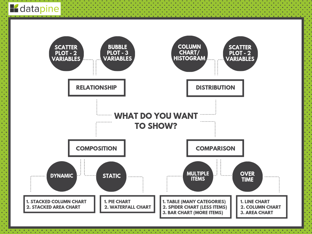
8. CHOOSE THE RIGHT DATA VISUALIZATIONS
We’ve covered vital elements of business intelligence best practices for dashboard design, and in many ways, visualization selection is an extension of these methods. The human brain digests visual information more efficiently than pure text. This means that when you’re working with your dashboard data, you should display it in a way that resonates with your audience on a deeper, more meaningful level. In doing so, you will ensure your data is transformed into actionable insights that ultimately drive the business forward.
BI dashboard imagery comes in many forms. To help you choose the right representation of your data, here’s our guide to choosing the right types of data visualization for your reading pleasure. Below you will find a short visual summary:
9. USE INTERACTIVE FILTERS
In order to make the analysis experience as efficient and intuitive as possible, you need to make sure that your BI dashboards are not static. When building them, a best practice is to always have interactivity in mind. This can be achieved with the help of various filters that make your data easier to navigate. Some common interactivity filters that you can apply include:
Drill downs: A drill down filter allows you to visualize lower levels of hierarchical data all in one chart. For example, say you have a bar chart displaying your customers by country. With a drill down filter, you can click on a country and the entire chart will automatically adapt to show you the number of customers by the city of that specific country. You can even go further by clicking on a specific city, and so on. The value of drill downs lies in the fact that you don’t need to overcrowd your dashboards in order to get a more detailed view; you can do everything in a single chart.
Drill through: Similar to a drill down, a drill through filter allows you to visualize additional, more detailed views about a specific KPI. The difference is that a drill through will show you the additional data in a pop-up instead of the same chart. For example, if you have a chart displaying the total revenue and you click on it, a drill through can break the revenue into different areas so you can understand exactly where it is coming without the need to jump to another report.
Click-to-filter: Another useful filter to enhance interactivity is the click-to-filter. As its name suggests, to use this filter all you need to do is click on a specific graph and the entire dashboard will be filtered based on it. For example, let’s say you are looking at a chart displaying the revenue for the past 12 months, by clicking on a specific month all the rest of the charts will display information regarding that month. By applying it you can easily explore your data and extract deeper understandings in an instant.
10. PROVIDE DATA CONTEXT
In order to properly analyze the role of data within a specific dashboard, everyone from the CEO to a first-year product salesperson needs to understand the notion of context. Data analyses and visual representations lacking context will be limited in their utility and ROI. It is normal for data points to generate more questions than answers. However, observers should be fully informed, nonetheless. For example, suppose a dashboard is monitoring product marketing effectiveness, and one of the data points included is total sales. In that case, this data point will be useless without knowing the measurement time frame. Is it this week? This month? This quarter? This fiscal year? Absent time-specific context, it is next to impossible to know the intended significance of the data. Also, answer yourself if you additionally need to develop KPI scorecards to update information on a periodical basis only.
A second but equally important part of the context is the currency. Selected metrics must be up to date in order to reflect current trends and challenges. If not, there is almost no point in any analysis. Data arriving at the party out of date creates a margin of analysis error that is a slippery slope.
Data rooted in past circumstances is bound to create “fact-based” decisions that are no longer representative of current business environments. While the expectation isn’t (and shouldn’t be) minute-by-minute updates, data metrics should put you in the best possible position to make informed decisions. For that to happen, data points should remain relatively current.
11. WEB-BASED ACCESS
This particular BI best practice is a matter of technological advancement, but also preference. In today’s digital age, with the demand for real-time updates, online business intelligence dashboards are the most invaluable tools a company can utilize. Web-based data sharing and analyses reach a wider audience and allow for greater collaboration with other solutions. File-based publishing is an option if budgets and capabilities are limited, but this will negate one of the greatest advantages of remote synchronization.
When in doubt about which storage technique is right for your organization, be sure to test each strategy and determine which implementation system aligns more seamlessly with your organizational needs, capabilities, and goals. Remember! The ability to share real-time dashboards on web browsers, TV monitors and mobile devices will grant your business the visibility it needs to stay in control of opportunities and trends. From data storage to real-time information delivery, to convenience, … web-based dashboard solutions will seamlessly align with the need for mobility and flexibility in today’s landscape.
12. CONSIDER YOUR TARGET AUDIENCE
Considering your target audience is one of the most integral practices for BI dashboarding, and it’s vital if you want to reap the best rewards for your BI-based efforts. When choosing data visualization types and crafting working designs for your dashboarding, it’s crucial to consider the end-user or the audience to which you’re aiming your presentation.
Are your audience members internal stakeholders, potential investors, or existing company partners? Or are your internal users working on a specific campaign or part of a focused department? If so, what data access will they need? All of this is integral to shaping your efforts to succeed. So, sit down collaboratively and consider all of these questions before setting up your dashboard.
13. TELL A TALE WITH YOUR METRICS
Storytelling is a powerful best practice for any business, regardless of industry or sector — so use it to your advantage. A compelling narrative will not only capture the attention of your audience; it will also break down your findings in an inspirational and digestible way. This approach will result in increased success across the board. To help enhance your KPI-driven storytelling efforts, here’s our definitive guide to dashboard presentation and storytelling in the digital age.
14. RELY ON ADVANCED TECHNOLOGIES
A couple of years ago, the reporting process was static. Providing businesses with little benefits. Modern reporting using professional BI dashboards is interactive and allows organizations to take their analytical efforts a step further. This leads us to our next tip.
Professional BI solutions provide users with advanced technologies that can significantly enhance their performance and the way they use their data. For instance, datapine’s modern data alerts use AI and machine learning to notify users when a predefined goal or target is met. That way, they don’t need to constantly check their data for changes and can focus their efforts on generating quality strategies.
Another innovative technology is predictive analytics. By analyzing current and historical data you can visualize accurate forecasts in your BI dashboards and use them to plan resources and strategies ahead of time. It can also help spot issues before they happen and implement preventive measures.
Taking advantage of these technologies can provide a huge competitive advantage that can skyrocket your business’s success.
15. REFINE - PERFECT - REPEAT
This is an often overlooked but integral element of BI best practices — to ensure sustainable success, you must continue to improve and enhance your efforts. While your BI dashboards may be perfect for your strategies today, they might lose their relevance tomorrow. The digital world is in a constant state of flux, and to remain adaptable to change, it’s vital to make continual improvements.
You should periodically work through steps 1 to 15, using your information as well as the landscape around you as a working guide. This is a practice that holds infinite value. Do this, and you’ll set yourself apart from the pack time after time.
4) Challenges Of Business Intelligence Dashboards
Just like any other business-related process, dashboarding has multiple benefits as well as challenges. To help you integrate them into your processes successfully, below we will discuss three of the most shared challenges organizations face and how you can prepare to prevent them from causing any future issues.
1. Data literacy: This is one of the most shared challenges businesses of all sizes face when implementing any data-related process into their daily operations. The truth is data is intimidating. Not everyone has the necessary skills to understand, manage, and communicate with it. Therefore, it presents amongst the biggest obstacles to efficient dashboard implementation. But don’t worry, this doesn’t need to be the nail in the coffin for your future analytical plans. Be sure to assess the level of data literacy across all employees beforehand and invest in training instances to make sure everyone has the necessary skills to get going. Remember, the nature of BI dashboarding tools is the fact that they are user-friendly and intuitive. Therefore, users don’t need a whole load of technical skills to use them.
2. Data Quality: Without quality information, your dashboarding efforts are doomed to fail. The consequences of bad-quality data can lead to a huge waste of resources and wrongly informed decisions that can break a company. That is why ensuring quality is so important and challenging. To prevent this issue from clouding all of your efforts, it is recommended to implement a well-thought-out data quality management system. This involves defining quality metrics to use as performance indicators, doing a detailed cleaning to erase any duplicate or wrongly formatted values, and implementing quality improvement methods across the entire data management process, among other things.
3. Data Privacy: The amount of information being collected by businesses on a daily basis is immense and keeps growing by the second. A huge portion of it includes sensitive customer data such as addresses, credit card numbers, emails, phone numbers, and many more, which is highly subjected to cybercriminals that hack into the company’s system to steal it. Authorities are aware of this issue and have implemented multiple laws and regulations that businesses need to follow to ensure their client’s data is secure from these attacks. Today, a data breach can have legal, financial, and reputational repercussions that can significantly affect a business, no matter its size. To avoid this from happening to you, it is important to invest in high-level security software and also implement a governance plan to ensure all roles and responsibilities regarding who can access and manipulate the data are clearly defined.
Now that you are up to date with everything there is to know about these modern analytical solutions let’s dive into our list of real-world business examples.
5) Real World BI Dashboards Examples & Templates
Best BI dashboards communicate key numbers in an understandable way while keeping the possibility to drill-down for more details. They prioritize the right metrics, personalize the content to the reader(s) and avoid clutter. The BI dashboard examples we will present next are focused on various functions a company usually contains while applying all the best practices we have discussed. We’re starting with the marketing department as one of the most vital functions within a company.
1. MARKETING KPI DASHBOARD
Here we have a strategic visual template that collects key financial health indicators for the marketing department. It shows the big-picture typically designed for c-suite executives that do not focus on specific marketing aspects (i.e., the numbers of clicks or impressions, the email open rate, etc.). Instead, the financial metrics displayed provide top managers and investors with the performance of the department over time and help them determine where their marketing dollars should go in the future.
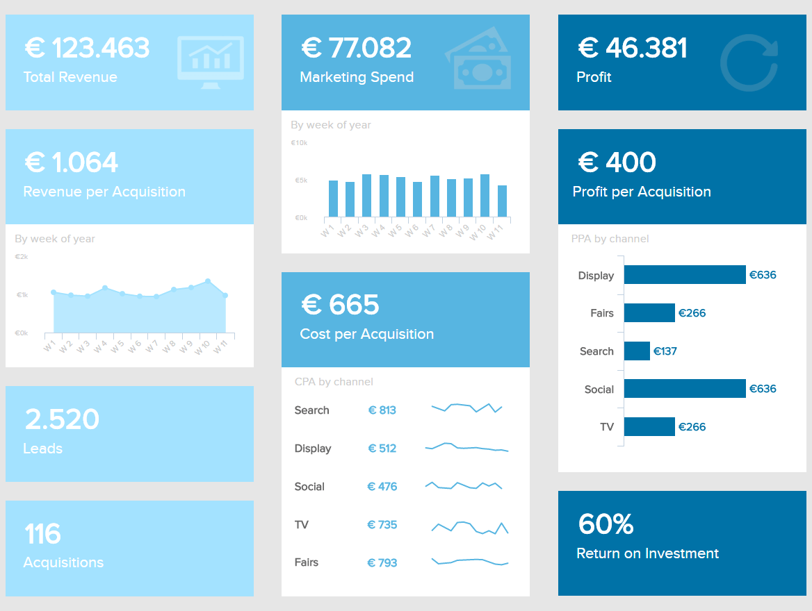
The design is consistent with several shades of blue that do not clash with each other, while the graphs and figures displayed are not cluttered and follow a clear visual order so every marketing KPI is comprehensible. The message of it is understood at a glance and the alignment and white space give a rest to the eyes, which are not struggling to get to the point.
Next, let’s move onto one of our best business intelligence dashboard examples relating to one of any business’s most important activities — sales. Without this function, a company would not be able to move forward and increase profits. By utilizing online dashboard tools, the department can successfully monitor and outperform each sales target and goal.
2. SALES BI COCKPIT
One of the best business intelligence dashboards for profitability, our sales dashboard below is focused on helping you hit sales targets and foster growth on a consistent basis, boosting your KPI monitoring processes and, ultimately, bottom line. Concentrating on high-level metrics, this example will enable you to cultivate a data-driven environment, crucial in generating more revenue and, ultimately, increasing profits.
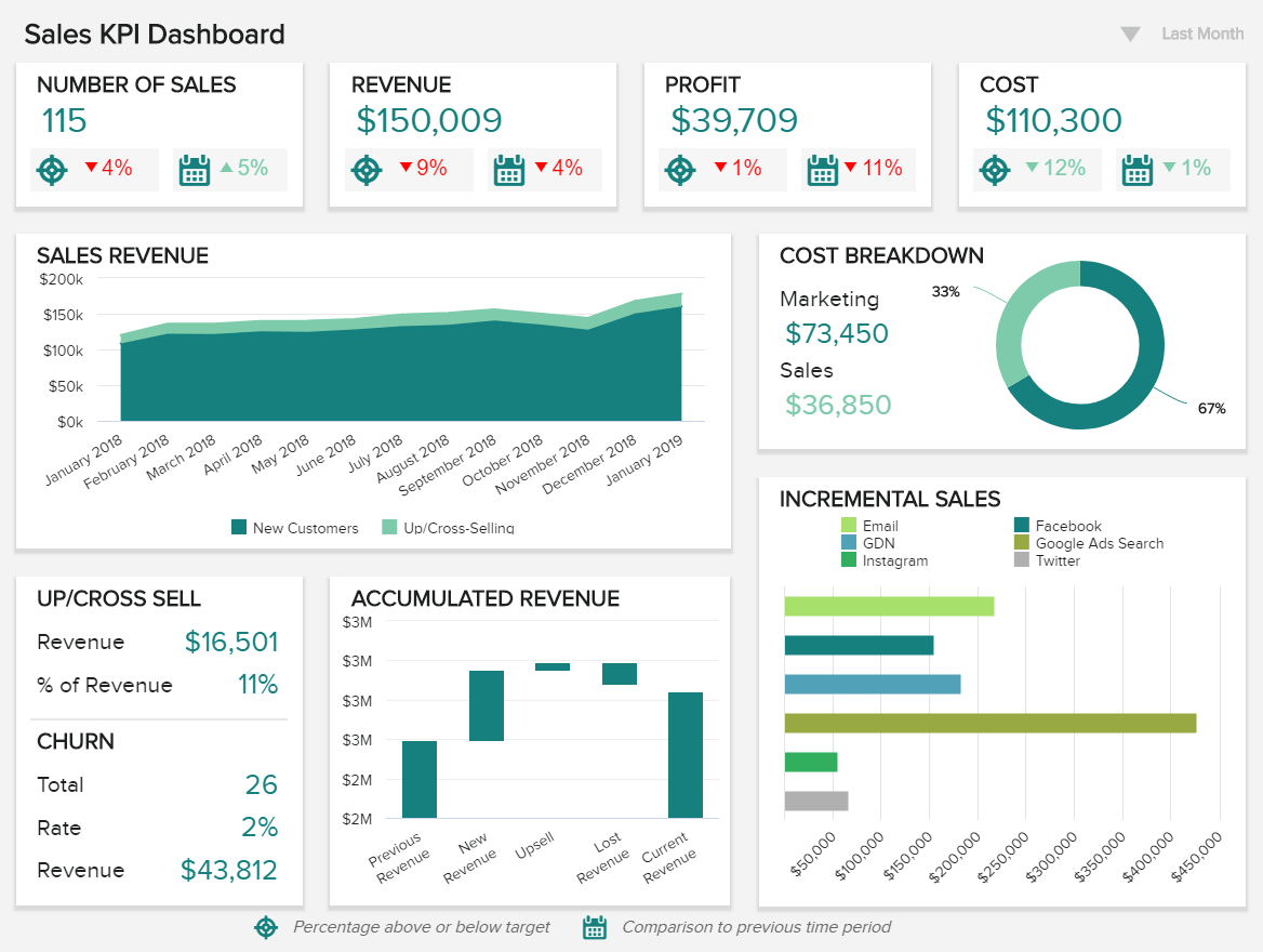
By offering clear, logical visualizations of your company’s most critical sales data, it’s possible to extract valuable findings at a glance while performing analysis that will help you strengthen inefficiencies while capitalizing on your strengths.
Working with dynamic sales KPIs including sales growth, sales target, acquisition cost, CLV (customer lifetime value), and ARPU (average revenue per unit), this sales report offers all of the functionalities to make your company more economically efficient, and as a result, more valuable.
3. Financial BI dashboard
One of the best BI dashboard examples for those that need a general financial overview of a company or department, our financial KPI example serves up a wealth of metrics based on improving processes and eliminating processing inefficiencies.
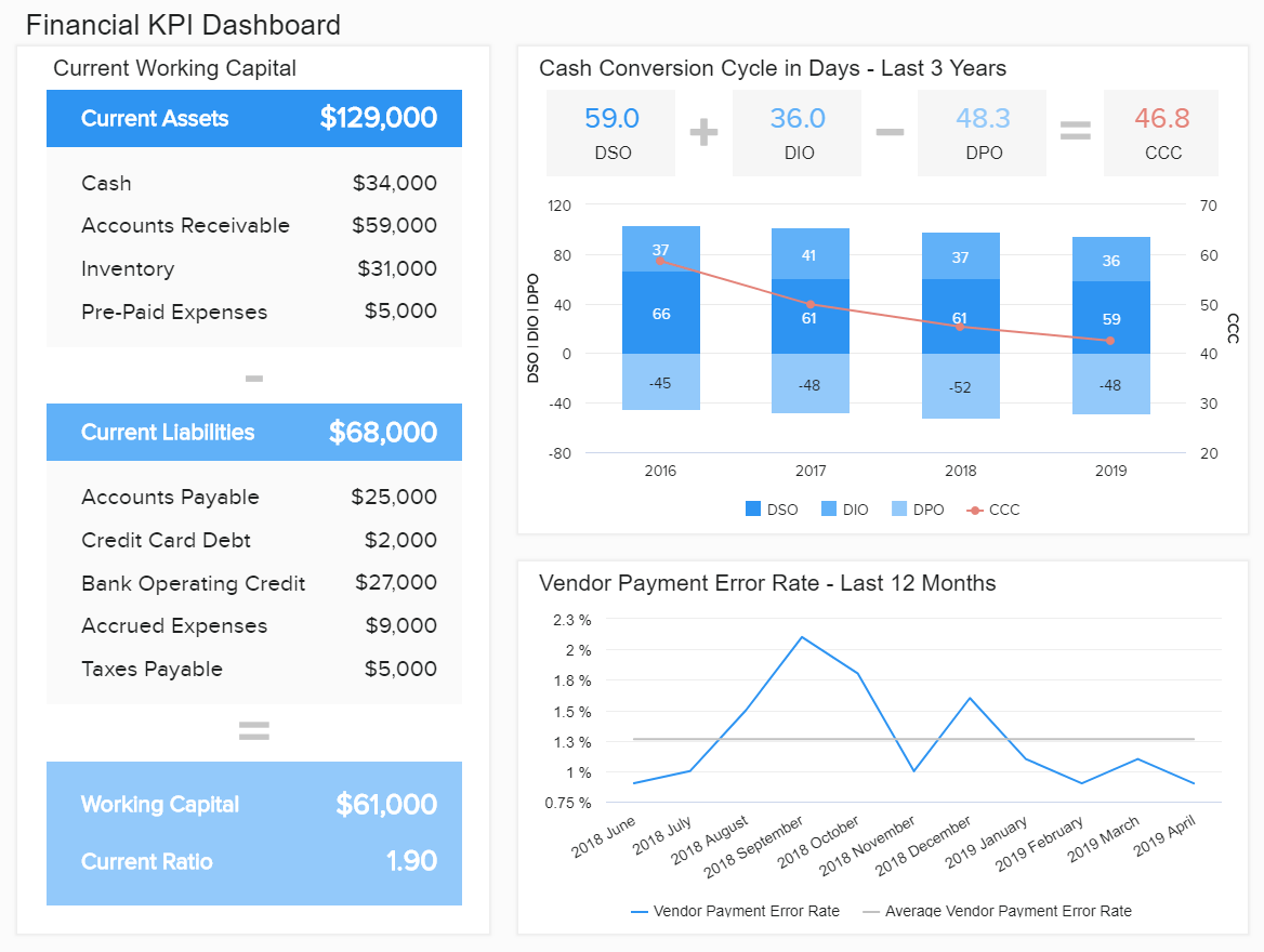
This financial dashboard sample breaks down a number of financial processes into digestible segments. As a result, you can gain a deep working insight into your working capital, cash conversion cycle, and vendor payment error rate. This mix of invaluable insights offers all of the key ingredients for developing seamless processes that help to save on unnecessary costs while significantly boosting productivity.
4. Management dashboard
High-level managers such as CEOs need to monitor metrics and KPIs from different departments and areas of the business. Our next example aims to assist on that task by summarizing complex data into an intuitive format that is easy to navigate at a glance. The metrics portrayed here enable managers to turn data into actionable insights and to ensure that everything is running smoothly.
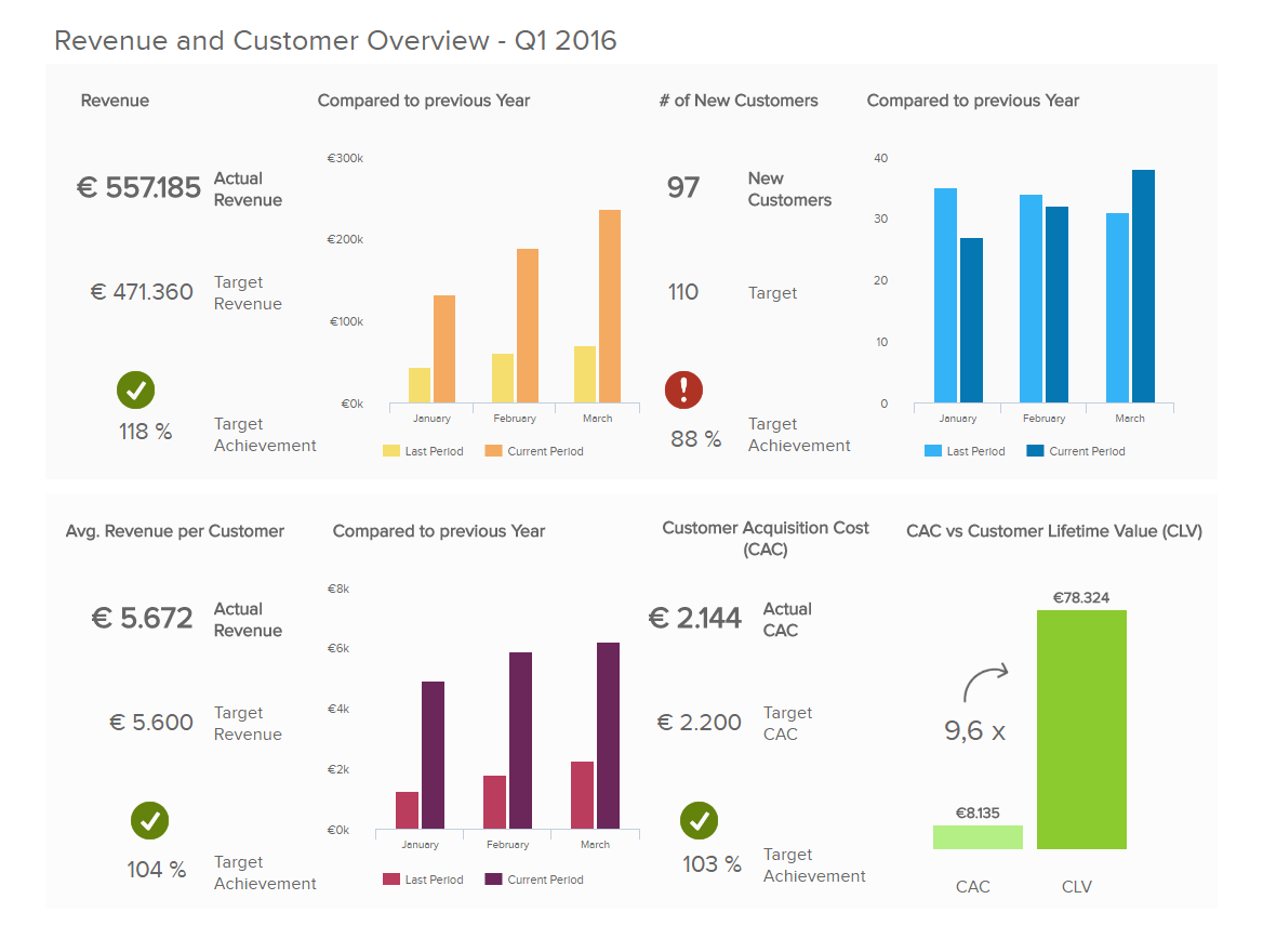
With real-time management KPIs such as the revenue per customer, customer acquisition costs, customer lifetime value, and the number of new customers, CEOs can quickly understand how strategies are developing. In this case, each metric is displayed with its actual value as well as a target value and target achievement percentage which lets you see at a glance if goals are being met or if something needs to be improved. For instance, here we can see that the target for new customers was not achieved this month. This insight is clearly displayed with a red exclamation point and it means that it needs to be investigated on a deeper level to see if anything needs to be optimized.
5. Customer Service Team dashboard
Just like sales, finances, or marketing, customer service is critical for business success. After all, having a bad image when it comes to helping customers solve their issues can significantly damage the reputation of the company and, consequently, affect sales and revenue. For this reason, tracking the performance of the service team to ensure that every critical process is running smoothly and that your organization is providing the best customer support that it can.
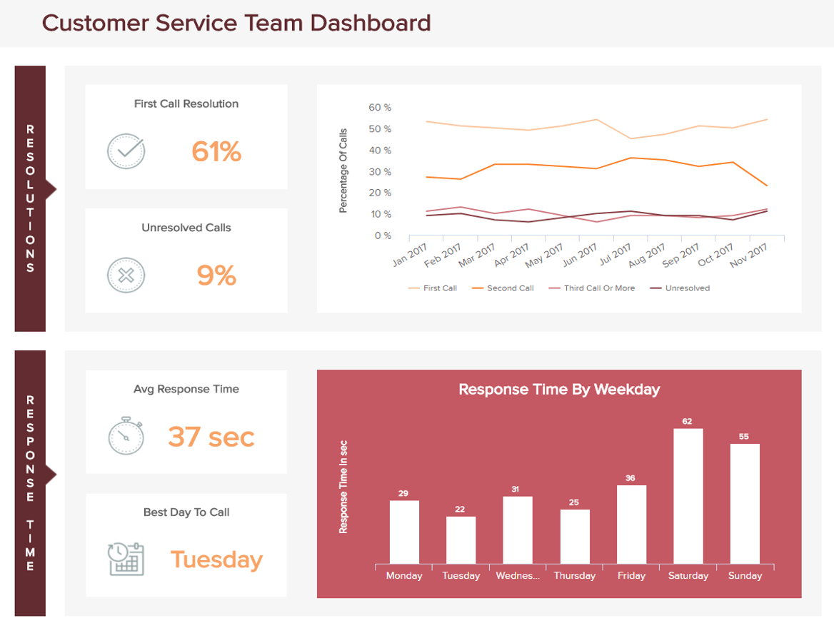
The example above is tracking the performance of the service team in two main areas: call resolutions and response time. These customer service KPIs allow you to extract relevant conclusions to plan and optimize your strategies. For instance, by looking at the response time by weekday, you can see that the days where it takes agents longer to respond are during Saturday and Sunday. This can mean that there are more tickets on those days and that agents are busier. To solve that issue, you can make sure more agents are available on those days so that the average response time doesn’t go up that much.
6. Logistics Warehouse dashboard
Probably more than any other industry, logistics can highly benefit from BI and analytics. Logistics companies gather data coming from several sources such as shipments, contact details, returns, picking and packing, and much more. All this inflow of information is hiding valuable insights that can help the company improve its profitability and operational efficiency. Let’s see it with an example of warehouse management.
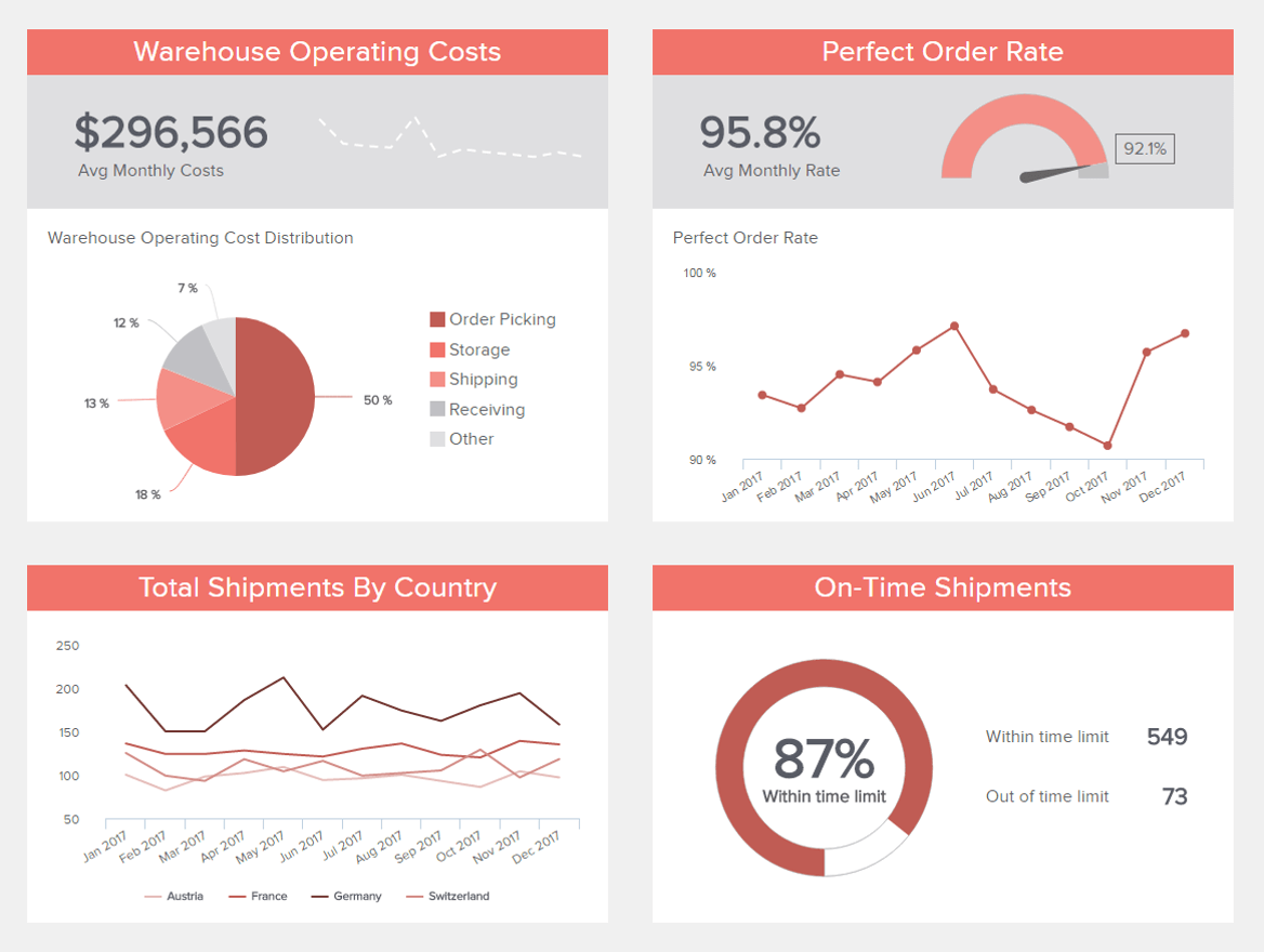
The logistics dashboard above includes relevant metrics related to warehouse operations. By getting a general overview of all these KPIs, warehouse managers can constantly monitor their performance and ensure everything is running smoothly. And not just that, by taking a deeper look into these indicators you can draw deeper conclusions to improve your operations. For example, by looking at the cost distribution you can understand if an area of the warehouse is spending more than it’s supposed to and adjust it so it won’t affect the financial health of your warehouse.
7. Manufacturing Production cockpit
Just like our logistics example, a manufacturing factory can also benefit highly from an interactive business intelligence dashboard. When dealing with production and machinery, unexpected issues are highly likely to appear. Putting in place analytical practices to stay ahead of these issues and tackle them before they become bigger can significantly increase operational efficiency. Additionally, extracting the maximum potential out of your manufacturing data can help you spot trends and patterns to optimize several production processes.
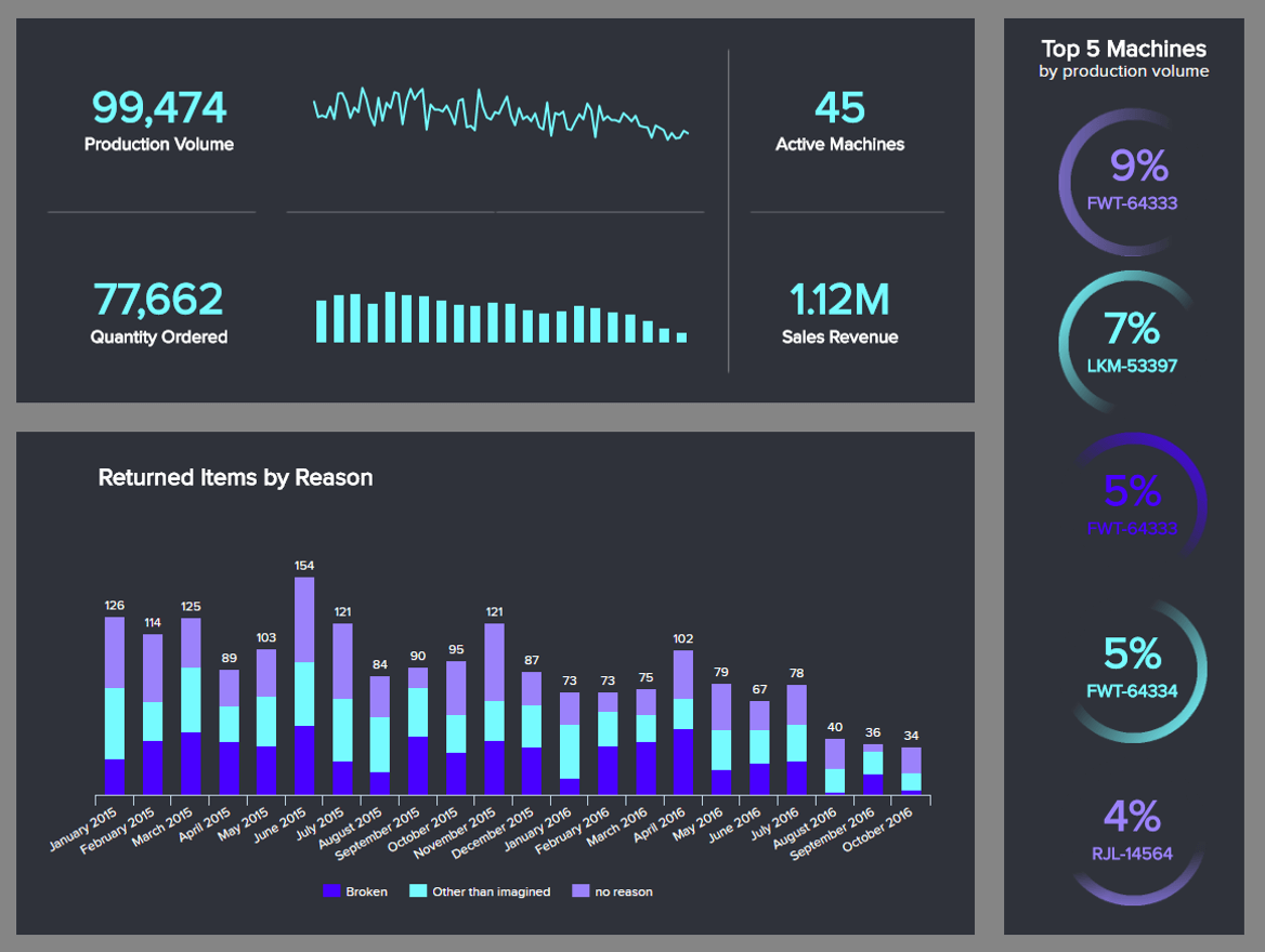
Armed with powerful production metrics, this report will not only help you spot issues but also to manage your daily operations efficiently. For example, on the right side, we get insights into the top 5 machines by production volume. This allows you to plan production by counting on the machines that are better for the job. Complementing this information are some other manufacturing metrics such as the production volume and the quantity ordered. Again, this is useful to track as it lets you plan some critical elements in advance, for example, calculating how many active machines you need to cover production.
8. Employee Performance dashboard
Next, in our list of BI dashboard examples, we have a human resources example tracking employee performance. The HR department uses data to ensure employees are working at their best to reach their maximum potential. In order to do this, they also need to ensure a great work environment, training opportunities when needed, and other measures that will enhance productivity. Let’s see it in more detail.
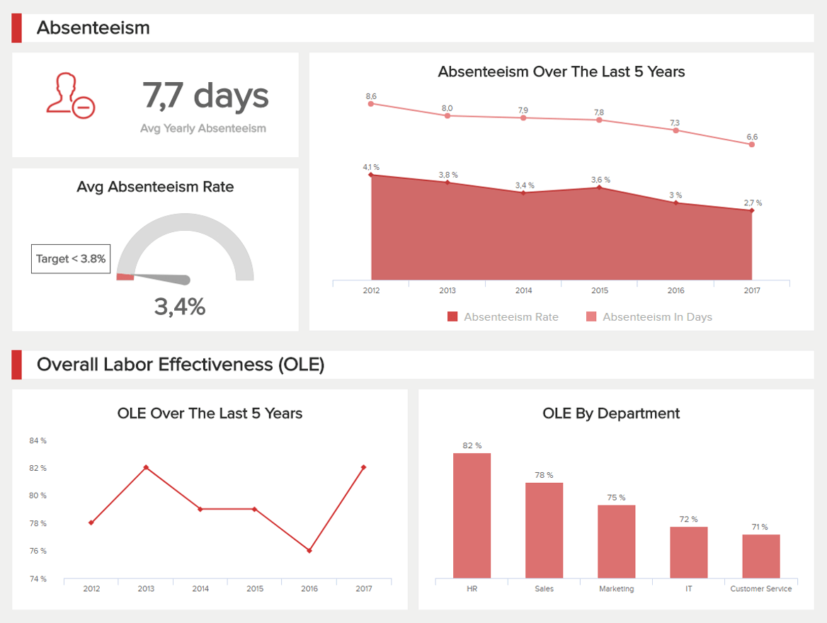
Just like some other examples on this list, this dashboard is divided into two main sections. The top one is tracking metrics related to absenteeism. These are important HR metrics to track as they illustrate the worker’s motivation and engagement in their work. In some cases, when a worker is calling in sick more than he or she should be, it can mean they are not motivated and you need to dig deeper into the reasons.
Next, we have the bottom portion, which tracks the overall labor effectiveness (OLE). This metric tracks the productivity of your employees based on pre-defined criteria. Traditionally, productivity was measured by dividing the total sales by the number of employees. However, modern businesses today use different approaches to measure productivity, one of them being using tailored methods depending on the department and function.
9. IT Cybersecurity dashboard
As we mentioned earlier in the post, cybersecurity is amongst today’s most important yet challenging topics for businesses. With cyberattacks becoming increasingly more common and complex, organizations of all sizes must implement measures to protect their systems and data from any suspicious activity. Our next template aims to do just that by providing the IT team with an overview of all their cyber security activities. So, let’s dive into it.
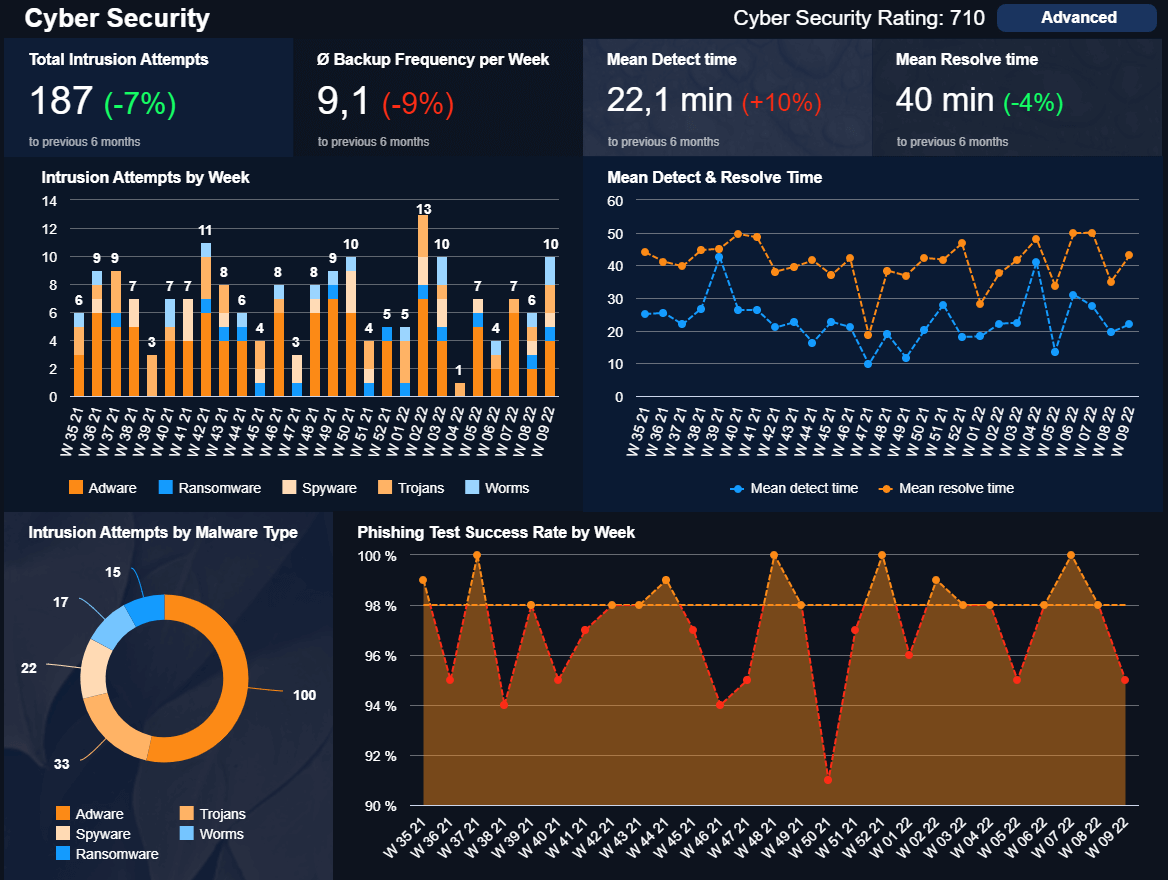
The IT dashboard goes into detail about four KPIs that are compared to the previous 6 months: the total intrusion attempts, which are broken down by week and type of attack, the backup frequency, and the mean time to detect and resolve, which are also broken down by week. This data enables the IT department to understand which are the most common types of threats as well as how prepared they are to respond to them. For instance, we can see that Adware is the biggest issue compared to others. So, it is a good place to start working on.
The template also includes a phishing test success rate which shows how successful your employees were at ignoring phishing threats via email. Doing regular tests like this helps in identifying weak spots and implementing training to prevent employees from falling into these frauds.
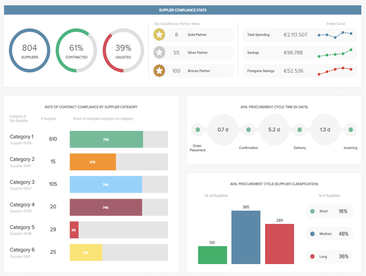
10. Procurement KPI dashboard
Procurement is another department that can highly benefit from professional BI dashboards. Our template below provides a 360-view of all relevant aspects regarding supplier performance and overall spending and compliance. With these insights in hand, the procurement manager can ensure all supplier relationships and contracts run smoothly.
At the top of the example, we get a summary of supplier stats that include the total number of suppliers as well as the percentage that are contracted and unlisted. Some of the contracted suppliers can then be classified as gold, silver, and bronze, depending on their value to the company. Gold ones, for example, offer interesting discounts and good terms of agreement. Paired to that, we get a 5-year costs break down where we can observe the department saved €96,000.
The lower portion of the procurement dashboard provides a breakdown of suppliers by category as well as the average procurement cycle time. Monitoring your cycle time and dividing suppliers by short, medium, and long can help you choose which suppliers you want to contact based on the time you have to complete the project.
11. FMCG KPI dashboard
More than any other industry that works with a supply chain, FMCG is the most complicated one. Successfully managing products that only last a short period is a hard task; measuring it using real-time KPIs can make a significant difference. Our next example provides a complete summary of short-term indicators regarding inventory, freshness of products, and time to sell, among others.
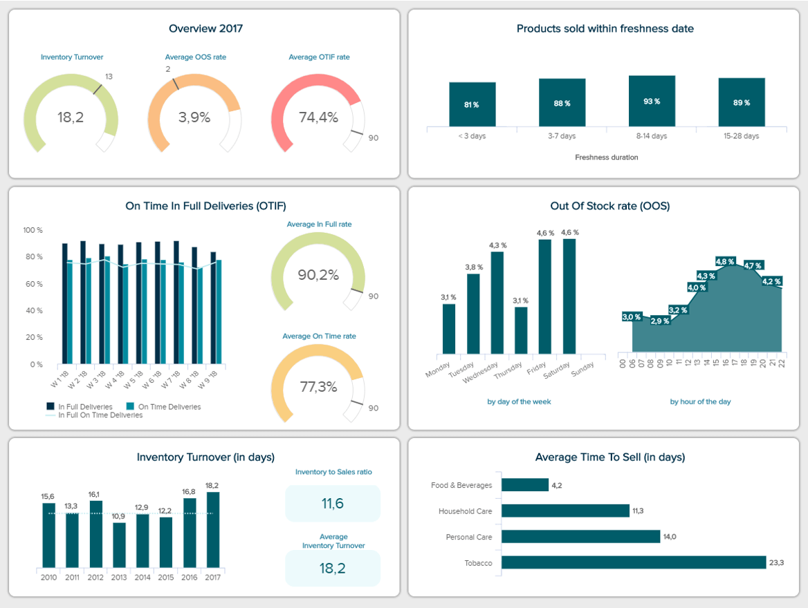
Let’s look at some valuable insights that FMCG companies can extract from this template. For instance, the products sold within freshness date is an invaluable KPI that helps you assess inventory management. Comparing this rate with the inventory turnover can help you calculate your inventory levels and ensure no products go to waste. Likewise, the average time to sell by product category can provide additional details regarding inventory amounts.
12. Content Quality Control dashboard
Rather you are a digital agency or a business that produces its content in-house, tracking the entire content production process using a modern business intelligence dashboard template can prove invaluable. Our content quality control example below can help you identify the topics that your audience enjoys the most as well as other improvement opportunities to boost your content strategies.
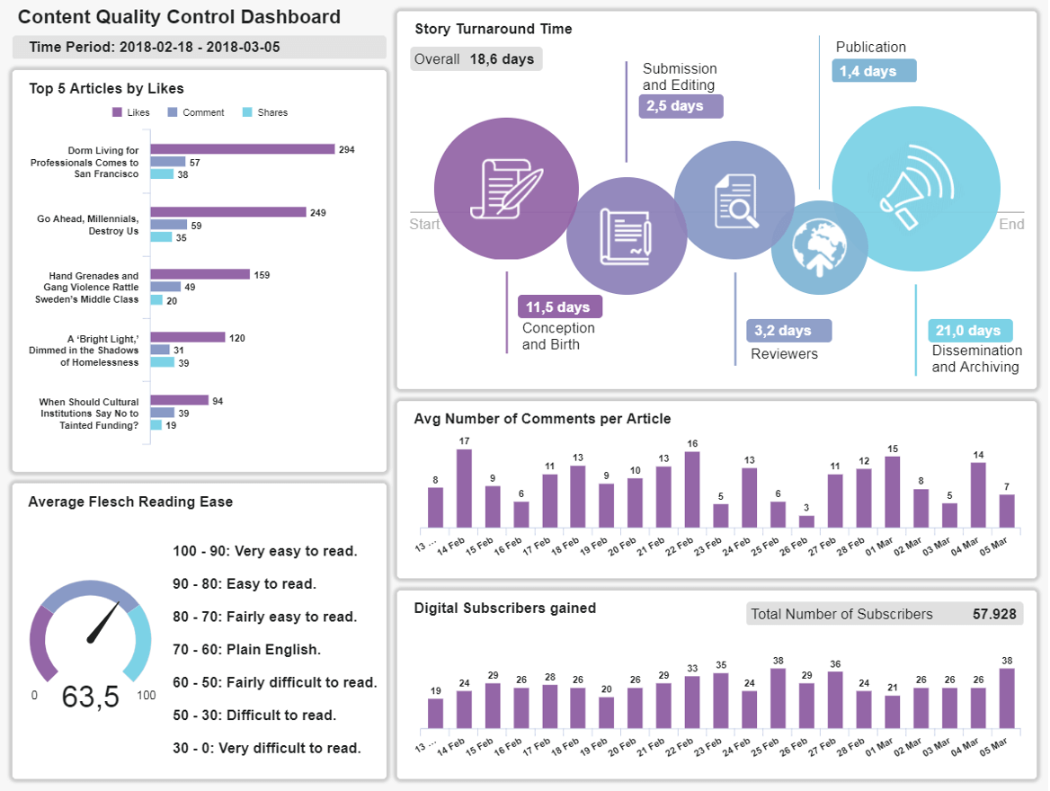
With insights into the top 5 articles by likes, the story turnaround time, the average number of comments per article, and other KPIs, content managers are able to get a 360-view of their performance to ensure the department is spending its resources in producing interesting stories that will engage the audience. An additionally valuable metric in this template is the Flesch Reading Ease. This serves as a type of “ranking” to evaluate how comprehensible your stories are. Of course, you want to ensure your texts are as understandable as possible. Therefore, tracking this indicator is a good method.
5) Conclusion & Guidance
Business intelligence and dashboards are extremely cost-effective by minimizing the potential for human error and streamlining the decision-making processes dependent on data interpretation. To help you on your way, you might want to consider datapine as your BI provider. Established in Germany with a long tradition of highest security layers in the world, datapine is continuously disrupting the EU and markets across the world, no matter if you need us for your management or data science efforts.
Freeing teams from IT bottlenecks, our BI solutions require no SQL knowledge and can be used by any business department. Built around an easy-to-use drag-and-drop interface, users can simply select the report elements they require and then leave the complex equations to our tool. Our software has been developed and refined with the help of companies from around the globe. Its function is based on real-life needs and wants, which means it understands the complex and myriad requirements of business function from the operational to the strategic, managerial to marketing, and offers support accordingly. It’s this real-world application that gives rise to datapine’s signature ease of use – from innovative data visualizations through to advanced data analysis tasks that were once complex are now as easy and pointing and clicking a mouse.
Finally, all common data sources can be integrated with a few clicks and with no software to download, any employee, in any location can begin to utilize dynamic real-time dashboards, automated reporting and visualization instantly, including mobile, on-the-go solutions. With no prior training required, the barriers to wielding business analysis tools – requirements such as formal IT training and previous BI experience – disappear.
With personal access, a cloud-based structure that guarantees 24/7 access from any location and enterprise-level security layers, see what datapine’s software can do for your business with a free 14-day trial!
Start your free trial and take advantage of modern dashboarding software today!