Utilize The Effectiveness Of Professional Executive Dashboards & Reports
Table of Contents
1) What Is An Executive Dashboard?
2) Top Executive Dashboard Examples
3) Executive Reporting Benefits
In the digital age, brands, businesses, and organizations have a wealth of knowledge at their fingertips: a level of insight that, if harnessed the right way, has the power to offer a real competitive edge while sparking innovation, inspiration, and creating an ever-evolving, well-oiled commercial machine. Business executive dashboards and reporting make this level of competitive advantage possible and provide business-boosting benefits across the board. But how so?
We are indeed living in a time rich in invaluable digital data. By gaining the ability to gather, organize, and analyze the metrics that are most important to your organization, you stand to make your empire more intelligent than ever before – and executive reporting and business dashboards will help you do just that.
Moreover, such dashboards will create a data-driven environment where you and your team can utilize a modern dashboard creator, automation, and intelligent solutions to increase productivity and save countless dollars.
To put the importance, functionality, and organizational benefits of data analysis into perspective, here, we’re going to explore the value of executive dashboard templates, offering an insight into what they are, why they work, and look at real-life executive report examples created with a modern online reporting tool.
But first, let’s walk through a practical definition.
What Is An Executive Dashboard?
An executive dashboard is a reporting tool used by C-level professionals to track critical data to efficiently manage business operations. Armed with powerful visualizations, decision-makers can analyze data and make smart strategic decisions to reduce risks and ensure growth.
Modern executive reporting consolidates key metrics while outlining problems and solutions in which KPI dashboards are used to provide additional insights and serve as an added visual representation that is usually lacking in executive reports and summaries.
The accessible visual nature of executive reporting means that it’s easy to make sense of specific data sets, spot ongoing trends, and take a number of decisive actions that ultimately benefit the business, often in real time. Primary areas are enhanced, aiming to identify weaknesses and strengths, improve internal processes, boost staff engagement, improve service, raise productivity, and make the organization more profitable.
Dashboard solutions connect relevant sources of information with the internal systems currently used within the company – platforms such as accounting software, your customer relationship management (CRM) program, email networks, and in-built website analytics, among others.
Through those connections, your reports pull all of this information into a single location, empowering you to view your organization’s most important insights without logging into multiple platforms or systems. Moreover, executive reporting and dashboards also allow you to set targets, work with specific data points, and tailor them to best suit the company's needs, aims, goals, and mission.
The point is that the information transmitted to the brain is better perceived when visually appealing; in fact, 65% of the population are visual learners. And, given that people following directions with illustrations do so 323% more efficiently than those who follow text-only directions, agile data dashboards are a powerful tool in today’s competitive commercial landscape.
Explore our professional dashboarding software 14 days for free!
Explore 25 Great Executive Dashboard Examples
Undoubtedly, executive dashboards are powerful tools that can streamline every area of your organization. If you follow best practices and work with the right tools, these reports will accelerate your company's growth significantly.
To demonstrate this, we will look at a range of examples that focus on business areas related to the roles of CMO, CFO, CTO, and COO, as well as industries including SaaS, retail, and manufacturing.
These 25 visual report examples will demonstrate the function and value of a professional dashboard designer in a real-world business context.
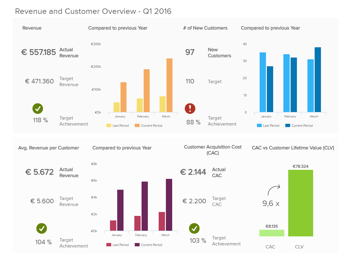
1. Management KPI Dashboard
The management KPI dashboard hones in on revenue on a consumer-based level while offering insights on the cost of new customer acquisition.
**click to enlarge**
By offering a mix of actual revenue metrics based on specific frames in addition to comprehensive information concerning revenue development, this management report is an invaluable way to spot real-time trends, make significant economic enhancements, and set tangible sales targets.
Moreover, the detailed customer-centric information served by this dynamic management dashboard will give you a better understanding of promotional activities, including cross-selling, upselling, or the overall value of your service individually. When driving down acquisition costs, developing your service, and boosting your profitability, these metrics are essentially gold dust.
Primary insights:
- Sales Target
- Customer Lifetime Value
- Customer Acquisition Costs
2. Executive Financial Dashboard for CFOs
The CFO has a demanding task to ensure a company's financial situation is progressing and has positive results. Focused on the strategic initiatives of the financial department, critical for ensuring the company has insights into the most important high-level financial charts and metrics, such an executive dashboard template provides many opportunities to dig deeper into the data and generate actionable insights. Let's take a closer look at an example.
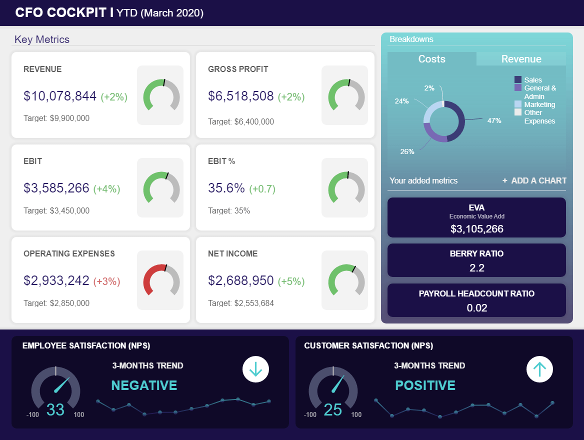
**click to enlarge**
This executive KPI dashboard hones in on the four most relevant performance areas that Chief Financial Officers find helpful in their strategic monitoring: costs, sales goals, gross profit, and satisfaction levels of customers and employees. The latter are not financial metrics per se, but they are included since CFOs need to know how the customers and the team are performing - if the satisfaction levels are decreasing, they will affect the finances as well. That's why C-level management needs to monitor these indicators to ensure that every person who is critical to keeping the company's financial health is satisfied and reacts immediately.
The focal metrics on the left side of this CFO dashboard depict the financial development within the first quarter of the year. You can immediately spot that operating expenses don't perform quite well compared to other executive reporting dashboard metrics such as net income or revenue. In this case, it makes sense to identify what caused this expense increment and adjust your strategies accordingly.
Primary insights:
- Berry Ratio
- Economic Value Added (EVA)
- Employee and customer satisfaction
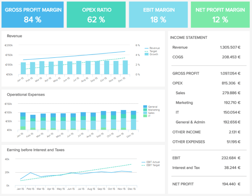
3. Financial Overview Dashboard
Another report example that focuses on the financial activity at a top level offers a panoramic snapshot of gross profit margin, operating expenses (OPEX) ratio, earnings before interest and taxes (EBIT), and net profit margin, as well as a host of additional relevant insights.
**click to enlarge**
These financial KPIs are often determined from the income statement and provide not only a viable means of streamlining your organization’s financial processes but also present opportunities to improve the overall financial structure of your organization’s financially driven operations.
By creating such a financial dashboard, you will not only have the possibility to automate many calculations but also focus on what the data tells you and provide opportunities to react quickly and on point.
Primary insights:
- Net Profit Margin Percentage
- Operating Expenses Ratio
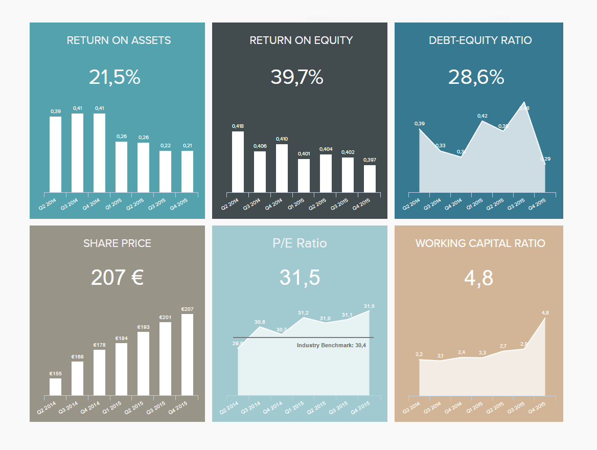
4. Investor Relations Dashboard
The investor relations dashboard is pivotal in quantifying your business’s operational data while calculating and communicating top-level metrics based on the company’s overall situation. This level of insight is key in keeping track of the major investors that could make or break your success.
**click to enlarge**
In addition to a host of invaluable equity and assets-centric information, this dashboard example also gives insight into your company’s share price, the first line of call in finance, and a near-absolute indication of your company's success.
Primary insights:
- Return on Assets
- P/E Ratio
- Return on Equity
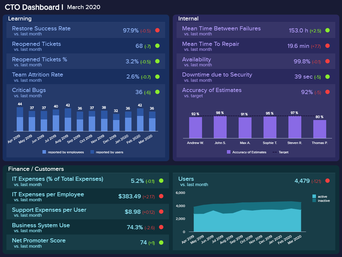
5. CTO Dashboard
As modern problems require modern solutions, CTOs have the responsibility to provide solutions and look after the relevant data and growth in technology and IT. By developing an executive reporting dashboard that helps manage and consolidate data from multiple touchpoints, managers from the IT department or company can have a bird's eye overview of the most important IT strategies and immediately act upon issues.
**click to enlarge**
In information technology, it's critical to have access to the most up-to-date and important data that will enable CTOs to make the best possible decisions and improve departmental performance. A solution, such as the CTO dashboard above, will serve as a single point of truth for the most critical IT data and strategic development.
The dashboard above focuses on three main sections: learning, internal, and finance/customers. Each section has its distinctive performance insights and underlines relevant metrics. In the learning part of this IT dashboard, the focus is on the restore success rate, reopened tickets, and team attrition rate. Critical bugs will tell you how well the team learns from mistakes and whether they need more support. In this case, you can see that almost all areas are marked green, except for one, which ultimately means that the teams' performance is quite good.
In the next part of the dashboard, which focuses on finance and customers, CTOs have the possibility to take a closer look at expenses, users, and the net promoter score. These metrics will help leaders connect additional information outside of the specific IT indicators in order to paint a more holistic and profitable picture. In other words, if users and customers are unsatisfied and costs keep piling up, it might make sense to investigate further because the IT department could experience additional issues. To learn more about how you can improve customer support processes and connect to other critical departments within an organization, we suggest you visit our Zendesk dashboard page.
Primary insights:
- Number of Critical Bugs
- Reopened Tickets
- Accuracy of Estimates
- Net Promoter Score
6. SaaS Management Dashboard
Our next example is dedicated to software as a service (SaaS). Covering all of the key aspects of top-level SaaS management, this most dynamic of templates offers a comprehensive birds-eye view of your entire operation.
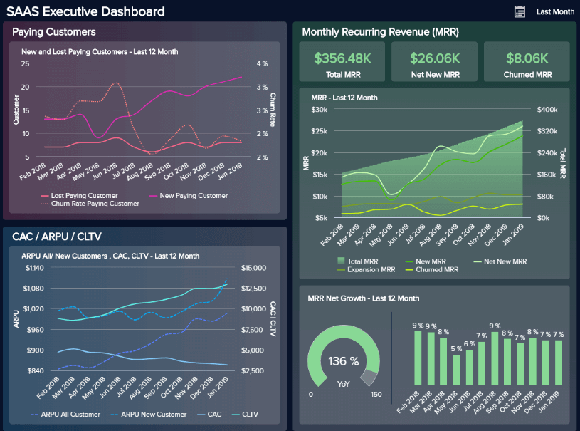
**click to enlarge**
Each KPI within this interactive reporting tool works cohesively to deliver a balanced mix of visual information that drills down into customers, recurring revenue, and costs.
With critical metrics including MRR, APRU, customer lifetime value, and customer acquisition costs, our SaaS reporting dashboard will not only help you improve the efficiency of your software as a service offering, but you’ll also be able to meet the ever-evolving needs of your customers on a sustainable basis. A powerful BI tool for any ambitious modern tech organization.
Primary insights:
- Customer Acquisition Costs
- Customer Lifetime Value
- ARPU
- MRR
7. CMO Dashboard
Amongst the best dashboard examples for senior-level decision-makers, our CMO marketing dashboard offers access to a wealth of invaluable information at a quick glance.
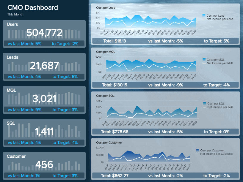
**click to enlarge**
Serving up five effective data points in a logical, digestible format, including numeric representations and line charts, this most inspirational of executive dashboard examples offers a wealth of insight in an easy-to-access, centralized space.
As an essential and all-encompassing field, digital marketing is integral to the growth and evolution of any modern organization, regardless of industry. Here, you can drill down into every vital aspect of your marketing performance while spotting integral trends both historically and in real time. By gaining access to such invaluable data, you can improve your responsiveness while formulating improved marketing reports and strategies that will expand your audience while boosting your return on investment (ROI).
Primary insights:
- Sales Target & Growth
- Website-Traffic-to-Lead Ratio
- Cost per Lead
- Lead-to-MQL Ratio
- MQL-to-SQL Ratio
8. COO KPI Scorecard
The scorecard format is a highly intuitive and reliable way to display data, especially for busy leaders juggling multiple priorities at any given time. Similar to dashboards for the CMO and CTO, this KPI scorecard focuses on areas relevant to the Chief Operating Officer (COO).
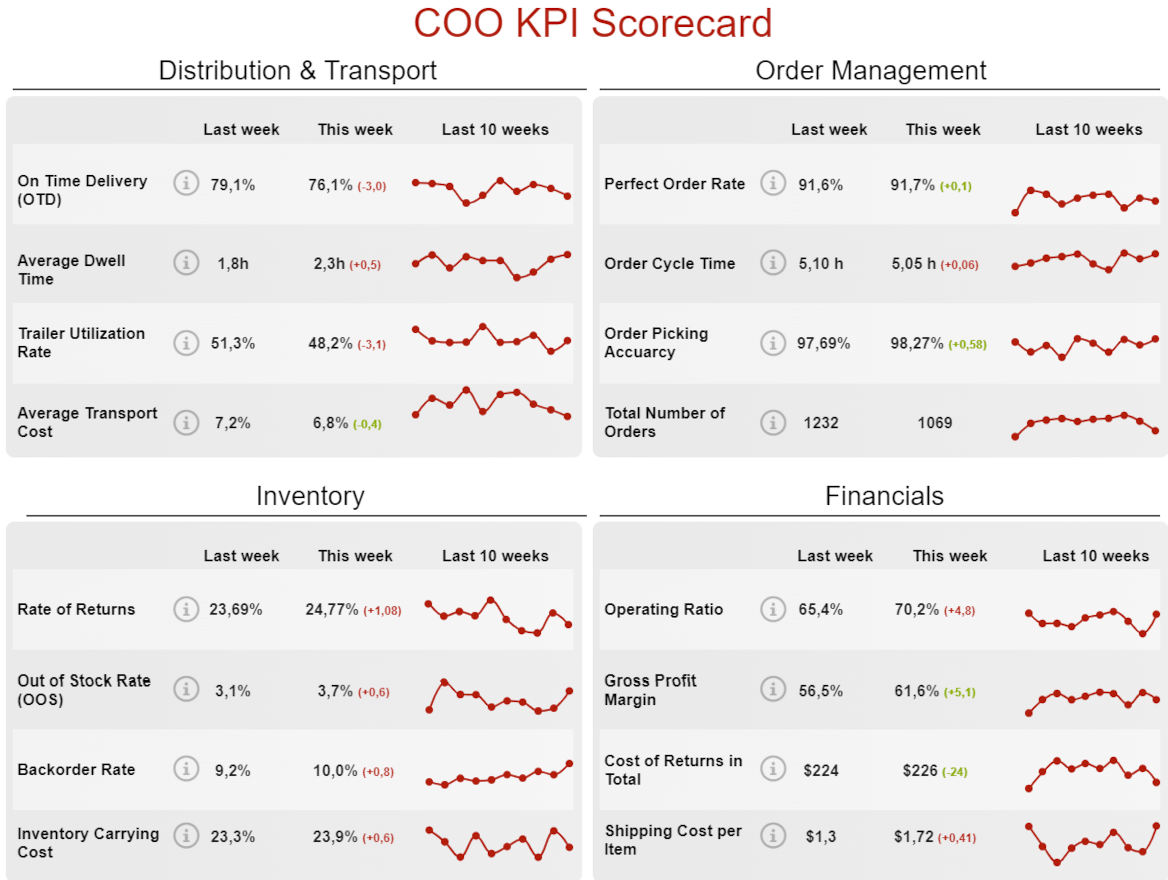
**click to enlarge**
In this example, we have four key areas of insight that impact operations daily: distribution & transport, order management, inventory, and financials. Each area displays values every week, along with comparisons to the previous week and trends over the last 10 weeks.
Starting at the top, we see metrics related to transportation and distribution, including delivery times, trailer utilization rates, and related costs. Based on the data in the example, we can see a slight cost improvement and an overall descending trend over the past 10 weeks. However, we can also see this same downward trend for on-time deliveries, a potential red flag that the COO should look into. Similar scenarios apply to the other areas of insight, offering a glimpse of the current week, previous week, and last 10 weeks for apples-to-apples comparisons.
The scorecard format allows for quick insights that COOs can use as jumping-off points for further investigation. With this data at a glance, users can drill down into individual areas and metrics for more information, allowing them to have informed conversations with the right stakeholders.
Primary insights:
- Gross Profit Margin
- Perfect Order Rate
- On-Time Delivery
- Out of Stock Rate
9. CEO Dashboard
CEOs make no shortage of major strategic decisions to protect the organization’s best interest and ensure a constant pattern of growth and productivity. To do their jobs effectively, they need robust knowledge and insight into how every department performs. Our CEO dashboard is designed to provide these insights using a classic scorecard format into the performance of every single department to inform their decisions.
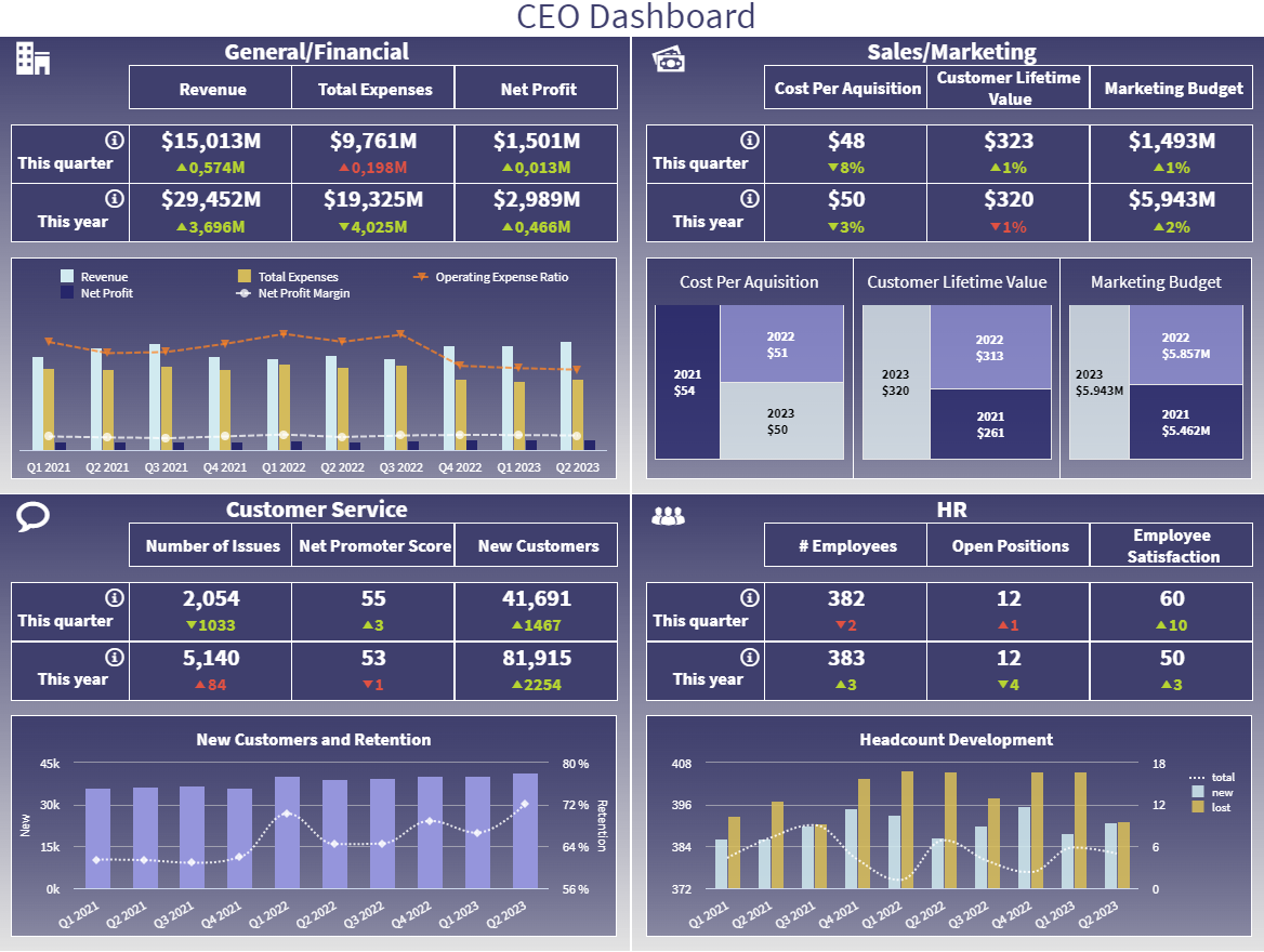
**click to enlarge**
The executive report example above has a scorecard format that provides a 360-view of four critical areas: finance, sales and marketing, customer service, and HR. Using these insights, the CEO can identify opportunities for improvement and spot potential problems before they can impact the organization’s ability to meet key goals.
Starting with the finance set of metrics, we can see critical figures like revenue and expenses, operating expense ratio, net profit, and net profit margin. Each of these indicators is displayed alongside the previous period’s performance. In the above example, we see the financial area is positive, with most data showing improvement on a quarterly and yearly basis.
Other areas of operations also display quarterly and yearly progress reports. CEOs can gain a detailed overview of cost per acquisition, customer lifetime value, marketing budgets, number of customer issues, number of employees, and other details. Each indicator feeds into each other, allowing CEOs to connect the dots to understand their performance quickly. For example, a rising trend in customer issues and many open positions could indicate a staffing shortage where there aren’t enough employees to handle customer queries.
Primary insights:
- Net Profit
- Customer Lifetime Value
- New Customers
- Open Positions
10. Sales KPI Dashboard
Next up in our executive summary dashboard examples is our sales KPI report. Naturally, sales are essential to almost every organization, regardless of sector, which means working with the right sales KPIs is vital to your ongoing growth and success.
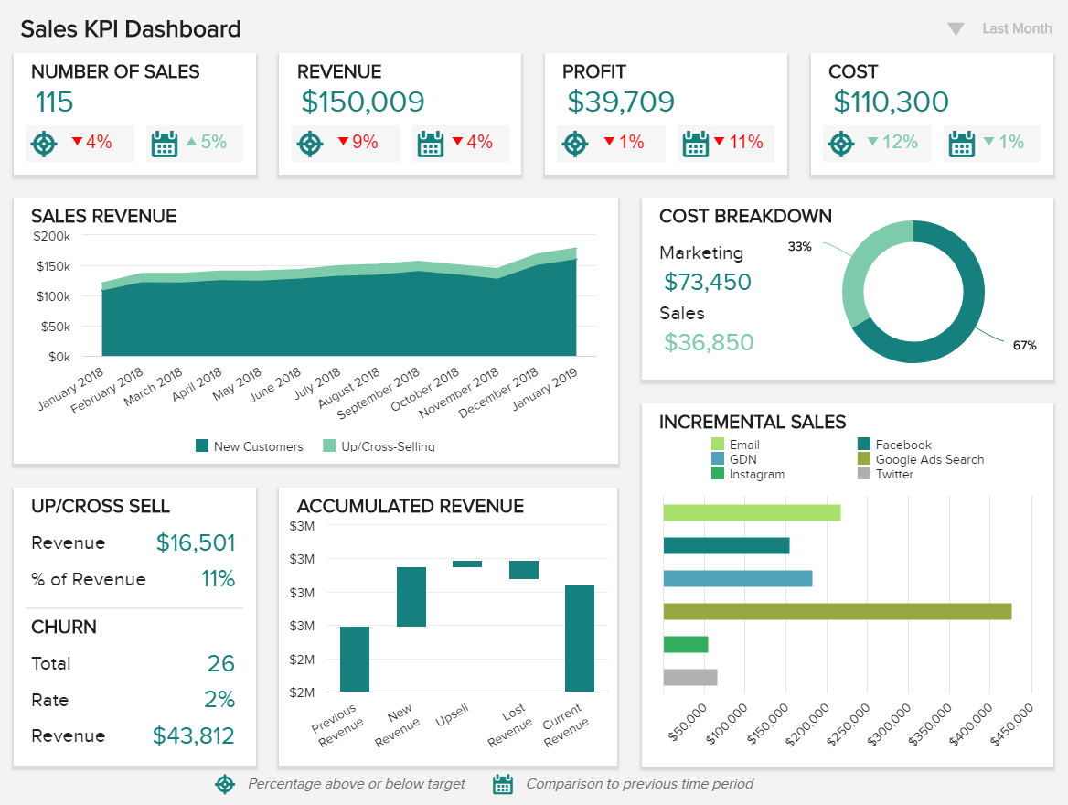
**click to enlarge**
Offering a comprehensive panorama of the practical information required to make sales activities perform optimally, this is amongst our most comprehensive executive summary dashboard examples. The range of sales graphs and charts included within this report provides a wealth of information that will vastly improve the internal efficiency of your sales department while helping to reduce costs, improve output, and, ultimately, boost your organization's bottom line.
This reporting tool empowers sales managers and directors to compare a range of metrics and identify where and how to make strategic adjustments that optimize the end results. Keeping your sales initiatives on the right track will contribute to your organization’s success year after year - and this is the very tool for the job.
Primary insights:
- Revenue per Sales Rep
- Customer Churn Rate
- Upsell & Cross-Sell Rates
- Profit Margin per Sales Rep
- Incremental Sales by Campaign
11. Executive Manufacturing Dashboard
Another effective executive management dashboard that serves as a template for high-level managers brings vital strategic indicators into a single access point. Designed as a KPI scorecard, this dashboard will ensure that manufacturing decision-makers have a clear overview of the effectiveness, quality, production, and costs.
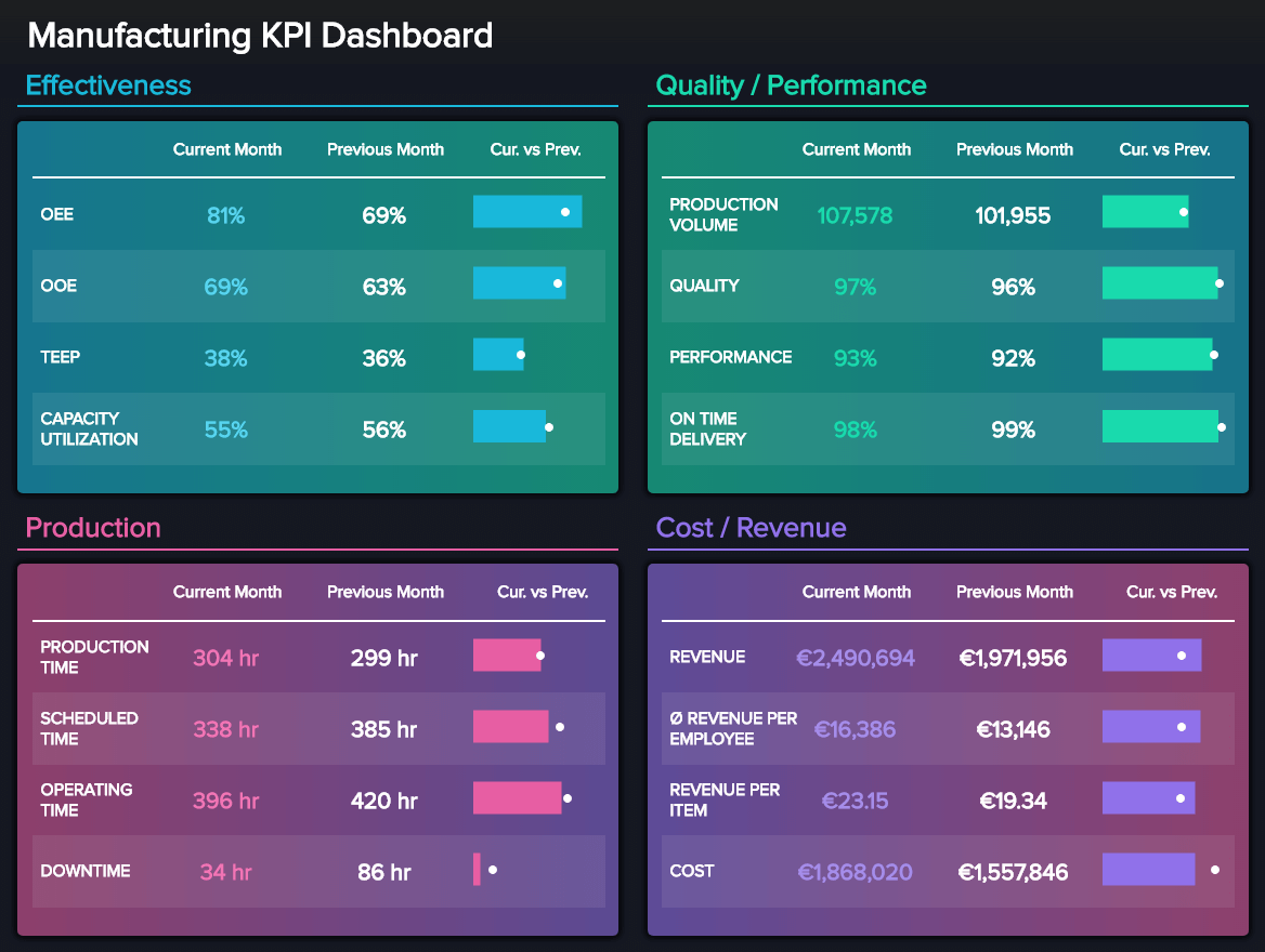
**click to enlarge**
The first part, called the effectiveness area, demonstrates the performance of critical metrics such as the overall effectiveness of operations, equipment, total effective equipment performance, and capacity utilization. These indicators, created with BI dashboard software, will help manufacturing leaders compare the development of the current month with the previous and see if there are any issues in the production process and if there are needs for additional adjustments.
Other parts are structured similarly but with different points in mind: C-level managers in the manufacturing industry should have an overview of the quality and performance where you can monitor the production volume, performance, and on-time delivery. That will help assess whether the products are delivered on time and compare the findings with the previous period, in this case, a month.
Finally, the last part of this executive dashboard report indicates the development of costs and revenue, showing the relation between the current and the previous month. Such data is important to control regularly since it can affect other metrics on this dashboard; if the production volume and production time increase, they can directly cause an uptick in costs.
Primary insights:
- Overall Operations Effectiveness (OOE)
- Overall Equipment Effectiveness (OEE)
- Total Effective Equipment Performance (TEEP)
- Capacity Utilization
12. COO Dashboard For Executives
This high-level executive dashboarding visual is designed for Chief Operating Officers with a strong operational presence and control. In order to optimize operations, COOs need to keep up with fast-paced environments and ever-changing situations that need data yesterday. That's why a dashboard that is generated with the help of self-service BI has enormous support power for data-driven COOs and the ones that strive to become one.
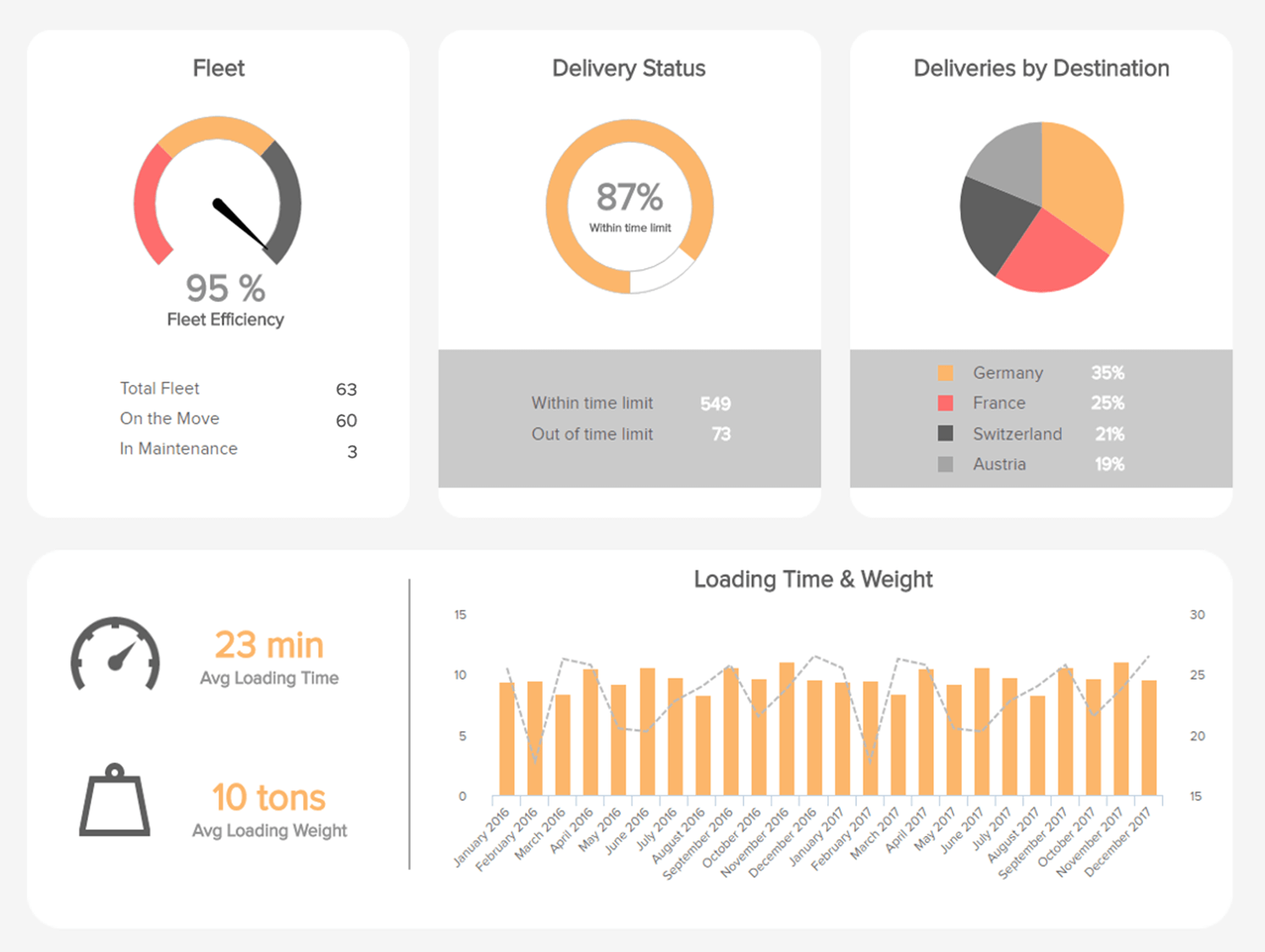
**click to enlarge**
When you consider the logistics industry, COOs need to have a reliable outline of business operations and quickly identify the potential for growth. As depicted in our report example above, transportation management is one of the most critical parts of logistics, where delivering products in the most effective way possible is a significant component of our cutthroat economy.
In essence, this COO dashboard displays fleet efficiency, average loading, time and weight, delivery status, and deliveries by destination. These insights will help execs assess the health of the transportation processes and whether there is space for improvement. If you spot any irregularities, such as an increase in the loading weight and time, you might want to consider whether this will cause potential accidents on the road. The point is to optimize your operations but not overstretch them so that you confront serious operational issues.
Primary insights:
- Delivery Time
- Transportation Costs
- Fleet Utilization
Explore our professional dashboarding software 14 days for free!
13. Financial Performance Dashboard
Designed for busy CFOs juggling many fiscal plates while making a series of pressing decisions regularly, our visually balanced financial performance dashboard provides the essential details for ongoing growth and success.
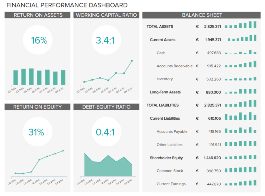
**click to enlarge**
This executive dashboard example serves a clear snapshot of how efficiently you spend capital while providing a wealth of at-a-glance information that helps maintain fiscal balance and make confident strategic choices, even under pressure.
With core financial metrics at your disposal, it’s possible to drill down into your return on various assets as well as equity and keep track of your working capital. Armed with this melting pot of data, you can maintain a harmonious financial structure, manage internal and external stakeholder relationships, and improve your company’s monetary efficiency while maintaining optimum productivity levels at all times. This dynamic BI finance tool is a chief financial decision-maker data-driven Swiss army knife.
Primary insights:
- Return on Assets
- Return on Equity
- Working Capital
14. Talent Management Dashboard
Poor recruitment choices or talent retention strategies can drain company budgets and stunt organizational progress. As an HR manager, one of your main concerns will be sourcing, developing, and maintaining the staff that pushes your company forward. But while the aim here is clear, getting it right is sometimes an uphill battle.
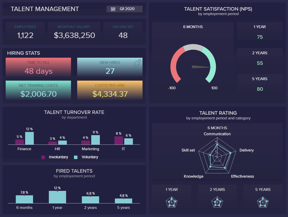
**click to enlarge**
Designed to help HR leaders maintain healthy staff retention and recruitment initiatives, our talent management dashboard offers a melting pot of data that simplifies benchmarking turnover rates, monitoring satisfaction levels, and accessing a wealth of high-level hiring stats.
Designed for maximum access to information, this highly intuitive HR analytics dashboard offers the tools to understand how long your talent has been at the company while categorizing their most valuable skill sets. You can also compare firing rates while analyzing key trends in overall staff satisfaction levels and explore correlations to your talent turnover rates for specific time periods. With this breadth of information at your fingertips, you can create strategies to keep your most important talent engaged at work while developing initiatives to streamline the hiring process and source skilled professionals in the areas you need them most. This is a dashboard that will save senior HR staff time while significantly improving your return on talent investment.
Primary insights:
- Talent Satisfaction
- Talent Rating
- Talent Turnover Rate
- Dismissal Rate
15. Hospital Performance Dashboard
Business intelligence in healthcare has become a critical element for efficient facility management. If you’re a key healthcare decision-maker, you know that many of your decisions affect the health and well-being of your patients. Sometimes, the strategies and initiatives you develop or sign off on can make the difference between life and death.

**click to enlarge**
As one of our most vital executive summary dashboard examples, this hospital dashboard has a balanced mix of logical visualizations that will ultimately improve patient care while creating interdepartmental efficiency and reducing unnecessary operational costs or expenditures.
From this informational hub, you can gain swift access to information that will empower you to assess nurse-to-patient ratios according to shift, treatment costs according to age group, readmission rates, length of stay, and patterns in hospital-acquired infections.
By analyzing this detailed information from one central executive summary dashboard, you can get under the skin of your hospital, honing in on any operational weaknesses in the process. If an issue arises, you can tackle it head-on before it gets out of hand. And if you identify any positive trends, you can use that information to make improvements in other areas of your institution.
Primary insights:
- Average Hospital Stay
- Hospital Readmission Rates
- Costs By Payer
16. Customer Satisfaction Dashboard
In our hyper-connected digital age, consumers are in the driver’s seat. With access to a wealth of information and potential buying power at the swipe of a screen or the click of a button, offering a consistent, meaningful, and seamless customer experience (CX) will set you apart from the pack.
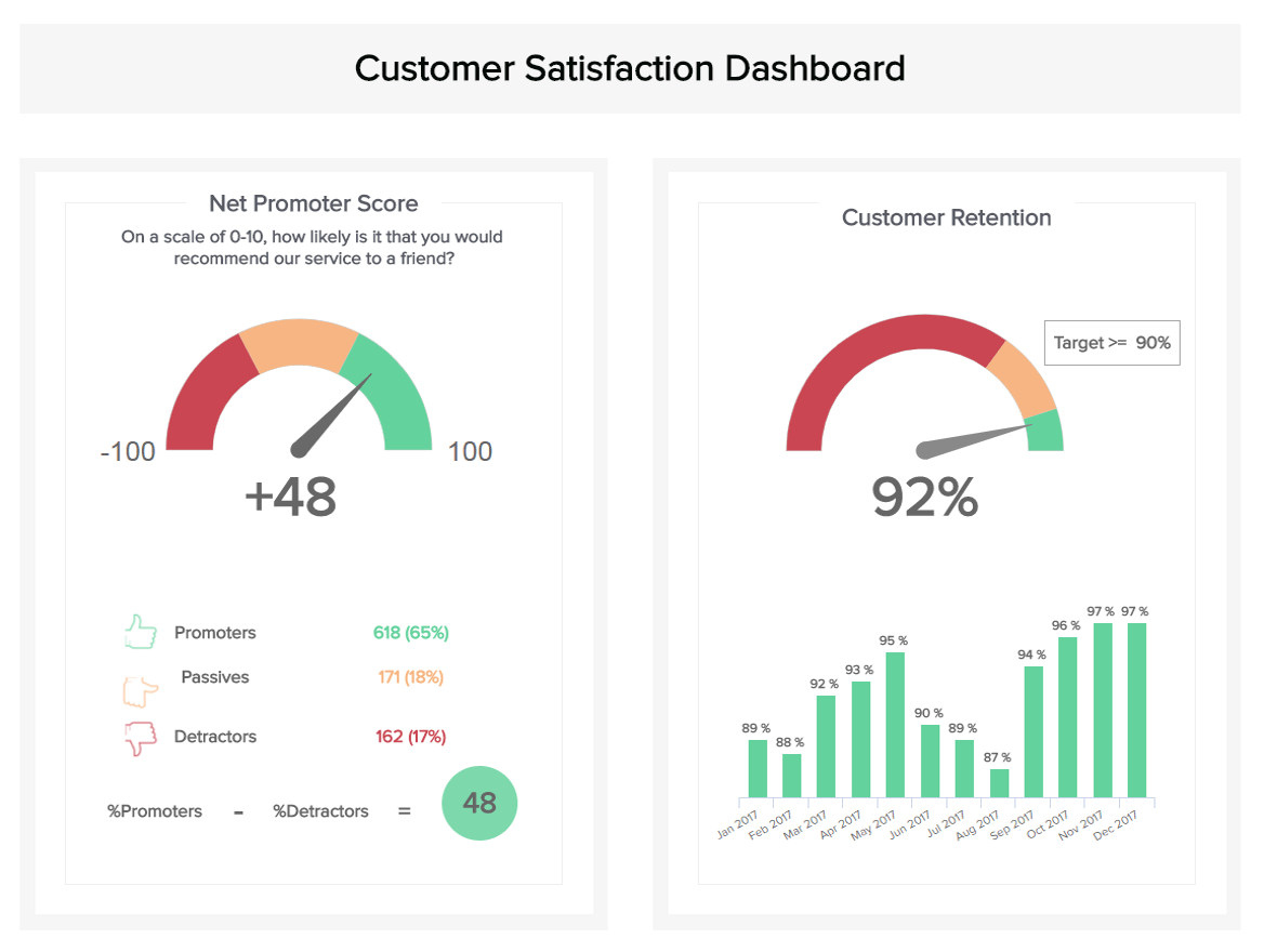
**click to enlarge**
To keep your customers consistently happy, working with the right customer service analytics tool is essential - and as one of our most amenable executive dashboard samples, this customer satisfaction dashboard will steer you toward consistent consumer-facing success.
With a cohesive mix of data points designed to offer a deeper understanding of your customer’s satisfaction rates, this dynamic executive dashboard template offers a clear-cut snapshot of your net promoter score (NPS), as well as a comparable rundown of your consumer retention rates in one easy-to-navigate space. Here, you can also discover how easy or difficult it is for your customers to navigate your website or use your services (this is a particularly useful function for SaaS companies).
With this comprehensive mix of insights at your disposal, you can make targeted improvements to your customer service process and communications while making valuable tweaks to the online experience you offer consumers across channels. This powerful executive project dashboard will help improve your customer retention rates and increase profits.
Primary insights:
- Customer Satisfaction
- Net Promoter Score
- Customer Effort Score
- Customer Retention
17. Procurement KPI Dashboard
Niche, sector, or industry aside, your procurement activities can have a significant impact on the rest of your business. If you have a poor procurement strategy, you run the risk of draining your budgets, creating supply chain inefficiencies, and even suffering reputational damage.
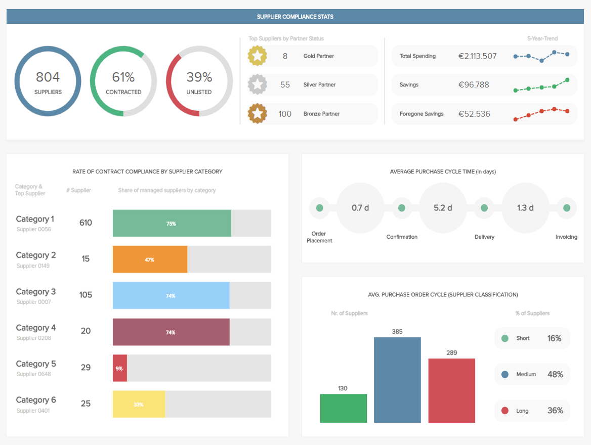
**click to enlarge**
As a procurement leader, it’s your goal to keep your processes fluent, your compliance rates healthy, and your supplier relationships valuable. It’s a colossal task, but as one of the most versatile executive dashboard templates, our procurement KPI dashboard will help you achieve it.
One of the key features of this particular report is the ability to dig deeper into your end-to-end procurement process - or procurement cycle. Armed with this visual information at all times, it’s possible to pinpoint specific inefficiencies and streamline the entire process. For instance, if you have a problematic supplier, you could set new procurement terms or replace them with a more reliable company, saving money and improving procurement productivity.
This executive dashboard example was created with modern procurement analytics software, demonstrating just how much scope and vision working with the right high-level analytic tools offers.
Primary insights:
- Compliance Rate
- Number of Suppliers
- Purchase Order Cycle Time
18. Retail Analytics Dashboard
Retail is a highly competitive landscape. If you want to stand out in your niche, the perfect combination of cross-channel promotional strategies, creativity, and organizational efficiency is essential. This executive monthly report will help you do just that.
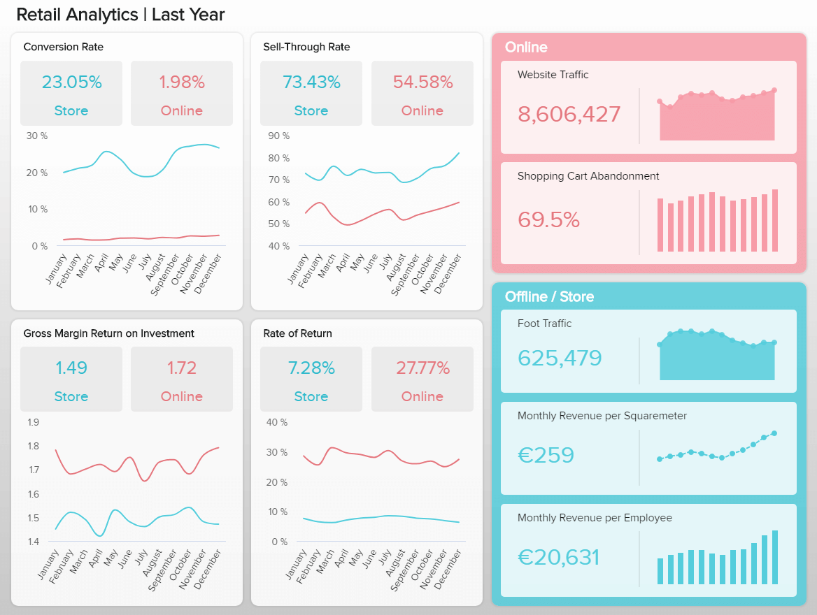
**click to enlarge**
From marketing campaigns to sales, staffing strategies, and beyond, modern retail managers and execs have a huge daily task on their hands. Part executive sales dashboard, part executive marketing dashboard, and part operational dashboard, our retail analysis tool serves up a wide range of essential insights in one digestible space.
Here, it’s possible to explore web traffic and foot traffic patterns, track correlations between investments and returns, examine employee revenue rates, and understand sell-throughs and conversions better.
Every strand of the information featured in this retail-based executive summary dashboard will help you meet the needs of your consumers head-on while building brand authority and boosting your overall return on investment (ROI).
Primary insights:
- Website Traffic/Foot Traffic
- Sell-through Rate
- Retail Conversion Rate
- GMROI
- Monthly Revenue Per Employee
19. Actual vs. Forecast Financial Executive Dashboard
Arguably one of the most important areas for the CFO, this financial executive dashboard uses forecasting technologies to predict how the financial situation of the organization will look in the future. This is done by using a mix of current and past data, and decision-makers often use it to define budgeting goals and other important processes for the coming fiscal year.
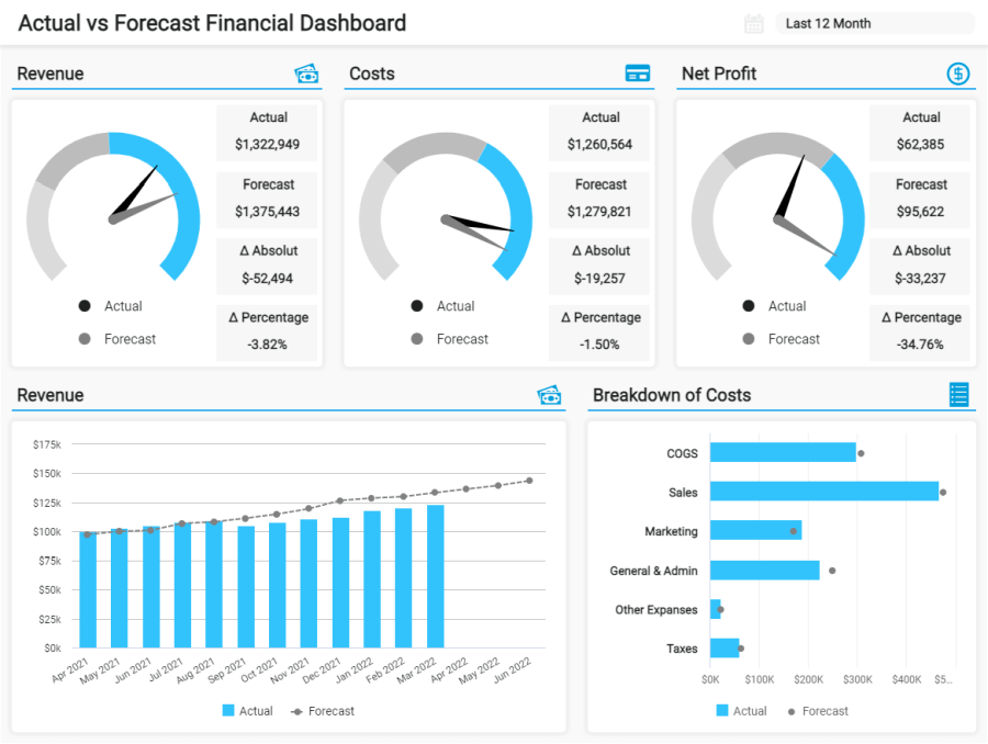
**click to enlarge**
This executive report template is a different take on an income statement, tracking three key areas for the finances department: revenue, costs, and net profit for the past 12 months. Each of these indicators provides insights into the actual and forecasted values and the absolute difference in money and a percentage. This allows C-level professionals to quickly understand if the numbers are going as expected or if something needs to be changed.
An important factor to consider is that financial forecasting can vary due to unexpected events or changing market conditions. Therefore, projections must be monitored carefully and in line with the organization's and industry's anticipated situation. Likewise, any variations should be analyzed based on the company’s forecasting methodologies and assumptions.
Paired with this useful knowledge, the example also provides a breakdown of the cost forecast. This is a very useful tool as it can help in planning resources for the coming period as well as spot inefficiencies that could be affecting profitability. For example, we can see that marketing spending was a bit over the forecasted amount, which could either be a negative situation or justified due to a successful strategy.
Primary insights:
- Actual vs. forecast expenses
- Actual vs. forecast income
- Cost breakdown
20. Executive Project Dashboard
As a project manager, your job is to ensure everything runs smoothly during the project completion process. This can become a difficult task, especially when a project involves a lot of people and departments. To help you in that task, our next example provides the perfect overview of indicators to track the progress of a project in different areas.
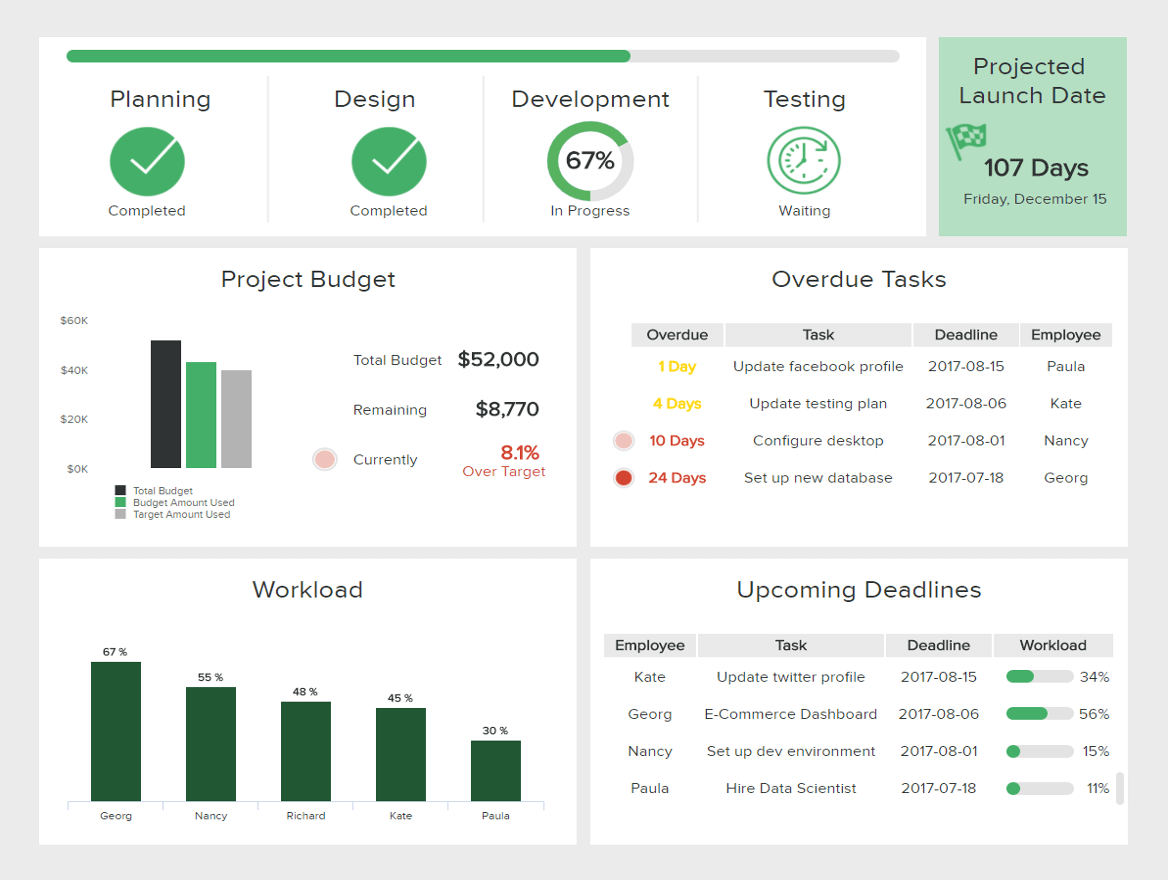
**click to enlarge**
What makes this executive project dashboard template so valuable is the fact that it provides a centralized view of all the necessary information to track the progress of the different tasks. The indicators in this template, covering key areas such as budgeting, overdue tasks, workload, and upcoming deadlines, enable team members and the PM to stay on top of any bottlenecks as soon as they occur.
For instance, we can see that there are a couple of way overdue tasks. This is something that needs to be looked into as it can delay other tasks that can’t be carried out without the previous ones being completed. By looking at the workload chart, you can see that George has the highest workload of the entire team; coincidentally, he is also the one with the highest overdue time. This could mean that George has too much work to be done and not enough time, so some decisions need to be made to ensure he has the necessary help and resources to complete his tasks efficiently.
Primary insights:
- Workload Capacity
- Budget Utilization
- Overdue Tasks
- Upcoming Deadlines
21. Customer Support KPI Dashboard
Customer support is considered one of the most important areas for any organization; after all, customers are the ones who can make or break a business. For that reason, ensuring the right resources are being invested into providing the best support is key to success. Likewise, ensuring those resources are turning into profits for the company is equally important. Our next example is a customer service dashboard that covers all costs-related metrics for the department.
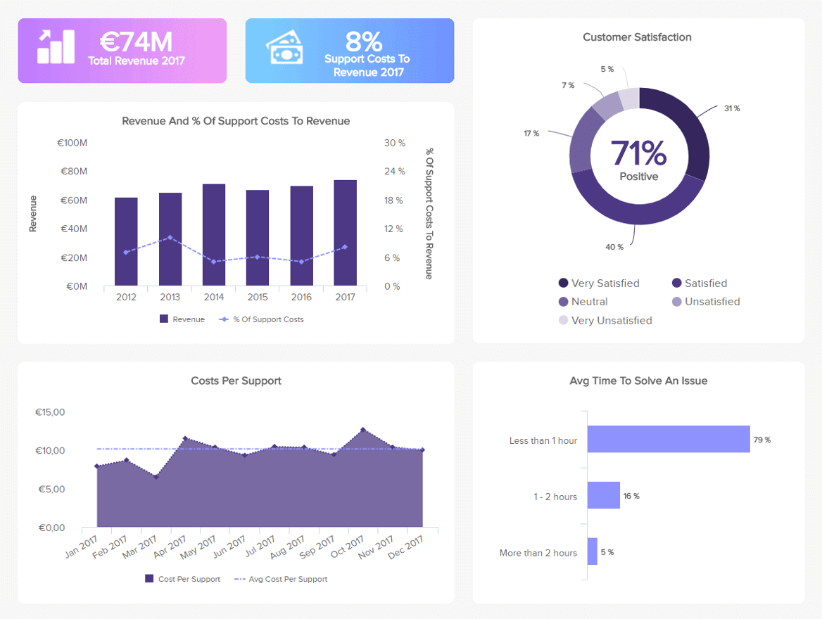
**click to enlarge**
Naturally, as with any business process, you want to keep costs at a minimum with the highest gain possible. Measuring the costs against revenue can provide a clear picture of how much gain you get from your investment and if any adjustments need to be made.
The average time to solve an issue is probably the KPI that affects costs the most. The longer it takes to solve, the fewer issues are solved in a day, and the higher the costs for the company. Needless to say, this also affects your retention rates and brand reputation, therefore, it is fundamental to optimize it. Another scenario in which costs can go up is overstaffing. If there are too many employees for the number of issues, it can generate unnecessary operational costs.
Primary insights:
- Service Level
- Support Costs vs. Revenue
- Customer Satisfaction
22. HR Diversity Dashboard
Diversity in the workplace has become a mandatory practice in today’s context. Every day, more and more organizations are realizing the value of mixing different cultures and backgrounds to bring innovative ideas that can drive success. That said, diversity still presents a challenge for many organizations. Our next example will help keep leaders informed regarding their current situation as well as the success of some implemented initiatives thanks to efficient HR analytics.

**click to enlarge**
When talking about diversity, there is a wide scope to consider as employees can have different genders, backgrounds, ethnicities, and capabilities. The HR executive dashboard above covers all these areas to provide useful insights that will help HR managers assess the situation. The share of management positions for female/diverse employees vs. males can show a common trend in the business world, where men occupy most of the high-paying positions. However, we can see that this company aims to increase management positions for female/diverse employees by up to 20% by 2025. A similar situation happens when looking at the ethnicity breakdown by department, where white people occupy most administrative positions. This needs to be looked into to ensure diversity across the board.
Another valuable metric in this dashboard is the turnover rate by diversity group, as this indicator will show how satisfied employees are with the organization. In this case, we can see that Black employees have the highest voluntary turnover, which means something is happening that makes them feel uncomfortable in the workplace. These valuable conclusions can lead HR execs to develop strategies to tackle the issues and support a more diverse and inclusive work environment.
Primary insights:
- Gender Diversity by Role
- Ethnicity Diversity
- Turnover Rate by Group
- Recruitment Breakdown by Ethnicity
23. Operating Expenses Executive Dashboard
The C-suite needs to keep a close eye on operating expenses to ensure they’re spending enough to generate revenue but not overspending to the point where profitability is negatively impacted. The operating expenses executive dashboard can help strike this balance. Operating expenses (OpEx) include production, marketing, salaries, rent, and inventory costs crucial to daily operations. Balancing these expenses to minimize costs without compromising efficiency or profitability is essential for a competitive edge.
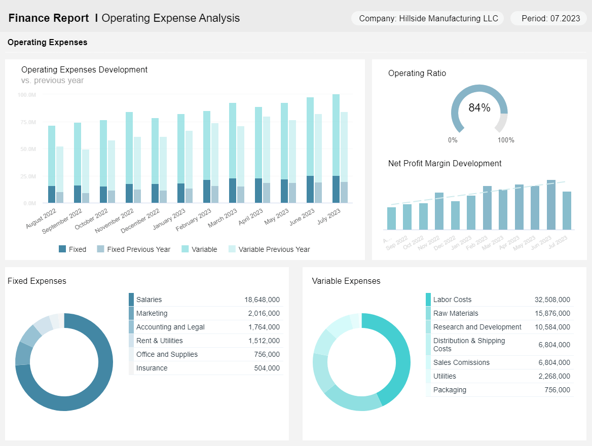
**click to enlarge**
This dashboard template details fixed and variable expenses, distinguishing mandatory fixed costs like rent and salaries from fluctuating costs linked to production and sales. Monitoring OpEx development aids in comparing monthly expenses to the previous year's performance and identifying potential inefficiencies or increased productivity.
Crucially, the operating ratio evaluates operational expenses as a percentage of revenue, guiding expense optimization strategies. These metrics offer a comprehensive view, coupled with a net profit margin breakdown, which highlights potential cost management issues.
Using the example data above, we can see a decrease in the net profit margin for the month of July. A low net profit margin could be cyclical, or it could indicate the business is unable to manage costs efficiently, which could have a ripple effect on investors and/or lead to a need to increase customer prices. In turn, this may impact customer satisfaction, which can be measured using additional operational dashboards.
Primary insights:
- Operating Expense Development
- Operating Ratio
- Fixed Expenses
- Variable Expenses
24. Sales Analysis Dashboard
The sales department sets the tone for operating expenses and revenue, helping to determine budgets, predict growth, and ensure overall healthy financials. That’s why having the ability to zero in on sales is so important in the executive sphere of influence. This comprehensive template boasts diverse filters, enabling thorough data exploration across product categories, sales representatives, regions, and observed periods within a singular platform, facilitating efficient problem-solving and strategic decision-making.
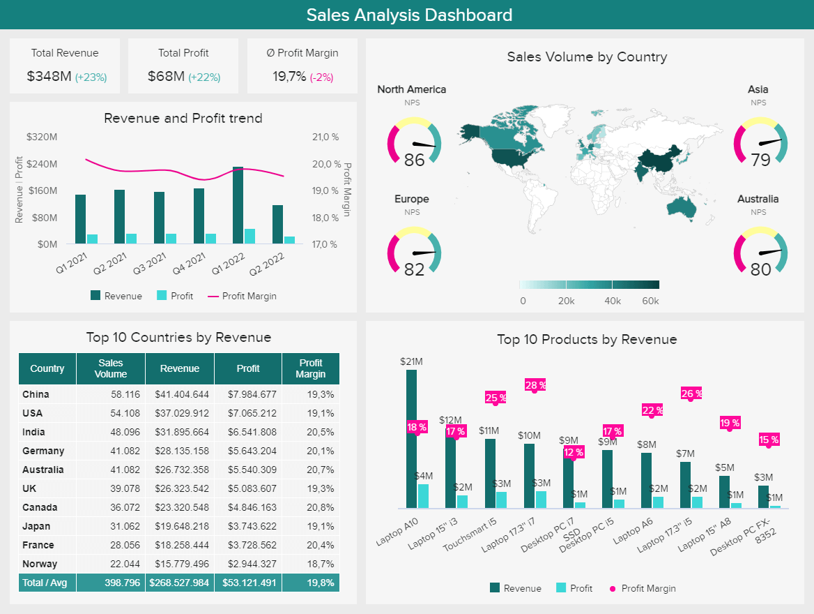
**click to enlarge**
To start, this dashboard presents an initial overview of three key performance metrics: total revenue, total profit, and average profit margin. Detailed graphs further dissect each metric, providing quarter-to-quarter and geographic comparisons. In this example, Q1 shows significantly higher performance than the previous year, prompting a deeper investigation to uncover underlying drivers of success.
Detailed breakdowns by country and product reveal disparities; for instance, China and the USA exhibit high sales volumes but comparatively lower profit margins compared to countries like India and Germany. Focusing on specific regions unveils potential opportunities such as surplus unsold inventory or elevated operational costs demanding attention for enhanced profitability.
Here, users can also analyze the top 10 products by revenue, which can help identify underperforming items and facilitate strategic interventions. Again, filtering delivers deeper insights such as top-performing products, directing focused endeavors, such as a marketing campaign, for maximum impact. On the other hand, aligning reduced sales with a low NPS in a particular country underscores the need for swift corrective action, potentially addressing issues like inadequate customer service or product deficiencies.
Primary insights:
- Total Revenue
- Profit Margin
- Top 10 Countries by Revenue
- Top 10 Products by Revenue
25. Energy Management Dashboard
Last but not least, we have the energy management dashboard, a valuable companion for general managers overseeing multiple energy-producing sites. This dashboard encompasses vital information, from total sales to sector-wise consumption and production costs per energy source, providing a holistic view of plant performance across various sites.
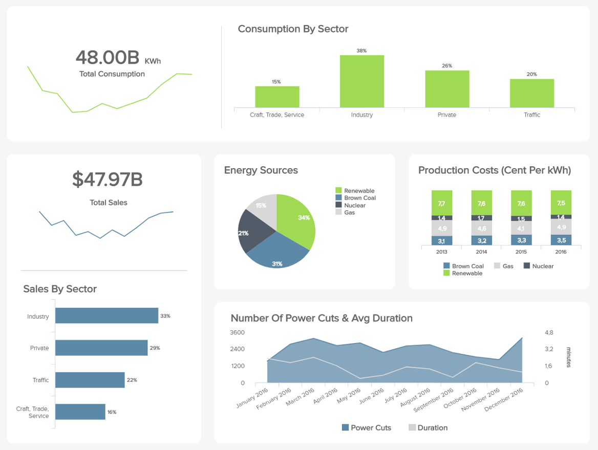
**click to enlarge**
In the example above, we see total energy consumption, which is then broken down by sector. We can also compare consumption to total sales, view the percentages of energy sources, and visualize production costs by source.
The dashboard's top section outlines total consumption across sectors, revealing insights into energy usage distribution. Notably, the industry sector consumes the most electricity at 38%, followed by households and transportation at 26% and 20%, respectively. Understanding sector-wise consumption evolution aids in identifying primary consumers and tailoring energy production and distribution to suit diverse needs. This information is crucial to differentiate, as industrial plants require distinct energy types and transportation methods compared to households.
This dashboard also monitors facility downtime, tracking power cuts and their duration. Scheduled downtime includes maintenance work, ensuring long-term operational efficiency. However, unexpected outages require swift responses, and frequent disruptions might signal outdated equipment needing replacement. Additionally, production costs categorized by energy source offer insight into long-term financial sustainability. The stacked bar chart with a year-over-year comparison enables informed decisions regarding cost-effective energy sources.
In essence, this energy management dashboard equips general managers with critical insights for effective planning, resource allocation, environmental considerations, and maintenance scheduling across diverse energy-producing sites.
Primary insights:
- Consumption by Sector
- Sales by Sector
- Production Costs
- Energy Sources
- Number of Power Cuts
Now that we have listed the top examples, we will look closer at the benefits of such dashboards and why you should utilize them.
Explore our professional dashboarding software 14 days for free!
The Benefits Of Executive Reporting & Dashboards
To paint a more detailed picture of the power and potential of executive reporting and dashboards, here are the key benefits of using these intuitive online data visualization tools:
- Vision: A report offers enhanced visibility and insight, thus allowing you to understand every key aspect of your business in greater detail and, in turn, make more informed decisions.
- Evolution: The ability to visualize your data will empower you to make continual improvements, moving with the landscape around you by measuring and building upon your performance.
- Economy: Rather than spending endless hours logging into your data systems and running reports, the best executive dashboards will allow you to view and engage with all of the information you need in one digestible space. Time is money, and if you’re saving time (while improving your internal processes), you will ultimately save money, making your empire far more economical as a result.
- Realization: By working with executive report-based KPIs that are most relevant to your organization, you’ll be able to refine and realize your business plan by working toward accurate, valuable targets and ensuring that you reach them time after time. There are a number of KPI examples you could choose from, but it’s important to find the right one for your organization.
- Development: The digestible visual insights gained from executive reports will give you the tools to track individual employee performance, helping you to reward top performers and develop those who need additional training, support, or motivation.
- Benchmarking: As dashboards for executives offer a wealth of dynamic visualizations based on very specific KPIs, it’s possible to set frequent benchmarks that will empower senior decision-makers to push organizational boundaries while measuring success in a way that improves engagement, motivation, and interdepartmental performance.
- Communication: By offering access to detailed pockets of information in a way that is engaging and digestible, executive status dashboards improve internal communication across the board by empowering everyone with information that improves the collaborative process while boosting individual performance.
- Speed: The quicker and more efficient a business is, the more likely it is to outperform its competitors. Executive dashboard reporting helps leaders make top-level decisions faster and more accurately, which serves to catalyze organizational progress in a number of areas. The intuitive and customizable nature of dashboards for executives offers the unique (and powerful) benefit of speeding up existing processes while enhancing the strategy and decision-making process.
- Evidence: While this may seem like an abstract concept, when it comes to analytics, the more panoramic a snapshot you can access, the better. By being able to dig down deep into a host of invaluable metrics, you’ll be able to back up your decisions with tangible trends, patterns, and visualizations that everyone understands - the kind of evidence that will make your decisions all the more persuasive. This is a notion that we have demonstrated with our examples and executive dashboard templates.
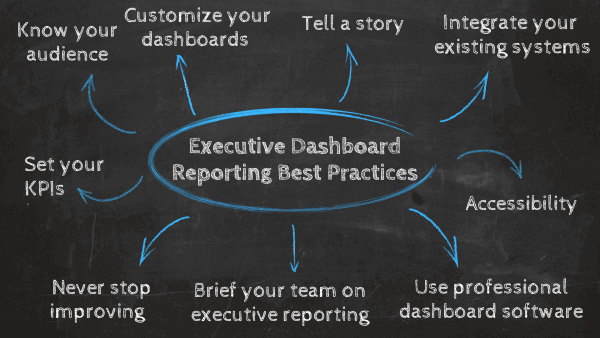
Best Practices In Dashboard Reporting
It should be quite clear that dashboards are invaluable to C-suite data visualization and decision-making. They provide a visual component to reports and summaries, adding value to written words. To reap the rewards of these reports, it’s important to understand what it takes to create an online dashboard that works for your organization in particular.
Let’s look at the essential executive dashboard best practices and steps you should consider when creating a compelling executive reporting practice. From understanding your users to data-driven storytelling, you’ll uncover all of the information you need to make your reports and dashboards as successful as possible.
1. Know your audience
The most fundamental aspect of reporting is understanding the needs, aims, and goals of your users. Depending on the key aim function of your executive summary dashboard, you will need to feature data visualizations and functionality that will improve performance while providing analytical opportunities that will benefit the organization's evolution.
By placing yourself in the shoes of your core users, asking people within the organization which data they would like to improve their performance (or make their role easier), and selecting the right key performance indicators, you will lay solid foundations for your executive summary dashboard efforts. This brings us to our next point.
2. Set your key performance indicators (KPIs)
Choosing the data points that best reflect your company’s core aims and goals will ensure that your reports are both relevant and effective.
For instance, if you’re looking to improve the financial health of your organization, you might want to tackle the financial reporting and analysis process and then choose to set up a financial dashboard, drilling down into KPIs based on operating expense ratios and net profit percentages.
3. Use a mix of real-time and past data
During the process of selecting the KPIs you will use to measure the success or failure of your strategies, it is important to consider real-time as well as past performance. On the one hand, the real-time analysis will give the different departments the possibility to act on any developments as soon as they occur. For example, the IT department can spot threats or bugs in the system and fix them before they can do any damage. The marketing department doesn’t need to wait 30 to 40 days to assess the success of strategies. Instead, they can optimize as they go to ensure maximum success.
On the other hand, historical data helps you learn from the past. You can understand what went wrong and how to avoid or fix it in the future. For example, you can apply the lessons you learned to reduce shipping delays, predict seasonal demand for inventory management, and more.
Having a mix of real-time and historical information in your reports will provide you with a complete picture of performance so you can make informed strategic decisions moving forward.
4. Integrate your existing systems
Concerning the setup of executive dashboard templates, it’s important to integrate all of your current business systems through APIs to ensure the accurate collection, curation, analysis, and real-time value of your data.
In doing so, you’ll ensure you’ve created a dashboard design that not only presents the insights and metrics that are most valuable to your organization but also a centralized space that will offer data-driven value throughout the organization.
5. Secure your data
As you’ve seen throughout this post, every executive report sample contains the most important information for the organization. For that reason, it is fundamental to ensure that the data in them is fully protected, especially considering the rise in cyberattacks that are affecting several industries and companies around the world.
In order to ensure your reports are protected, it is important to set a data governance plan. This will ensure that the roles and responsibilities regarding data manipulation are clearly defined across the organization. For instance, these dashboards can be password-protected when they include sensitive information. Another aspect to consider is where the data is stored in an insecure location, which can significantly increase the possibility of breaches. If you are relying on cloud storage, make sure you use a cloud BI tool that provides security protocols such as data encryption, segregation, security patches, and more.
6. Customize your dashboards
Once the framework of your template is up and running, you can tailor it to your preference, editing your dashboard. Hence, it returns your specified insights and metrics in a way that is most valuable to your organization.
The best executive dashboards adhere to the best possible design practices. To help customize your executive report format for success, follow our essential guide to dashboard design principles and best practices.
7. Tell a story with your data
As a species, we thrive on storytelling. By creating a strong narrative with your dashboards and visualizations, you’ll deliver essential messages in a way that inspires both internal and external stakeholders, leading to increased success in the process. Look at your dashboard and consider whether each KPI or visualization conveys the message you want to communicate to your end-users or audience. Ask trusted stakeholders to offer valuable feedback, and you will end up with a narrative that yields consistent results.
Creating narratives with your metrics and insights essentially extends the design process. To steer your efforts, here’s a guide to data storytelling for your reading pleasure.
8. Use professional dashboard software
To make the most out of your dashboard, professional software is a must. While you can try to use static reporting methods, you won't have that much power over your data as spreadsheets and presentations lack real-time information and interactive elements. This will affect your analysis and delivery since you will spend a significant amount of time exporting and manipulating data for each dashboard or report you want to create.
By using modern software and tools, real-time data is right at your fingertips, and interactive possibilities are endless, from drilling down into bits and pieces of your charts to powerful filters that automatically change your visualizations. That way, you will have more time to focus on other critical tasks in your company and gain a great business assistant to skyrocket your performance.
9. Brief your team on new reporting processes
It’s essential that you are clear and transparent about your executive reporting processes with the entire organization. Give the right people access to the right metrics and hold internal workshops to ensure everyone is up to speed with the new system.
If everyone knows how to use the core features and functionality of your reports, and they’re fully on board with your updated analytics processes, you’ll be able to squeeze every last drop of value from the wealth of business data available at your fingertips.
10. Give extensive access to the right personnel
To maximize the value of your dashboard for executives, you should ensure that every senior decision-maker in the organization has access to the right reports. If your leaders are fully literate with your new dashboard software and have 24/7 access across devices, they will be able to make better decisions swiftly and guide your organization toward success.
11. Never stop improving
Whether you’re working with a SaaS executive dashboard, a high-level sales dashboard, or any other data-driven template for that matter, you should commit to periodically examining your efforts to see whether they are returning the best results. Whatever your industry, it’s important to understand that change is constant. By making tweaks to your dashboard that align with the landscape around you, your executive analytics efforts will continue offering the best possible ROI while pushing your organization forward.
Executive Reporting Common Challenges & Mistakes
Leveraging executive reporting dashboards can deliver key insights and opportunities you’ve missed. Still, it requires planning and applying a few best practices to get the most bang for your buck. The process itself can be quite an undertaking; without a clear vision and directives, companies may fail to capture the insights they need to drive tangible results.
Common reporting challenges and mistakes include:
- A lack of clarity into objectives: Failure to define clear objectives about the purpose of your dashboard or reporting processes can lead to a disconnect between actions and goals. This can also lead to confusion about what data to include, making it less effective in providing actionable insights at a glance.
- Overcrowding your data: Including too much or irrelevant information can overwhelm users and diminish the dashboard's effectiveness.
- Ignoring end-user needs: Designing a dashboard without considering the specific needs and preferences of the end-users often results in a disconnect between the dashboard's design and its usability.
- Ineffective visualization: Poor data visualization choices, such as comparing unrelated time periods, omitting information, or using inappropriate graph types, can obscure information or make the data misleading rather than make it easily understandable.
Explore our professional dashboarding software 14 days for free!
Key Takeaways Executive Dashboards & Reports
We’ve drilled down deep into executive-level dashboards, and one thing is clear: companies that use data analytics are five times more likely to make faster decisions, based on a survey conducted by Bain & Company. Moreover, according to Gartner, most big industry decision-makers believe that big data will accelerate positive change within the coming years. In terms of improving business performance, smart data analytics is key - and our real-life big data examples are tangible proof of that very notion. The time to embrace dashboard software is now.
During our journey into the world of executive report examples and executive dashboard templates, we’ve considered the practical applications of modern reporting tools, looked at the official definition, and explored the many benefits cutting-edge analytical skills bring to the table.
As a senior-level player, you will no doubt be responsible for formulating plans and initiatives that can make or break your business. Of course, such vital decisions come with an enormous amount of pressure. But, with executive-level reports and dashboards, you can make choices, create strategies, and communicate with your staff with 100% data-driven confidence - something that will make your working life easier and more successful.
Executive reporting via interactive dashboards provides a true window of vision that not only provides greater real-time results but has the unrivaled power of cementing continual evolution and a sustainable level of success in an increasingly competitive digital world.
Perpetual growth and progress are essential to the longevity of any company looking to thrive and survive in this cutthroat business age, and senior-level reporting is the vessel that will secure your success year after year.
Ready to tackle your analytics and test these dynamic dashboard tools for yourself? Try our powerful dashboard software for a 14-day trial today - it’s completely free and will open you up to all of the key benefits of digital dashboard reporting. Enjoy!