Get Started With Interactive Weekly Reports For Performance Tracking
Table of Contents
2) Why Are Weekly Progress Reports Important?
3) How to Create a Weekly Status Report
4) Weekly Report Templates & Examples
Businesses across industries have been analyzing their performance for decades using traditional written reporting formats, but with the amount of data being produced every day, the need for more frequent reporting is growing. Often, companies generate written monthly, quarterly, or yearly reports that serve several purposes, but they do not provide the level of detailed insights that businesses require in order to succeed and stay ahead of their competition. This is where interactive weekly reports come into the picture—and you can create your own with the right weekly report software.
Armed with powerful visualizations and real-time metrics, modern weekly summary reports enable businesses to closely monitor the progress of their strategies to extract relevant insights and optimize their processes to ensure constant growth.
To get you started with interactive weekly reporting with powerful data visualizations, in this post, we will cover the definition, tell you a few benefits of using them, provide you with top weekly report templates for different industries and functions created with a professional BI dashboard software, and finalize with some tips to achieve successful regular reporting.
Let's kick it off with the definition.
What Is A Weekly Report?
A weekly report provides an overview of relevant aspects related to the performance of a business during a given week. Powered by interactive visualizations, managers and employees use them to outline the progress of the week and find improvement opportunities.
Typically, these tools are used to track progress or success for different business scenarios, such as projects, sales, finances, marketing campaigns, human resources, or any other area that might be relevant. Traditional reporting formats are often written in a way that might include an introduction, body, and conclusion. Even though this weekly reporting format sample is needed to summarize some relevant details, it is also static and less efficient.
Today, more and more businesses are turning to online visualizations, such as a dashboard creator that is user-friendly and accessible for everyone. The ability to visualize your frequent performance through interactive reports will improve your decision-making by providing a 360-degree view of your progress. We will see these interactive tools in action throughout the post.
Why Are Weekly Progress Reports Important?
As mentioned, weekly reporting provides businesses with a detailed overview of relevant tasks affecting various departments and functions. Now that remote work is a permanent part of the business world, the need for more detailed monitoring of progress and tasks has grown. An online reporting tool provides managers with interactive weekly status updates so they and their employees can stay connected, even if they are working remotely. This allows for less frequent meetings and more time to concentrate on tasks. Paired with this, weekly activity reports are important because:
- They allow for informed decision-making: Besides being instrumental to success, monthly, quarterly, and annual reporting do not provide the immediate insights that a weekly operations report can. Tracking relevant KPIs will often improve decision-making while keeping every relevant stakeholder engaged with the metrics.
- They enable team performance tracking: Tracking the progress of the different teams is another reason why weekly reporting is such a relevant practice for modern businesses. As a manager, you need to know what your workforce is doing and how they are doing it. Being able to provide regular feedback to your employees based on their consistent ability to meet benchmarks will keep them more engaged with their tasks and increase productivity.
- They help spot improvement opportunities: The short-term nature of weekly business reports allows for a more detailed view of the development of different organizational strategies. Through this, you can find improvement opportunities as well as spot potential inefficiencies before they become bigger issues. Paired with this, reporting on a week-to-week basis can also save your company money and time as you can quickly identify if a strategy is unsuccessful and reallocate resources accordingly.
- They enhance collaboration & communication: One of the prime benefits of using these modern analysis tools is that they are valuable tools to enhance communication and collaboration between different stakeholders. Modern BI reporting tools make it easy to visualize all your relevant information sources into one single access point so everyone can stay connected with the latest developments. Empowering everyone in your organization to generate their own interactive reports every week will increase your company's productivity, and a data-driven culture will be implemented in the long run.
- They improve responsivity: By gaining access to highly visual insights, you will improve your company’s overall business intelligence, which, in turn, will empower you to respond to emerging opportunities, changes, or potential issues swiftly - saving time and money in the process.
Try our professional reporting software for 14 days, completely free!
How to Create a Weekly Status Report
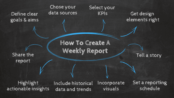
Now that you’re up to speed with the key features and functions of a weekly progress report, let’s consider how to create one that will optimize every key area of your organization.
- Hone in on your key aims, goals & outcomes
To create a business weekly report template that offers a genuine insight into the progress of your initiatives and activities, taking the time to consider your key organizational aims, goals, and outcomes is essential.
While this may sound like an obvious step towards creating a weekly metrics report that gets results, many companies wade in without ironing out these critical details. Sit in a collaborative environment and take the time to consider what you’re looking to achieve over a 12-month period across every department.
Take these aims and consider which ones will benefit most from the insights of BI weekly report templates. Once you’ve combed through every aim and goal, it will become clear which activities or metrics require seven-day monitoring.
- Choose your data sources
The next step in producing an effective weekly activities report is choosing data sources that offer the most relevant insights. Examine all your key sources and look at the metrics that align with your seven-day monitoring goals. Doing so will help you trim the fat, working with a mix of digital intel that will enable you to transform raw insights into progress-boosting visuals - metrics that will integrate into your reporting dashboards seamlessly.
Curating details from the right sources will allow you to consolidate your most impactful into one central online dashboard and gain access to quality information that will ultimately make your organization more robust, responsive, communicative, and intelligent across the board.
- Set your KPIs
Armed with your refined goals and best sources, you can choose the right KPIs for your weekly status report template. Remember that the KPIs you choose should be focused on your goals and not distract from them. Choosing too many indicators to include in your report can distract from the analysis and the insights extracted from it.
Take the time to consider which visualizations will present your data in a way that is not only accessible but will help you measure your success on a seven-day basis with minimal friction and maximum success. Once you start populating your weekly project status report with a cohesive mix of KPIs, it will leap into life.
- Get your design elements right
Once you’ve set your KPIs, you can focus on your weekly report format. When it comes to designing your weekly status report template, the most important thing to remember is that you should lead with substance over style.
Yes, having a neat and pretty reporting design is important, but if anything gets in the way of clarity or usability, it needs work. A few best practices in formatting include not overcrowding the report with too many visuals, sticking to just a few colors, and choosing simplicity overall. This will enable you to focus on conveying the facts and figures in the clearest and most engaging way possible without distracting your audience from the true objective of the report.
Read: Our complete guide on the top 25 dashboard design principles and best practices for essential tips that will make your weekly report sample layout sing.
- Tell a story
Even though you’ll be monitoring your metrics every seven days (possibly more), it’s still important that your KPIs and design layout follow a logical narrative. Visuals that tell a story will make your insights far more accessible to all internal and external stakeholders, making your metrics more impactful in the process. For this reason, it is important to provide context and insights that will enable your audience to understand the story you are trying to tell and make better decisions.
- Create a reporting schedule
Consistency is key to getting the most from your report. It’s best practice to set a time or date to pull data and conduct your analysis, along with a specific date to distribute the results. The report should focus on the same sources and metrics within the same time ranges (e.g., every Sunday to Saturday). Consistency in timing helps maintain accountability, plus it gives other stakeholders something they can look forward to and incorporate into their own decision-making.
- Incorporate visuals
Visual representations make it easier to see trends and patterns. We process images in our brains faster than we do text, which is why visuals are a key part of decision-making. It’s best to use a combination of graphs, charts, tables, and bulleted lists to tell your data story. When choosing visuals for your weekly report template, make sure they are aligned with the nature of the data so they can be more easily understood. Labels, legends, and annotations can also help clarify complex information.
- Include trends or historical data
Incorporating trends and historical data in your weekly report provides valuable context. By showcasing how KPIs have evolved over time, stakeholders can better understand progress, fluctuations, and seasonality. Highlighting trends helps identify long-term patterns, allowing stakeholders to make informed decisions based on historical performance. You don’t have to share copious amounts of historical context in each weekly report; these reports should be quick reads but have some comparison between past vs. present performance to demonstrate change.
- Highlight actionable insights
Even with visuals, decision-makers may need an extra push to understand the key takeaways—and, more importantly, what they should do next. Highlighting the actionable insights within the report can help readers focus on what’s most essential. You can do this by pinpointing any anomalies or trends, showing how findings align with bigger objectives, and directly tying any issues to your recommendations.
- Share the report
Don’t let your reports gather dust. Decide who needs to know what you’ve collected and share the report with the right stakeholders. This can be a formal weekly meeting or as informal as an email or one-on-one conversation. Different stakeholders may need access to different information, so ensure you’ve tailored your findings and recommendations to the right audience.
Read: Our complete guide on dashboard storytelling for essential tips and advice.
Now that you know the benefits of visual weekly progress reports and how to create one, we will go through a list of 10 powerful report templates for different industries, platforms, and internal functions.
Try our professional reporting software for 14 days, completely free!
Report Templates For Status Tracking
We’ve covered the essential steps to create successful weekly reporting templates and shared some useful tips and resources to assist you on your journey - now, let’s look at some real-world examples.
Each of these dynamic weekly report examples offers a wealth of company-boosting insight into different departments or organizational functions. Let’s start by looking at a marketing example.
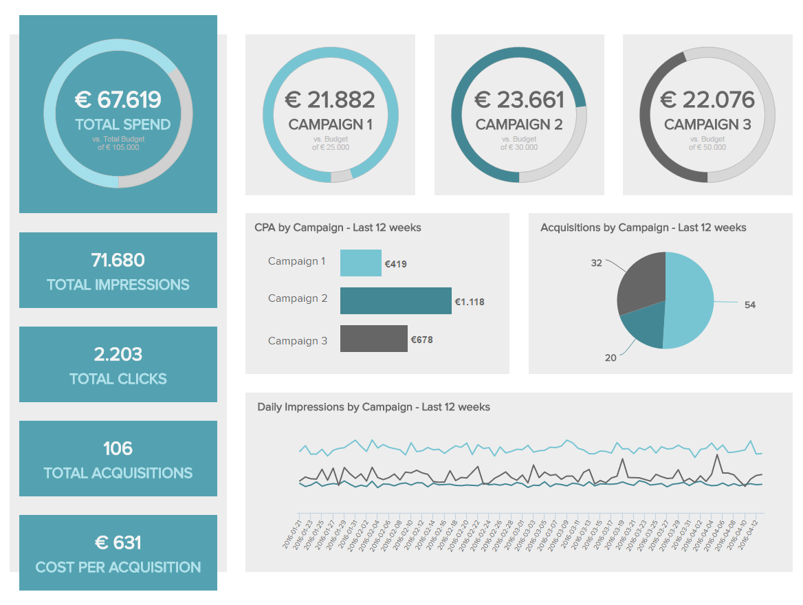
1. Weekly Marketing Report
Our first weekly report sample is an interactive marketing BI dashboard tracking the success of different campaigns through metrics such as total impressions, clicks, acquisitions, and costs. Let’s look at it more in detail.
**click to enlarge**
The template starts by providing the total spend by campaign and comparing it with the expected spend. This is an important metric to monitor every week as it lets you understand if your cost goals align with what is feasible. For example, if you implemented a campaign with a large budget and in the middle of a week you realize that it is not paying you back, you can make adjustments immediately before it is too late and you waste your budget (something very likely to happen if you were monitoring your spending monthly or quarterly). You can also see if a campaign is exceeding expectations and allocate more resources to it.
Next, we get an overview of metrics such as clicks, impressions, and acquisitions, each of them displayed for the last 12 weeks. The value of including historical data in your weekly status dashboards is clearly depicted in this interactive marketing report. Tracking the development of each campaign will allow you to test different strategies and compare the results to the values of the previous weeks. This allows you to monitor every important aspect of your campaigns in more detail and use your resources wisely.
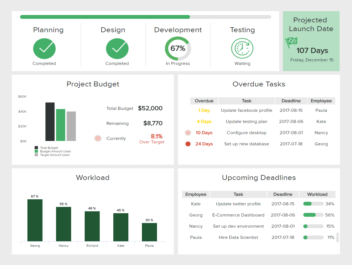
2. IT Report
Between handling tickets and dealing with big projects such as website updates, your IT department always has its hands full. This weekly project status report aims to make your life easier by providing you with the most important details regarding the status of your IT project, facilitating communication, and ensuring efficient development.
**click to enlarge**
This intuitive example of weekly report, provides a mix of operational and costs-related IT metrics that accurately represent the project status. Through this, you can ensure that you are not going over your budget, track that all deadlines are being met, and that your employees are not overloaded with work. Furthermore, by looking at these metrics every seven days, you can take a deeper look into the causes of overdue tasks and find smart solutions so that the project's development will not be affected.
Tracking the performance and status of larger IT projects every week with an IT dashboard will keep managers and anyone else involved in the project informed about every relevant task or development, facilitating the decision-making process and minimizing the scope so that issues can be spotted fast and handled efficiently. Not just that, getting this level of insight every week will also enable teams to stay connected with their tasks and deadlines while enhancing collaboration.
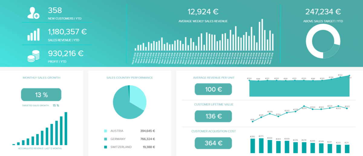
3. Weekly Sales Report
Our next weekly progress report template is a sales dashboard providing a detailed overview of the sales department’s ongoing success, focusing on metrics such as sales growth, sales targets, ARPU, CLV, and CAC.
**click to enlarge**
Built with a valuable mix of visualizations, this digestible weekly sales report offers a full picture of your sales operations so you can understand your performance quickly and easily. For instance, the top part of the dashboard provides insights into the performance of your sales team. By looking at the sales target metric, you can easily evaluate if anyone needs extra training to reach their individual targets.
On the other side, the bottom part of the dashboard, tracking the ARPU, CLV, and CAC, provides a snapshot of how these metrics developed in the last 12 weeks so you can dig deeper and find trends and patterns that will improve your progress. Getting all this intel together in an interactive weekly executive report like this enables you to compare these important numbers and monitor if you are on track to meet your goals. In the long run, you will augment your operational management and improve your profit margins.
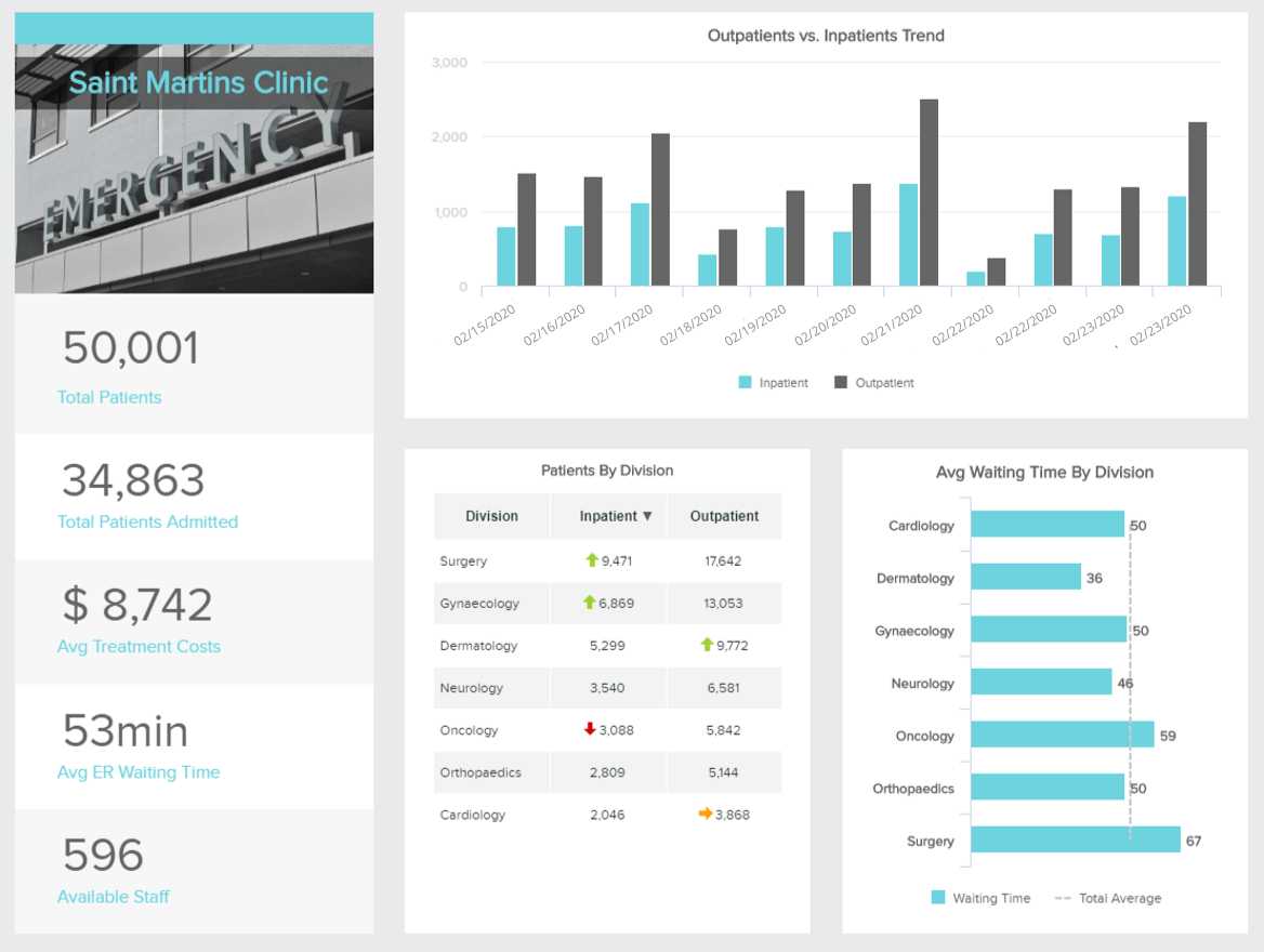
4. Weekly Hospital Report
Next in our rundown of examples comes a weekly status report template for the healthcare industry. Armed with powerful metrics related to management and operations, this healthcare dashboard will enable you to identify trends, spot any bottlenecks, and help allocate your resources for sustainable facility development.
**click to enlarge**
Running a healthcare facility is not an easy task. Every detail and department must be carefully monitored, as any issue can directly affect patient care. For this reason, the value of producing seven-day dashboards in this industry is not in question.
The dashboard above was created with a healthcare business intelligence tool with real-time data so you can always extract fresh insights. Starting at the left side, we get a glance at relevant values such as the total patients, total patients admitted, average treatment costs, average ER waiting time, and available staff. These metrics are all complemented with more detailed graphs by division. Through this, you will be able to understand if a specific department is overcrowded and allocate resources to ensure patients are getting optimal care.
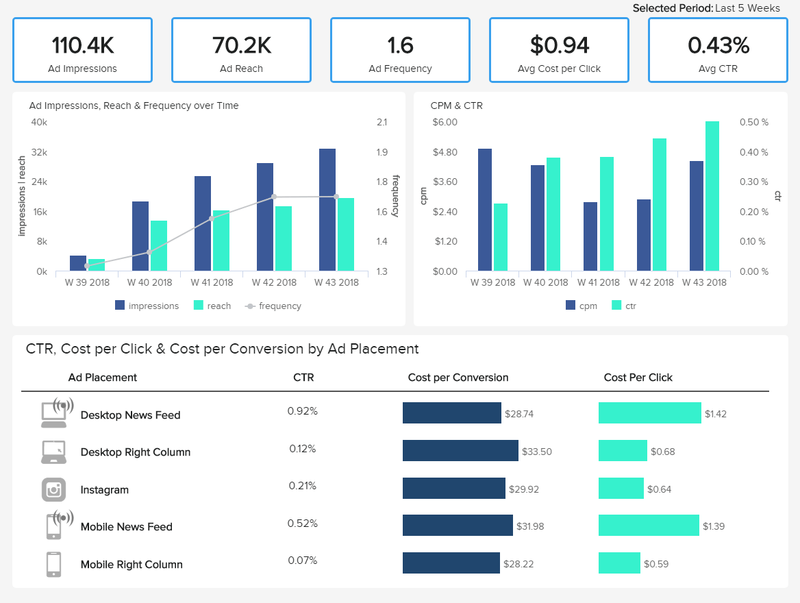
5. Weekly Facebook Report
An especially valuable weekly report format, this Facebook dashboard focuses on the development of advertising, enabling you to optimize your campaigns, distribute your resources wisely, and keep up with any algorithm changes that might come up. Like this, you will save time and resources by creating data-backed campaigns.
**click to enlarge**
Going into more detail with this weekly Facebook report, we first see the current value of fundamental Facebook KPIs for ads management, such as impressions, reach, frequency, cost per click, and CTR. Each is then broken down into more detailed charts displaying the development of the past 5 weeks in a visually appealing way that makes them easy to understand at a glance. Getting this level of insights on a seven-day basis will enable you to monitor the progress of your campaigns closely and test different ad strategies based on which one performs better for your business. If you want an even deeper understanding, each week can be filtered by day.
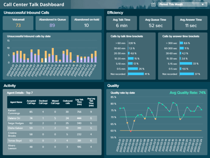
6. Weekly Service Report
Next, we have a weekly report example for a popular cloud-based customer service solution: Zendesk. Considering call centers have a bad reputation for long waiting times and inefficient solutions, focusing your efforts on providing the best talk service should be a priority, and this dashboard will help you do just that.
**click to enlarge**
By providing a mix of Zendesk KPIs related to call center performance, this report will help you optimize every relevant detail related to the development of your call team to ensure quality service.
Although this report focuses on the progress of one month, it is also a valuable resource to track weekly as it lets you dig deeper into the reasons for specific issues or trends. For instance, tracking the performance of your agents on a seven-day basis can let you understand if anyone needs extra training. Additionally, you can find patterns in your customer’s behaviors, such as the times they are most likely to call or the problems they face the most. This way, you can prepare your resources and strategies accordingly.
7. Weekly Security Report Template
We live in a hyper-connected digital age that evolves at warp speed. Failing to prioritize your company’s cyber safety is like leaving your front door wide open in the dead of night - and the costs of breaches are financially devastating.
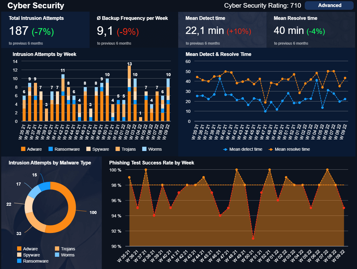
**click to enlarge**
A weekly activity report template designed to create a cohesive and consistent cyber security strategy across the organization, this essential tool uses seven-day monitoring IT KPIs, including average attack response times, backup frequency, phishing test success rates, cyber security ratings, and the number of intrusions experienced over a seven-day period.
This melting pot of information will ensure that you can fortify your organization against the looming threat of cybercrime with complete confidence - saving your company untold amounts of time, money, and progress, stunting logistical stress in the process.
Try our professional reporting software for 14 days, completely free!
8. Social Media Weekly Overview Report
Social media is ever-present in the digital age, and regardless of your niche or sector, it remains one of the most effective ways of engaging with (as well as winning over) your target audience. It’s a vessel designed for organizational growth - if you have a progressive strategy.
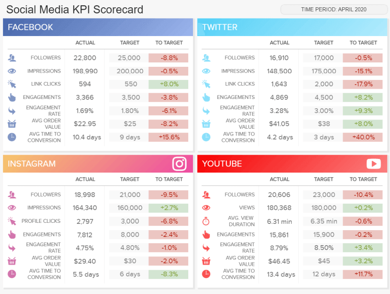
**click to enlarge**
Our social media KPI scorecard is a visually balanced weekly status report template that offers a wealth of brand-boosting information with a quick glance.
Split into key social media platforms, including Instagram, Facebook, Twitter, and YouTube, this savvy tool serves up insights based on seven-day followers, content clicks, engagement, and impressions.
Here, you can also identify key trends or patterns related to average order values, conversion times, and specific engagement rates across platforms. Armed with these powerful metrics, you can uncover content-based strengths and weaknesses to optimize your messaging as well as your posting times for maximum success. In turn, you’ll enjoy a consistently healthy return on investment (ROI) from your social media marketing efforts.
9. Logistics Weekly Report
Without a well-oiled fulfillment and logistics strategy, it’s unlikely that your organization will ever reach its full potential. Conversely, optimizing every aspect of your strategy for maximum efficiency will accelerate your commercial growth.
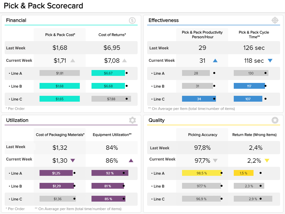
**click to enlarge**
This invaluable weekly progress report template, in the shape of a professional logistics dashboard, makes a powerful addition to any business’s analytical strategy as it hones in on regular patterns related to pick & pack costs, picking accuracy and cycle times, use of packing materials, and equipment utilization rates.
One of the most striking aspects of this highly visual tool is the fact that it’s part weekly financial report. Here, you can make accurate decisions based on improving your company’s fiscal health through your core logistical initiatives while consistently assessing areas that need improvement or refinement. A powerful tool that will accelerate your commercial growth from the ground up.
10. FMCG Weekly Report Templates
The Fast Moving Consumer Goods (FMCG) industry is arguably one of the most relevant industries for weekly tracking since these companies deal with edible products that are being consumed by people. Therefore, any mistakes can have major effects. According to a study by Deloitte, FMCG businesses using analytics will stay ahead of the game by identifying key price points in the market, understanding consumer behaviors, and developing new pricing strategies based on competitive intelligence. Now, we will take a look at two weekly progress report templates that are valuable for this industry.
- On-Shelf Availability
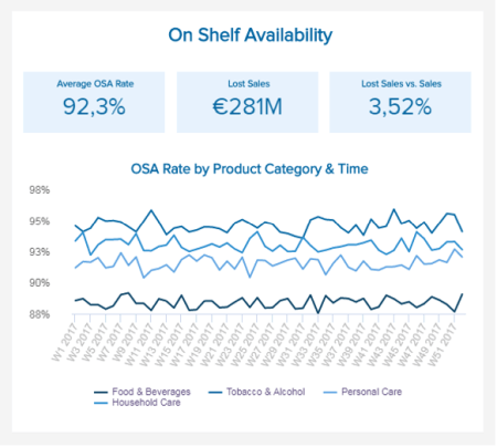
This weekly progress report template is intended to measure the percentage of time a particular product has been available for sale on shelves. This metric is usually measured by auditing the store's available products or conducting a deeper inventory analysis.
This is an important FMCG KPI to be measured regularly. It allows you to understand at which frequency some specific items are being sold and plan your stocking and inventory strategies accordingly. If customers arrive at the supermarket and do not find what they are looking for repeatedly, they will simply move to the next one.
- On-time In full Deliveries
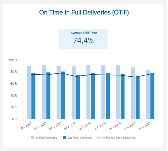
In this next weekly report sample, we look at the supply chain delivery performance within the FMCG industry. This report tracks different levels of delivery, including the quality standards, time to be delivered, and quantity delivered. Keeping track of this every week can be helpful for supermarkets to measure the performance of suppliers, as it allows them to determine if some are not delivering the expected service.
We covered templates for various business functions, industries, and platforms. If you want to see more than 80+ interactive reports, browse our list of dashboard examples and find the ones that better suit your business. Now, we will go to the final section of this guide, where we will provide you with some tips for the perfect weekly reports format.
11. Weekly Sales Cycle Length Report
The sales cycle length represents the time it takes for a lead to become a paying customer. Some sales cycles are nearly instant—a customer buying ingredients from a grocery store, for example. Others can take significantly longer, lasting weeks, months, or even a year or more, as sales reps explore the customers’ needs, customize contracts, follow up with leads, and manage the back-and-forth of inking a deal. It’s easy to get lost in the details and excitement of making a sale, and productivity can often suffer as a result. That’s why tracking the sales cycle length is so important—you can spot inefficiencies in your sales process to improve and close more deals.
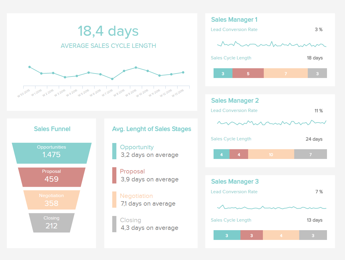
**click to enlarge**
The sales cycle length dashboard provides insights about this timeline, showing how long reps take to turn leads into profits. Here, we represent the sales cycle length by stage: Opportunities, Proposals, Negotiations, and Closings. You can see how long each part of the sales cycle takes and assess productivity at every turn. Reps benefit from this intel because it creates a sense of urgency and responsibility to follow up with leads in a timely manner. A stage that goes far beyond the average may have little chance of moving to the next phase, so they can use these details to figure out what’s working and what isn’t in their approach.
Users can also drill down by individuals and as a whole sales team for additional insights. Ideally, you can use this report to accelerate the sales process, identify high-performing sales reps, and close more deals over time.
12. Weekly Customer Service Report
The customer service department must solve customer issues quickly and efficiently to keep them happy and engaged. After all, unhappy customers can only lead a business to failure. Therefore, having access to weekly reports is an invaluable benefit to spot issues and trends fast and boost support strategies. Let's explore the example below.
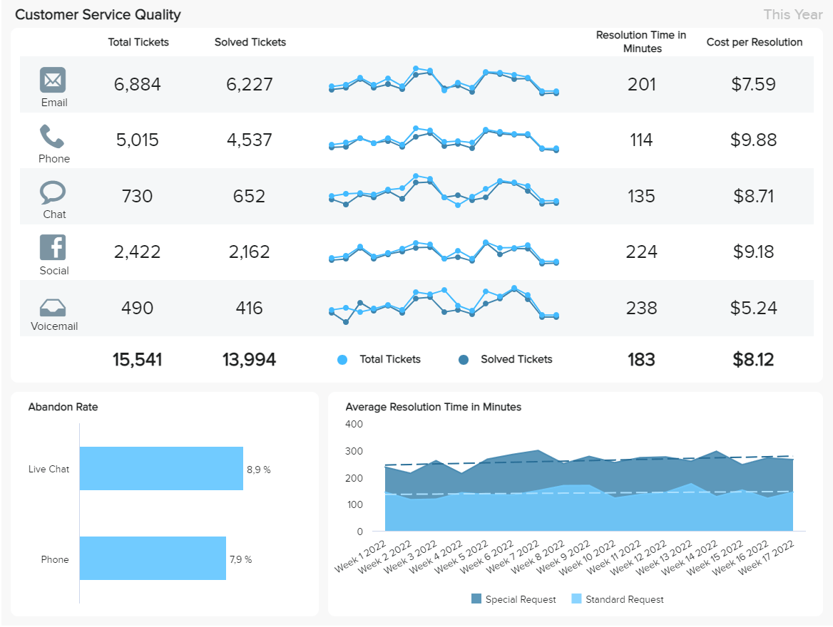
**click to enlarge**
The template above provides a 360-degree view of different customer service channels with a mix of performance and financial metrics. Having this complete overview can help managers compare the different channels and spot improvement opportunities. For example, we can see that social channels have the highest resolution time and the most expensive costs. While they have many solved tickets, it is still worth trying to lower the resolution time to lower overall costs. To do so, you can implement weekly strategies and test whether they are successful. Tracking strategies every week can help you test different approaches and change details to make sure resources are spent smartly.
13. Weekly COO Report
COOs make hundreds of decisions in a week and often need to do so quickly. They rely heavily on data to inform these decisions, but they need to be able to access it quickly and trust its accuracy. With operations spanning multiple departments and points of interest, having fragmented intel in one place is critical to streamlining decisions.
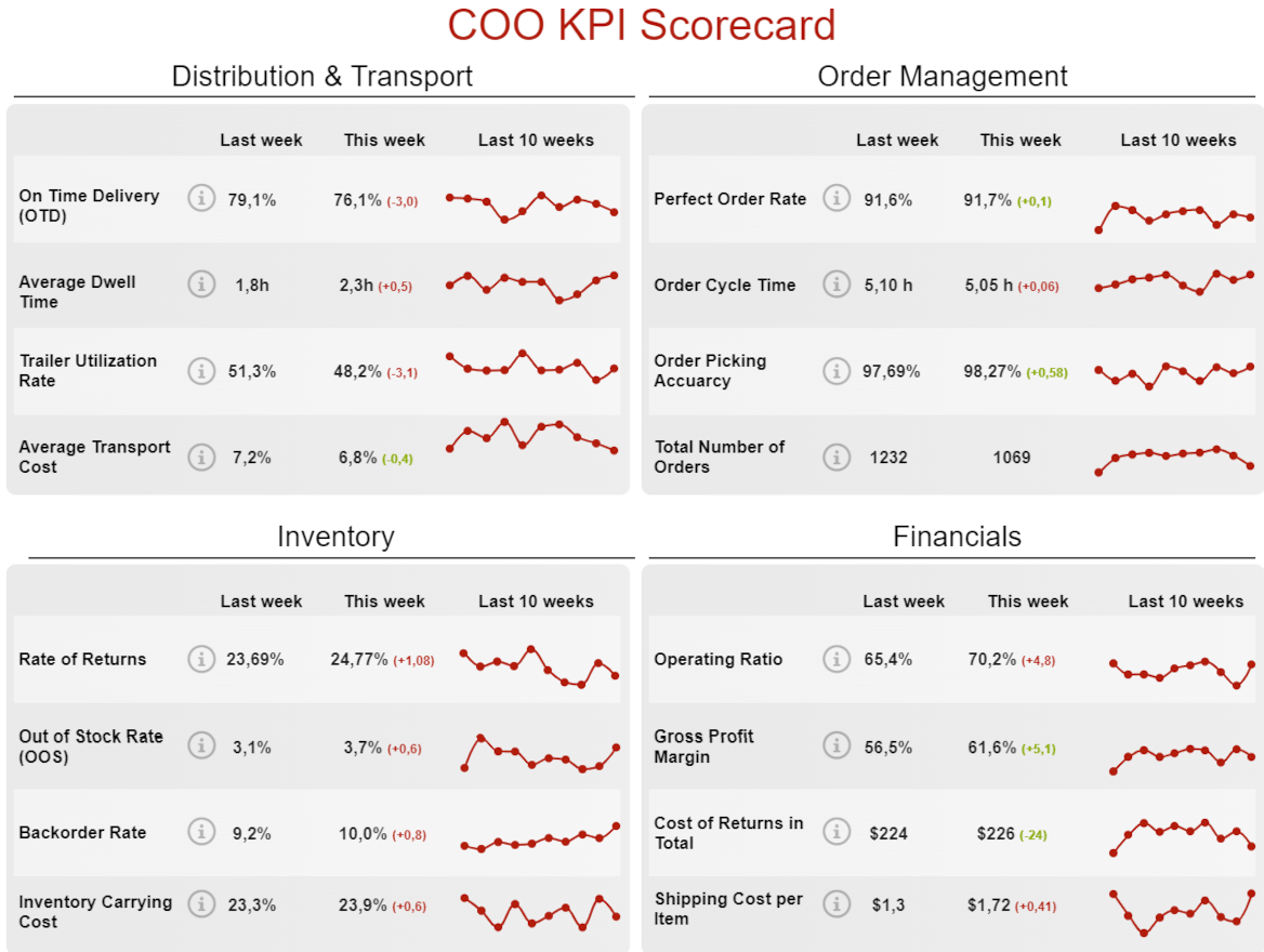
**click to enlarge**
Arranged in a scorecard format, the COO logistics dashboard focuses on four key areas of operations: distribution & transport, order management, inventory, and financials. Starting with distribution and transportation, COOs can monitor KPIs like on-time deliveries and trailer utilization rates to see how efficiently they transport goods. Order management metrics also help shine a light on transportation and distribution by showing order cycle times and picking accuracy. Without healthy inventory levels (e.g., a high out-of-stock rate), trailer utilization rates and on-time deliveries can have a negative impact, for example. These same metrics can illustrate the reasons behind your financial picture—poor trailer utilization could result in a higher shipping cost per item, for example.
Context is key in decision-making, and combining multiple areas into a single report allows COOs to gain greater context into their decisions.
14. Weekly Google Analytics Report
Our last weekly report example focuses on the quintessential tool for businesses, regardless of company size or industry. So much can be learned from Google Analytics regarding your website traffic and how it’s impacting business operations. People visit your website to discover your brand, learn more about your products and services, engage with your content, and ultimately do business with you. Google Analytics delivers insights into the user journey and experience so you can better capture their attention and give them what they want when they want it.
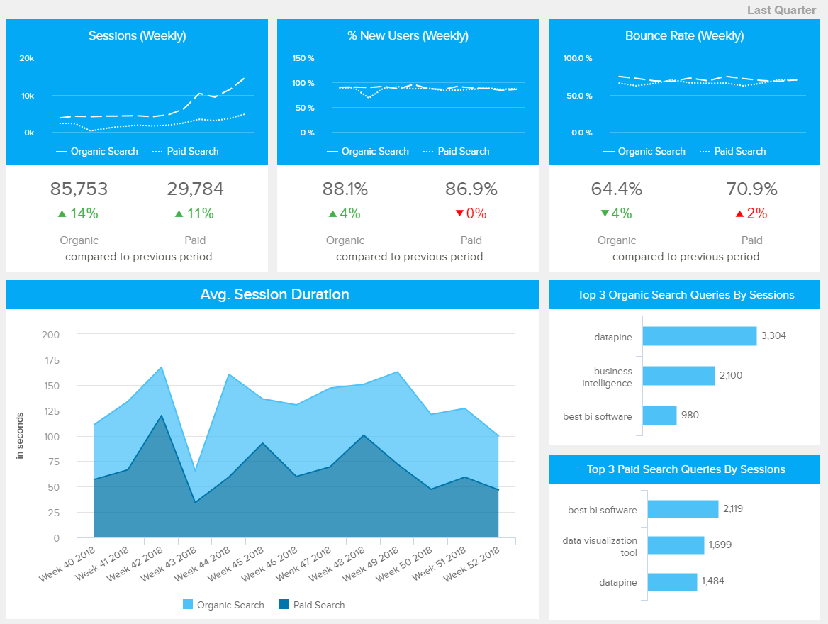
**click to enlarge**
This organic vs. paid search report gives users instant insights into their online performance. Traffic comes from multiple sources, and it’s important to know if you’re spending money on the right sources or if you’d be better off allocating that spend to other channels. Ideally, you’ll be able to taper your spending on paid search over time as more people discover your business and will think of you on their own without the need for online advertising. This report can show how you’re progressing toward that goal and the quality of the leads that come from both types of traffic. Numbers alone mean little if you’re not getting results, so metrics like bounce rate, search queries, and average session duration can help you see the impact of paid and organic searches.
Top Elements Of A Weekly Performance Report
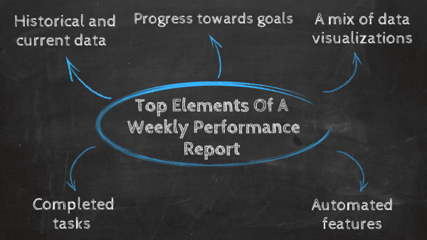
There is no set of rules that you should follow to create the perfect weekly performance report, as each of them will have a different purpose, as you saw in our examples. However, there are a few steps and elements that you should follow to achieve weekly reporting success. For instance, you should incorporate what was achieved in the previous week as well as future plans for the next one. Paired with this, before creating your report, you should also consider who your audience is and what KPIs and visuals will tell your story in the best way possible. Going a bit more in detail, the main elements that should be included in a successful weekly report are:
Historical and current details
As mentioned, one of the steps you should follow when creating your data collection is to include current performance as well as past insights in your weekly reporting. On one hand, getting insights into the progress of different strategies and tasks will help keep everyone in the team on the same page about their performance as well as learn from the different obstacles they faced during that week and find improvement opportunities. On the other hand, having historical details will help you spot trends and patterns in your performance, providing you with a deeper understanding of your business. For example, if you implement a change and see that numbers dropped from the previous weeks, then it is an indication that the strategy might not be working.
Progress toward goals and targets
Setting targets and goals is a valuable reporting practice as it not only motivates employees to perform better to reach their goals but also lets you realistically measure your progress. Your weekly performance reports can include KPIs tracking a yearly business goal, as well as smaller goals such as the number of sales or followers to reach over seven-day periods. It is important to remember that not every KPI will represent your goals best, so you need to choose the ones that will provide the most value to your report instead of overcrowding it. If you want to see several metrics for different functions, industries, and platforms, browse our list of key performance indicators examples.
A mix of visualizations
As mentioned throughout this post, the value of modern weekly progress tracking lies in the fact that they are powerful visual tools that make the reporting process accessible to everyone without the need for any technical skills. Including a mix of interactive graphs and charts in your weekly reports is fundamental as they will provide context and allow you to extract relevant insights at a glance. Tools such as datapine offer a dashboard reporting tool that enables you to create interactive weekly progress reports in the form of online dashboards with just a few clicks. Through this, you keep every relevant stakeholder involved in the analysis process by making it visual and user-friendly.
Completed tasks
As one of the prime benefits of weekly reporting is enhancing communication between managers and their teams, your weekly reporting should also include the completed tasks and reached goals of the week. This will help managers stay connected with the different tasks of the team while keeping a record of what has been accomplished in terms of organizational goals.
Automation features
Considering that modern businesses have their hands busier than ever, it is timely impossible to manually create a report every week without taking away valuable time from other tasks. For this reason, a successful weekly reporting process should include report automation features that will leave the pains of manual reporting in the past and facilitate how businesses deal with their reports. BI tools such as datapine auto-generate dashboard information with real-time data on whatever time schedule you decide. With just a few clicks, you will have weekly status reports with fresh insights waiting to be untapped.
The Value Of Visuals For Efficient Weekly Reports
As humans, we’re visual creatures, and as such, we digest imagery far more readily than linear information.
We live in a highly evolved digital age where the static reporting strategies of the past are fast becoming obsolete. Rather than wading through pages upon pages of uninspiring statements or figures, now it’s possible to gain a wealth of organization-boosting insights with a simple glance.
Static methods once had their place, but in today’s world, they’re labor-intensive, time-consuming, and, more often than not, inaccurate.
Whether you’re talking about a sales weekly report template, a weekly market report, or any other kind of informational offering, interactive online data visualization tools are the way forward. Interactive weekly status report templates allow you to reach out and touch your company’s most valuable metrics and empower you to use them in a way that transforms raw data into actionable insight.
With modern dashboards and tools, you can drill down, zoom in, filter, and access every key insight with ease. Using visual KPIs, it’s possible to keep track of your most important initiatives every seven days to ensure you’re consistently working towards your most important objectives. Tracking your progress this frequently will also help you remain responsive to any sudden changes and issues that will inevitably come your way.
All in all, the value of these types of reporting tools is enormous - and with consistent measuring, monitoring, and tracking, you will see a healthy return on investment (ROI).
Try our professional reporting software for 14 days, completely free!
Key Learnings For Successful Reporting
As we reach the end of our weekly reporting journey, we hope you better understand the benefits of tracking progress and status using interactive visualizations.
Your weekly reports will provide you with an overview of your current performance and the historical metrics, allowing you to understand diverse phenomena. Thus, you will enjoy an efficient decision-making process based on facts and not simple human intuition.
We defined modern weekly reports, discussed the benefits your business can enjoy from them, reviewed examples for different business scenarios, and concluded with tips for developing a successful report format. To keep your mind fresh, here is a small summary of key things you should not forget:
Why are weekly progress reports important?
- They allow for informed decision-making
- They enable team performance tracking
- They help spot improvement opportunities
- They enhance collaboration and communication
- They improve responsivity
What should a weekly report include?
- Historical and current insights
- Progress toward goals and targets
- A mix of visualizations
- Completed tasks
- Automated features
Now that you know the fundamentals of seven-day analytical weekly reporting tools and methods, you can create an informational strategy that will see you not only reach but exceed your organizational goals consistently. No longer will you be shooting in the dark, hoping for the best - armed with the right visual tools - you will know exactly what to do in any given situation.
Are you ready to start making your own interactive weekly reports with the help of an industry-leading dashboard tool? Then try our 14-day trial completely free and start benefiting from quality reporting today!