Discover 20 Essential Types Of Graphs And Charts And When To Use Them
Table of Contents
1) What Are Graphs And Charts?
2) Charts And Graphs Categories
Data and statistics are all around us. It is very likely that you have found yourself looking at a chart or graph at work, in the news, sports, media, advertising, and many other places at some point in your life. That is because graphical representations of data make it easier to convey important information to different audiences. That said, there is still a lack of charting literacy due to the wide range of visuals available to us and the misuse of statistics. In many cases, even the chart designers are not picking the right visuals to convey the information in the correct way.
So, how do you make sure you are using and understanding graphs and charts in the right way? In this post, we will provide you with the necessary knowledge to recognize the top 20 most commonly used types of charts and graphs and give insights into when and how to use them correctly. Each type of chart will have a visual example generated with datapine’s professional dashboard software.
This knowledge will be valuable if you are a data visualization designer, a business user looking to incorporate visual analytics into his/her work, or just an average viewer looking to learn more about the topic. Let’s start this journey by looking at a definition.
What Are Graphs And Charts?
A graph or chart is a graphical representation of qualitative or quantitative data. It uses different symbols such as bars, lines, columns, tables, box plots, maps, and more, to give meaning to the information, making it easier to understand than raw data.
As you probably already know, multiple kinds of graphs and charts are widely used in various fields and industries such as business decision-making or research studies. These visual tools are used to find relationships between different data sets and extract valuable conclusions from them. In some cases, they are built by hand, and in others, most commonly, they are built using visualization tools.
That said, the type of chart or graph you use will vary depending on the aim of the analysis. For instance, percentages are better viewed through a pie or bar chart while data that is changing over time is better viewed over a line chart. For that reason, it is important to have a clear understanding of the different chart types to make sure you are using the right one.
Below we will discuss the graph and chart categories. These categories will build a solid foundation that will help you pick the right visual for your analytical aims. Let’s dive into them.
Charts And Graphs Categories
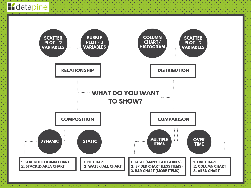
As mentioned, asking the right questions will form the foundations for choosing the right types of visualization graphs for your project, strategy, or business goals. The fundamental categories that differentiate these questions are based on:
- Relationship: Understanding connections between different data points can significantly help discover new relevant insights. For instance, in the medical field, analyzing relationships between diseases and gene interactions can help discover a treatment for a particular disease. When it comes to visuals, a few graphics can help you easily identify and represent relationships. Scatter plots are valuable when you want to represent smaller data sets of two variables while bubble graphs are best for larger information with three or more variables.
- Distribution: In statistics, distribution refers to the possibility of the occurrence of an outcome. To understand this, scientists and analysts use charts to represent the frequency distribution of the data and extract conclusions from it. For this purpose, they use line charts to analyze trends, scatter plots to highlight similarities across variables, and histograms to see the frequency distribution of a single variable across categories.
- Composition: The purpose of business graphs and charts for composition is to compare parts to a whole in absolute numbers and normalized forms, usually a percentage. It is one of the most common and traditionally used visualization categories and it is usually limited by the simplicity of the chart types. Common composition graphs include pies, tree maps, and stacked bar charts.
- Comparison: As its name suggests, this category refers to the comparison of multiple variables or multiple categories within a single variable. When comparing information it is fundamental to pick a chart that will make it easier to understand the differences. These differences can be within multiple elements, for example, top-selling products, or over time, such as the development of sales for different products over a year. For this purpose, tables, spiders, lines, columns, or area graphs are always a good choice.
To get a clearer impression, here is a visual overview of which chart to select based on what kind of data you need to show:
**click to enlarge**
Discover 20 Different Types Of Graphs And Charts
Now that you understand the key charting categories you are ready to dive into the main types of graphs and when to use them. Here, we will focus on the 20 most common types of visuals to represent your data in the most meaningful way possible. Each chart type has a visual example generated with datapine.
1) Number Chart
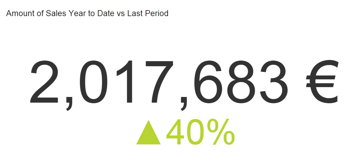
When to use
A real-time number chart is essentially a ticker that will give you an immediate overview of a particular KPI. At a glance, you can see any total such as sales, percentage of evolution, number of visitors, etc. This is probably the easiest visualization type to build with the only consideration being the period you want to track. Do you want to show an entire history or simply the latest quarter? It is crucial to label the period clearly so your audience understands what story you are telling. Adding a trend indicator compares your number to the previous period (or to a fixed goal, depending on what you are tracking).
Other considerations
Number charts are often the first thing people see and are the quickest to read, so if there are too many, your narrative can get diluted. Using too many can also make your dashboard a little superficial. If you want more in-depth information, limit the number of number graphs and leave room for other types of data visualization that drill down a little deeper.
When you add a trend indicator, we suggest you compare numbers from the same period. For example, if you are tracking total sales for the current quarter, compare that data to the same quarter last year (or last period – depending on your story). If you select a target manually (perhaps you have no accurate past data), be sure to set realistic goals to be able to get on top of your KPI management practice. Again, remember to label the trend indicator clearly so your audience knows exactly what they are looking at.
2) Line Chart
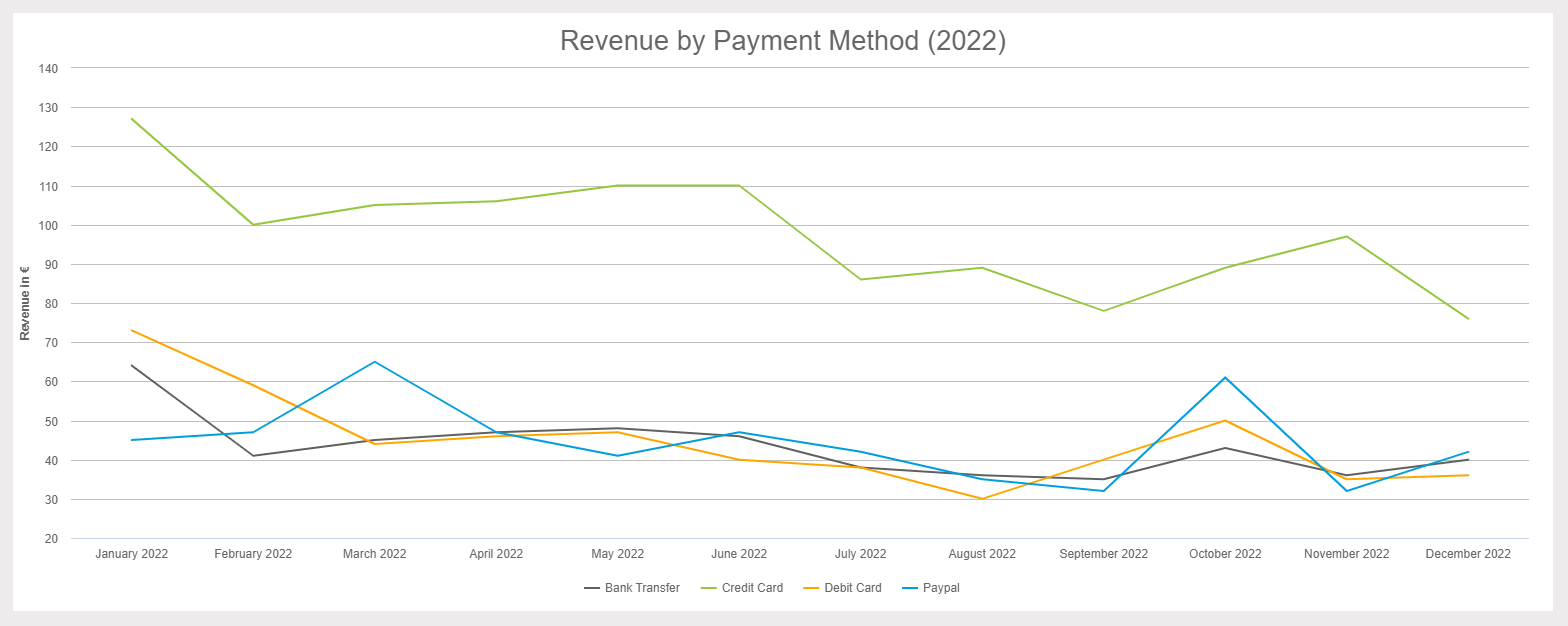
**click to enlarge**
When to use
The purpose of a line chart is to show trends, accelerations (or decelerations), and volatility. They display relationships in how data changes over a period of time. In our example above, we are showing Revenue by Payment Method for all of 2019. Right away, you can see that the credit card payments were the highest and that everything took a dip in September. The takeaways are quick to register yet have depth.
Other considerations
Too many lines (variables) can make your chart complicated and hard to decipher. You may also find your audience constantly referencing the legend to remind them which one they are looking at. If you have too many variables, it’s time to consider a second (or even third) chart to tell this story.
When it comes to layout, keep your numbers relevant. When you set up your axis scale, keep it close to the highest data point. For example, if we had set the y-axis above to track all the way to 200K (when our highest data point is just over 90K), our chart would have been squished and hard to read. The top half would have been wasted space, and the data crammed. Let your data breathe a little!
One more thing!
A great feature of line graphs is that you can combine them with other types of visualizations, such as bar graphs. Using a double y-axis, one for the bar graph and one for the line, allows you to show two elements of your story in one graph. The primary y-axis below shows orders (bar graph), and the secondary y-axis is sales totals (line). The metrics are different and useful independently, but together, they tell a compelling story.
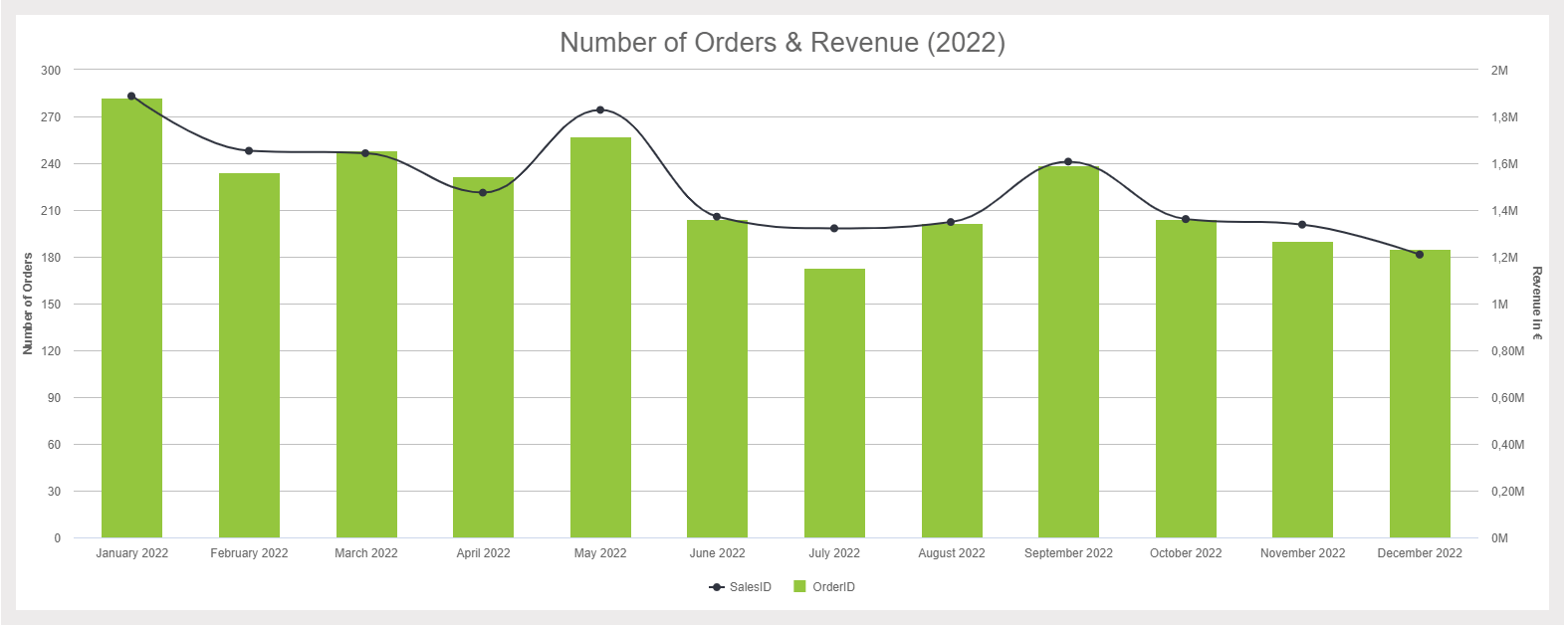
**click to enlarge**
3) Maps
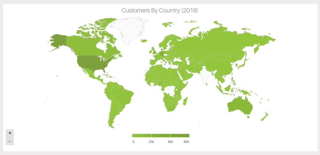
When to use
Maps are great at visualizing your geographic data by location. The information on a map is often displayed in a colored area map (like above) or a bubble map. Because maps are so effective at telling a story, they are used by governments, media, NGOs, nonprofits, public health departments – the list goes on. Maps aren’t just for displaying data; they also direct action. This was seen most recently through the Zika outbreak. Mapping the spread of the disease has helped health officials track it and effectively distribute resources where they are most needed.
Even if you aren’t saving the world from Zika, maps can help! For example, they are great at comparing your organization’s sales in different regions.
Other considerations
Everyone loves maps. However, that doesn’t mean you always need to display one. If the location isn’t a necessary part of your analytics story, you don’t need a map. They take up a lot of room, so only use them when necessary. Also, don’t just fill your maps with data points. Clickhole did a good job of satirizing this common data visualization type by placing 700 red dots on a map. Filling your map with data points doesn’t tell a compelling story; it just overwhelms the audience.
4) Waterfall Chart
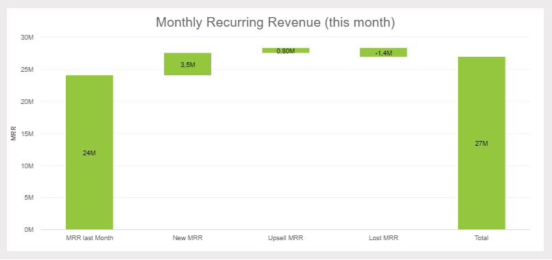
**click to enlarge**
When to use
This extremely useful chart depicts the power of visualizing data in a static, yet informative manner. It shows the composition of data over a set time period, illustrating the positive or negative values that help in understanding the overall cumulative effect. The decrements and increments can cause the cumulative to fall below or above the axis at various points, causing a clear overview of how the initial value is affected. It is often used in financial departments for analytical purposes, usually depicting the changes in revenue or profit. For example, your MRR (monthly recurring revenue), new revenue, upsell, lost, and current revenue. In our example above, we can conclude that our current revenue increased in our set time period.
Other considerations
Waterfall charts are static in their presentation so if you need to show dynamic data sets, then stacked graphs would be a better choice. Also, showing the relationship between selected multiple variables is not optimal for waterfall charts (also known as Cascade charts), as bubble plots or scatter plots would be a more effective solution.
5) Bar Graphs
There are three key types of bar graphs that we will cover in this section: Horizontal, Grouped and Stacked. Although all are in the same chart family, each serves a distinct purpose. Let’s discuss each of them in detail below.
a) Horizontal Bar Graphs
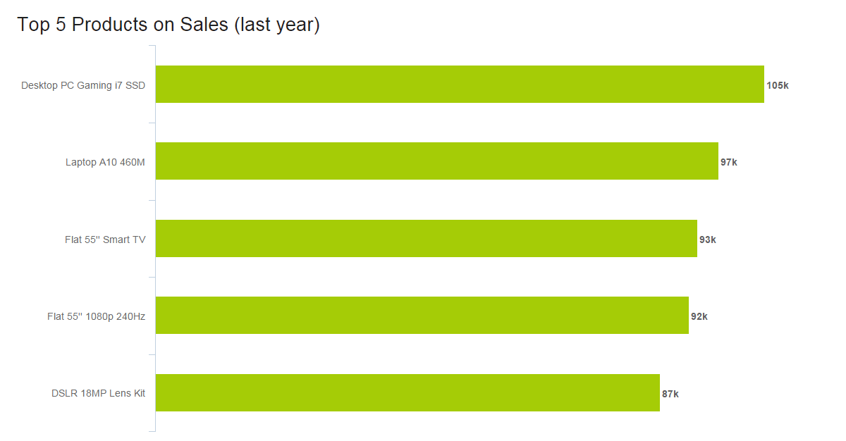
**click to enlarge**
When to use
Horizontal charts are perfect for comparative ranking, like a top-five list. They are also useful if your data labels are really long or complex. Keep them in an order that makes sense, though. Either list by value (like we did above) or, if that’s not the strength, choose a logic for the labels that makes sense, like listing them alphabetically.
Other considerations
Because time is best expressed left to right, it’s better to leave showing an evolution for the column chart. Also, like many charts, when you have too many values, a horizontal bar graph quickly becomes cluttered.
b) Grouped bar graph
When to Use
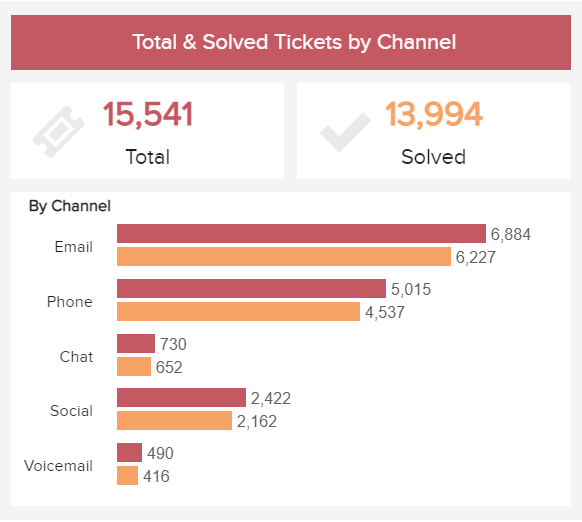
Grouped bar charts follow the same logic as horizontal bars, except that they show values for two variables instead of one. The two variables are often displayed in disparate colors to help differentiate them from each other. It is recommended to use this chart type when you want to compare elements within a specific category or across other categories on the chart. For instance, in our example generated with a customer service analytics tool, we can see customer service tickets by channel divided between the total and solved ones. In this case, the grouped chart can help compare the values between the total and unsolved tickets as well as compare the number of solved tickets across channels and extract conclusions.
Other considerations
Just like with the horizontal one, you need to be careful not to add too many categories into this graph type as they can make it look cluttered. The chart becomes difficult to read with the increase in categories, therefore, it is not the best when it comes to relationship or distribution analysis.
c) Stacked bar chart
When to Use
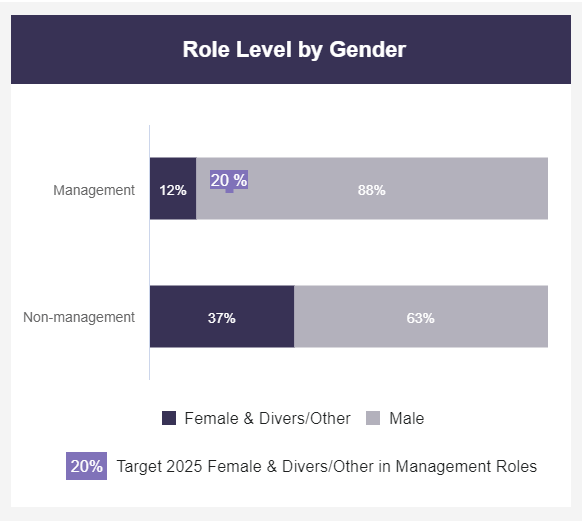
A stacked bar chart is a variation of the traditional bar graph but, instead of dealing with one categorical variable, it deals with two or more. Each bar is divided into multiple subcategories that are compared with each other usually using a percentage. In the example above, the chart is comparing management and non-management positions (first categorical variable) that are being occupied by female and diverse employees vs male employees (second categorical variable). This allows the users of the bar to not only focus on the comparisons between the bars themselves but also extract conclusions based on the subcategories from each individual bar.
Other considerations
When building a successful stacked bar graph it is important to carefully decide which of the two categorical variables will be the primary one. The primary one is the most important one and it will define the overall bar lengths. The secondary one will define the subcategories. Usually, if you are dealing with time ranges or numerical values, these make the best primary variables. However, it will vary from case to case.
6) Column Graphs
When to use
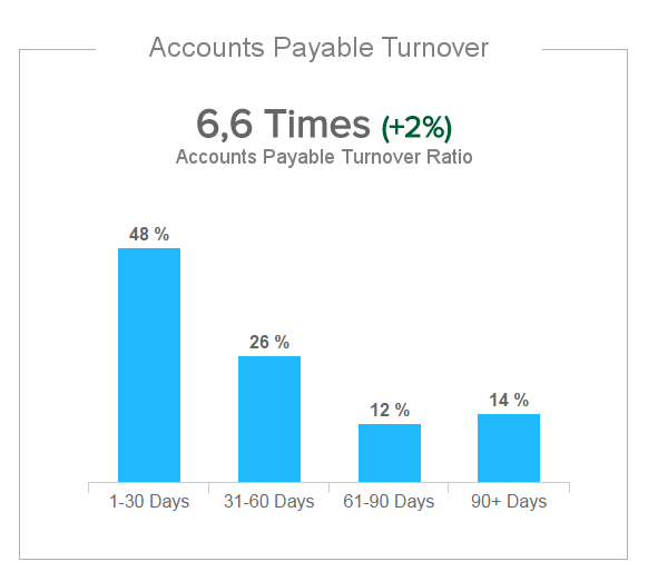
Column charts are the standard for showing chronological data, such as growth over specific periods, and for comparing data across categories (you can see this in the example where the accounts payable turnover is being compared based on date ranges). In general, for these kinds of charts, the categories are typically displayed on the horizontal axis while the numerical values are displayed vertically using rectangular columns. The size of the columns is proportional to the values displayed on the chart and their height allows people to easily extract conclusions at a glance. Unlike the bar chart which can display larger or more complex datasets, the column chart has a size limitation making it best to display smaller data. This makes it the go-to visualization for anyone looking for an easy and understandable way to display their information.
Other considerations
Aside from the obvious design mistakes like using too many colors or too many categories, other things you want to make sure of are: if there is no natural order for the data (e.g. age categories or time ranges), it is recommended to order the values from higher to lowest or lowest to highest. Additionally, the y-axis should always start at 0, otherwise, the height of the columns can become misleading.
c) Grouped column chart
**click to enlarge**
When to use
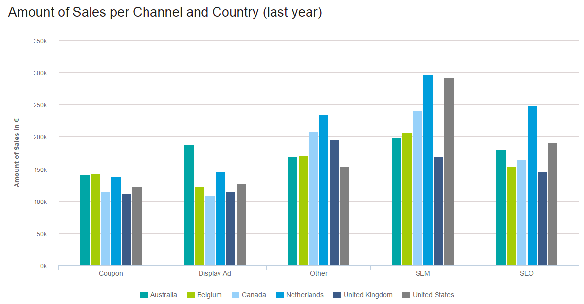
Just like the grouped bar chart, the grouped column chart compares two categorical variables instead of one using vertical columns instead of horizontal bars. The purpose of this graph is to see how the subcategories from the secondary variable change within each subcategory of the primary variable. Comparisons can be done within-group or between groups depending on the aim of the analysis. In our sales data analysis example, Amount of Sales per Channel and Country (last year), it is clear that we are comparing six regions and five channels. The color coding keeps the audience clued into which region we are referencing, and the proper spacing shows the channels (good design is at the heart of it all!). At a glance, you can see that SEM was the highest-earning channel, and with a little effort, the Netherlands stands out as the region that likely enjoyed the highest sales.
Other considerations
An important consideration when it comes to this graphic is to not use it to compare totals within the different levels of the categorical values. For this purpose, it is better to use a stacked column chart which we will discuss below.
b) Stacked Column Chart
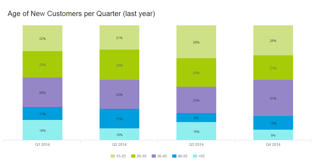
**click to enlarge**
When to use
Stacked charts handle part-to-whole relationships. This is when you are comparing data to itself rather than seeing a total – often in the form of percentages. In the example above, the story isn’t about the total number of customers aged 15-25, but that 22% of the customers were 15-25 in the first quarter of 2014 (and 26% in Q4). The numbers we are working with are relative only to our total.
When showing single part-to-whole relationships, pie charts are the simplest way to go. Twenty-two percent of our customers are 15-25, leaving the other 78% to fit into the pie somehow. People get pie charts. They’re easy. But what if we want to show the same information over different periods? This would be a multiple part-to-whole relationship, and for this, we use a stacked bar graph. Again, we are telling the story of the percentage of customers in a certain age range, per quarter. The total number of each isn’t relevant here (although that information is used in the calculations). With proper spacing, we see each quarter clearly, and the color coding shows that overall, 46-55-year-olds are the most difficult customers to attract.
Other considerations
Aesthetically speaking, when you have too much data, columns become very thin and ugly. This also leaves little room to properly label your chart. Imagine we had 10 different age ranges per column. Some results, if not most, would be only slivers. To make your chart easy to understand, use good colors, proper spacing, and a balanced layout. This invites people to look at your chart and even enjoy it. A pretty chart is a much nicer way to consume data than squinting at a table.
7) Pie Charts
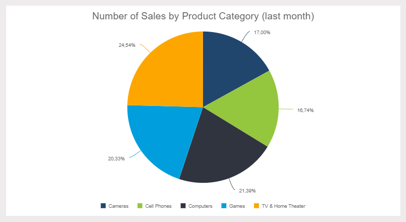
When to use
The much-maligned pie chart has had a bad couple of years. In fact, it has become pretty cliché to talk about how bad pie charts are. We understand the pie chart doesn’t do a lot, but it does do some things quite well. Pie charts are useful when demonstrating the proportional composition of a particular variable over a static timeframe. Let’s look at some particular cases:
- When the parts add up to 100%: The “part-to-whole relationship” is built right into it a pie chart in an obvious way. At a glance, any user knows a pie chart is splitting a population into parts and that the total of those parts equals 100%.
- When approximating is okay: The pie chart is particularly effective when eyeballing values are enough to get the conversation going. Also, it’s easier to estimate the percentage value of a pie chart compared to, let’s say, a bar chart. That’s because pies have an invisible scale with 25%, 50%, 75%, and 100% built-in at four points of the circle. Our eyes can easily decipher these proportions, driving the conversation about what variables do and don’t take up most of the pie. Your audience doesn’t have to guess the proportions – you can easily add data labels or build the sister of the pie chart, the donut chart, to display additional information.
- When there aren’t many proportions to the variable or they are combined: Pie charts are great when answering questions like, “What two largest suppliers control 65% of the market?”
Your audience isn’t always going to be comprised of data scientists. Accordingly, your presentation should be tailored to your particular audience. This brings us to another pie chart strength: people are familiar with pie charts. Any audience member will feel comfortable interpreting what the pie chart is presenting. As a bonus, circles generate more positive emotions: our brains like to look at circles over sharp corners. In the end, a pie chart simplifies the data story and encourages the audience.
Other considerations
Data visualization guru Edward Tufte famously declared that “pie charts are bad, and the only thing worse than one pie chart is lots of them.” We already talked about the pros of pie charts and why we don’t adhere to this strict no-pie-chart philosophy. We should also state that there are plenty of instances where you should not use a pie chart. First off, pie charts portray a stagnate time frame, so trending data is off the table with this visualization method. Make sure your audience understands the timeframe portrayed and try to document or label this applied filter somewhere.
Pie charts are also not the best types of data charts to make precise comparisons. This is especially true when there are multiple small pieces to the pie. If you need to see that one slice is 1% larger than another, it’s better to go with a bar chart. Another thing about multiple pieces to your pie – you don’t want too many. Pie charts are most effective when just displaying two portions. They lose presentation value after six segments. After six, it is hard for the eyes to decipher the slice's proportion. It also becomes difficult to label the pie chart, and valuable online dashboard/reporting real estate is often wasted in the process.
This brings us to the last issue: circles take up space. If you are using multiple pie charts in a dashboard, it is probably best to combine the data in one chart. We recommend checking out the stacked bar chart for these cases. You can also have a look at the different pie charts that are commonly used and explore the disadvantages of pie charts.
8) Gauge Charts
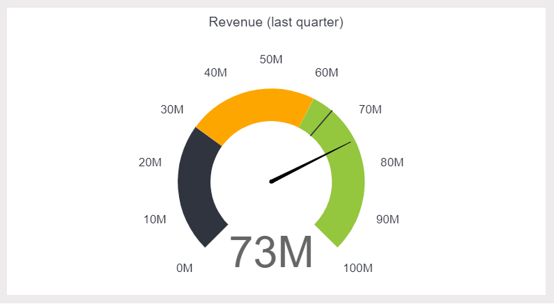
When to use
Gauge charts, also known as dial charts or speedometer charts, use needles and colors to show data similar to reading on a dial/speedometer, and they provide an easily digested visual. They are great for displaying a single value/measure within a quantitative context, such as to the previous period or to a target value. The gauge chart is often used in executive dashboards and reports to display progress against key business indicators. All you need to do is assign minimum and maximum values and define a color range, and the gauge chart will display an immediate trend indication.
Other considerations
Gauge charts are great for KPIs and single data points. After that, they can get a bit messy. With only one data point, you can’t easily compare different variables. You also can’t trend data using gauge charts. All of this makes taking actionable insight from a gauge chart difficult. Furthermore, they take up a lot of space – if your live dashboard has precious real estate, it may not be most efficient to fill it with multiple gauge charts. Using one chart to summarize multiple KPIs, you will likely get more bang for your buck.
9) Scatter Plot
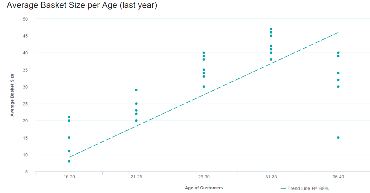
**click to enlarge**
When to use
Scatter plot is not only fun to say – it’s what you need when looking for the correlation in a large data set. The data sets need to be in pairs with a dependent variable and an independent variable. The dependent (the one the other relies on) becomes the y-axis, and the independent – the x-axis. When the data is distributed on the plot, the results show the correlation to be positive, negative (each to varying degrees), or nonexistent. Adding a trend line will help show the correlation and how statistically significant it is.
Other considerations
Scatter plots only work when you have a lot of data points and a correlation. If you are only talking about a few pieces of information, a scatter plot will be empty and pointless. The value comes through only when there are enough data points to see clear results. If you only have a little data or if your scatter plot shows no correlation at all, this chart has no place on your business dashboard.
10) Spider Chart
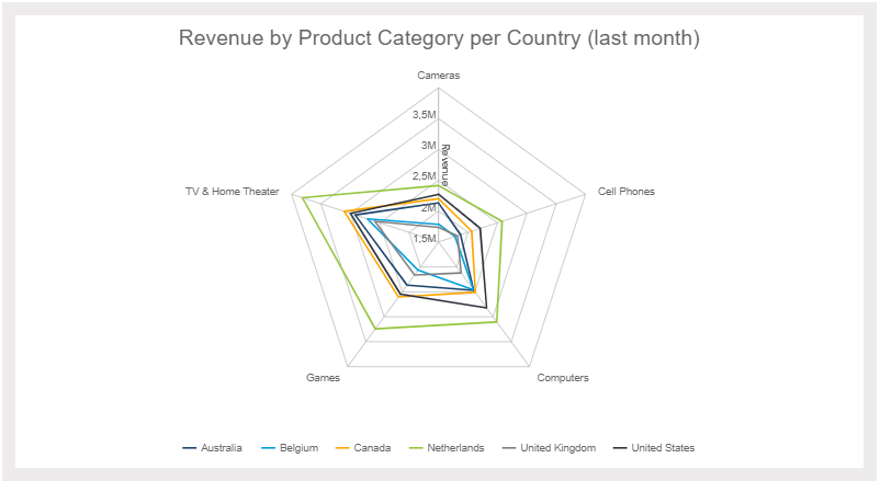
**click to enlarge**
When to use
Spider charts, or radar charts, are comparative charts used when multivariate data is displayed with three or more quantitative variables (aspects). This is useful when you want to evaluate two or more “things” using more than three aspects, all of which are similarly quantifiable. It’s certainly a mouthful, but it’s simple when you put it into use. Spider charts are great for rankings, appraisals, and reviews. For example, the three “things” we are comparing in our e-commerce example above are regions: Australia, Europe, and North America. The aspects we are comparing against are products sold are Cameras, TVs, Cell Phones, Games, and Computers. Each variable is being compared by how many units were sold – between 0 and 500. Europe is clearly outselling in all areas, and Australia is particularly weak in Cameras and Cell Phones. The concentration of strengths and weaknesses is evident at a glance.
Other considerations
This is not the easiest data analysis chart to pull off, but it really impresses when done correctly. Using this chart if you have more than five values in your dimension (five “things” to evaluate) makes it hard to read, which can make it pointless altogether. Whether you use solid lines or shaded areas, too many layers are difficult to interpret. Naturally, it is not a choice when you want to show time (the whole circular thing...).
11) Tables
**click to enlarge**
When to use
We know – tables aren’t technically a graph. But sometimes, you really just need a table to portray your data in its raw format. With a table, you can display a large number of precise measures and dimensions. You can easily look up or compare individual values while also displaying grand totals. This is particularly beneficial when your audience needs to know the underlying data or get into the “weeds.” Tables are also effective if you have a diverse audience where each person wants to look at their own piece of the table. They are also great at portraying a lot of text or string values.
Remember – just because you are using a table doesn’t mean it can’t be visually pleasing. You can use various colors, border styles, font types, number formats, and icons to highlight and present your data effectively.
Other considerations
There are many reasons to use a table, but there are also many instances where different types of charts are a better choice. It all comes down to our eyes and brain. Tables interact primarily with the verbal system – we read tables. This reading includes processing the displayed information in a sequential fashion. Users read down columns or across rows of numbers, comparing one number to another. The keywords here are reading, processing, and time. Tables take longer to digest.
Graphs, on the other hand, are perceived by our visual system. They give numbers shape and form and tell a data story. They can present an immense amount of data quickly and in an easy-to-consume fashion. If data visualization is needed to identify patterns and relationships, a table is not the best choice. Also, while it is fun to get creative with colors, formatting, and icons, make sure your formatting and presentation choices are increasing your perception. The tables are hard enough to read as is!
12) Area Charts
**click to enlarge**
When to use
The area chart is closely related to the line chart. Both chart types depict a time-series relationship, show continuity across a dataset, and are good for seeing trends rather than individual values. That said, there are some key differences between the two. Because of these differences, “when to use area charts” does not equal “when to use line charts.”
Line charts connect discrete but continuous data points through straight line segments. This makes them effective for facilitating trend analyses. Area charts technically do the same, except that the area below the plotted lines is filled with color. In this case, an un-stacked area chart is the same thing as a line chart – just with more coloring. The problem you run into here is occlusion: when you start comparing multiple variables/categories in an unstacked area chart, the upper layers obscure the lower layers. You can play around with transparency, but after three variables, un-stacked area charts are hard to read.
This brings us to the most commonly used area chart: the stacked area chart. Like stacked bar charts, stacked area charts portray a part-to-whole relationship. The total vertical of a stacked area chart shows the whole, while the height of each different dataset shows the parts. For example, a stacked area chart can show the sales trends for each region and the total sales trend. There are two different stacked area chart types you can use to portray the part-to-whole relationship.
Traditional Stacked Area Chart: The raw values are stacked, showing how the whole changes over time.
Stacked Percentage Area Chart: Percentages are stacked to show how the relationship between the different parts changes over time. This is best used to show the distribution of categories as parts of a whole where the cumulative total is less important.
Other considerations
As we hinted earlier, for the most part, you should stay away from un-stacked area charts. If you are just comparing 2-3 different variables that don’t obscure each other, then go ahead. But in general, they are often messy and don’t follow data visualization and dashboard design best practices. When it comes to stacked area charts, don’t use them when you don’t need to portray a part-to-whole relationship – use a line graph instead. Also, if you are trying to compare 7+ series, a stacked area graph becomes hard to read. In this case, you should once again turn to the line graph.
13) Bubble Plots
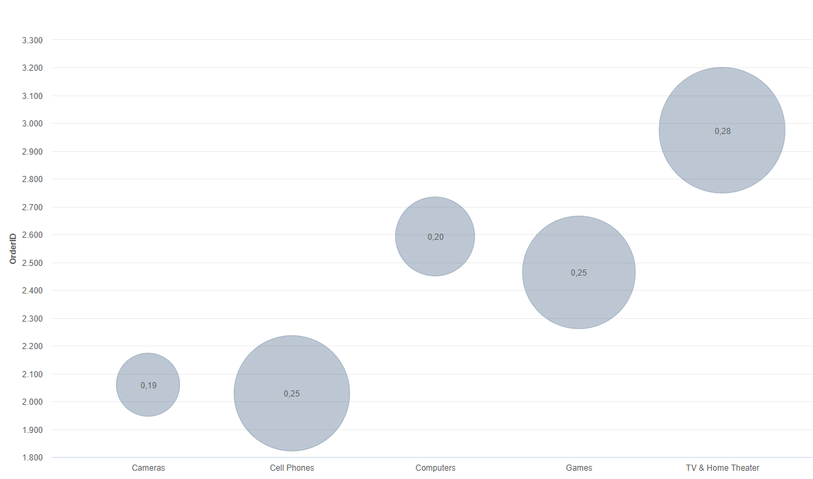
**click to enlarge**
When to use
Bubble charts, or bubble graphs, are among the best types of data graphs for comparing several values or sets of data at a glance. If you’re looking to show the relationship between different product categories, revenue streams, investment risks, costs, or anything similar, bubble charts or plots are incredibly effective.
For instance, our example bubble plot showcases the relationship between a mix of retail product categories, primarily the number of orders and profit margin.
Here, you can tell that the TV & Home Theater product category has the highest number of orders (around 3,000 as you can see from the number scale on the left) as well as the highest profit margin, and therefore, it is the biggest bubble on the chart. Comparatively, the camera category shows the lowest number of orders in addition to the smallest profit margin and naturally is the smallest bubble on the chart.
The bubble plot is extremely powerful for visualizing two or more variables with multiple dimensions. And here, the bigger the bubble, the higher the profit margin. Not only are bubble plots visually stimulating, but they are also incredibly effective when building a comparative narrative for a specific audience.
Other considerations
It's difficult to go too far wrong with bubble charts, but the most common mistake with these types of business charts is focusing on varying the “radius” of the values rather than the “area” they take up on the chart. Doing so sometimes makes the bubbles on the plot disproportionate to the graph, making the information misleading at a glance. In short, your bubbles should be accurate in terms of size compared to the values. Get this right, and you’ll get the results you deserve.
14) Boxplot
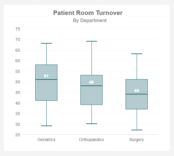
When to use
Just like the histogram, the box plot is a graph that is used to represent the distribution of numeric data using boxes and lines. Each box is composed of five elements also known as the “Five-number summary” which are the minimum, first quartile, median (second quartile), third quartile, and maximum. Each of these elements represents a value and how it is distributed within the data set. Anything outside these values would be considered an outlier. An outlier is any value that is extremely high or extremely low compared to the nearest data point. Outliers (which are usually plotted as dots in the chart) need to be identified because they can affect the end result of the analysis and box plots are the best visuals to do so.
Other considerations
Just like other types of charts on this list, box plots are not the best choice when it comes to big data sets. Their visual simplicity makes it hard to see details about the distribution results which makes it more difficult to interpret, especially when dealing with complex data. Plus, this chart works at its best when comparing different groups (as seen in our example above). So, if you are trying to look at the distribution of one single group a histogram is a better choice.
15) Funnel chart
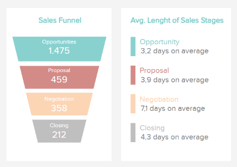
When to use
As its name suggests, a funnel chart is a visualization type used to show how data moves or flows through a specific process. They are commonly utilized to display sales, recruitment, or order fulfillment funnels where the values are often decreasing as the funnel becomes smaller. This can be seen in the example above in which the number of potential clients decreases at each stage of the sales funnel. This is a natural progression that happens because not every person that shows interest in the opportunities stage will end up buying the product or subscribing to the service.
In some cases, the sizes of the sections of the funnel chart are plotted proportionately with the value they are representing. This means the top section is 100% and the rest will represent their corresponding percentage with their size. This is not the case with our example in which the sections are sized to match the funnel shape, not the values contained in each section.
Other considerations
Funnel graphics are very specific visuals that can only be used in particular cases. You should only use it if your data goes through a sequence of stages and the values are decreasing with each stage. Plus, they are only useful to represent a single variable which means they cannot be used to visualize relationships between variables. A good alternative for a funnel graph is a bar or column chart.
16) Bullet chart
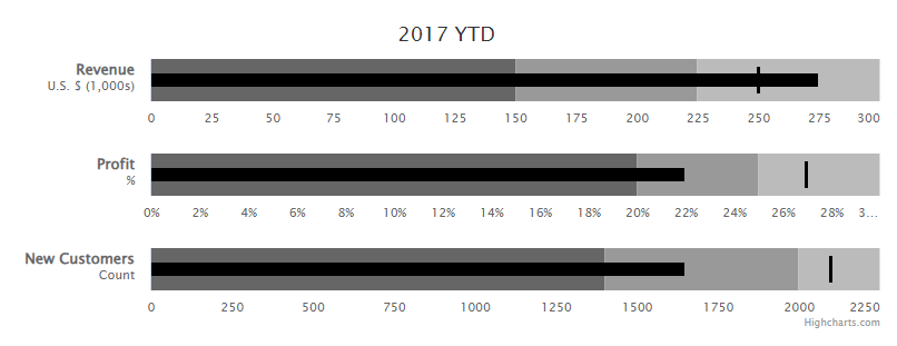
When to use
A bullet chart is a variation of a bar or column chart but it provides some extra visual elements to give more context to the data. It is usually used for performance tracking to make comparisons against a goal or other relevant values and it is composed of three key elements. A single measure is represented by a darker shade bar with a length that represents the performance of that value, qualitative ranges are represented by lighter shades in the background, and a target or comparative measure which is represented with a small line that is perpendicular to the orientation of the graph. Bullet charts are great alternatives to gauge charts, especially when you are working with a KPI dashboard and don’t want to take up too much space from it.
Other considerations
It is important to note that bullet charts are complex visuals that might be challenging to understand for non-technical audiences. In some cases, some people might choose to remove the shaded background to focus only on the actual value against the target or remove the target and focus on the qualitative ranges to make the chart friendlier to analyze. This variation is also known as an overlapping bullet chart and it can be done using columns and bars, as we will see in our two examples below.
1. Overlapping bars bullet chart

**click to enlarge**
As we saw with different graph types previously, the bullet chart can be vertical (using columns) or horizontal (using bars). It is recommended to use bars when you want to display more categories or longer category names to avoid making the visual cluttered. In the example above, we can see the number of orders by product of the current year compared to a target. In this case, due to the number of products, a bar bullet graph is the best choice as it contains a lot of information without affecting the readability of the data.
2. Overlapping columns bullet chart
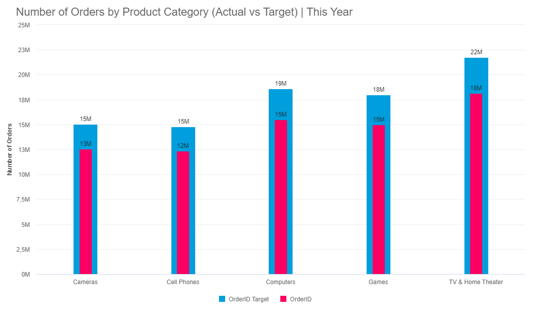
**click to enlarge**
On the other side, a bullet column chart is a better choice when you want to organize categories from left to right or when you have fewer categories to show. In this case, we can see the number of orders by product category. Given that product categories are fewer than the actual number of products, it is a good choice to pick columns to represent this data. In a traditional bullet chart, the number of orders by a quarter could be added for additional context as qualitative measures.
17) Treemap chart
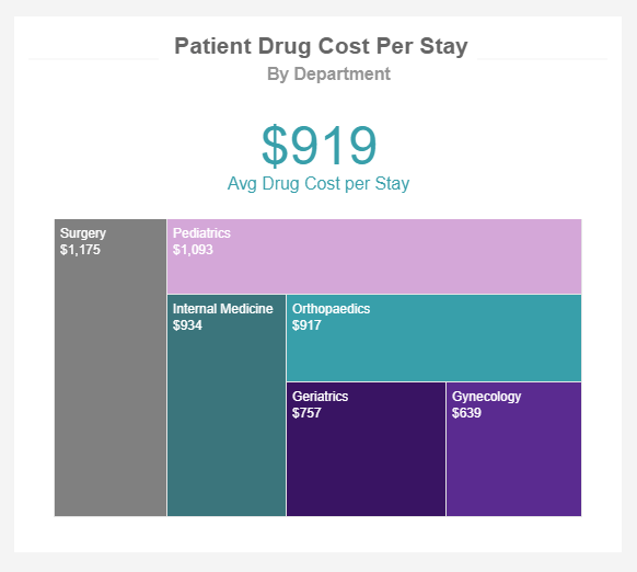
When to use
A treemap is a chart type used to display hierarchical data through rectangles that decrease their size as the value decreases, this process is also referred to as nesting. It is used to display large amounts of raw data in a visually appealing way that allows users to easily extract valuable conclusions at a glance. Its name comes from the shape of a tree, as the chart can be divided into multiple categories with different “branches” and “sub-branches”. Each of these categories should have a different color and the dimensions of the rectangles are based on the size of the data being displayed.
Given that a treemap is used to visualize massive amounts of raw data, they can display an infinite amount of subcategories (or sub-branches) which can make them harder to understand. However, in most cases, users can drill down into the different categories to dig deeper into the data and answer different questions that might arise.
Other considerations
If you are not trying to show hierarchical data then you should stay away from treemaps. Just like it happens with pie charts, this visualization is simply showing parts-to-whole relationships, therefore, it becomes useless for other purposes. You should also avoid treemaps if the data being displayed is too close in size. This defeats the purpose of the graph which is to easily identify the largest item from a specific category. A few alternatives for treemaps include column charts and scatter plots.
18) Stream charts
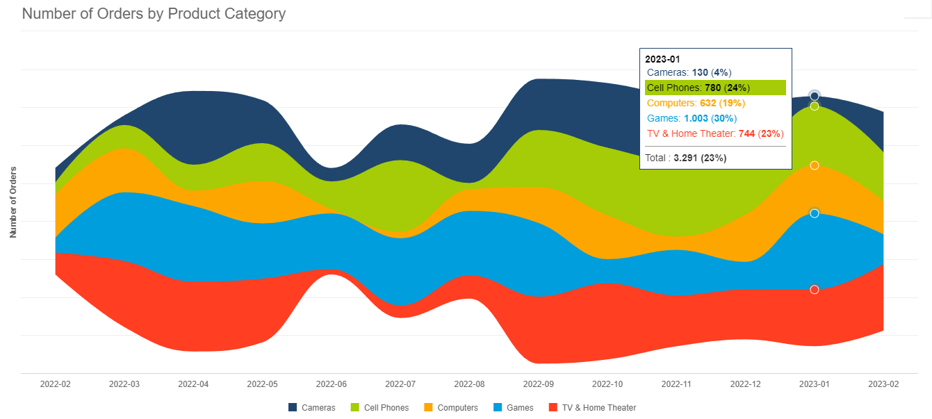
**click to enlarge**
When to use
A stream graph is considered a variation of the area chart with the difference that, while the area chart is plotted with a fixed x-axis, the stream graph has values displayed around a central axis. Hence, the flowing river-like shape. They are frequently used to identify trends and patterns in big datasets with multiple categories and evaluate how they change over time. Just like with other kinds of charts on this list, the width and length of the streams are proportional to the values being displayed. The colors can represent different categories or other specific criteria. In our example above, we can see the number of orders by product categories each month. The width of each stream can provide valuable insights into the performance of each category. For instance, from June to August orders for TVs and Home Theaters decreased a lot compared to other months so some conclusions need to be drawn.
Other considerations
In general, if your aim is to use the chart to deeply analyze the data and extract conclusions from it, then the stream is not your best option. They are often cluttered with a lot of information which can lead to legibility issues. This can happen especially when you have smaller categories that end up looking way too small compared to bigger ones. For that reason, it is best to use stream charts as interactive visuals instead of static or printed ones.
19) Word Cloud
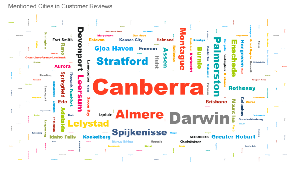
When to use
A word cloud is a straightforward type of graph that displays a set of words concerning a specific topic. The words are arranged in different directions and the sizes of the words will vary depending on specific criteria. For example, if a word cloud is generated based on a text from product reviews, the size of the words can be influenced by the number of times each word is mentioned within the text. On the other hand, if you are generating a word cloud of all the countries in the world, the names of the countries can be bigger or smaller depending on their population. From an analytical perspective, word clouds don’t provide a lot of value apart from being an engaging and visually appealing way of presenting a topic or supporting discussions.
Other considerations
There is no general rule when it comes to colors on a word cloud. Some might use different colors to provide meaning to certain words while others might use standard colors to match their branding. Whichever case you are using, the rule of not adding too many colors to avoid overcrowding the visual still applies when it comes to word clouds.
20) Progress chart
When to use
As its name suggests, this chart is used to track the progress of a specific activity or scenario usually in a percentage form. It can be represented using bars or columns and is often tracked against a set target, as seen in the graph examples below, in which you can see a colored area representing the completed percentage and a lighter shade representing the remaining percentage to complete 100%. Progress graphs are wildly popular when tracking the development of a project as they provide a clear overview of the status of different tasks. They are also valuable visuals when you are trying to show any kind of percentage value or progress against a target.
Other considerations
Progress charts are very straightforward and don’t provide a lot more information than the development of a metric. If you want to gain more insights you can explore using a bullet chart as they provide more context to the data.
- Progress bar graph
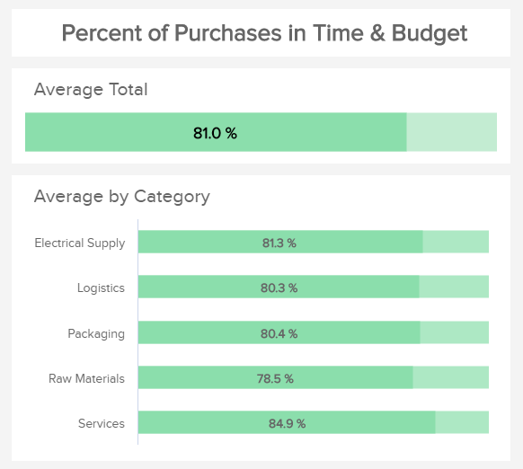
The progress bar chart is used to track the progress of a specific activity or metric using horizontal bars. The example above is tracking the percentage of purchases in time and budget from a procurement department. Ideally, the end goal for each category would be 100% as this means all purchases are made on the expected time and budget. However, this is not always the case and the progress bar is a great way to see how far from the expected target the values actually are. In this case, the average is represented by a darker color of green, and the remaining percentage to reach 100% is represented by a lighter shade.
- Progress column graph
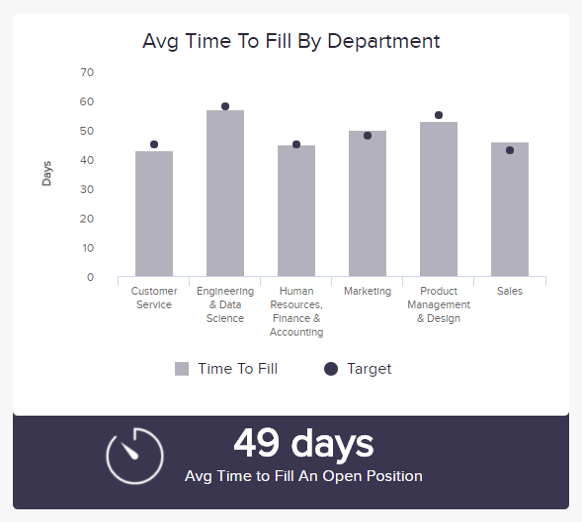
The progress column chart is a type of progress chart that uses columns to represent different data values. In this case, our example is showing the average time to fill a position by the department where each department has a predefined target they are expected to reach. In this case, the target value is represented by a dark purple dot, in other cases, it could be represented with a lighter shade of the same purple from the column. Using a progress chart to represent this metric is a great way to compare the different departments and see if any of the processes need to be optimized to better reach the expected target.
How To Choose The Right Chart Type: 9 Essential Questions To Ask
To go further into detail, we have selected the top 9 questions you need to consider to ensure success from the very start of your journey.
1. What story do you want to tell?
At its core, data charts are about taking data and transforming it into actionable insight by using visuals to tell a story. Data-driven storytelling is a powerful force as it takes stats and metrics and puts them into context through a narrative that everyone inside or outside of the organization can understand.
By asking yourself what kind of story you want to tell with your data and what message you want to convey to your audience, you’ll be able to choose the right data visualization types for your project or initiative. And ultimately, you’re likely to enjoy the results you're aiming for.
For more on data storytelling, check out our full guide for dashboard presentation and storytelling.
2. Who do you want to tell it to?
Another key element of choosing the right data visualization types is gaining a clear understanding of who you want to tell your story to – or in other words, asking yourself the question, “Who is my audience?”
You may be aiming your data visualization efforts at a particular team within your organization, or you may be trying to communicate a set of trends or predictive insights to a selection of corporate investors. Take the time to research your audience, and you’ll be able to make a more informed decision on which data visualization chart types will make the most tangible connection with the people you’ll be presenting your findings to.
3. How big is your data?
As you probably learned from our list of the essential types of charts and when to use them, the size of your data will significantly affect the type of visualization you decide to use. Some charts are not meant to be used with massive amounts of data due to design aspects while others are perfect for displaying larger information.
For example, pie charts are not good if you are trying to show multiple categories. For that purpose, a scatter plot works best. Another example is with column and bar charts. Bar charts use horizontal bars that make it easier to represent larger data sets. On the other side, column charts are limited by size due to their vertical orientation, making them better for smaller data.
4. What is the type of data you are using?
Another important question to ask yourself is what type of data you are using. As we saw at the beginning of the post, there are 4 key categories when it comes to data visualization: composition, distribution, relationship, and comparison. There are also qualitative and quantitative data that can be better represented using a particular graphic. For this reason, it is important to carefully define the type of data you are using before thinking about visualizing it. In the following questions, we will see what you need to ask yourself based on the mentioned categories.
5. Are you looking to analyze particular trends?
Every data visualization project or initiative is slightly different, which means that different data visualization chart types will suit varying goals, aims, or topics.
After gaining a greater level of insight into your audience as well as the type of story you want to tell, you should decide whether you're looking to communicate a particular trend relating to a particular data set, over a predetermined time period. What will work best?
- Line charts
- Column charts
- Area charts
6. Do you want to demonstrate the composition of your data?
If your primary aim is to showcase the composition of your data – in other words, show how individual segments of data make up the whole of something – choosing the right types of data visualizations is crucial in preventing your message from becoming lost or diluted.
In these cases, the most effective types of visual charts include:
- Pie charts
- Waterfall charts
- Stacked charts
- Map-based graphs (if your information is geographical)
7. Do you want to compare two or more sets of values?
While most types of data visualizations will allow you to compare two or more trends or data sets, there are certain graphs or charts that will make your message all the more powerful.
If your main goal is to show a direct comparison between two or more sets of information, the best choice would be:
- Bubble charts
- Spider charts
- Bar charts
- Columned visualizations
- Scatter plots
Data visualization is based on painting a picture with your data rather than leaving it sitting static in a spreadsheet or table. Technically, any way you choose to do this count, but as outlined here, there are some charts that are way better at telling a specific story.
8. Is timeline a factor?
By understanding whether the data you’re looking to extract value from is time-based or time-sensitive, you’ll be able to select a graph or chart that will provide you with an instant overview of figures or comparative trends over a specific period.
In these instances, incredibly effective due to their logical, data-centric designs, functionality and features are:
- Dynamic line charts
- Bar graphs
9. How do you want to show your KPIs?
It’s important to ask yourself how you want to showcase your key performance indicators as not only will this dictate the success of your analytical activities but it will also determine how clearly your visualizations or data-driven stories resonate with your audience.
Consider what information you’re looking to gain from specific KPIs within your campaigns or activities and how they will resonate with those that you’ll be sharing the information with - if necessary, experiment with different formats until you find the graphs or charts that fit your goals exactly.
Here are two simple bonus questions to help make your data visualization types even more successful:
- Are you comparing data or demonstrating a relationship?
- Would you like to demonstrate a trend?
At datapine, data visualization is our forte. We know what it takes to make a good dashboard – and this means crafting a visually compelling and coherent story.
"Visualization gives you answers to questions you didn’t know you had." – Ben Shneiderman
Design-thinking In Data Visualization
When it comes to different data visualization types, there is no substitute for a solid design. If you take the time to understand the reason for your data visualization efforts, the people you’re aiming them at, and the approaches you want to take to tell your story, you will yield great results.
Here at datapine, we’ve developed the very best design options for our dashboard reporting software, making them easy to navigate yet sophisticated enough to handle all your data in a way that matters.
With our advanced dashboard features, including a host of global styling options, we enable you to make your dashboard as appealing as possible to the people being presented with your data.
Your part in creating an effective design for the different types of data charts boils down to choosing the right visualization to tell a coherent, inspiring, and widely accessible story. Rarely will your audience understand how much strategic thought you have put into your selection of dashboards – as with many presentational elements, the design is often undervalued. However, we understand how important this is, and we’re here to lend a helping hand.
In this guide, we covered different types of charts to represent data, explored key questions you need to ask yourself to choose the right ones, and saw examples of graphs to put their value into perspective. By now, you should have a better understanding of how each type of visual works and how you can use them to convey your message correctly.
To summarize, here are the top types of charts and their uses:
- Number Chart - gives an immediate overview of a specific value.
- Line Chart - shows trends and changes in data over a period of time.
- Maps - visualizes data by geographical location.
- Waterfall Chart - demonstrates the static composition of data.
- Bar Graphs - used to compare data of large or more complex items.
- Column Chart - used to compare data of smaller items.
- Gauge Chart - used to display a single value within a quantitative context.
- Pie Chart - indicates the proportional composition of a variable.
- Scatter Plot - applied to express relations and distribution of large sets of data.
- Spider Chart - comparative charts great for rankings, reviews, and appraisals.
- Tables - show a large number of precise dimensions and measures.
- Area Chart - portrays a part-to-whole relationship over time.
- Bubble Plots - visualizes 2 or more variables with multiple dimensions.
- Boxplot - shows data distribution within multiple groups.
- Funnel Chart - to display how data moves through a process.
- Bullet Chart - comparing the performance of one or more primary measures.
- Treemap - to plot large volumes of hierarchical data across various categories.
- Stream Graph - shows trends and patterns over time in large volumes of data.
- Word Cloud - to observe the frequency of words within a text.
- Progress Chart - displays progress against a set target or goal.
But in our hyper-connected digital age, there are many more different kinds of graphs you can use to your advantage. Putting everything together in a professional business dashboard is even better. These visual tools provide centralized access to your most important data to get a 360-view of your performance so you can optimize it and ensure continuous growth.
Complete with stunning visuals, our advanced online data visualization software can make it easy for you to manipulate your data and visualize it using professional dashboards. The best part is, you can try it for a 14-day trial, completely free!