A Complete Guide To The Power Of Line Graphs With Examples On When To Use Them

Table of Contents
Graphs and charts have been a part of our lives for many years now. Every day, we encounter graphical representations of data in our jobs and also in the news or advertisements. That is because visuals make it easier to convey and understand critical information, breaching the knowledge gap between audiences across industries.
That being said, for data visualizations to be successful and avoid misleading your audience, it is necessary to understand the different use cases for each visual. At datapine, we are committed to making data and analytics a friendlier practice, and that starts with understanding the role each visualization plays in your data storytelling process.
That is why we are putting together a series of blog posts that do a deep dive into different types of graphs and charts to help understand what each of them can do for your analytical efforts. We have already covered bar charts, column charts, spider charts, area charts, and gauge charts; today is the turn of line charts. So, buckle up and enjoy the journey to understanding the value of this powerful visual.
What Is A Line Graph?
A line graph (or line chart) is a data visualization type used to observe how various data points, connected by straight lines, change over time. It is often used to identify and interpret trends, patterns, and relationships in continuous data.

Just like other types of graphs and charts, line graphs are composed of a vertical and a horizontal axis. In this case, the vertical axis (y) represents the values of the data points, and the horizontal one (x) represents the time across which the data points are plotted. The straight lines that unite the data points make it possible for the users to analyze how the values changed over time, making line graphs popular visualizations to identify trends and patterns, observe growth or declines, and spot outliers, among other things.
Although they look simple, line graphs are complex visuals that can efficiently convey various kinds of data. Some of the most common ones include time series data that record values at a specific time interval, such as stock prices or monthly website traffic; continuous data that shows an uninterrupted flow of values, such as population growth over the years; and sequential data, which shows values that have a sequential order, such as manufacturing stages.
Benefits & Limitations Of Line Graphs
As you will learn throughout this guide, line graphs offer a range of advantages that can significantly improve how you interpret and interact with your data. That being said, they also have some limitations or challenges that you should be aware of, and below, we will discuss both.
Benefits:
Starting with benefits, line graphs are versatile visuals that enable you to simplify complex data sets into a highly digestible format. They are especially useful when dealing with large data sets as they lower cognitive overload by highlighting relevant trends that otherwise remain hidden in a sea of raw information. This also makes them easier to interpret and friendlier for non-technical users.
Another great benefit of this visual is their ability to communicate stories compellingly through the progression of data points. For example, a line graph showing quarterly profits with an upward trend tells the growth story of a company. This makes them highly engaging visuals for projects or presentations.
Going a step further, line graphs can also help users predict future scenarios by analyzing historical trends. For example, you can use a line diagram to show historical sales volume and identify seasonal effects to plan your production and marketing strategies ahead of time.
These are just a few of the multiple benefits of professional line graphs. Now, let’s discuss some of the limitations. Understanding some of these challenges or limitations can help you ensure your data is accurately represented.
Limitations:
While line graphs stand out when highlighting trends and relationships between data sets, their effectiveness diminishes when it comes to plotting and analyzing more complex trends, such as showcasing how multiple variables interact in a multivariate scenario. In that case, it is better to use more complex visuals like a bubble chart.
Another point that can be considered a limitation is that line graphs are only valuable for representing continuous or sequential data. They become less valuable when plotting categorical or discrete data, which is better suited for bar or pie graphs. For example, if you are trying to represent the number of animals at the ten largest Zoos in the country, then a line chart is not the best choice as there is no valuable reason to connect the data points with a line.
Try our 14-day free trial & benefit from professional line charts today!
What Are Line Charts Used For (& When Should You Avoid Them)
Now that you have a better understanding of what line graphs are and how they are constructed, let’s discuss in which context you should use them and in which ones you should stay away from them.
- Tracking changes over time: As mentioned earlier, the most popular use case for line graphs is to track changes over time. The fluctuations on the lines make it easy to identify trends and extract valuable conclusions about how the data has changed in a day, week, month, year, or more.
- Plot multiple data series: Line charts can also be used to plot multiple data sets that are represented by multiple individual lines. Doing so allows users to get a deeper understanding of how the different variables change over time and how each affects the other.
- To represent continuous data sets: These visuals also prove valuable when providing an uninterrupted flow of continuous data and how it evolves over an extended period. An example of this can be temperature fluctuations across the day, which are constantly changing with no interruptions.
- To show small changes in data: The versatility of line graphs allows users to format the chart to show very small changes in the data. By zooming into the information, you can spot smaller trends and changes that might be relevant to the analysis.
After reading the limitations portion of the blog, you probably have a sense of when not to use a line chart. As a reminder, we will quickly go through it again below.
- You should avoid using line charts when plotting data that is not continuous or sequential.
- Line diagrams also become less effective when using fractional or decimal values as they are harder to plot.
- You should also know these graphs can become overcrowded when plotting too many lines. We recommend sticking to a maximum of 5 lines to keep the design clean and understandable. More on this later in the post.
Types Of Line Graphs
Just like other chart types we covered in this series, line graphs have variations. There are four line graph types that we will discuss today. Each uses the same principles we have discussed up to this point, with some variations that make them suitable for different analytical scenarios. Let’s dive into them!
- Simple line graph
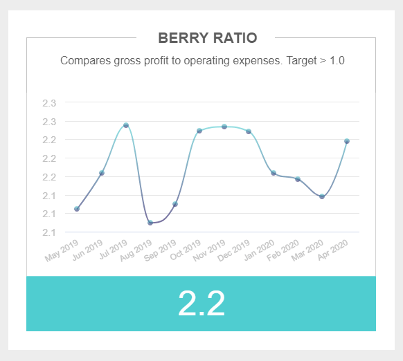
This is the simplest version of the line chart. As seen in the image below, it only tracks one dependent variable and how it changes over time. It is a simple chart that doesn’t provide deeper insights rather than upward or downward fluctuations in the data. That is not to say it can’t prove valuable for specific scenarios. The simple line chart can provide context and uncover relevant trends, especially when visualized with other charts in a professional financial dashboard.
- Multiple line graph
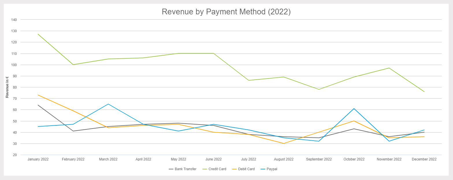
As its name suggests, the multiple line graph plots various dependent variables against a single independent time variable. The variables are often represented with different colors to make it easier for the user to compare them and extract conclusions from the data. Unlike the simple line chart, this type offers a more complex experience that allows for a deeper analysis and exploration of the data. The different lines can be compared with each other to extract valuable conclusions.
**click to enlarge**
- Combined line graph
While this is not a type of line chart per se, it is a variation that has become increasingly popular amongst analysts. What we define as a “combined line graph” is basically the act of combining a line chart with another type of chart to get an advanced view of data. In the image below, we see a combination of a line and a bar chart with two y-axis, one for each chart. While each of these variables can work independently, when put together in this insightful graph, they tell a complete story that allows decision-makers to dig a bit deeper and extract valuable insights.
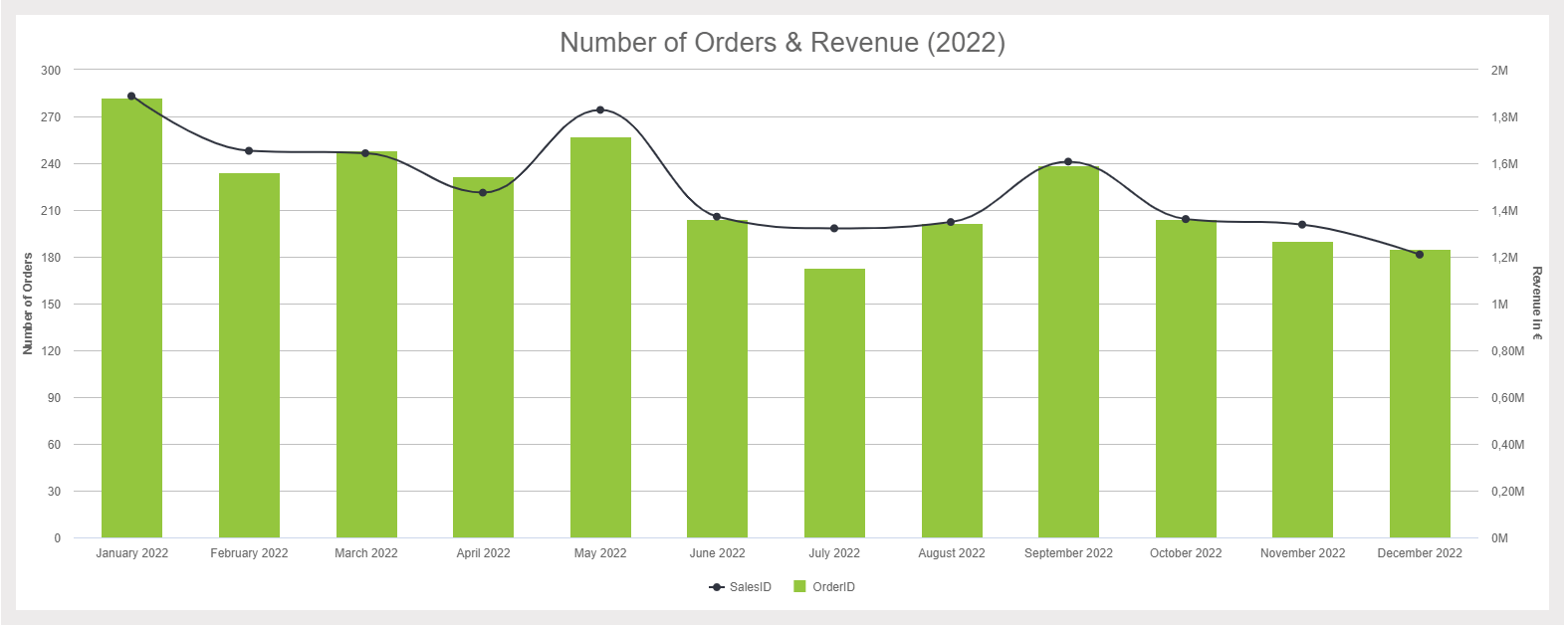
**click to enlarge**
Mixing two chart types into one is an invaluable analytical feature that can boost your decision-making process. datapine's professional online data analysis tool allows you to generate advanced charts like the one above in just a few seconds.
- Sparkline chart
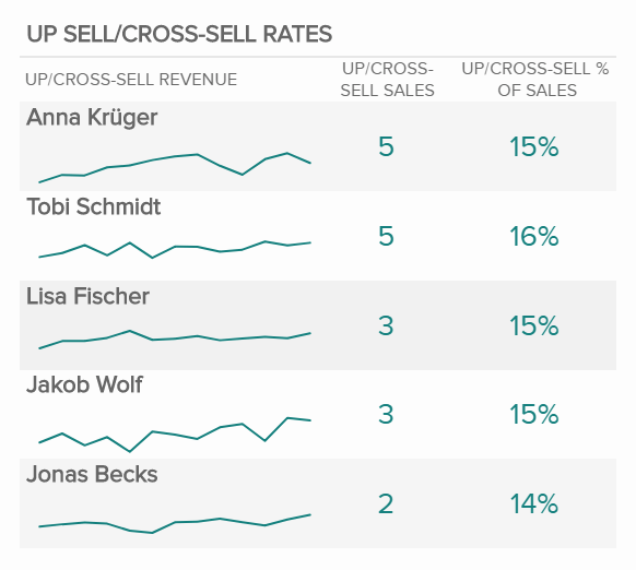
Last but not least, we have the sparkline chart. This particular variation, which is very popular in finance, is built with multiple small line charts that are mainly used to show changes over a period of time. Due to the small size of the lines, there are no labels on the line charts. However, the statistics on the side provide the necessary information to understand the starting and ending values.
The image below shows a sparkline chart comparing up-sell and cross-sell rates for different sales agents. With that information, we can identify which agents are most successful and replicate their strategies with other agents to ensure success across the board. Likewise, we can identify struggling agents and provide them with help or additional training.
Try our 14-day free trial & benefit from professional line charts today!
Tips To Create A Line Chart
Now that you know the theoretical part of this visual, it is time to think about how to make a line chart. Just like any type of visuals, line graphs are constructed following some key considerations to prevent them from being misleading or too overcrowded. Following these best practices and tips will help you ensure you are building a successful visual.
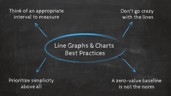
- Think of an appropriate interval to measure
The first best practice you should follow is to carefully pick the time interval or bin size in which you will plot your values. If you are using time as your measurement, ensure you are not using an interval that is too wide, as this can hide valuable trends. Likewise, if you are using an interval that is too small, it may only show insignificant fluctuations. Therefore, it is essential to consider the time interval based on the goal of the analysis and the nature of the data. In some cases, analysts and designers might plot two lines, one for the overall trend and a second for a more detailed data view with a smaller time interval. This way, you get a complete picture of the situation.
- Don’t go crazy with the lines
If you ask anyone about a key design principle of data visualizations, it is to avoid overcrowding them at all costs. While some visuals have the space to fit in multiple variables, like bar charts, most of them can only fit a couple before becoming messy and more challenging to understand. This is the exact case of line graphs. As mentioned earlier, we recommend you stick to five or fewer lines per graph, as adding more can look like a tangle of lines that is impossible to analyze.
It is important to mention that this is not a mandatory rule. If there is enough space between the lines, you can still add as many as you want. So, it would be best always to use your judgment during the design stage.
- A zero-value baseline is not the norm
If you have ever read one of our data visualization posts, then you might be aware of the zero baseline rule. This rule says that your charts should be plotted using a zero baseline to prevent the data from being misleading to the eye of the audience. Well, believe it or not, this rule does not apply to line charts. This is because the main goal of this visual is to highlight changes over time; therefore, the size of the values is not as relevant. Hence, when plotting your graph, you can start your vertical axes at the value that will highlight the trends and changes most efficiently.
That being said, if you are trying to represent a frequency distribution using a line diagram, then your baseline should always start at zero.
- Simplicity above all
This is more of a general tip, but it applies to any kind of visual you ever design. We are talking about simplicity. When designing your graph with a professional line graph maker, you should keep every aspect of the chart as simple as possible. Stick to a couple of colors that are not too strong or bright, avoid using 3D lines or effects, and use a plain, thin line to avoid deviating the audience's attention from the data. When it comes to labels, use precise language, considering the level of knowledge your audience has. Lastly, avoid using grid lines at the background of your chart unless it is truly necessary. With all these considerations in mind, you are set to generate a stunning visual.
Line Graphs Examples & Templates
As you learned from the previous section, creating a line chart involves some key considerations and best practices to follow to be successful. These powerful visuals prove to be highly valuable in a number of business areas due to their engaging and user-friendly nature. To help you keep putting their value into perspective, below, we will show five examples of line charts generated with a professional line graph maker.
- Sales
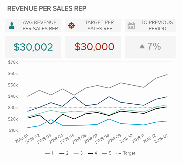
Our first line graph template tracks the revenue per sales representative, with each colored line representing a different sales agent. What makes this sample so valuable is that it offers a dotted red line as a target value, which allows the chart user to clearly understand at a glance which sales reps are underperforming and which ones are overperforming. The information on the chart is also compared to the previous period to understand if there has been any improvement. Having this information at hand in a professional line chart for sales can help managers spot inefficiencies and offer underperforming agents some additional training and assistance.
- Marketing
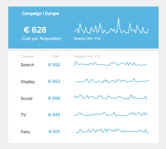
The following line chart template is a sparkline format, and it tracks one of the most important KPIs for a marketing dashboard: the cost per acquisition. It basically measures how much it costs the business to acquire a new customer. In this case, it is divided by channel and tracked weekly. Since we are only interested in learning which channel is the most profitable to acquire customers, the sparkline format is a valuable way to quickly understand how each channel performs compared to the others.
- Manufacturing
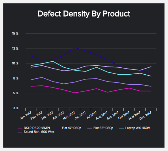
Our next line graph sample tracks the defect density by product every month of the year. Many manufacturing KPIs could benefit from this type of visual as decision-makers in this industry need an agile view of their data to ensure operations are running as expected. Here, we can observe that there weren’t such big spikes in the defect density except for the product Flat 47”1080p, which saw a significant spike during April and July. Luckily, the defect density of this product decreased continuously throughout the rest of the year. However, it is still the second highest of all products; therefore, it should be looked into more detail.
- Customer Service
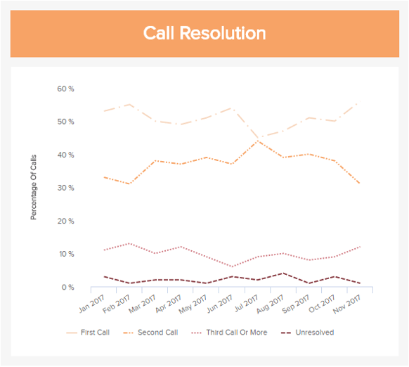
The first call resolution is one of the most important customer service KPIs to track, and it is also a perfect example of a line chart format with multiple variables. The KPI is tracked monthly over 11 months and against the percentage of calls that get solved on the first, second, and third try, as well as the unresolved ones. Looking at the chart above, we can see that over 50% of the calls during the year were resolved in the first call, which is a positive result. However, we can also see that the percentage of unresolved calls increased since April, reaching its highest point by November. This means something is going wrong in the service department that needs to be fixed to ensure that the percentage starts to decrease again.
- Logistics
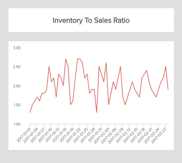
Last but not least, in our list of line chart samples, we have an example of the simple line chart format tracking a single variable, the inventory-to-sales ratio. Essentially, this most insightful of logistics KPIs tracks the ratio between the available inventory for sale and the actual quantity sold. In this case, the KPI is tracked every three days and shows a lot of fluctuations, which makes it harder to extract deeper conclusions on its own. However, when visualized together with other relevant KPIs like the inventory turnover or the carrying cost of inventory in a professional logistics dashboard, decision-makers can get a complete picture of the situation and ensure efficient inventory management across the board.
If you want to see more examples like the ones above, check out our library with over 350+ KPI examples for different industries and functions.
Try our 14-day free trial & benefit from professional line charts today!
Key Takeaways Of Line Charts
As we learned from this insightful guide, line graphs are powerful visualizations that help businesses identify trends, patterns, and relationships in continuous data. The best part is that this versatile visual can be used in different formats for basic and more advanced analytical scenarios, making it a great tool to boost a company’s data-driven efforts.
The bottom line is there is no better visual than line charts when analyzing how data changes over time. With the right tools and data visualization techniques, anyone without the need for prior analytical knowledge can start using line charts to visualize their most relevant KPIs and inform their strategies.
As you saw earlier in our list of line graph examples, these visuals are valuable in a number of industries and functions. So, if you are ready to apply all your knowledge and start generating the best line charts, then try our professional online data visualization tool for a 14-day free trial today!