Zendesk Dashboard examples
A Zendesk dashboard helps the customer service department monitor, analyze and optimize the ticket system, as well as all relevant customer support processes. It enables businesses to take advantage of data-driven decisions by summarizing KPIs in one central place.
Zendesk is a cloud-based help-desk solution used by more than 200,000 companies worldwide as a support ticket system for effective customer service management. With datapine's advanced KPI dashboard software, you can deeply analyze your Zendesk data and combine it with multiple other sources to leverage the full potential of your enterprise data and increase the quality of your customer support in the long-run. Thanks to professional dashboards and modern customer service analytics, you can keep an eye on all your important Zendesk KPIs at all times and share them within your team or company to promote a data-driven corporate culture.
We will now present 5 professional Zendesk dashboard examples covering different application areas of the customer support.
Daily Operational Zendesk Dashboard - Zendesk KPI Dashboard - Support Team Performance Dashboard - Zendesk Talk Dashboard - Digital Assistant Dashboard.
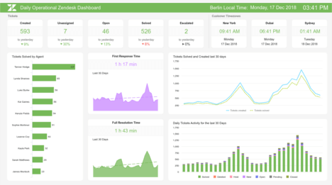
Daily Operational Zendesk Dashboard
Open Daily Operational Zendesk Dashboard in Fullscreen

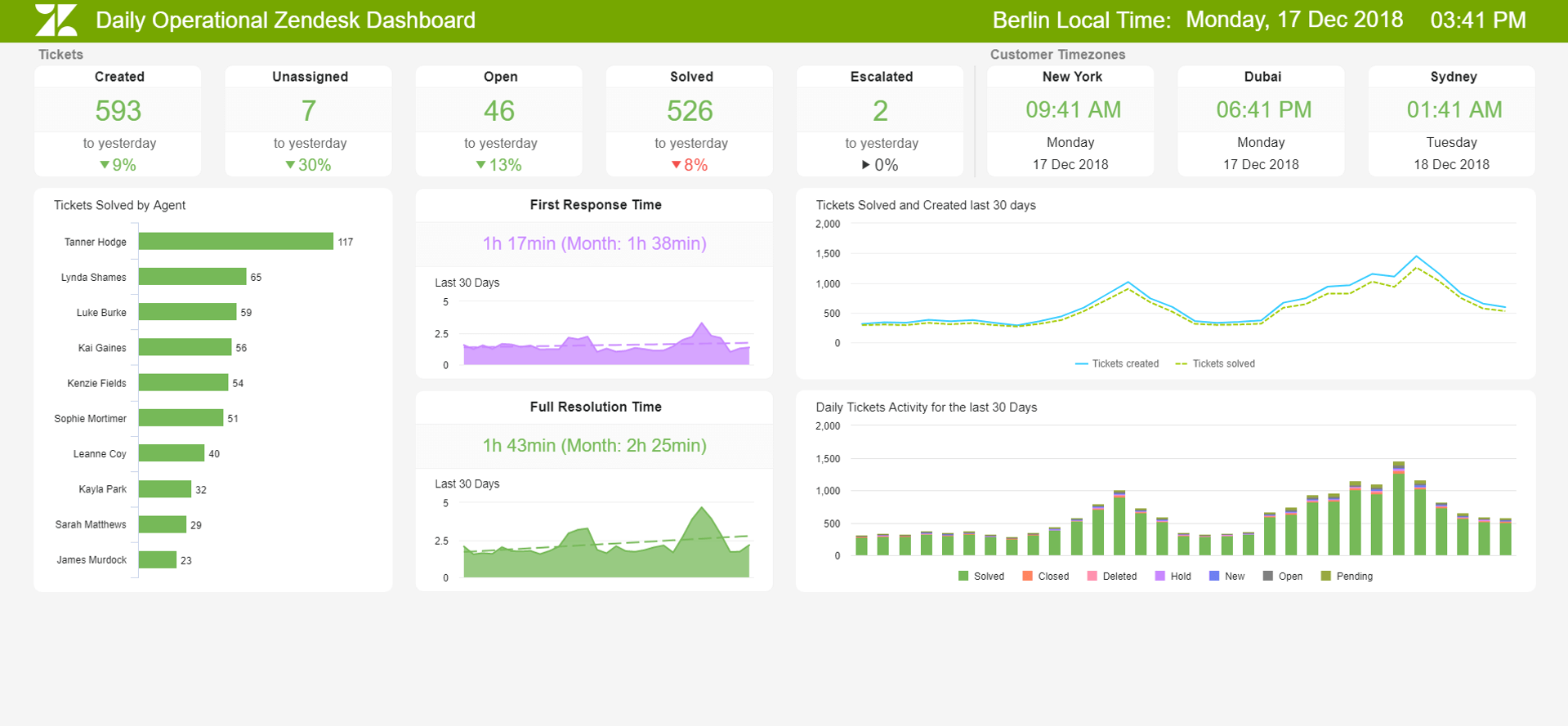
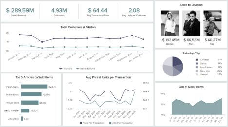
Our first Zendesk dashboard example is an operational dashboard used for effective daily customer support management that provides the team leader with a comprehensive overview of daily support performance.
Among other things, these key metrics are displayed in a visually appealing way: the number of tickets and ticket status, the first response time (FRT) and the average resolution time (MTTR). In the upper part of the dashboard, you will find the number of tickets per status, such as created, unassigned, open, solved and escalated tickets, as well as the percentage deviation of this key metric compared to the previous day. Thanks to such a clear overview in real time, problems in the ticket system or an increased number of customer questions, for example, can be detected early and appropriate countermeasures can be initiated promptly.
In the lower part of the Zendesk KPI dashboard, you will find the number of tickets solved for each support employee as well as the current daily values and the monthly average values for the first response time (FRT) and the average resolution time (MTTR), which we have selected to illustrate these two, central help-desk key metrics. The FRT describes the average time interval between a customer inquiry and the first response of the support team. The MTTR, on the other hand, captures the average time it takes service team to complete a resolution after a case has been opened. Both indicators significantly impact customer satisfaction because customers are reluctant to wait a long time for a response and want the issue resolved as quickly and effectively as possible. You should therefore monitor these two metrics daily, especially since customer satisfaction is often not measured every day or the corresponding sample size for one day is insufficient to perform a meaningful analysis.
Modern, dynamic dashboard solutions such as datapine facilitate the daily monitoring and analysis of all relevant key performance indicators from different perspectives thanks to various interaction options such as drill-down, zoom-in, drill-through and extensive filter options. In addition, they reduce the manual analysis and reporting effort to a minimum.
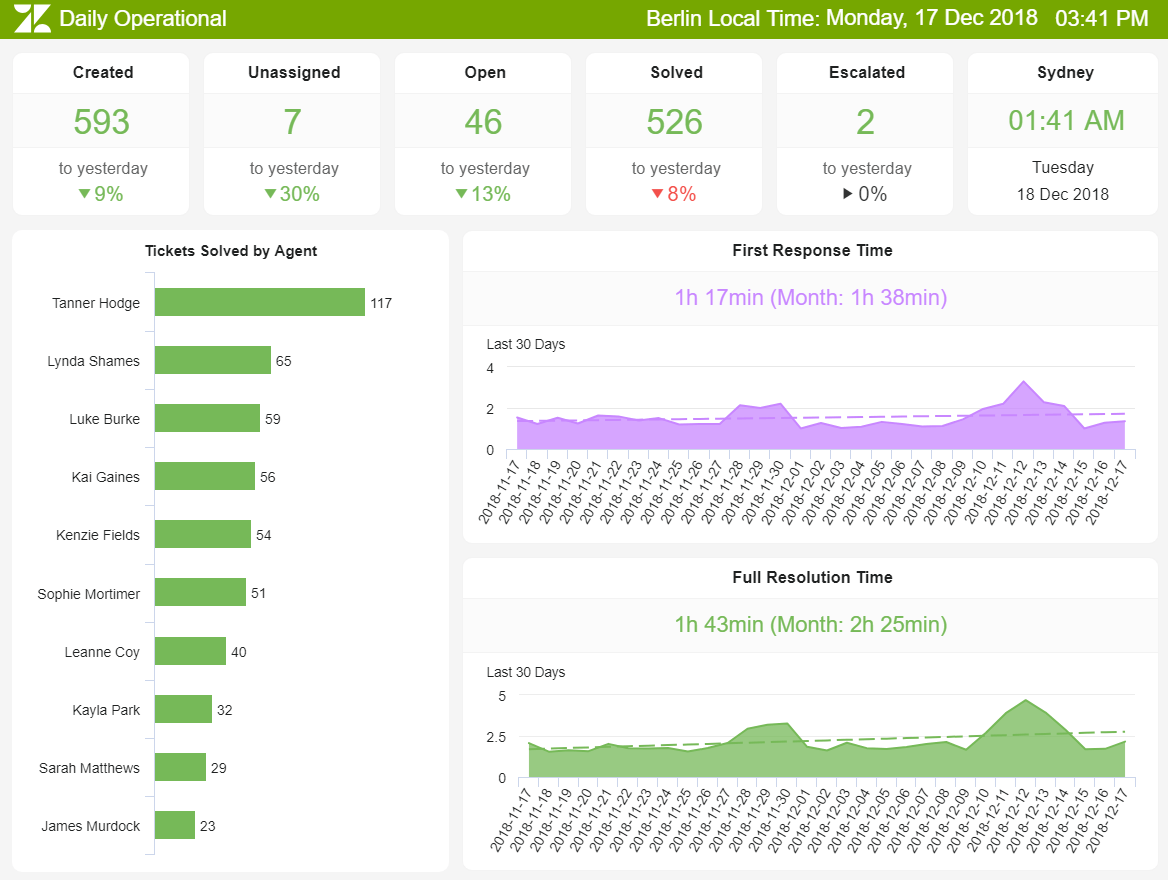
Our second Zendesk dashboard example has a strategic focus and considers a longer time period. For the last month, the following KPIs are displayed: customer satisfaction, the different ticket types, the number of tickets for all relevant support channels as well as the daily development of the already discussed first response time (FRT) and average solution time (MTTR).
In the upper section of the Zendesk dashboard, you will also find a representation of the individual ticket statuses for the last month. For example, we can see that approximately 800 out of 20,000 tickets were reopened within a month, equivalent to roughly every 25th ticket. Such analyses with correspondingly larger sample sizes over a longer period of time help you better evaluate the daily key performance indicators also on our first operational dashboard example (this also applies to FRT and MTTR). Below is the history of the number of tickets created and resolved for each day of the month. This allows you to identify patterns and trends to consider in your future resource allocation. It is also worth analyzing the number of tickets per weekday or hourly. If, for example, you receive a lot of customer inquiries by telephone, especially on Mondays, you can take this into account in the corresponding personnel planning. With modern dashboard tools such as datapine, intelligent data alarms also help you to identify such patterns and anomalies in the data: they automatically do so with the help of artificial intelligence and machine learning.
In the lower part of the Zendesk KPI dashboard, you will find an overview of the different tickets by type as well as the customer’s most frequently used contact channels. To illustrate this, we have divided it into four categories, which, of course, can vary greatly depending on the industry and business model. In our example, the majority of customers use e-mail to contact us. Here, trend analyses are useful for your strategic planning in order to meet the needs of customers in the future as well - in other words, to offer the preferred form of contact in the best possible quality. When considering tickets by type, you should try to create a maximum of 5 to 6 main categories from the total of tickets. You can then analyze the key metrics for these main categories in detail, or filter them on your dashboards with just a few clicks. With this approach, you can, for example, identify inefficient support procedures for certain ticket categories, manifesting in a long average resolution time or low customer satisfaction.

Our third Zendesk dashboard template will help you monitor the performance of the entire support team, which we have illustrated for a five-person team. It considers, among others, the following KPI templates: first contact resolution rate (FCR), occupancy or utilization rate, and net promoter score.
In addition to the first response time (FRT) and the average resolution time (MTTR) already discussed, the first contact resolution rate (FCR) is a key success criterion for customer service. It reflects the percentage of tickets and support requests that can be clarified directly without a second contact with the customer. Accordingly, a high FCR usually correlates with a lower MTTR. Last but not least, you should always look at the 3 indicators mentioned above together, and not in an isolated perspective, and always keep an eye on the impact on customer satisfaction. Our dashboard example illustrates the first resolution rate for various tickets by types and customer enquiries. In addition, it makes sense to consider individual employees or support channels. As a rule, a high FCR is expected, especially in telephone inquiries from customers.
In the central section of this Zendesk dashboard you will find the utilization rate for the entire team as well as a summary of those employees who have a low utilization rate of less than 75 percent (please open the Support Team Performance dashboard in full screen mode to see all details discussed). The utilization rate shows you the percentage of time employees spend on support-related activities, such as answering phone calls, processing tickets, or supporting live chats. In customer service, utilization rates of 75 to 85 percent are appropriate. By monitoring the workload for the entire team, you can, for example, identify additional personnel requirements if these are permanently well above 85%. By monitoring and analyzing the utilization rate for individual employees, you can quickly identify overloaded or underchallenged employees, analyze the underlying causes, and take them into account in future task planning and team development.
On the right side of the dashboard, you will also find a detailed overview of the five customer service staff members: the number of closed and open tickets and customer satisfaction. Experience has shown that, in addition to the customer satisfaction score (CSAT), it is extremely useful to survey the net promoter score (NPS) to measure customer satisfaction levels within customer service. Therefore, you will also find it on our Zendesk dashboard example. Of course, you can also see the NPS on an employee basis.
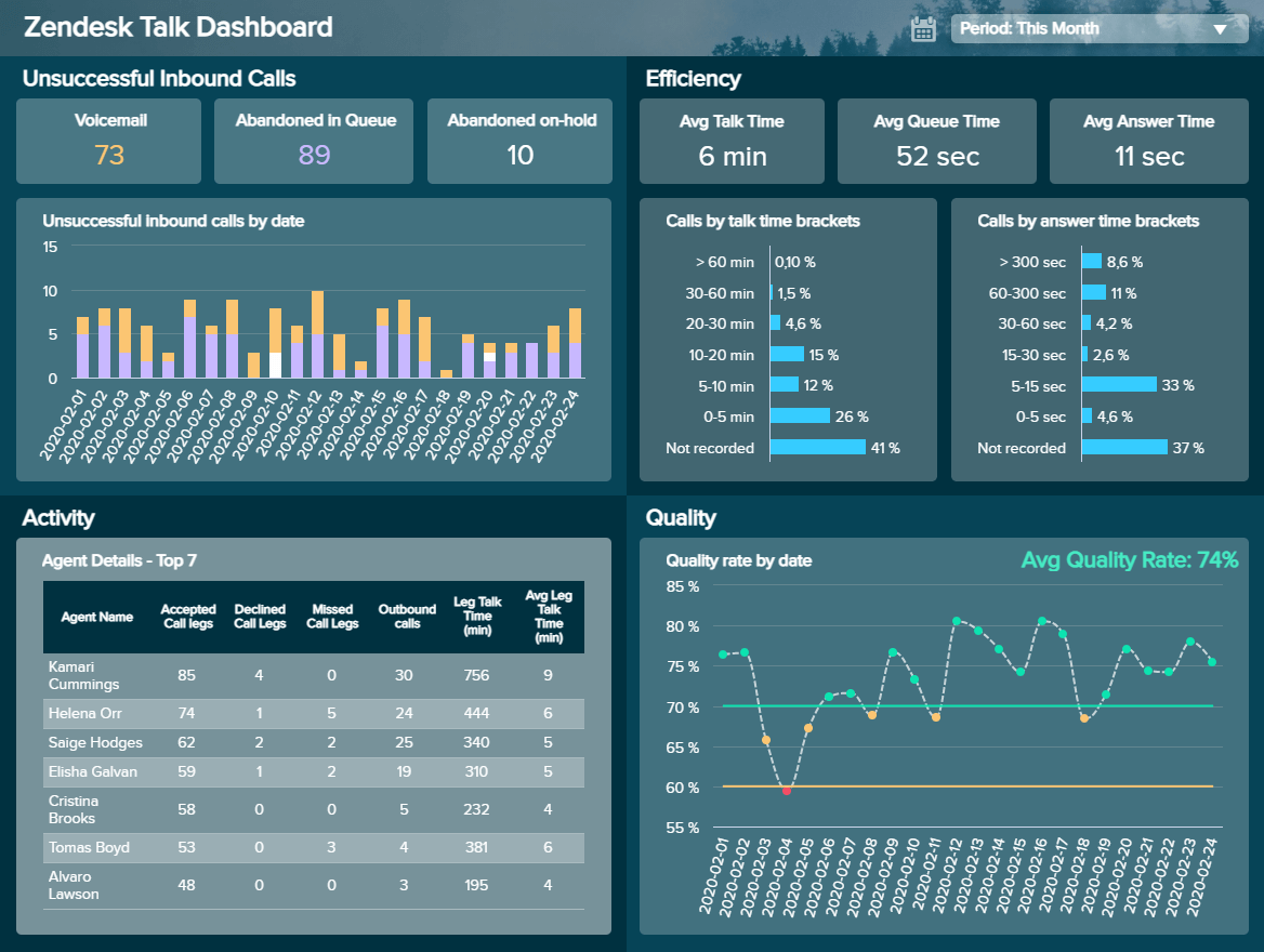
Our next example is the Zendesk Talk dashboard, and as its name suggests, it aims to measure and monitor relevant metrics related to your call service performance. Efficient call management should be a priority for any business as call centers often have bad reputations for long waiting times or unsuccessful results; therefore, focusing your efforts on delivering a great call center experience can give your business a big competitive advantage.
The dashboard is divided into 4 main categories that cover different aspects of the performance of your Zendesk call center data: unsuccessful inbound calls, efficiency, agent’s activity, and quality. Starting with the inbound calls, we first see an overview of three types of unsuccessful inbound calls for this company: voicemail, abandoned in queue, and abandoned on-hold. These metrics are further represented in a bar chart divided by date. This way, you can understand in which days you had failed inbound calls of which type and define the reasons.
Next, we see the efficiency section, which contains a mix of time-based Zendesk talk metrics that enables you to understand how efficient your contact center and your agents are timewise. On top of this section, we get a quick glance at the average talk time, the average queue time, and the average answer time, which measures the time an agent takes to answer a call since it started ringing. The Zendesk Talk dashboard then goes more in detail with two graphs displaying the calls by talk time and calls by answer divided into brackets to understand exactly what percentage of your calls is taking what time. Ideally, you should set a target for each of these metrics and constantly monitor them to find any issues. For example, if your call talk time is longer than it should be, you could look deeper into the most common calling reasons and set standard procedures for your agents to follow.
Later on, we have the agent’s activity section. Here we see details of the performance of your top 7 agents divided into different categories of leg calls. You can also do this with your underperforming agents and find ways in which they can improve their numbers, for example, with more training instances or help from the best-performing agents. Finally, the Talk dashboard displays a quality graph based on a positive and a negative percentage. By looking at how your Zendesk call center data fluctuated, you can identify in which periods the quality was low and dig deeper to find the reasons.
Although each section of the Zendesk Talk dashboard can tell you a lot by itself, you can also extract powerful insights by putting together metrics from different areas. For example, you can compare your unsuccessful inbound calls in the queue with the average queue time and draw deeper conclusions that will boost the performance of your calls: do you need to hire more agents so that the waiting times won’t be so long? Or maybe you need to invest in training so that your agents will handle requests faster.
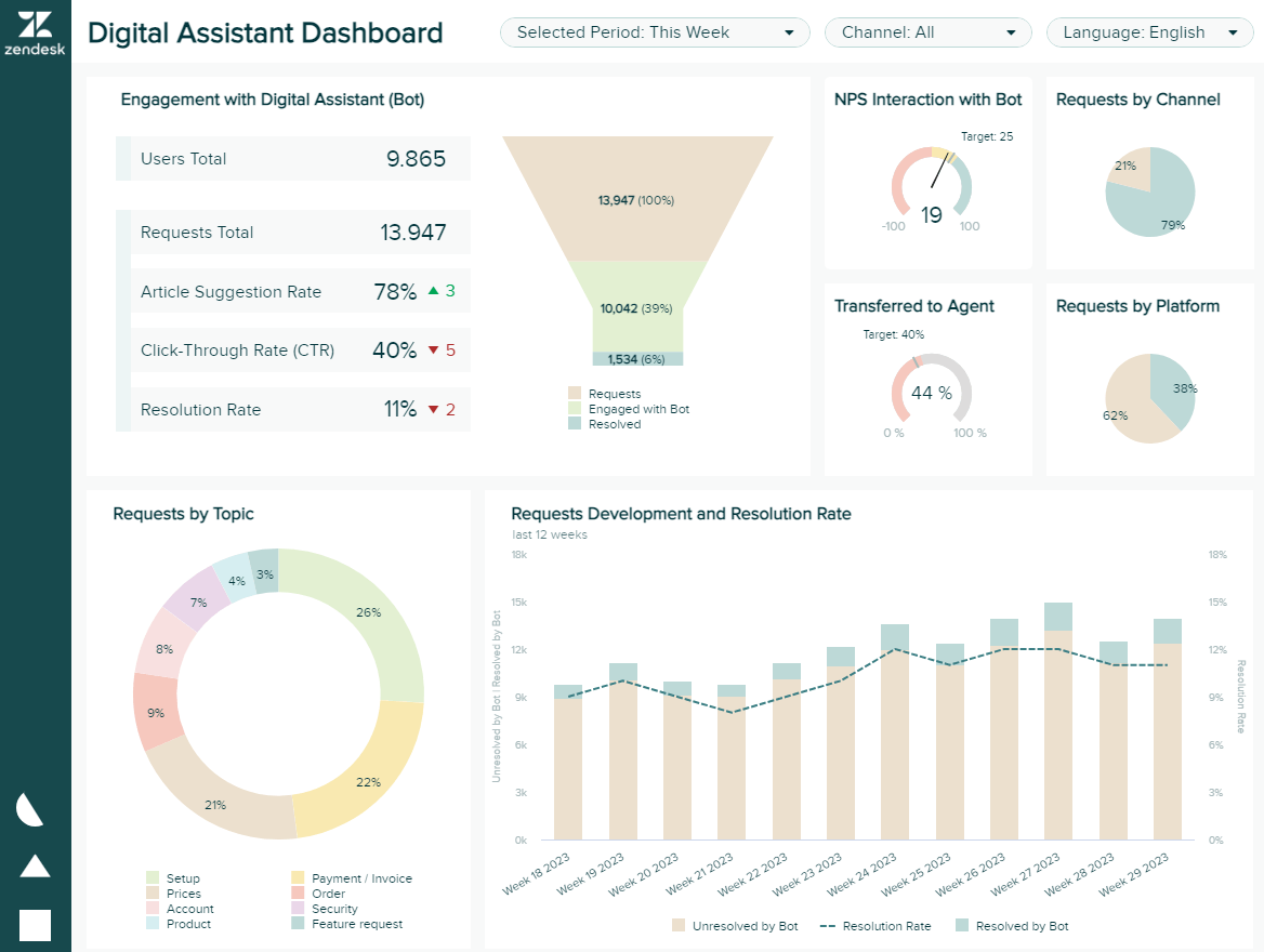
So far, we’ve covered examples related to the most traditional service channels, such as email, calls, and chats. For our last example, we will dive into a fairly recent technology that is becoming increasingly popular amongst organizations. We are talking about digital assistants. The concept of digital assistants, such as chatbots, has been around for a couple of years now, with big companies such as Apple and Facebook being early adopters. That said, today, many businesses of all sizes have seen this innovative technology as an option to boost how they communicate with their customers, especially in the B2B industry, where 58% of companies currently use chatbots. Our dashboard above provides a weekly overview for companies that want to evaluate the performance of their digital assistants. Let’s dive into it.
The dashboard starts with an overview of engagement metrics, including the total number of users and requests, article suggestion rate, CTR, and resolution rate. Each of them is broken down in more detail in other sections of the dashboard to help users extract deeper insights. For starters, the total users and requests are broken down in a funnel where only 6% of the initial requests are solved by the bot. This is a low percentage and needs to be looked into as it can affect satisfaction levels, as seen in the interaction NPS chart where the business has not reached its target of 25.
The 6% of resolved issues can also be reflected on the “transferred to agent” KPI, where we see the business is slightly over its target of 40%. This can be either because the chatbot is not efficient enough or because the issues that customers are experiencing require human interactions to be solved. A further look into the dashboard can also help us answer this question. The request by topic chart shows a breakdown of the most common types of requests. This information is complemented with the top 10 suggested articles table (open live version to see it), which provides insights into the usefulness of the resources the bot suggests to customers. There we can see that, overall, requests related to payments, prices, and orders have a high transfer rate and account for a substantial portion of total requests. Therefore, the business needs to find a way to either decrease these requests or implement better solutions through the bot.
Last but not least, the dashboard provides deeper insights into the nature of requests. The live version of the template offers a breakdown of requests by hour on weekdays and weekends to help users be prepared to meet demand. Additionally, the requests development and resolution rate chart help get a complete overview of the performance.
We hope that with the 5 Zendesk dashboards discussed here, we were able to demonstrate the advantages of dashboard software modern for monitoring, visualizing, analyzing, and optimizing all relevant customer service processes. So, what are you waiting for? Discover for yourself, and test our software in full functionality for 14 days completely free of charge, and create your first Zendesk dashboard with just a few clicks!
Setup only takes one minute. No credit card required!