Create Modern SQL Dashboards With Professional Tools & Software
Table of Contents
Companies must collect, store, monitor, and analyze massive volumes of data to manage business performance and successfully deliver profitable results. No matter if your company is small or large, there is a great chance that you've been using SQL as the go-to tool for managing and extracting value from your database. There is still lots of relational database management included regarding online data analysis and different possibilities to perform the same. In some cases, you will need a coding solution where you can build your own queries, but in others, you will also look for a visual representation of your relational data. The good news is that you can utilize both with the help of modern and professional SQL dashboard tools.
That said, in this post, we will take a detailed look into what is an SQL dashboard, how to create one (or several) and provide you with visual examples that will represent the undeniable power that SQL has on offer. In the end, you will get an idea of what it can do for you, and if utilizing SQL reporting tools makes sense for your business; hence you can derive even more insights. But let's start from the beginning and define this kind of dashboard.
What Is A SQL Dashboard?
An SQL dashboard is a visual representation of data and metrics that are generated from a SQL relational database and processed through dashboard software. They enable you to perform advanced analysis by creating your own queries or through a visual drag-and-drop interface.
While there are other data analysis methods you can use to analyze and optimize your results, a SQL data dashboard is based on a relational database that is updated in real-time. Therefore, you don't need to pull reports that are set in the past. In other words, you don't need to work with historical data since SQL dashboard software can do the hard work for you and automatically update any data you might possess. Using business intelligence dashboards built on SQL can prove to be beneficial in many ways, and if you work with databases, you know how important it is to effectively build your analysis and continue delivering value to your business.
Moreover, you can use online data visualization, and with that in mind, each SQL metrics dashboard can be created and delivered with interactivity levels that traditional tools such as Excel simply cannot provide.
To put things into perspective, we will take a closer look at how to create SQL dashboards and learn about examples used in real business scenarios.
We offer a 14-day free trial. Benefit from great SQL dashboards today!
How To Create SQL Dashboards - Coding & Visuals
To be able to extract the full potential out of your SQL database dashboard, knowing how to utilize SQL is essential. Luckily, it is considered one of the easiest programming languages out there, with infinite resources to learn from. That said, modern SQL tools such as datapine provide a user-friendly environment that enables both technical and non-technical users to benefit from SQL. All they need to do is connect their databases and generate their dashboards.
Once you have connected your database to your preferred online SQL query builder, it's time to start with the analysis. Here we will look at examples illustrated with datapine's dashboard tool and focus on 5 topics that are important when you want to create your own SQL dashboard:
- Creating charts: The start of any analysis begins with creating charts in order to visualize your data or perform advanced cross-database queries.
- SQL Join: To combine and clean data, you will use one of the most common SQL Join types (Inner, Left, Right, or Full Outer Join).
- Interactivity: By utilizing interactivity, you can drill into your data as much as needed while keeping the dashboard visually clean.
- Comparing different time periods: Providing additional information to dashboard viewers can be achieved by comparing time periods that put numbers into relations.
- Comparing to previous periods: Similarly, comparing to previous periods will enable you to provide additional perspective in relations by also implementing a time filter.
We will start with the SQL chart creation option and show you how easy it is to work with datapine's SQL report builder, visually and with the code.
1. SQL Chart Creation
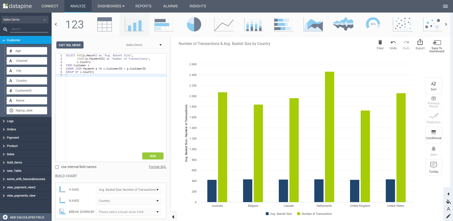
When you want to use SQL to create charts, you can simply copy your own code or create a new one based on the chart type and the data you want to show. Let's see this through an example.
**click to enlarge**
The example above was created with the help of a SQL command that needs to be entered in the dashboard tool for queries in order to generate the visual on the right:
SELECT AVG(p.Amount) as "Avg. Basket Size",
COUNT(p.PaymentID) as "Number of Transactions",
c.Country
FROM Customer c
INNER JOIN Payment p ON c.CustomerID = p.CustomerID
GROUP BY c.Country
This simple command will enable you to utilize SQL in a way that shows results immediately, with numerous other options to adjust and tinker with the data as much as you need. If you don't want to avoid using coding, a simple drag-and-drop interface will do the hard work for you. To learn more about different dashboard tips and tricks, you can check out our guide on how to create a dashboard.
Next, our article will focus on the SQL Join functions, which are based on the concatenation (Concat) of strings, to show you how different relations can be achieved through simple commands created with a dashboard tool for SQL.
2. SQL Join
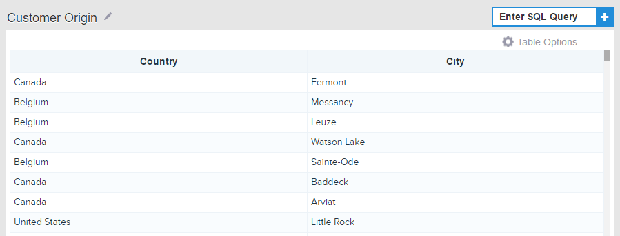
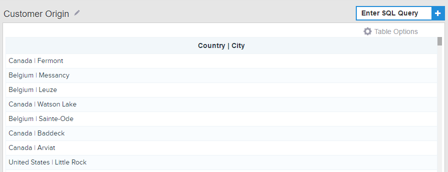
Sometimes, you need to adjust the appearance of the data. Therefore, you must join or clean underlying data (tables) or apply other advanced functions or formulas. That said, when you build your dashboard, it's beneficial to use SQL Joins for some chart types (e.g., dynamic textboxes) to customize the look of your dashboard elements. In essence, SQL Joins will combine rows or columns from two or more tables based on common fields behind them by using the Concat command. For a practical explanation, let's say you have a customer table with columns that depict country and city, like in the example below:
**click to enlarge**
To combine these two columns into one, a simple Concat command needs to be entered:
Select Concat(`Customer`.`Country`, ' | ' ,`Customer`.`City`) as 'Country | City'
From `Customer`;
After the command is entered, your table will change, and it will display the data in the following manner:
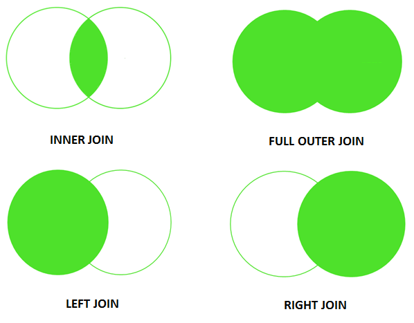
It's useful to take into account that there are different SQL Join types, and the most common ones are:
- Inner Join: Most commonly used, this type of Join displays the set of records that appear in both tables. The result is a new table that contains all fields from the previous two tables. Simply put, this option will enable you to show just the rows that appear in both tables.
- Left Join: If you want to display every record from one table and the matching records from another, then you will use Left Join. In this case, if there is no matching data, the table will show NULL.
- Right Join: Similar to the Left Join, but with reversed roles so that you will return all rows from the right table and the matched rows from the left one.
- Full Outer Join: If you want to join both the left and right tables simultaneously, you will use Full Outer Join.
Those are the most common types of Joins you will probably encounter during your work with a SQL server dashboard tool, but a visual representation of how they behave might give you a clearer picture:
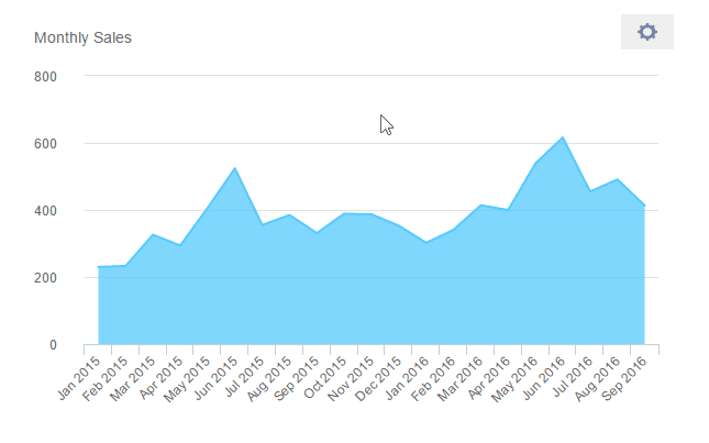
3. Chart Interactivity With The Zoom Option
The zoom option is an excellent function to add to your charts and graphs since its interactivity will upscale your database dashboard examples and allow you to drill down into the smallest units of time without overcrowding your visuals.
The command that is needed to create such an option is the following:
Select dp_zoom(DATE_FORMAT(`Sales`.`Date`, '%b %Y')) as Date, COUNT(`Sales`.`SalesID`) as Sales
From `Sales`
Group by 1
Order by `Sales`.`Date`;
Looking into the data on such a granular level will enable you to keep the dashboard clean and avoid overcrowding the elements.
4. Comparing Different Time Periods
When you need to compare metrics to different periods to see how your business is scaling and identifying trends, using a SQL dashboard tool for that very function is useful. Not only will you be able to see the performance of your business over a set time frame, but compare it to other periods so you have a comprehensive overview of what has changed and how.
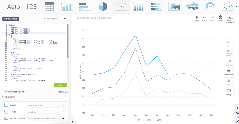
**click to enlarge**
In the example above, we can see the command entered on the left side of the screen, and if a line chart is selected, the visual will look like the picture above. This will allow you to see how your numbers performed during different time periods, e.g., sales performance for the years 2017, 2018, and 2019.
5. Comparing To Previous Periods
By also adding the time filter to your charts, you can quickly and automatically adjust your comparison to previous periods. It's helpful in scenarios where you want to view the current performance and compare it to the previous year, e.g., by simply selecting the filter on your charts, as shown in the example below:
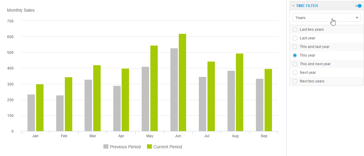
**click to enlarge**
Whether you need to develop a financial dashboard, procurement, or sales, this option can greatly improve your view of the numbers since you don't have to manually perform analysis each time you want to look at the data. Your analysis can be beneficial across the board by evolving your SQL server monitor dashboard with visuals, interactivity, and filters. It can also be favorable in ad hoc analysis when you need to compile a one-time report to quickly look at a specific business question you need to answer on the fly.
We offer a 14-day free trial. Benefit from great SQL dashboards today!
Visual SQL Dashboard Examples
Now that you understand the definition and main components of a professional SQL reporting dashboard, we will go through 6 examples to help you understand what the final product will look like. These examples, generated with datapine’s dashboard generator, cover various common analytical scenarios that businesses must deal with daily. Let’s dive into them.
1. FMCG Dashboard
The example above shows the actual value of what you can accomplish with SQL. Building an FMCG dashboard by using advanced SQL commands or simply drag-and-drop desired values will prove to be the most efficient way to analyze massive volumes of data. Our example shows crucial metrics such as the out-of-stock rate, inventory turnover, and the average time to sell, among others, to help an FMCG company improve performance, avoid inventory issues and maximize profits.
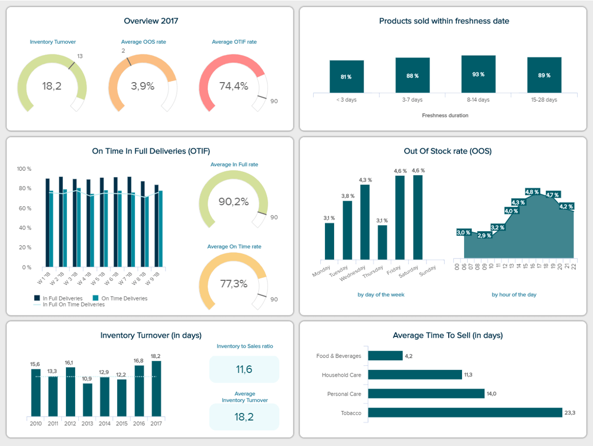
**click to enlarge**
With these insights in hand, FMCG businesses can optimize their strategies to ensure their clients have the best experience possible. Plus, it can help them spot improvement opportunities as well as trends and patterns. For instance, they can analyze historical inventory turnover rates and plan their inventory levels ahead of time. This way, they can avoid wasting resources on wrong inventory levels, making the entire organization more efficient and profitable.
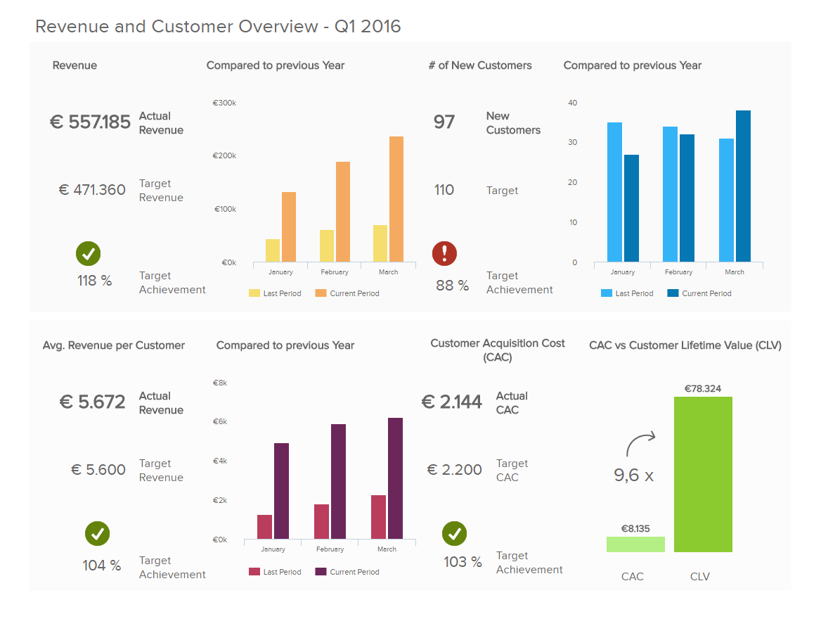
2. Financial Dashboard
Finances are another area that can greatly benefit from using analytics and SQL-generated dashboards. Our example below shows detailed information about a company’s financial health by providing insights into liquidity, invoicing, budgeting, and overall financial stability. Having this kind of overview is fundamental for organizations because it provides the necessary knowledge to make informed decisions regarding their strategies. Even better, users can generate such a template in a matter of minutes by using a drag-and-drop interface. No need for any intervention from the IT department!
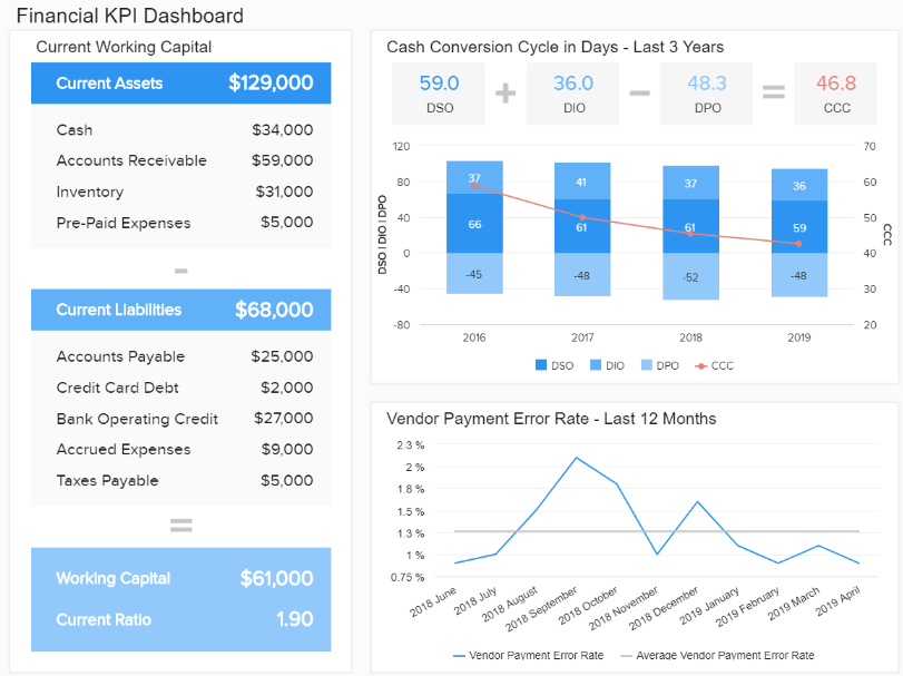
**click to enlarge**
As mentioned previously, the level of detailed information provided by this template gives decision-makers a 360-view of the company’s performance. For instance, the cash conversion cycle has decreased in the past three years. This means the company has successfully turned its investments, inventory, and other resources into cash. A closer look into the working capital also shows a positive development with a current ratio of 1.90. Showing that the company is profitable and has enough money to remain solvent.
3. Sales Dashboard
One of the biggest benefits of using SQL dashboards is boosting collaboration. By accessing online reports full of useful information, teams can stay connected and successfully work towards the same company goals. Our following template focuses on collaboration by providing an overview of the performance of the sales department on a departmental level but also for individual sales agents. With this information, managers can get a sense of the status of their strategies and provide training where needed.
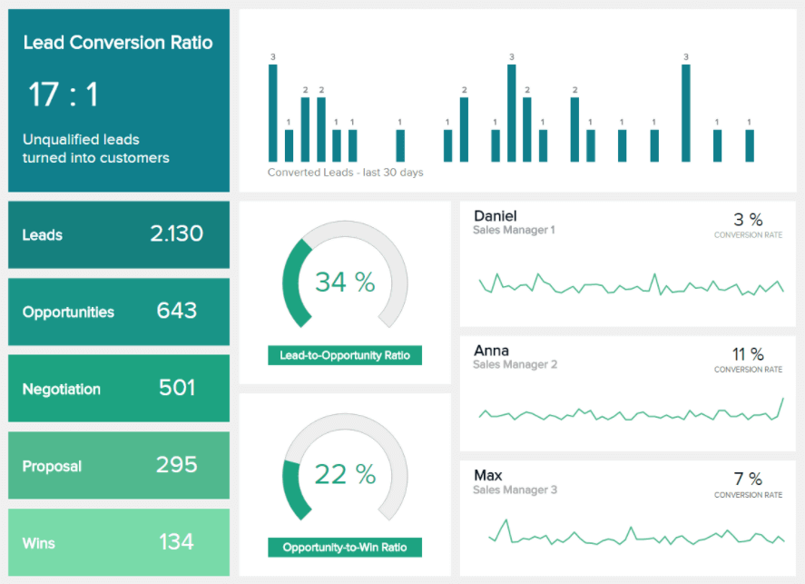
**click to enlarge**
As seen in the image above, the template offers an interactive view of the current status of the entire sales process of a B2B business. It shows the total number of leads and how they spread into the different stages of the sales cycle, including opportunities, negotiation, proposal, and wins, which are considered the final conversion. The sales dashboard also offers details on the conversion rate of each sales agent. We can see that Daniel, sales manager 1, has the lowest rate of 3%. This means there’s much potential to improve as Ana, sales manager 2, has reached an 11% conversion rate.
4. Marketing Dashboard
Displaying real-time data is another benefit you can reap from creating dashboards in SQL. Mixing real-time and historical insights can help organizations get the 360-view they need to make informed decisions and build strategies with the smartest resource allocation. In that sense, the marketing department is one of the areas that can benefit the most from real-time data. Our marketing dashboard template below provides an overview of the performance of three campaigns on a weekly basis.
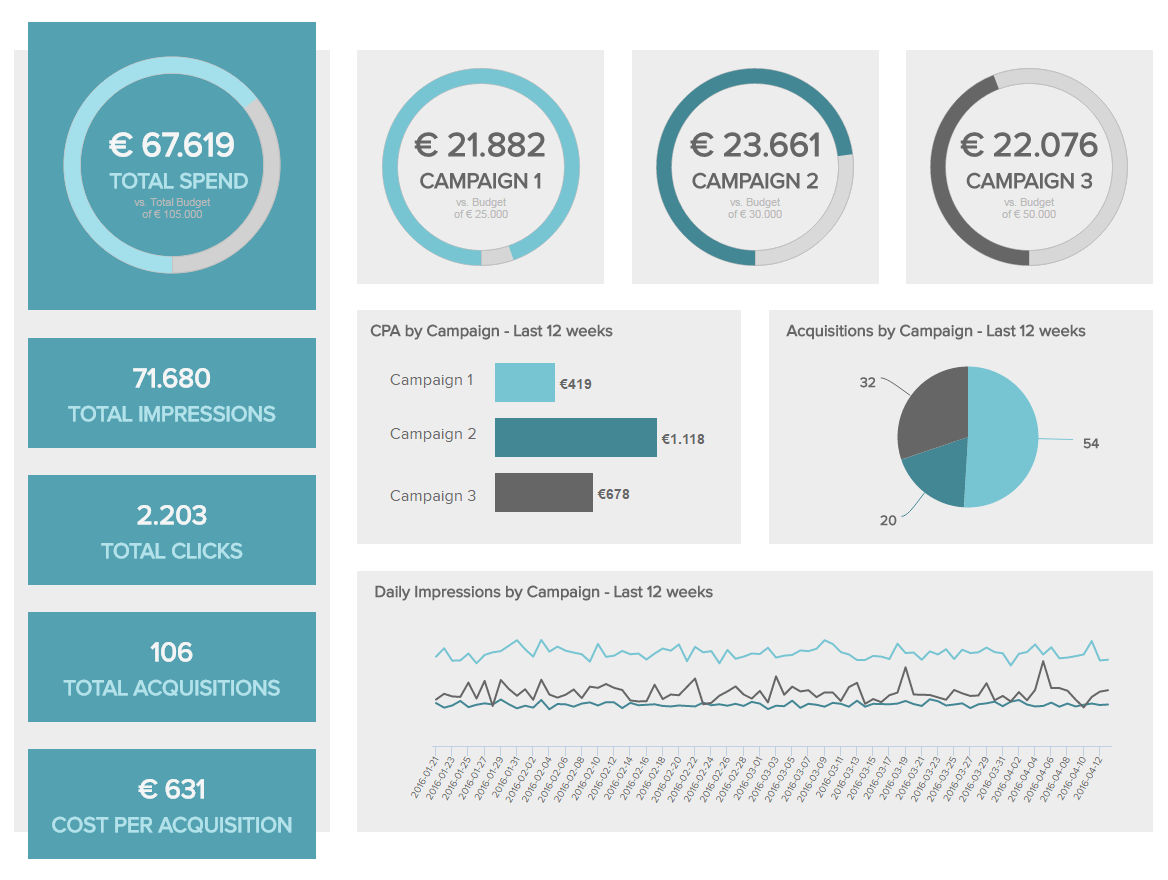
**click to enlarge**
By looking deeper into the data, we can see that campaign 1, which has almost reached its total budget, has the highest number of impressions and acquisitions at the lowest cost. Therefore, we can consider it successful. On the other hand, campaign 2 has the lowest number of impressions and acquisitions at the highest cost. However, the budget has not been fully utilized: therefore, there is still an opportunity to make some changes and turn things around. This might not be recognized without the real-time view provided by this template.
5. HR Dashboard
Just like we saw with finances, sales, and marketing, the human resources department also gathers massive amounts of data that must be displayed in an interactive and user-friendly environment. After all, ensuring you are hiring and retaining the right talent can significantly impact the organization's overall success. Our HR dashboard template below focuses on talent management and the performance of different retention and recruiting efforts.
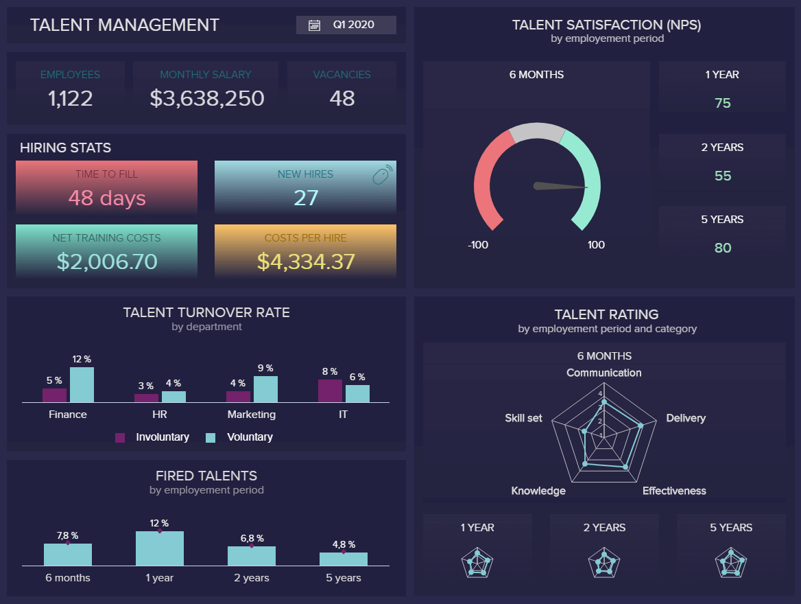
**click to enlarge**
With this data in hand, HR managers can extract deeper conclusions about the level of productivity and satisfaction of their employees. For instance, the talent turnover rate chart shows marketing and finances have the highest percentage of voluntary leaves. This needs to be looked into, as replacing positions in these areas is expensive and hard. Plus, having so many people quitting the company can also affect the motivation levels of other employees. Therefore, an internal investigation should be carried out to understand the reasons behind the high rates of voluntary leaves.
6. Customer Service Dashboard
Last but not least, we will discuss the value of generating dashboards using SQL tools in the customer service department. While all the magic happens behind the scenes when generating your queries, the true value of these dashboards lies in the final product. This visually appealing template lets users quickly understand what the data tells them, thanks to interactive elements such as icons and time filters.
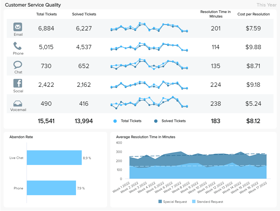
**click to enlarge**
The customer service dashboard shows the performance of 5 different service channels: email, phone, chat, social media, and voice mail. Each channel shows the total number of tickets and the number of solved ones with a trend chart comparing the two values. Plus, we get insights into the average resolution time and costs. Here, all channels seem to perform similarly, with most tickets being solved positively. However, social media has the highest resolution time and one of the highest costs per resolution. This should be investigated in more detail to determine if costs can be decreased.
We offer a 14-day free trial. Benefit from great SQL dashboards today!
SQL Dashboards - Start Building Your Own!
We have explained the basic definition and provided examples generated with a dashboard tool for queries, and listed some codes you can also use to develop your own SQL KPI dashboard. When you need to focus on specific business metrics and generate numerous reports or perform basic and advanced analysis to outperform your past results, SQL will always be one of the best tools to do so.
Building such dashboards is a sure way to optimize and deliver the best possible performance, regardless of the company size, industry, or department. If you want to learn more about this exciting structured language, we suggest you read our rundown of the best SQL books. Finally, to start your own journey of building dashboards for SQL and utilizing both the code and visuals most effectively, try our software for a 14-day free trial!