Seize The Power Of Analytical Reports – Business Examples & Templates

Table of Contents
1) What Is An Analytical Report?
2) Why Is Analytical Reporting Important?
3) How To Create An Analytical Report?
In recent years, analytical reporting has evolved into one of the world’s most important business intelligence components, inspiring companies across industries to adopt a more strategic mindset.
While many companies struggle to leverage an effective business intelligence strategy, the importance of analytical information creates a fluctuation of knowledge that cannot be simply collected into a single spreadsheet. It has become harder to create and use a single report and communicate a wide range of vital insights between departments, stakeholders, and important parties in a single company. That’s why a business needs a proper analytical report that will filter important data and improve the creation of the full management report that can lead to a successful business operation.
That doesn’t mean that creating these kinds of statements should only be intended for specialized analysts who can read and interpret complex information more swiftly, but with self-service BI tools that expand the knowledge of all employees in a company, analytical reports can become one of the most invaluable instruments that force progress, directly affect operating costs and use modern interface which everyone understands.
That said, we will delve deeper into analytical reporting as well as its value in real-world business content. We will also look at how to create them with the assistance of professional online reporting software.
Let’s get started.
What Is An Analytical Report?

An analytical report is a type of business report that uses qualitative and quantitative company data to analyze as well as evaluate a business strategy or process while empowering employees to make data-driven decisions based on evidence and analytics.
While analytical reporting is based on statistics, and historical data, and can deliver a predictive projection of a specific issue, its usage is also spread in analyzing current data in a wide range of industries. For instance, a hospital has seen in its analytics that the average waiting time can be reduced by conducting specific actions. A marketing agency can decide to allocate its budget differently after the team has seen that the most traffic comes from a different source of the invested budget. Applications of these kinds of reports are different, and, therefore, the writing style and generating valuable insights are distinctive in every industry.
Why Is Analytical Reporting Important?
Now, let's consider the business-boosting benefits of operating with powerful indicators.
Analytic reports are the gateway to business intelligence (BI). And when your organization becomes more intelligent, you will push yourself ahead of the competition. Working with them will empower you to land informed, accurate decisions while allowing you to problem-solve or respond to change with pinpoint accuracy.
To put their importance into perspective, here is a rundown of the top benefits of effective report analysis:
- Communication & collaboration: By investing in effective BI reporting tools and processes, you can give everyone in the business access to valuable visual indicators from one central location. This will empower them with the knowledge they need to perform better in their roles while preventing any interdepartmental friction due to poor or inaccurate information. Armed with powerful analytics report metrics, everyone in the company will be on the same page, creating a culture of open collaboration and communication in the process.
- Productivity: In addition to better communication, analytics will also give you a panoramic view of your internal processes. By gaining this level of shared insight, you can streamline inefficient processes across the board while motivating your team to focus on more strategic activities to grow the business. The result? A more engaged, more productive business that is not only more adaptable but also more profitable.
- Innovation: A modern business tool offers a wealth of valuable KPIs all in one place. With the assistance of a dashboard creator, you also get dynamic data visualizations designed to provide deep-dive insights into your business’s most vital functions or processes. Thanks to report analysis, you will be able to identify weaknesses, capitalize on trends, uncover patterns you never knew existed, and generate accurate predictions. You can also assess and improve your customer satisfaction score by making data-driven decisions to enhance the overall customer experience. From an accessible dashboard, you can create logical narratives and share details that will ensure your sales, marketing, customer service, financial, HR, and fulfillment activities are all the more innovative. When you do that, you will stand out in your niche and, ultimately, grow the business.
- Evolution: The digital world is in a state of constant motion. What works today may be obsolete tomorrow, so keeping up with the changes is essential to not only survive but thrive. A report provides 24/7 access to historical info and live data thanks to reporting automation, and predictive features that will empower you to respond to continual change, refining your business models or processes according to the landscape around you while keeping down operational costs and maintaining staff engagement. As every noteworthy report is interactive and customizable, you can easily make continual tweaks or adjustments and stay ahead in your field as you and your industry grow.
The take-home here is: With the right analytical report template, you will improve vision, efficiency, and communication in every key facet of the business, which will boost your bottom line while attracting more clients or customers to your business.
Try our professional reporting software for 14 days, completely free!
How To Create An Analytical Report?
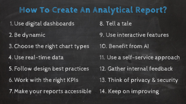
Now that we've looked at a definition and some top benefits, we’ll consider how to create an analytics-style report to enhance business intelligence across the board with the assistance of modern and professional tools.
1. Use digital dashboards
The first step should always be to think about the best medium in terms of usability and presentation. It’s possible to create a comprehensive report using a spreadsheet, whitepaper, or a simple Word document or file. But these more traditional methods are usually clunky and time-consuming. It is possible to structure data across a broad range of spreadsheets, but the final result can be more confusing than productive.
By using an online dashboard, you will be able to gain access to dynamic KPIs in a way that’s digestible, actionable, and accurate. No more sifting through droves of spreadsheets, no more patchwork data analysis, and static presentations. With digital analytical reporting, you will see the insights unfolding before your very eyes.
2. Be dynamic
Traditional reports have a standard structure that doesn’t facilitate editing. Traditional types of analytical reports typically consist of a title page, table of contents, introduction, methodology, body section, conclusions, recommendations, and a bibliography. But with dynamic, interactive dashboard reporting software, your structure will be far simpler and more holistic. As such, you can retain all the conventional information you require, but the dynamism will provide facts you can use live and dig deeper while drilling down into pockets of knowledge with the swipe of a screen or the click of a button.
3. Choose the right chart types
Perhaps one of the most important steps is choosing the right chart type. Once you’ve made a conscious commitment to work with dynamic analytical reports, the next phase of the operation comes in the form of choosing the right chart type. A modern data report offers a host of interactive charts and visualizations you can use to your advantage.
If you choose the right types - those that represent the information you’re looking to convey with your data analysis report - you will enhance communication and productivity. Common chart types include interactive bar charts, line charts, bubble plots, area charts, and maps. To assist you in picking the right ones, here is a guide to choosing the best types of graphs and charts for your business.
4. Use real-time data
In addition to working with the right chart types, using dynamic real-time data is one of the cornerstones of analytical reporting success.
Interacting with real-time data through dynamic visualizations will ensure you can respond to any potential issue as it unfolds. Moreover, working with real-time data that aligns with your exact goals or objectives will improve your in-the-moment decision-making. At the same time, it will give you the capabilities to evolve your strategic efforts in line with the ever-changing commercial landscape surrounding your business.
5. Follow design best practices
When you’re considering the preparation of these reports, presentation is everything. Regardless of how powerful your dashboard software is, without following best practices, you will dilute your most vital organizational information, making it far less effective. When it comes to the design aspect, a clear, concise layout with a balanced mix of visuals is the way forward. For powerful analytical reporting, you must ensure your layout provides clear-cut answers to the questions linked to crucial aspects of your business’s progress. You should avoid packing too many charts and widgets into any analytics reports as it will only detract from your most valuable information. Also, for maximum data-driven success, focus on following a logical format that will allow you and your users to extract actionable insights at a glance. Adding tables at the bottom of the page will enable you to achieve a logical format as they usually provide more value than charts, graphs, or similar metrics.
6. Work with the right KPIs
As well as the many different types of analytical reports that exist in the digital age, there are also many types of dynamic KPIs you can use. The visually rich and interactive nature of these KPIs means that you can gain access to a wealth of invaluable facts, both past, predictive, and real-time. For an informational-style report format to work at its optimum capacity, selecting the right KPI template to consistently work toward your business goals is vital. When you’re creating or developing a business analytics report, you should consider which trends you are looking to uncover or benchmark and choose your KPIs accordingly.
Focusing on your primary business goals will ensure you reach a suitable conclusion when picking dynamic KPIs - doing so will ensure your business is more adaptable, more responsive, and more innovative with the initiatives you develop for the organization. By choosing your indicators well, you gain the ability to spot strengths and weaknesses while making your information more accessible to other stakeholders, both internal and external. This is an essential component of making sure that you get the structure of an analytical performance report just right.
7. Make your reports accessible
Expanding on our previous point, your business analytics report must always be accessible. In addition to developing a visually accessible, logical design and format, your relevant information should always be available to the right people in your organization whenever and wherever they need it. By working with pre-defined templates, you will be able to provide 24/7 access to your company’s most important KPI dashboards as employees will be able to log in and extract insights from a multitude of devices, including smartphones and tablets. The primary aim of a business analytical report is to improve internal business intelligence while empowering everyone with the knowledge they need to perform better - this limitless level of accessibility will do just that.
8. Tell a tale
You’ve probably noticed that we’ve already mentioned the importance of “telling a tale or story” - and for good reasons. The human brain favors strong narratives or a plot it can follow, so if your analysis report format is developed with storytelling in mind, you will make your business reporting efforts far more powerful.
To learn more about how to improve your efforts, you can read our comprehensive guide on data analysis methods and techniques.
9. Use interactive features
When fine-tuning an analytical report, it’s important to consider the features and functionality that will make your data more interactive.
Working with certain features will bring your most valuable insights to life while helping your users to perform better within their roles. These dynamic features include:
- Clickable chart or graph filters
- Detailed data visualization drill-throughs and drill downs
- Chart zoom-in functionality
- Dynamic text boxes and images
- Practical informational toolkits
By enabling the right features and helping everyone within the business understand how to use them, you will ensure your analytical reports offer maximum value, offering a consistently healthy return on investment (ROI) in the process. If you want to see this interactive dashboard feature more in detail, then take a look at our complete guide on the topic!
10. Benefit from artificial intelligence (AI)
Leveraging the power of AI technology will make your data analysis report template all the more powerful. The best modern AI software is equipped with autonomous functionality that streamlines and optimizes the analytical process.
Without a doubt, two of the most valuable AI features that drive today’s types of analytical reports are predictive analytics and intelligent alerts. With AI-powered predictive analytics, it’s possible to visually map out accurate future trends or patterns that will optimize your strategic planning. This level of vision will also allow you to take targeted measures to nip any potential inefficiencies in the bud before they spiral out of control. With intelligent alerts, your reports will inform you when you’ve reached a specific benchmark or any informational abnormalities occur. As a result, you will become exponentially more adaptive, responsive, and able to evolve your analytical efforts.
11. Implement a self-service approach
When it comes to analytical reports, it’s important that every key user or stakeholder can interact with the right insights with minimal support or intervention.
Adopting a self-service approach will empower everyone in the business to explore, examine, and extract valuable information that will optimize their abilities and ultimately, push the business forward. The right type of analysis report tool will make your data accessible while presenting each metric in a way that offers maximum value across the board. As a result, everyone will benefit from your company’s most pivotal data.
12. Gather internal feedback from your stakeholders
Once your analytical reporting tool is up and running, gathering feedback from every relevant stakeholder is vital to ensure ongoing success.
When working with such instruments, it’s critical to get your initial design and formatting correct—but it’s equally important to focus on continual maintenance.
By holding focus groups and workshops (or requesting online feedback) split into two main segments—your internal users and external stakeholders who you present your discoveries to—you will identify any gaps (both functional and informational) in your analytical report format (or formats).
Regardless of your sector or industry, adopting this mindset is vital, as it will ensure your data remains accessible and every single facet of your dashboard helps your users perform to the best of their abilities.
13. Keep on moving, improving, and evolving
Expanding on our previous point: once you’re up and running with your business analysis report and everyone is on board, moving with the landscape around you is vital.
Make a point of checking in with your analysis report format, design, and KPIs on a frequent basis. Consider whether the visualizations and benchmarks you’re using still represent the industry around you as well as the phase of the journey you’re currently on.
If you’ve found that you’ve suddenly scaled your business, for instance, you might find that you need to realign your core organizations and perhaps drill down deeper into your recruitment, talent retention, and fulfillment data.
The point here is that if you want to keep winning through business intelligence, committing to changing, and evolving your efforts continually is the best way forward.
14. Think about privacy and security
In the age of information, having watertight cybersecurity policies is of paramount importance — especially when you’re working with data.
That said, when you’re building an analysis report template or working with analytical software, prioritizing privacy as well as security is critical. It’s important to create your reports using dashboards with in-built features or functionality that will protect your (or your consumers’) most sensitive data from devastating attacks, breaches, or leaks. Plus, placing privacy at the very top of your analytical priority list will ensure you remain compliant concerning legislation like GDPR and CCPA.
Try our professional reporting software for 14 days, completely free!
Benefit From These 22 Analytical Report Examples
Many industries are discovering that analytical reports are essential for healthy and consistent business development across the board. These 22 strikingly different but equally powerful analysis report examples prove it.
Let’s take a look at them, one by one.
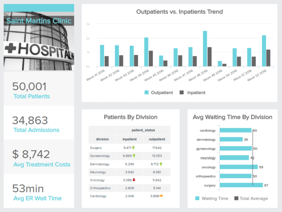
1. Healthcare: How can we reduce the patients waiting time in our hospital?
**click to enlarge**
Primary KPIs:
- Treatment Costs
- ER Wait Time
- Patient Wait Time
Next, we look at an analysis report sample in the health and wellbeing sector. The healthcare dashboard above emphasizes healthcare metrics that combine historical information, and statistics and delve deeper into the analysis of trends, therefore, it can serve as a fundamental part of generating future decisions that are important to run and modify a successful hospital strategy. Although big data in healthcare is becoming expansive and increasing in the variety of information it can provide, it also uses reports in the form of a dashboard (like the one above) so that every piece of information generated has its own measurement and quality of evidence. The average waiting time by division can clearly increase the effectiveness of different hospital departments if used correctly. Also, the number of patients can explain why some divisions have a bigger amount of waiting time, and, therefore, propose a solution to reduce it, and also reduce costs that directly affect the department.
This metric is important for the finance department, but the holistic view of all the informational scopes created and presented in this arrangement will assist management in making better decisions. The image above can also serve as an analytical report template, which can then be used as a roadmap to a successful hospital strategy.
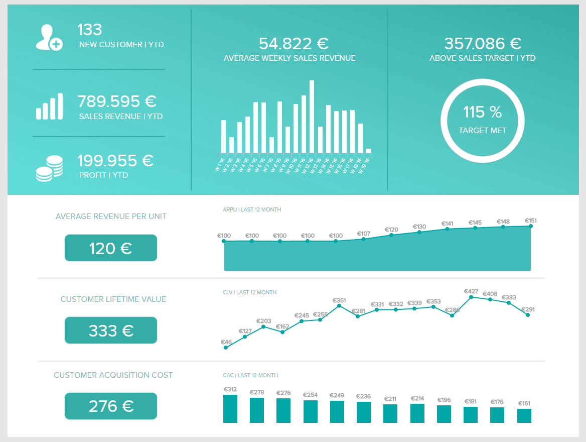
2. Sales: How to exceed targets next year?
The next analysis report example comes from the sales industry.
**click to enlarge**
Primary KPIs:
- Sales Growth
- Sales Target
- ARPU
- Acquisition Cost
- CLV
This sales dashboard combines a lot of important KPIs, like the average weekly revenue, customer acquisition cost, and yearly overview of the revenue and profit. You can even go further and interactively explore these units on a daily, weekly, monthly, or quarterly time frame. The importance lies within the interpretation of big data compiled into just one central hub and a quick summary of the crucial factors that a sales report should have.
The sales target is exceeded by 115%, which means that managers can quickly conclude their targets are on track, provide feedback to their team and generate more ideas on how to proceed with the next steps of a strategy. Incorporating this kind of report into a business practice can bring value to a company, as smart KPIs are presented in a clear and efficient way. Combining these indicators, which provide straightforward evidence and an overview of the overall strategy, managers can reduce operational costs and set additional targets on how to decrease customer acquisition costs, which is one of the main goals of any solid strategy.
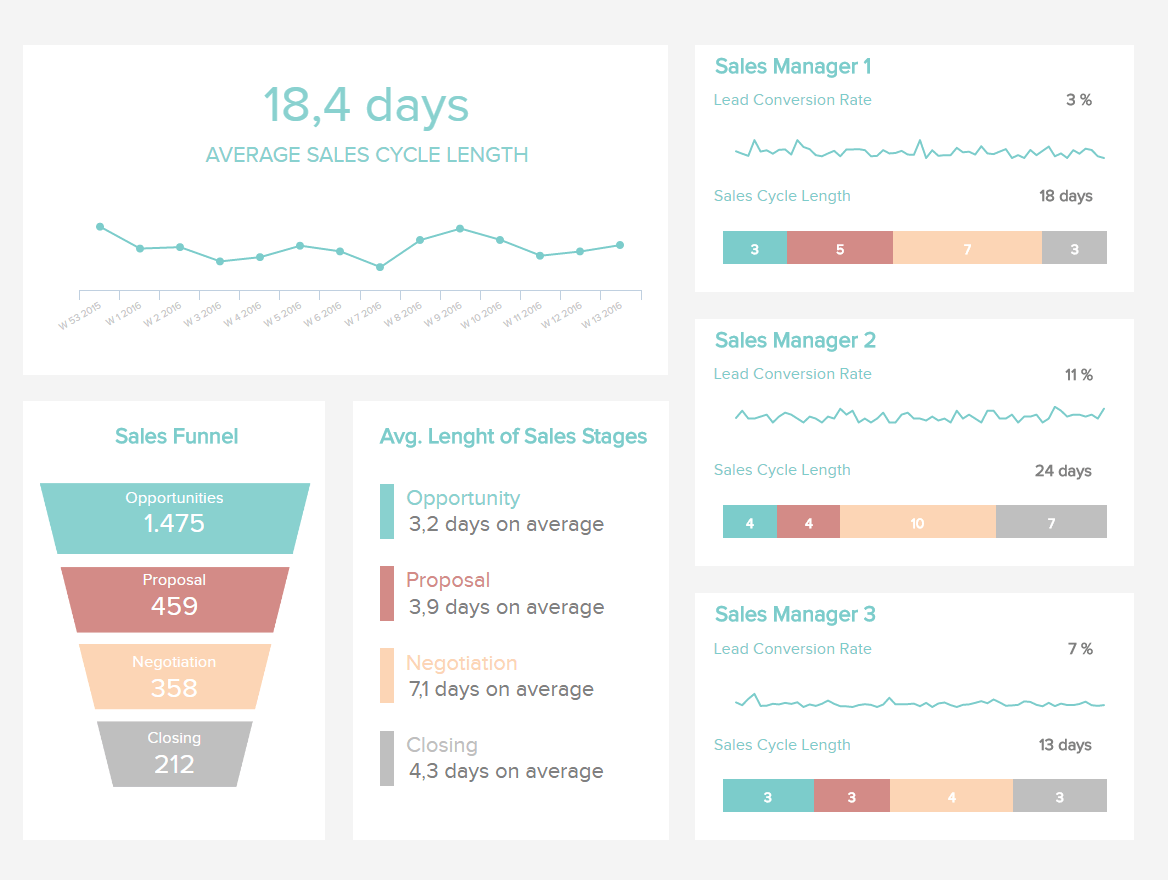
We can go even deeper on a monthly level.
**click to enlarge**
This monthly report combines data of sales reps, their whole funnel, the average length of stages within their journey, and the average cycle length. You can see the single efficiency and conversion rates of a specific manager or representative, and gather information on the number of opportunities, proposals, negotiations, and closing times each one had. This sharp series of sales charts and analyses can project evidence of an effective selling cycle, meaning each member of a team can visually see their part of the strategy and make decisions based on the presented data. Since these kinds of reports can be used by different teams and stakeholders, the important value of clear analysis and numbers can define future actions while analyzing current data.
3. Marketing: Where should we allocate our budget?
Our third example of an analytical report comes from marketing. Digital marketing KPIs have expanded since the use of digital media has entered the marketing scene and reports have become more broad and detailed. Although you can combine your tracking KPIs into a single spreadsheet, it is often more useful to have a clear overview of specific campaigns, return on investment, cost per click, or landing page conversion rate.
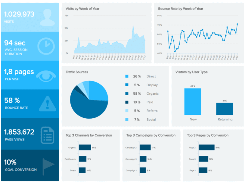
**click to enlarge**
Primary KPIs:
- Traffic Sources
- Conversion Rate
- Bounce Rate
This data analysis report template shows a perfect overview of web analytics metrics. It quickly shows the total amount of visits, average session duration, bounce rate, page views, and the total goal conversion rate. Based on this info, a marketing department can quickly grasp into their analytics and conclude whether to make changes to their strategy or make an additional decision for a specific campaign. Monitoring traffic sources can easily define where to invest more or less, and the systematization of top campaigns, channels, and conversions can easily provide evidence of historical data based on the last year’s performance, or a weekly rundown of trends. This kind of marketing dashboard can bring consuming writing and exporting documents into the pains of the past since the dynamics of digital reports have gone into the future of the digital age.
4. Finance: How can we reduce the operating expenses ratio?
The fourth in our examples of analytical reports comes from the finance sector.

**click to enlarge**
Primary KPIs:
- Return on Assets
- Return on Equity
- Working Capital
This financial dashboard is a simple representation of how you can meet all your financial objectives in one analytical report, as it combines: gross profit margin, operating expenses ratio, operating profit margin, and net profit margin. All these indicators offer valuable and succinct insights into one central point of access which can be then analyzed in more detail by providing data and, therefore, a base for making future decisions. After seeing this visual representation of the most important performance indicators, stakeholders, managers, or employees can benefit from insights and decide whether to reduce the operating expenses or take action into developing a new strategy to increase revenue and profit.
5. FMCG: How do we make our supply chain more efficient?
Our next sample comes in the form of our FMCG dashboard. A business analysis report focused on fast-moving consumer goods (FMCG), this report sample is ideal for businesses turning over large amounts of inventory on a regular basis.
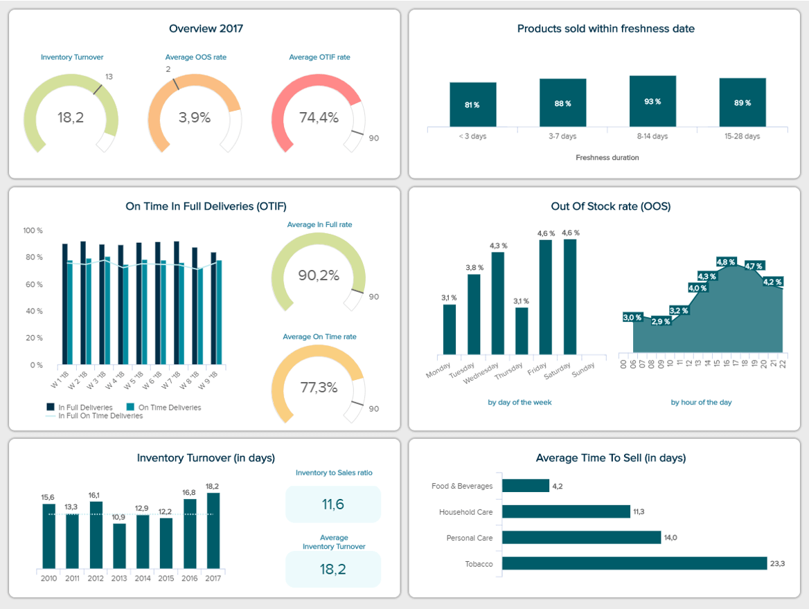
**click to enlarge**
Primary KPIs:
- Out of Stock Rate (OOF)
- Delivered On-Time & In-Full (OTIF)
- Average Time To Sell
- Percentage of Sold Products Within Freshness Data
Boasting a cohesive mix of supply chain metrics designed to give business owners the capabilities to develop efficient strategies for streamlining their stock handling and fulfillment activities, this analytical report sample offers both at-a-glance and long-term strategic performance indicators based on average selling times and out-of-stock rates, among other invaluable nuggets of information.
This is a powerful report that will save you time and money while significantly improving both your supplier and consumer relationships in the long run.
6. Market research: How is our brand awareness?
This analysis report template is based on improving your business’s market research strategies to gather critical insights using a more efficient, effective, and value-driven approach.
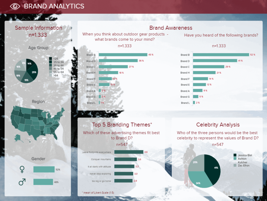
**click to enlarge**
Primary KPIs:
- Unaided Brand Awareness
- Aided Brand Awareness
- Brand Image
- Celebrity Analysis
An analysis report format offers a two-fold solution — the mix of KPIs featured within this real-time dashboard can help businesses across industries boost their brand awareness and leverage influencer relationships while collecting market insights that will help in the development of smarter, more results-driven marketing and communication initiatives.
This is a visual tool that will help you create a brand image that resonates with your target audience while taking advantage of business-boosting opportunities across a range of mediums, from email to social media and beyond.
7. Manufacturing: How efficient are my costs and processes?

**click to enlarge**
Primary KPIs:
- Asset Turnover
- Unit Costs
- Return on Assets
- Maintenance Costs
This balanced analysis report offers an at-a-glance snapshot of all core manufacturing metrics related to costs over a set period.
In today’s fast-paced, hyperconnected world, manufacturing companies or departments are under enormous pressure to fulfill high-quality products that meet stringent QC regulations while keeping costs at a consistent minimum.
Equipped with charts that display accessible financial trends, this analysis report is designed to give manufacturing decision-makers the tools to assess KPIs such as unit costs and return on assets swiftly and confidently. By using this key data report template, you will strike the perfect balance of quality, consistency, and financial efficiency – the operational sweet spot.
8. Support Team: Are we meeting our customers’ needs?

**click to enlarge**
Primary KPIs:
- Top Agents
- First Contact Resolution Rate
- Utilization Rate
- Net Promoter Score
In an age where customer service and experience are considered even more important than price or product, you cannot afford to be complacent with your support efforts. That’s where this data report template comes in.
This support-centric Zendesk dashboard will help you optimize your support team for continual success. The analysis report example offers an overview of general customer support KPIs such as Net Promoter Score (NPS), first contact resolution rate, and the amount of open and unassigned support tickets for a 30 days period. Among these, it displays an interactive chart showcasing the individual performance of your support agents, like this you can reward the employees with better numbers and help or incentivize the ones with lower ones. By tracking and measuring your support success you will gain the ability to make strategic decisions to make your service department incredibly efficient.
9. Procurement cost: Can I improve my return on investment?
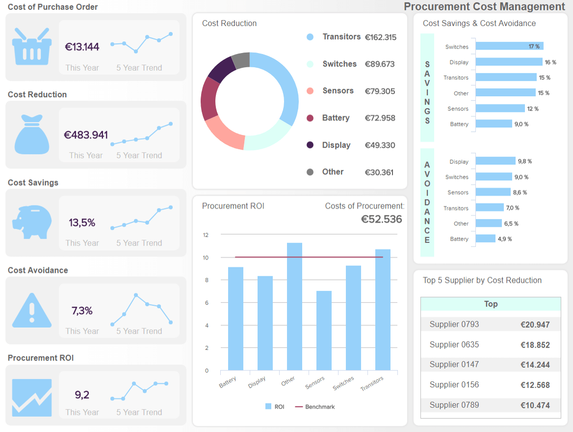
**click to enlarge**
Primary KPIs:
- Cost of Purchase Order
- Procurement Cost Reduction
- Procurement Cost Avoidance
- Procurement ROI
This procurement-based analysis platform is focused on costs and purchases. The design showcases interactive charts tracking metrics like the cost of the purchase order, cost reduction, cost savings, cost avoidance, and procurement ROI, all of them displaying the actual number and a 5 years trend. In addition, you can see a detailed breakdown of the cost reductions, cost savings, and avoidance, among cost reductions related to suppliers.
By drilling down into this cohesive mix of procurement KPIs, it’s possible to omit any unnecessary costs from your procurement processes while understanding the ROI of specific items within your inventory. Tracking these metrics regularly will enable you to optimize every element of your procurement chain, ensuring that your efforts are not only value-driven but also won’t drain your budget with minimal gain. This is an essential data analysis report example for businesses across industries.
10. Employee performance: How well is my team doing?
HR is one of the beating hearts of your business. Keeping your employees engaged and motivated will improve your productivity levels significantly. This HR-centric data analysis template will help you do just that.
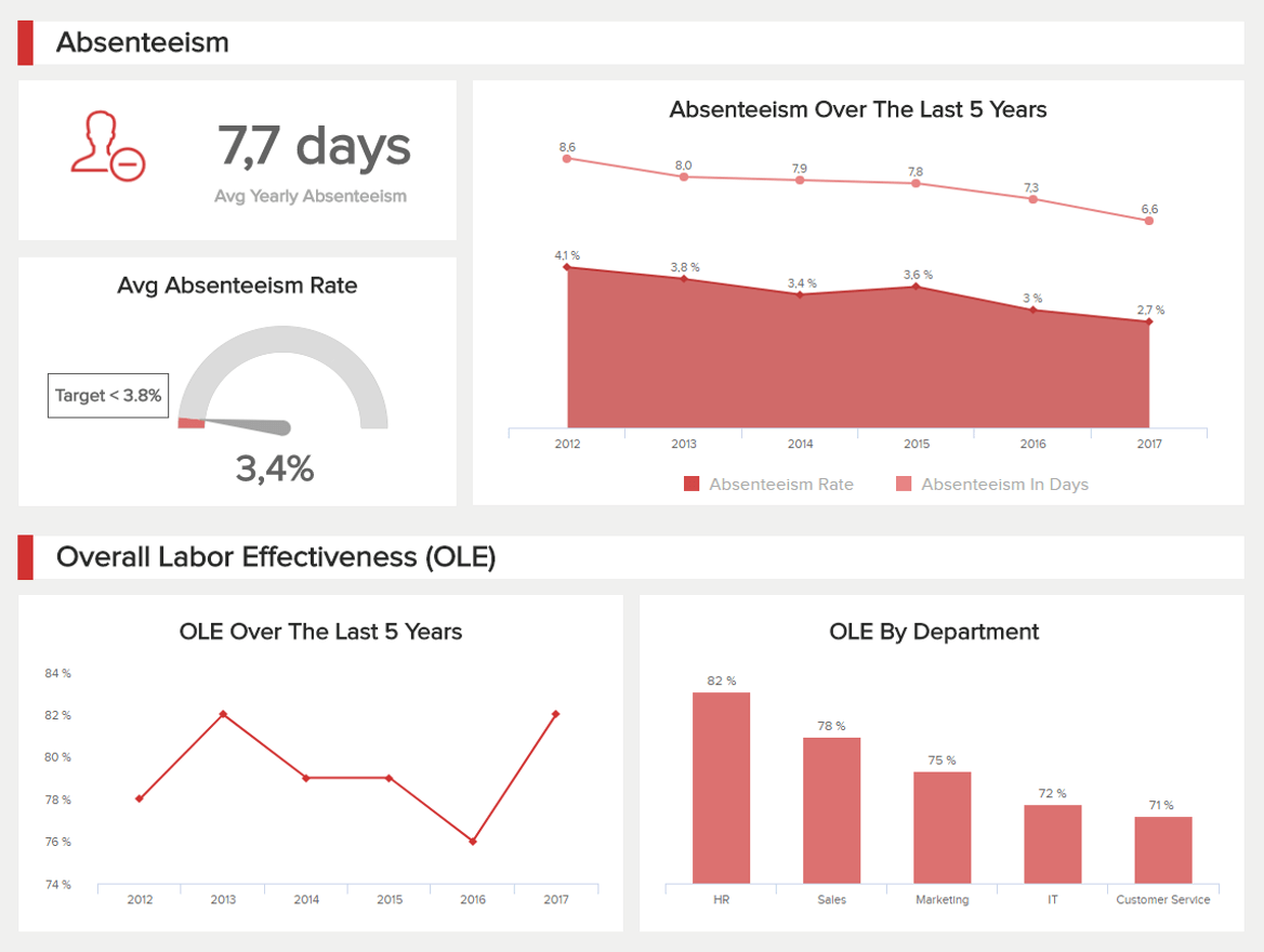
**click to enlarge**
Primary KPIs:
- Absenteeism Rate
- Overtime Hours
- Training Costs
- Employee Productivity
Built to track labor effectiveness and absenteeism as well as staff productivity, overtime rates, and labor costs, this detailed tool will ensure your talent remains engaged while operating to the best of its abilities. Tracking these HR KPIs frequently will help you provide support, resources, or training where required while tackling any inefficiencies or staff-related issues head-on with a productive, valuable solution. This is a tool that will create continual success and cohesion in every department.
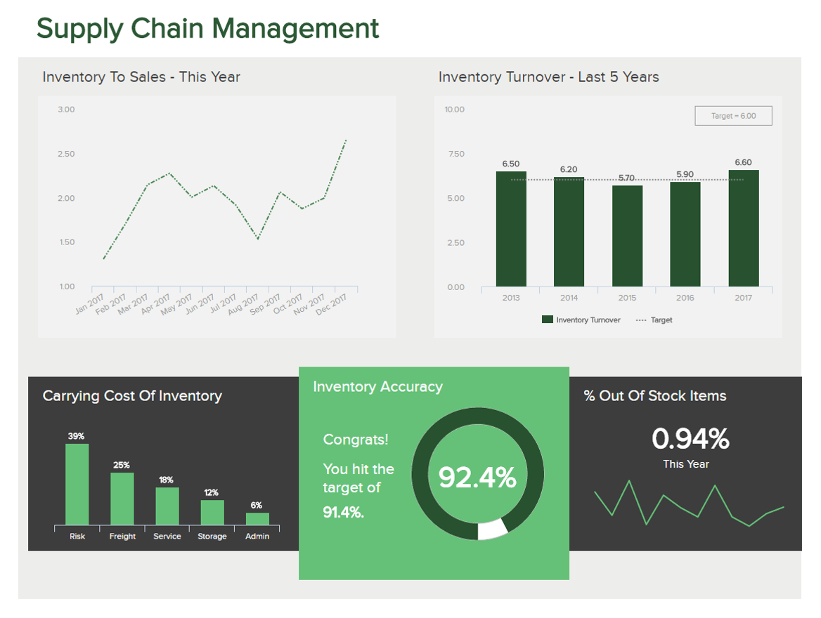
11. Supply chain: Are my operations optimized from end to end?
Historically, businesses across industries have hemorrhaged money with poor, inefficient supply chains and operational bottlenecks. But by taking a data-driven approach to your supply chain-based activities, you can cut out inefficiencies or operational snags.
**click to enlarge**
Primary KPIs:
- Inventory Accuracy
- Inventory Turnover
- Inventory to Sales Ratio
This logistics dashboard is a business analytics report that will help you track turnover, out-of-stock items, and inventory-to-sales ratios with pinpoint accuracy. By doing so, you can reduce redundant supply chain costs while keeping your entire process flowing from end to end. This is an analytics report example designed for sustainable supply chain success.
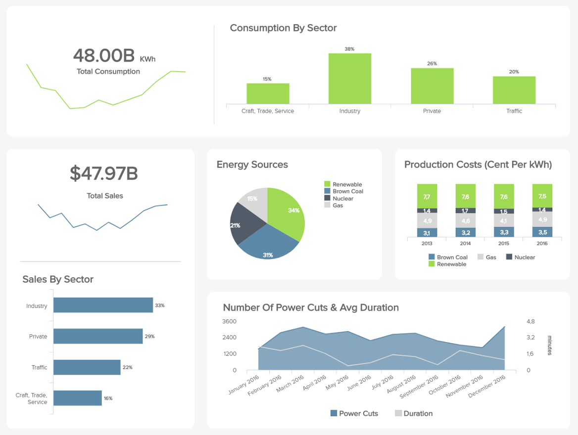
12. Energy: How sustainable & power-efficient is my business?
Many companies overlook their energy consumption – but it counts. If you have several offices, warehouses, or commercial sites to manage, you will suffer without proficient energy management solutions or strategies.
**click to enlarge**
Primary KPIs:
- Power Cuts & Average Duration
- Consumption by Sector
This energy dashboard allows you to compare your energy consumption to other sectors while gaining vital information on power cut durations, emissions, overall consumption, and costs. Armed with a melting pot of energy usage data, you can use this tool to become more financially efficient as well as greener and more sustainable – which is vital in an increasingly progressive and competitive digital landscape. By putting a data-driven energy management strategy in place, you will make your business more sustainable while reducing your annual costs.
Try our professional reporting software for 14 days, completely free!
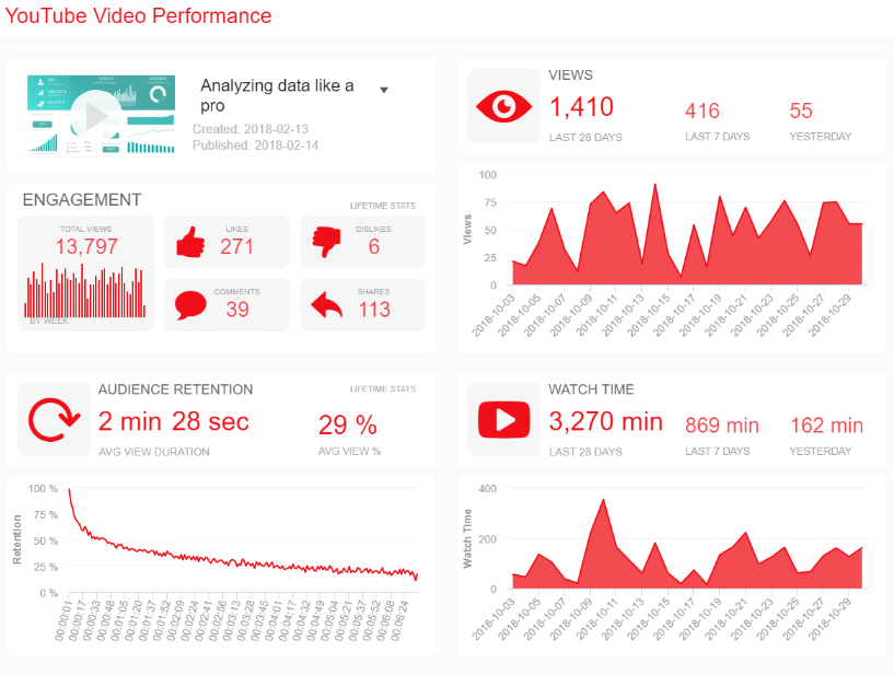
13. YouTube Performance: What content works for my target?
With customers choosing videos over regular content more and more, brands have the opportunity to give important information in a more engaging and interactive way. For instance, by using explainer videos you can tell your audience about a new product, a service, or even what your brand is about, without putting them through the pain of reading long texts to find the information they need. With this type of content, you can also close more deals and increase conversions by adding extra value to your company.
**click to enlarge**
Primary KPIs:
- Engagement
- Audience Retention
- Views
- Watch Time
Our YouTube dashboard is an invaluable tool to measure the performance of your video content. It contains detailed charts showcasing forms of engagement metrics such as likes, comments, shares, and views along with two graphs displaying the average audience retention by seconds and the average watch time for the specific video.
By tracking these metrics you can see the overall outcome of a specific video and compare it with others to understand what kind of content your target audience enjoys the most. In addition, by looking at the average watch time you can get a notion of how long your videos should be to keep the viewers entertained. This will lead to an optimization of resources and better content for your audience.
14. IT CTO: are your high-level tech-centric decisions working?
The role of a CTO is high-pressure and all-encompassing. The execution, rollout, and development of technology within a company have a direct impact on its ongoing success. That said, as a CTO, your decisions must be swift, razor-sharp, and built for consistent growth.
Our slick CTO IT dashboard is designed to provide senior tech decision-makers with access to quality high-level metrics at a quick glance.
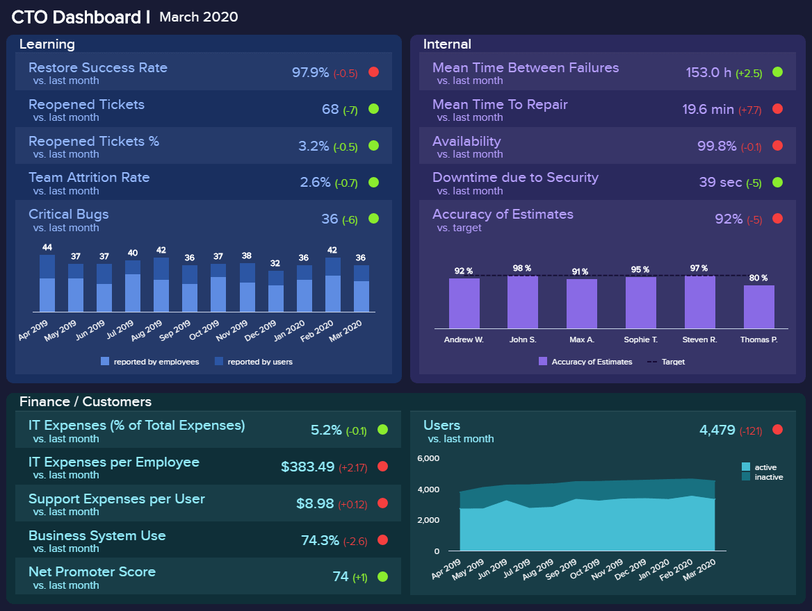
**click to enlarge**
Primary KPIs:
- Number of Critical Bugs
- Reopened Tickets
- Accuracy of Estimates
- New Developed Features
- Team Attrition Rate
With a balanced design and a wealth of visual information including critical IT KPIs such as user trends, critical bug quantifications, team attrition rates, newly developed features, and more, here you have everything at your disposal to act at the moment while formulating business-boosting strategies in a number of key technological areas.
15. CMO: how can I drive more efficiency from my campaigns?
The next of our dynamic analytical reports examples is for a company's CMO. Marketing and communications are key in delivering consistent brand messaging to specific segments of your audience across a wealth of channels. It's a colossal task, and if done right, it can bring exponential value to any business.
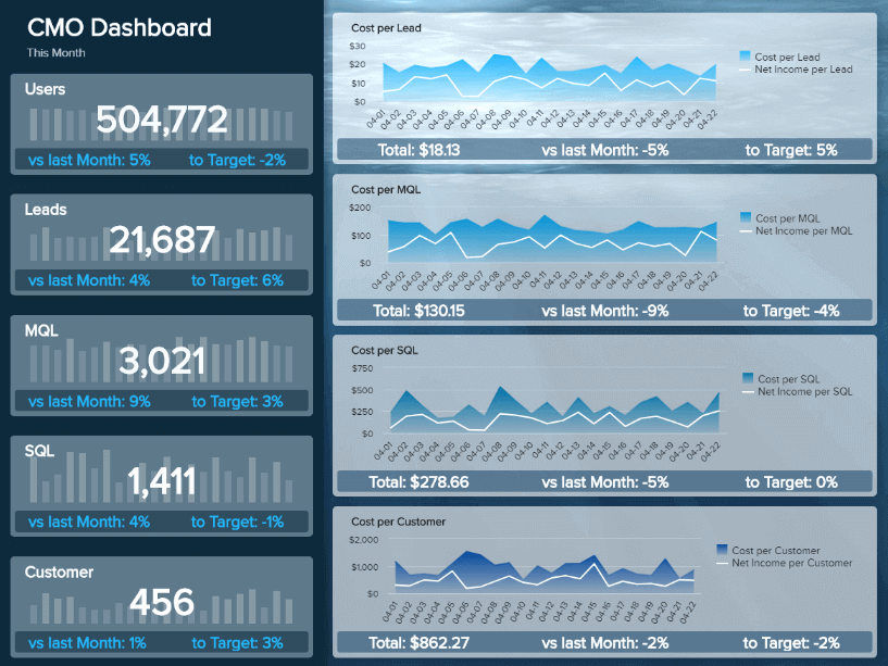
**click to enlarge**
Primary KPIs:
- Sales Target & Growth
- Website-Traffic-to-Lead Ratio
- Cost per Lead
- Lead-to-MQL Ratio
- MQL-to-SQL Ratio
This highly-informative analytical report template is built to provide busy CMOs or senior marketers with the insight to measure campaign success with pinpoint accuracy while managing budgets and ensuring the best possible return on marketing investment (ROMI) with every promotional initiative.
The information delivered by this template also offers a level of insight that will ultimately improve the collaboration between sales and marketing departments.
16. Customer retention: how can I inspire customer loyalty?
In our hyper-connected digital age, consumers are well and truly in the driver’s seat. As such, taking measures to improve customer retention and loyalty is critical to your business’s ongoing growth.
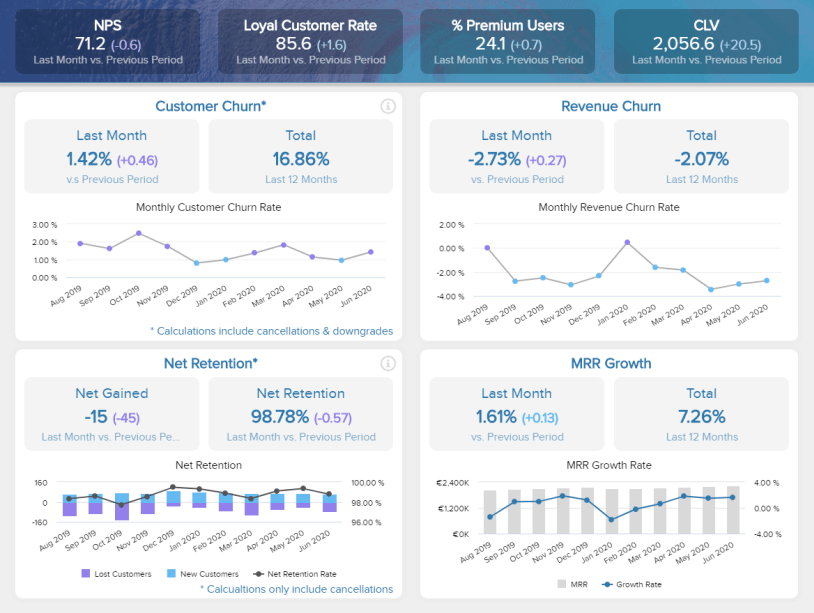
**click to enlarge**
Primary KPIs:
- Customer Churn
- Net Retention Rate
- Revenue Churn
- MRR Growth Rate
Not only are existing customers more cost-effective to maintain, but a loyal consumer will also act as a brand advocate, which, in turn, will expand your brand reach further with minimal effort. This retention dashboard will give you a clear insight into your levels of churn, retention, and growth, making it easy to target any potential issues affecting loyalty.
Armed with this invaluable information, you can set about developing strategies that will reduce your customer churn across every relevant channel and touchpoint.
17. Content quality: can I improve the impact of my communications?
Content is everything in the digital age of business. Without delivering a consistent flow of quality content that enlightens, helps, or inspires your audience, you will eventually come to a grinding halt.
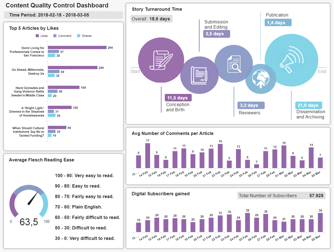
**click to enlarge**
Primary KPIs:
- Flesch Reading Ease
- Average Comments per Article
- Story Turnaround Time
Our panoramic analytical report sample provides professional reporting based on the accessibility, efficiency, and engagement of your business’s content.
Working with these critical insights, you will ensure your content reads naturally while discovering new ways to reduce turnaround time and gaining a clear understanding of the type of articles, mediums, or ideas that resonate most with your audience, driving better results in the process.
18. IT costs: how can I optimize my expenditure & boost ROI?
As the very backbone of any forward-thinking organization, the IT department is responsible for keeping the whole ecosystem ticking. But, with so many processes and applications to consider, budgets can become strained.
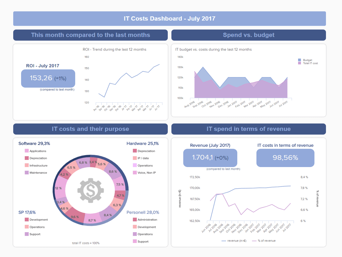
**click to enlarge**
Primary KPIs:
- IT ROI
- IT Costs Break Down
- IT Costs vs Revenue
This expense-oriented analytical report example is visually balanced and offers a vivid breakdown of the entire department's costs, revenue, and ROI over a monthly, quarterly, or annual timeframe. Not only is it possible to map out your budget versus spending over a specific period, but you can also pinpoint exactly where you’re spending most of your budget.
Gaining a firm visual grasp of your IT costs breakdown, you can take strategic measures to drive down any fiscal inefficiencies while distributing your resources in a way that is more balanced and built for sustainable success. One of the most striking features of this analysis report sample is the fact that you can keep a close eye on your department's overall ROI with a quick glance. As a result, you will keep your IT department operating at maximum efficiency while earning the very best returns for your ongoing efforts.
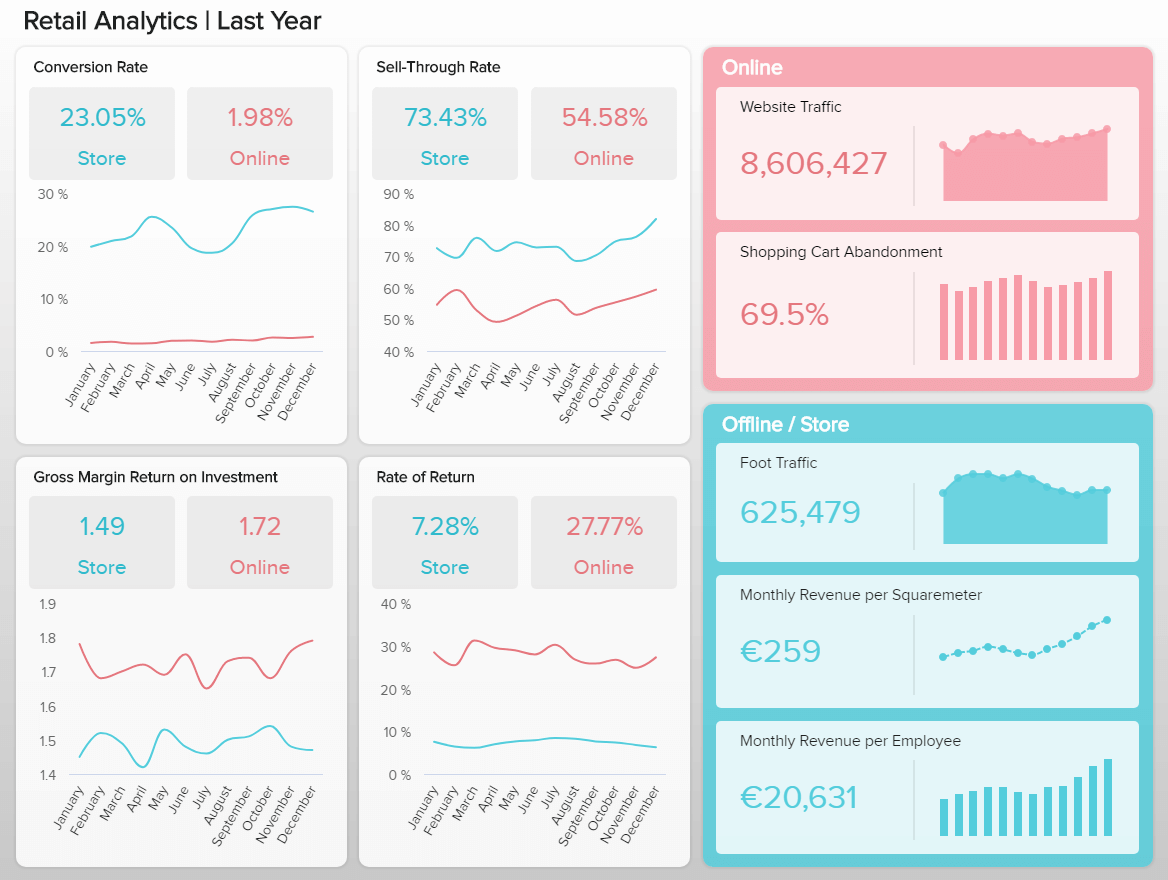
19. Retail optimization: how can I streamline my marketing and selling activities?
Retail is an ultra-competitive but incredibly rewarding industry — as long as you have the right strategy in place. To develop a sustainable strategy that results in continual growth and evolution, sweating the right data is key — that’s where analytics reporting comes in.
**click to enlarge**
Primary KPIs:
- Website Traffic/Foot Traffic
- Sell-Through Rate
- Retail Conversion Rate
- GMROI
- Monthly Revenue Per Employee
As an analytical report template designed to help stretched retail brands take charge of their most impactful data, this retail dashboard drills down into trend-based KPIs, including web or foot traffic, sell-through rates, conversions, GMROI, and revenue.
Armed with this melting pot of information, you can track the ongoing balance between your investments and returns while making accurate comparisons on inventory received versus sold. Gaining access to real-time data based on revenue per employee as well as traffic and cart abandonment rates will give you the capacity to optimize every phase of your consumer-facing retail journey for complete success. Working in close collaboration with this insightful analysis report format will result in consistently solid conversion rates while preserving the financial integrity of your physical or online store.
20. Google Analytics optimization: how can I drive greater analytical conclusions from the platform?
Google Analytics (GA) is one of the most rewarding data-driven platforms and offers a wealth of consumer-facing intelligence for brands across any niche or vertical imaginable. But, with so many using GA to improve the digital experiences they offer, cutting through the noise can prove challenging.

**click to enlarge**
Primary KPIs:
- Sessions and Users
- New and Returning Visitors
- Bounce Rate
- Goal Conversion Rate
An analytical report format designed to offer additional depth and context when using the platform, our Google Analytics dashboard will help you pinpoint exactly where and how in your digital journey you can drive consumer engagement.
With dynamic KPIs including sessions and users, new and returning visitors, bounce rates, and goal conversion rates on the visual menu, here you can dig deeper into essential pockets of data that will boost your regional, as well as international, success. Harnessing this essential data, along with the dashboard’s superior machine learning capabilities and drill-down functions, you can optimize your user flows, consumer content, and multi-channel marketing strategies for success across the board.
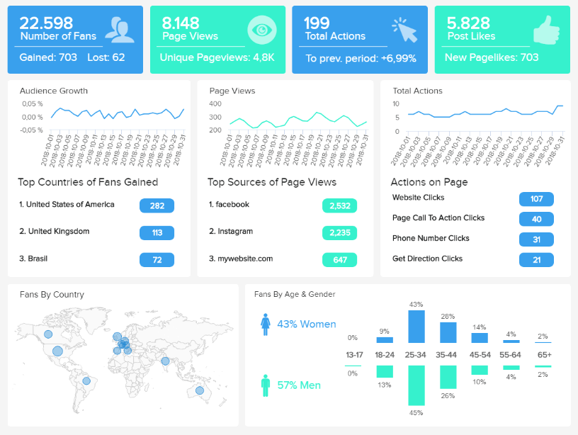
21. Facebook marketing: how do I improve engagement & boost brand awareness with my content?
Facebook remains one of the world’s most popular and actively subscribed-to social media platforms. By understanding your Facebook audience on a deeper level, you will unlock the key to knowing which type of content earns the best rates of engagement.
**click to enlarge**
Primary KPIs:
- Number of Fans
- Follower Demographics
- Page Views by Sources
- Actions on Page
This particular analytical report sample is visually striking and offers a granular breakdown of key Facebook engagement metrics, including page views by source, on-page actions, fan numbers, and follower demographics.
Each informational element in this Facebook dashboard works in harmony to provide the tools necessary to create communications that appeal to specific audience segments while understanding where your content is leading your Facebook users. If you discover, for instance, that your Facebook posts are prompting a healthy number of website clicks but a consistently low level of desired CTA clicks, you can reassess the times you’re posting, as well as the content or sentiment of your messaging, to drive more social conversions.
Here, you have everything you need to level up your Facebook marketing strategy in one accessible analytical report outline — an essential tool for any ambitious modern company.
22. Procurement analytics: how can I optimize every key phase of my procurement funnel?
If you deal in tangible goods, your procurement strategy will dictate many core aspects of your organizational efficiency and flow.

**click to enlarge**
Primary KPIs:
- Supplier Quality Rating
- Vendor Rejection Rate & Costs
- Emergency Purchase Ratio
- Purchases In Time & Budget
- Spend Under Management
This data analysis report example is equipped with interactive KPIs that will help you appraise the quality of your suppliers, along with any associated operational costs, with pinpoint accuracy. Working with this powerful procurement dashboard will also empower you to uncover key patterns related to your ongoing expenditures throughout the year while drilling down into your emergency purchases ratio.
Here you can set actionable benchmarks for every key component of your procurement strategy while identifying any suppliers or parts of your process that might be draining your budget. Tracking your vendor costs and rejection rates will also play a pivotal role in your ability to examine your ongoing quality management strategies. As a result, you can reassess your supplier relationships while ensuring you keep the entire chain flowing from end to end.
Analytical Reporting Mistakes to Avoid
We’ve looked at an official analytical report definition and explored various types of analytical tools—we’ve even walked through a comprehensive list of samples. Now, let’s look at the essential mistakes you should avoid when generating them.
- Not knowing your goals and objectives
The first cardinal sin of analysis-based report building is not taking ample time to work through your core business goals or objectives in a collaborative environment. Without looking at your existing functions and setting actionable goals or outcomes, you will choose the wrong metrics and essentially analyze information that offers very little value to the growth of your business. The bottom line? Do not skip this vital phase of the operation. Set aside ample time for goal setting and make sure that you involve the relevant personnel or stakeholders.
- Not considering your users or audience
The next mistake boils down to a failure of considering your end-users and those who will need to read your reports. Think about what various users across different departments will need in terms of KPIs, visualizations, and access to perform better at their roles while ensuring your templates are set up for external stakeholders to understand the information before them and you will ensure your efforts deliver maximum results across the board, all while building collaborative bonds.
- Choosing style over substance
When designing your dashboards, you should never choose style over substance. Making your design visually appealing is good, but you should never prioritize aesthetics over practicality. Work through your reports in detail and ensure every relevant strand of information is clear, accessible, and fully interactive to ensure the best (and most informational) user experience possible. Refer to our design tips in the report building section for inspiration.
- Not providing training
Developing wonderful data templates is all well and good, but without training everyone within the business, your efforts will offer little value. That said, you must run workshops on your new data tools and make sure that everyone in the business understands why they should use them as well as how to use them to the best of their abilities. No exceptions, no compromises.
By avoiding these key mistakes, you will ensure that every analysis-centric report you write will improve business intelligence across the business. And in doing so, you will thrive.
Try our professional reporting software for 14 days, completely free!
Takeaways From Analytical Reports
The digital age has transformed the way we interact with the world around us. Now, businesses across sectors have the power to collect, curate, and interpret data in a way that improves intelligence and accelerates success. In this bold new world, BI tools have emerged as must-have tools for getting and staying ahead in a competitive digital landscape.
After asking the question, “What is an analytical report” and exploring an official definition, looking at a mix of real-world samples, and drilling down into how to make an analysis report, it’s clear that these dynamic, interactive, and highly visual displays offer no end of the business-boosting value.
We’ve uncovered an official analytical report definition, and explored a wealth of analytical reports examples and the data-driven benefits are clear. It’s easy to see how these kinds of reports can be used across industries by offering actionable insights that cover a host of departments, activities, and internal functions. Using BI dashboard tools will ensure that you stay on top of today’s market while reducing operational costs and propelling yourself ahead of the competition with powerful data-driven initiatives.
An online data visualization tool, coupled with the right analytical reports examples, can help track the specific and holistic progress of your company and improve your decision-making. Welcome to the future.
If you want to start rocking your reports today, try datapine for a 14-day trial. It’s time to take your data to the next level.