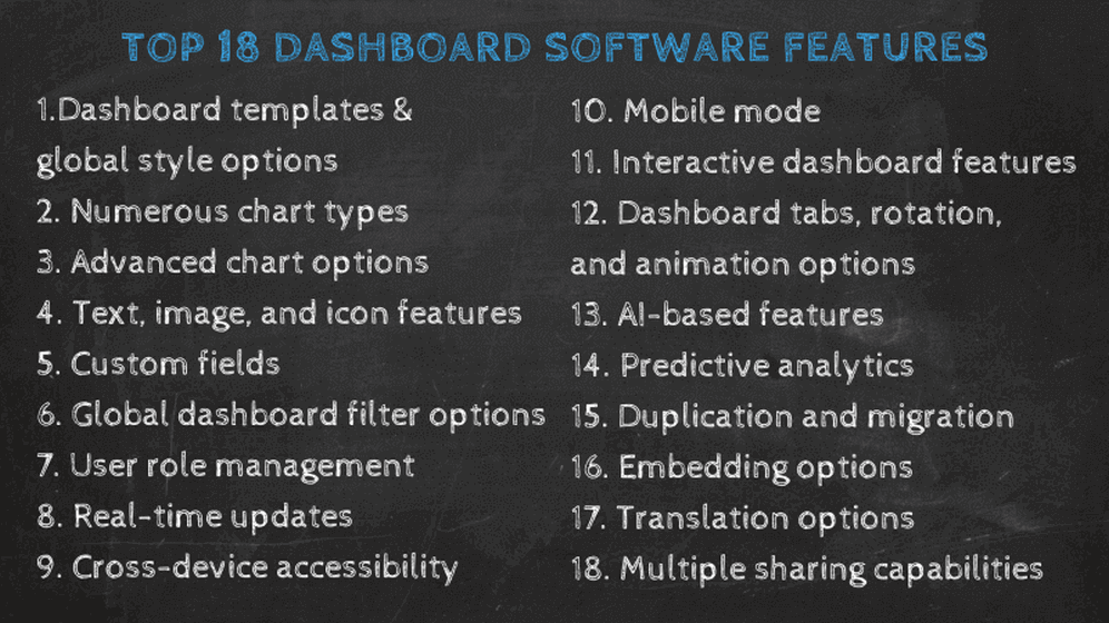
Dashboard Software Features Which features do you really need in 2023?
Top 18 Dashboard Software Features For 2023
Table of Content
1) What is dashboard software?
2) How do you benefit from dashboard software?
3) Top 18 best dashboard software features
4) How to select the best dashboard software?
5) Dashboard tools challenges & mistakes to avoid
Data analytics, business intelligence (BI), and dashboards are becoming indispensable tools for businesses looking to upscale their performance and reach more profits. With all the information you must gather, monitor, and analyze in today’s digital age, you may be wondering if you are getting the most out of your data. A crucial first step to maximizing your insights is finding a state-of-the-art, professional dashboard software with the necessary features for your business.
If you are thinking of investing in this technology but don’t know what to look for or where to start, here we’ll provide everything you need to know, and more. You’ll learn what is a dashboard software, how you can take advantage of it, how to choose the right one for your business and the top features a dashboarding software must have in 2023 to be able to reach and outperform business’ goals. Let’s get started.
1) What Is Dashboard Software?
Dashboard software is an information management tool that tracks, gathers, and displays business data in interactive and customizable visualizations that enable users to monitor the health of a business, analyze processes, and provide them with actionable insights.
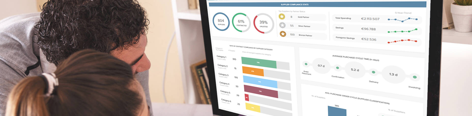
- An example of a modern dashboard software interface -
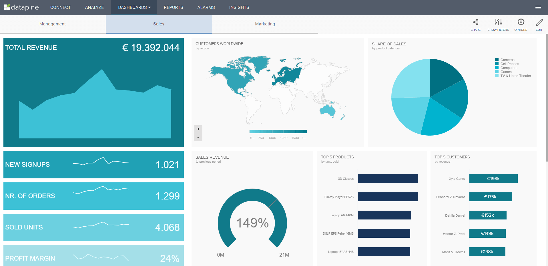
A professional business dashboard software empowers anyone on your team to immediately create charts and automated reports in the shape of interactive dashboards that can be easily shared with the right decision-makers. Any team member, from CEO to a junior manager, has the ability to discover, visualize, present, and share data in any way they deem relevant. Whether you want to see critical customer KPIs or last month’s sales figures, the numbers you need are only a few clicks away.
While these dashboarding tools have been available to upper management for years, the development of self-service solutions that can be used by anyone across the organization has paved the way for an unprecedented level of access that democratizes decision-making and engages every employee in the bottom line. Let’s see the most eminent benefits of utilizing such tools in more detail.
2) The Benefits of modern Dashboard Software
Imagine that your sales team is presenting to a potential client, on the verge of closing a sale, when a question arises about past performance, financial efficiency, future predictions, or any of a host of factors. Out comes your phone or tablet, and seconds later, the data is charted, providing context simultaneously. This is just one scenario where performance data dashboard software brings added value to businesses, and now we will explain dashboard features and benefits to any business that implements these modern solutions into its workflow:
You gain a consistent view of KPIs: All your key performance indicators (KPIs) become visible from a centralized location, formed on a single screen, no matter the data source(s) you need to utilize. You can easily connect flat files, CRM- and ERP data, databases, helpdesk, social media, and many more, which will provide you with instant access to all the business information you might gather and need to analyze. That way, as a non-technical user you can fully explore your datasets with the help of a KPI dashboard and obtain a consistent, unified view of your business metrics, without relying on additional assistance from other departments.
You empower everyone to explore data: Back in the day, the IT department had the full responsibility to code the required data or generate reports that would take days, if not weeks. Modern solutions cut the middleman and provide the user with a drag-and-drop interface that enables you to explore the data on your own. This self-service approach empowers you to create and analyze your own dashboard, without writing a single line of SQL code by simply selecting the desired chart, and dropping it onto the required area. Your data is immediately visualized, and you don’t need to wait for the analysis for hours or days. Powerful online data analysis tools will do all the hard work for you.
You get real-time updates: Real-time is all the rage these days, and why shouldn’t it be? Just think - your data is automatically updated without the tedious and error-prone practice of manually entering new information. A real time dashboard allows you to monitor activity as it happens throughout your business processes. Your charts and reports are updated continuously in less than a second after the action occurs. Gone are the days of a decision-maker requesting a report for a meeting that gets rescheduled leading the report preparer to have to do the work twice. No matter when you need to look at the report, the charts are up to date.
You become more flexible: In recent years, dashboard programs have evolved into scalable SaaS solutions that offer access from anywhere, and at any time. The only requirement is an Internet connection, and the tool is immediately available. Many layers of security will enable you to safely explore your data, no matter where you’re located or if you use a laptop, tablet, or even mobile phone. This kind of flexibility empowers users to answer business questions immediately, perform analysis on-the-go, and avoid expensive in-house IT management and maintenance.
You profit from a data-driven culture: To be able to move a business forward, productivity is the key. By establishing data-driven workflows, you will be able to minimize risks, and improve your decision-making processes as well as the overall business efficiency. Consequently, guesswork is completely eliminated, and each employee has the chance to base decisions on the right information, at the right time. Ultimately, the right dashboard program increases organizational efficiency and creates a data-driven culture that can only bring positive results to the business.
You increase business efficiency: The truth is, to establish yourself on the market, and survive, you need advanced business efficiency. Reducing manual tasks is a critical component of successful business management and development and it’s one of the top priorities when it comes to increasing efficiency. Ask yourself, how many more tasks can you additionally automate and free more time? Moreover, the possibility to answer urgent business questions quickly will enable you to cut even more hours while focusing on other burning questions. Take chances, avoid risks with company dashboard software that will become your most invaluable business partner.
You reap the benefits of smart features: With the possibility to utilize artificial intelligence, the dashboarding software augments the traditional means of monitoring, analyzing, and generating actionable insights, and takes you to the next level of data management and strategic decision making. If a business anomaly occurs or a specific goal is met, modern tools will instantaneously alert you, hence, you can take immediate action and prevent a business disaster or celebrate your newly reached goals. You can benefit from neural networks, pattern recognition or threshold alerts that will help you spot trends and identify patterns, notifying you of important changes even on your mobile.
You begin to trust your data: By utilizing a modern dashboard application, users have the chance to completely trust their data since the software becomes the single point of truth, no matter the number of data sources. If you work with flat files, CRM/ERP, databases, helpdesk, or marketing analytics, you can simply connect your data, and work with a single interface. This notion is extremely important since today companies gather so much data that working with different tools and software has become tedious and tiring. Companies and, in the end, people, are looking to simplify their processes – dashboard tools are the answer.
You will need the best dashboard software to fully utilize all these discussed benefits and more. Here we will distance ourselves from traditional means of representing data such as Excel or PowerPoint, as they nevertheless don’t cover most of the features we will discuss, and help you to identify key features a professional software should have in 2023.
3) The 18 Best Dashboard Software Features In 2023
As we expounded on the benefits and how you can take advantage of implementing these solutions into your business, now we will take a closer look at the top features they should provide you with in order to upscale your business. We will focus here on actual features that are utilized during the creation, use, and sharing processes, after your data is ready and connected to the tool. Therefore, we will omit data quality (management), and third-party integrations that enable you to access your data from a single point of truth these are already inevitable requirements; hence, we won’t look into further details.
Many of these discussed software features are covered on different levels, therefore we will often differentiate, within a single feature, between basic/standard, and more advanced ones. Let’s get going.
1. Dashboard templates and global style options
- An example of a professional dashboard template -
These features help to speed up the dashboard creation process and editing. Predefined templates, such as the example above, provide you with the possibility to choose from various pre-built and designed templates that you can simply select, and the software creates the whole dashboard for you which you can edit afterward. This custom dashboard software feature can come in handy when you don’t have time to build your own customized solution or need fast visualizations of your data. It is also a great solution for users who don’t feel comfortable generating their own dashboards but want to reap their benefits.
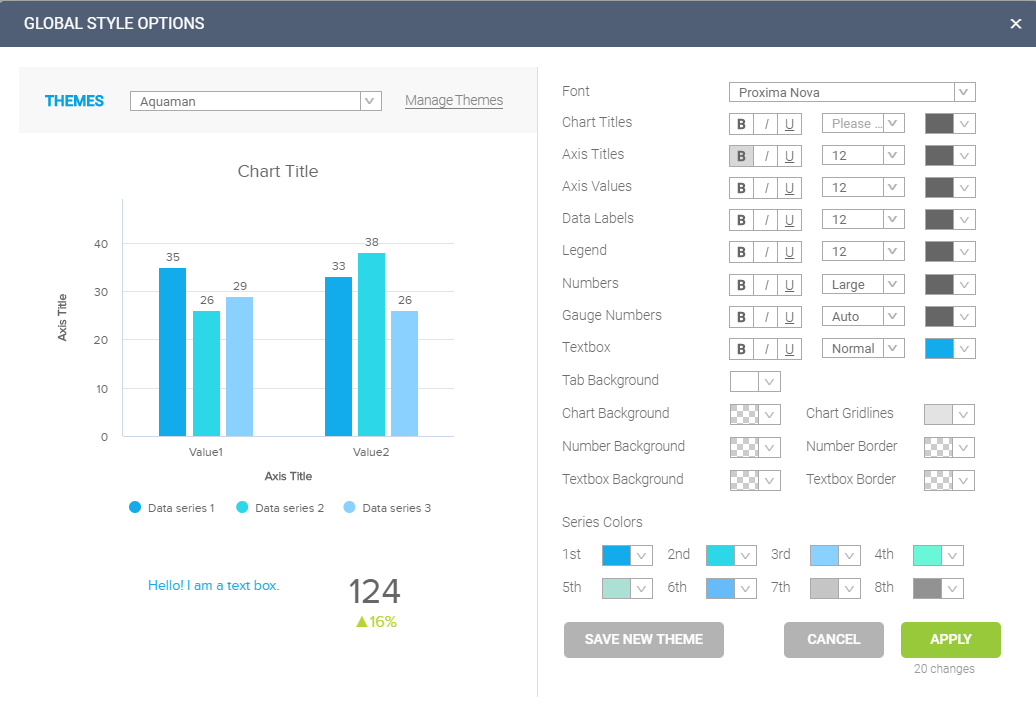
- Global style options help to adjust the dashboard design with a few clicks -
Global style options allow you to change the fonts, colors, and background colors, etc. of all dashboard elements including charts, texts, and others. This is especially useful when you want to present a more professional dashboard that is tailored to your business or a client’s brand identity. You can also apply unified style settings to the data labels, text elements, and legends of your charts and graphs. This allows you to adjust your dashboard design quickly for all charts. With global style dashboard options, you can easily stick to a unified corporate brand, image, and story. In the same vein as global style options, predefined dashboard themes allow you to change the look and feel of your dashboards with no effort. You can define your own themes or choose between a few default themes. This is particularly helpful when you are implementing your data analytics and still fine-tuning your branding and story.
2. Numerous chart types
When building a data visualization, you should always think through about utilizing the appropriate chart type. This can be done by carefully thinking about the purpose that this visualization is meant to serve. Is your chart going to be based on the relationship of your data, composition, distribution, or comparison? A well-developed software provides over 25+ data visualization types that allow you to visualize your data in the most meaningful way. This is an important feature as the types of graphs you choose will determine the quality of the end product – your dashboard.
While it might not sound like a big deal, choosing the wrong chart type can significantly damage your analysis as the data in them can be perceived in a different way. For example, it might sound great to visualize the percentage of sales by country using a pie chart, however, if you are trying to show sales in 15+ countries then a pie chart would look overcrowded and the information would not be delivered clearly. Case in point, when building your visualizations, you should look further than the standard charting options like column, bar, or line charts, and take advantage of more advanced ones such as gauges, maps, waterfall, bubble, or progress charts. Although these last ones sound like more complicated visualizations, they prove to be quite useful to track everyday business operations.
According to a project developed by Google News Lab and adioma, the most searched types of data visualization on the Internet are the bar chart, followed by a Gantt chart, histogram, and pie chart. While that doesn’t mean they’re the best choice for your visualization efforts, it certainly heightens their popularity. Remember to keep in mind that there is no one universal chart you should use, but you can upgrade each chart by utilizing an advanced feature such as custom chart tooltips that enable you to adjust the shown information when you hover with your mouse over a part of the chart, providing you with a small snippet. Let’s look at some of these advanced charting options of a modern dashboard program more in detail in the next point.
3. Advanced chart options
A well-developed dashboarding software will contain advanced charting options such as adding a secondary axis, the combination of multiple chart types into one or different trend indicators, for example for a number chart. Since number charts are built quite often, a trend indicator can be individually or globally applied to the dashboard to change the trend colors – ultimately, it indicates visually if the trends are positive or negative. There are a number of trend lines available that can be applied to most charts. Among some of the most common ones, we can find the exponential trend line which is used to show when values rise or fall at increasingly high levels, the linear trend which indicates steady growth or decrease in the data, or the logarithmic one which is mostly used when the rate of change between one unit of data increases or decreases quickly and then levels out.
Another dashboard function, conditional formatting, lets you highlight variances to point out unexpected values, and discover hidden trends and patterns. You can apply rules based on values, fixed or relative limits, and custom criteria – the choice is yours. Moreover, you can specify different color scales to display your formatting, and the chart will change colors based on your applied rules. Most of these advanced charting features are possible thanks to an intuitive drag-and-drop interface that state-of-the-art dashboard tools offer, which allows users to build advanced visualizations without the need for any coding knowledge or technical skills. All you need to do is drag the desired fields into the y and x-axis, define any other conditions such as dimensions or filters, and your charts will be built within seconds as seen in the image below. These kinds of functionalities open the analytical doors to non-technical users, giving them the power to integrate dashboarding practices into their daily operations without the need for deep training or manual work. Something that was not possible a couple of years ago, when the IT department was in charge of all data-related tasks.
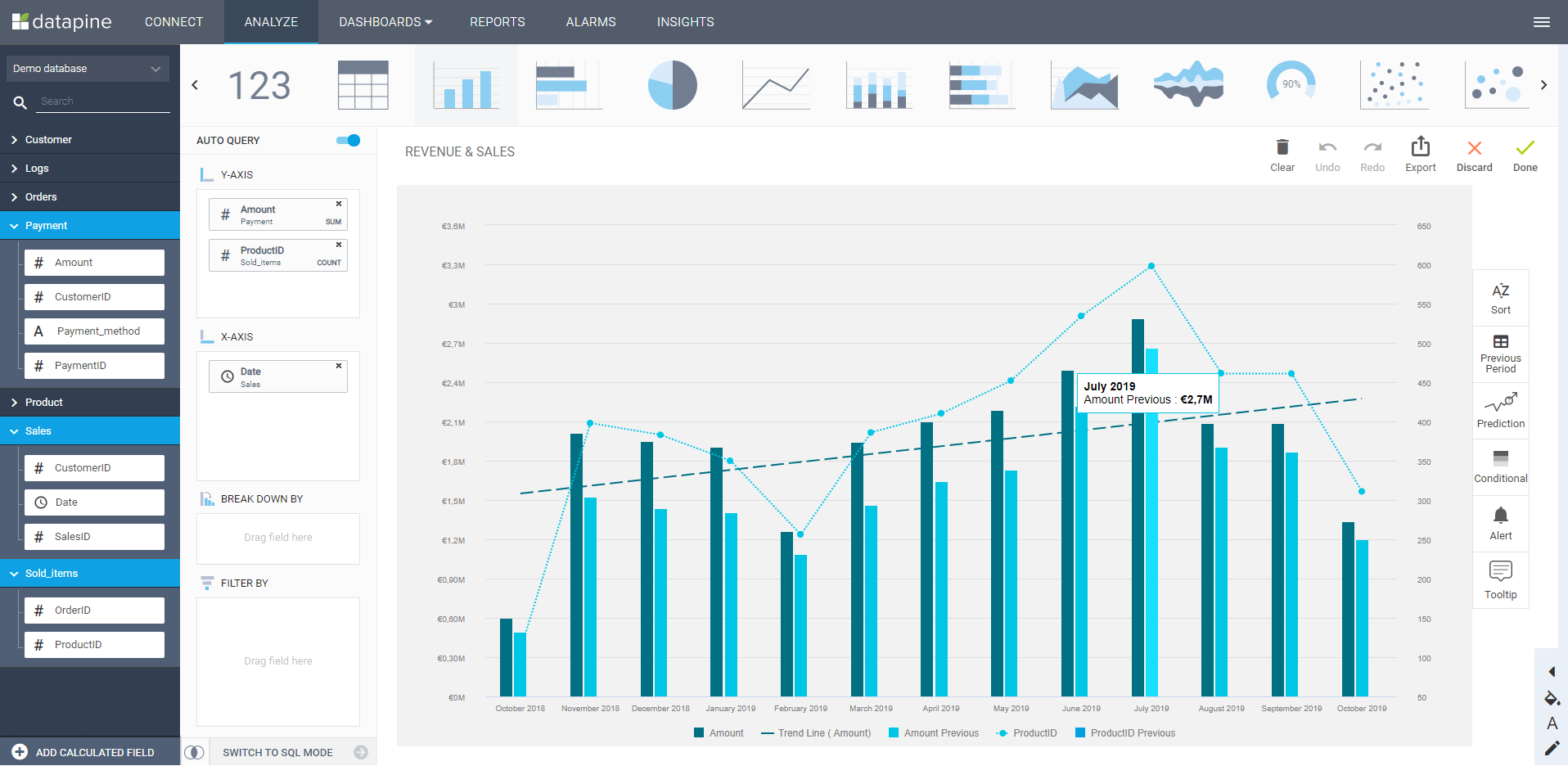
- An intuitive drag & drop interface with advanced chart options -
One additional advanced dashboard functionality is the comparison period feature that helps you to compare your data serie(s) to the previous period (the last period or the same period last year). This option is extremely valuable, as many simple software solutions don’t have it, but particularly important if you want to have proper comparisons of your data within one chart. Businesses can use this functionality to compare sales from different periods and extract valuable conclusions. For instance, about potential product demand.
4. Text, image, and icon features
A basic requirement for creating professional dashboards is the possibility to add text, images, and icons. These dashboard options simply enable you to add your own textual content and external images to help the audience understand the data better. It can be anything from explaining an acronym or the meaning of a KPI or just providing some context to better understand the data in the dashboard. Plus, it is also extremely useful that the tool provides its own icon library where you can simply search and select out from thousands of icons, and make basic edits such as changing colors.
- Built-in icon/widget libraries save time within the dashboard creation -
Additionally, dynamic text boxes/images often supplement your data visualization story and reduce the risk of overlooking valuable information when you need to know whether your business trends are performing well or need additional adjustments. If you have an implemented value or criteria that are under your specified benchmark, a clear exclamation mark will show you that this KPI is underperforming and needs attention. On the other hand, a checkmark will provide a clear signal that the KPI is performing well and the viewer will have an obvious cue of the overall metric’s functioning. This filter can be implemented on various KPIs within the dashboard and provide additional insights for each and every data needed. It is extremely useful since the dashboard itself will alert you if any differences happen, so manual calculations are no longer necessary.
You will also need a function in your dashboard tool that will enable users to add specific explanations or additional information to text boxes and images: information tooltips. It is triggered once you hover over with a mouse which enables you to see, for example, a definition of a specific KPI or notes about the data you need or present at a meeting. This is useful to include in a dashboard since definitions and specific explanations are available just by hovering, so the user doesn’t necessarily need to remember every little detail s/he wanted to say or explain.
5. Custom Fields
Custom fields are an indispensable feature of professional business dashboard software. On the one hand, they allow users to create individual calculated fields and, on the other, to combine several category fields (dimensions) into a merged field with the help of different join types. This also enables business users to create calculations from several fields from different data sources without having to adapt the underlying data sources. With modern dashboard solutions such as datapine, custom fields can be easily created via drag & drop and a variety of different functions. Here are four selected examples:
IIF: Checks if the condition is true and returns the value "then", otherwise the value "else". This expression is often used to build categories or to monitor targets: e.g. IFF(sales>target, 'target reached', 'target not reached').
DATEDIFF: Returns the difference between two date specifications (start date and end date) in time units (year, month, day, hour, minute, second, etc.): e.g. DATEDIFF([Signup_date], NOW(), 'day')= 15.
NPS: This is quite a useful function for evaluating customer surveys using the Net Promoter Score (NPS). It calculates the difference between the best two ratings (promoters) and the lower seven ratings (detractors) on a scale of 0-10.
CASE: The CASE function evaluates the fields, compares them to a sequence of values, and returns a result. If a corresponding value is encountered, CASE returns the return value, if no match is found, the default return expression is used.
These are just four randomly selected examples. Usually, you can find between 50 to 100 predefined functions available, as well as the usual join types (Cross-, Left-, Right- and Inner Join). You can then use the created fields like any other field in your analyses and data visualizations.
Let’s put this into perspective with an example. Imagine you want to calculate the tax for each country based on your gross revenue. For this, you need to generate a calculated field using the CASE function followed by the country expression, and the specific country you want to visualize, for example, the United States. Once your formula is completed with all the expressions needed, your new custom field will be ready and saved in your custom field’s library. You can easily turn it into a chart within seconds by simply dragging and dropping the needed fields into the y and x-axis.
If you want to see every step of this example using a state-of-the-art dashboard application, take a look at this short YouTube video, illustrating the use case in 2 minutes.
6. Sophisticated global dashboard filter options
You can easily set up global dashboard filters with many different constraint values, such as text fields with equal to, less than or equal to, between, among others, and many additional variations and possibilities to combine them. While global filters are standard, there are additional important dashboard features to consider: the first enables you to effectively manage and apply dynamic time fields which you can easily edit for every chart on your dashboard. This kind of an interactive calendar will ensure you can flexibly navigate through past figures and also compare your data for specific time frames.
The second important feature is the hierarchical filter, where the selection from one filter influences the selection of another. Besides having a standard global dashboard filter (that filters the whole dashboard for selected variables with a few clicks), hierarchical filters help you to manage related filters effectively. For example, you select a product category and automatically the related product filter selects the relevant products of the concrete category. Simple, and no manual work needed. The third important feature is cross tab connected filters – basically, they’re global filters that get dynamically synchronized and applied in multiple dashboard tabs. For example, you have generated a dashboard with 5 tabs, and by applying this filter on only one tab, it can be automatically applied to other dashboard tabs without the need to create it 5 times.
Another important section to mention is the advanced time filter. On one hand, these filters allow you to instantly filter your charts according to a specific period of time by using quick time buttons that you can directly create on your dashboards. For example, you can filter by last week, month, quarter, or year. On the other hand, you can generate customized time filters for two different dates. Imagine you want to visualize your sales performance on Christmas and Black Friday, you can easily generate a filter to access the data from these dates easily without having to go back and change your entire dashboard. This can be done with any separate periods that your business might need to monitor.
Finally, another feature worth mentioning is the ignore filters option that will enable you to exclude a chart from applied filters on the dashboard, and will not be influenced by them. This option might be useful when you want to show unfiltered chart values, for example when you want to compare the total revenue with the selected markets, or simply check what raw data lies behind all the filters.
7. User Role Management
Another critical feature of a professional dashboard application is the opportunity to assign different user roles and adjust various forms of access and data exploration. There are 4 main pillars you should look for: admin, viewer, power viewer, and user. Each of these roles has different workflow possibilities that make the analysis even easier. And not just that, your dashboards will most likely be full of sensitive data, and having access to user role management features is a measure to keep your data safe, as you can choose who sees the data and how they manipulate it. Let’s look at these roles more in detail:
Admin: As in many other software and tools, the admin is the highest level of administration capability, being the only one that can access all modules and features available in the software. S/he has the ultimate power to add other users, restrict data access or adjust the account in any way that s/he sees fit. e.g., assign filters for dashboard viewers, or add, delete, and edit data sources and dashboards.
Editor: The editor is one level lower than the admin; the difference is that s/he can only access a limited number of modules and features and cannot delete data sources. The editor only has access to shared dashboards which s/he can edit or assign viewers’ access.
Power viewer: This type of a viewer has access to a chart library that the admin assigned and s/he can edit the charts’ appearances, but can’t create a new chart on his/her own. The power viewer cannot manage the data source but can add other viewers, e.g. in bulk, if you have multiple sales managers or departments and bigger teams.
Viewer: This role has restricted access and viewing rights only. In other words, the dashboard is shared but only with limited access, depending on the features (for example filters) that the admin allowed. This role is useful when the admin doesn’t want to share the complete analysis process, but only the selected features on the dashboard itself. For example, a sales VP wants to share relevant data with regional managers, and s/he doesn’t need access to complete sales information.
As you can see, comprehensive reporting and custom dashboard software has the ability to adjust to different roles and access levels that many companies need in order to keep their data clean, and relevant for the end-user. This provides a level of security and functionality that makes working with data a very pleasant experience for all.
8. REAL-TIME UPDATES
Keeping your data relevant is a key requirement in today’s fast-paced world where the information from yesterday may no longer be the right one for today. A complete dashboard solution should offer real-time updates that will keep your business up to date and ready to act on any new developments as soon as they come up. Traditional means of data visualization such as PowerPoint presentations or Excel sheets are no longer useful due to their static nature which makes it impossible to extract fresh business insights. Live dashboards containing real-time data provide companies with a huge competitive advantage by having full control over every aspect of their performance as soon as it happens.
This is all possible due to the fact that modern dashboard software offers easy data integration. Meaning you can connect all your most relevant data sources and visualize them together in your dashboards with just a few clicks. Most dashboarding solutions out there give you the possibility to use their internal high-speed data warehouse which guarantees fast data processing, hence, real-time updates.
That said, getting access to real-time data updates will save you the pains of manually collecting and updating the data on your dashboards, leaving you way more time to perform other important tasks and saving a great amount of costs that you can allocate to other areas or tasks. Something especially valuable considering that, on average, organizations use over 100 data sources to inform their strategies and updating each of these sources manually becomes an impossible task. Additionally, it will create a collaborative and innovative environment in your organization, as your live dashboards can be easily shared and accessed from any device with an internet connection. More on this in the next point!
9. 24/7/365 cross-device accessibility
One of the dashboard capabilities needed in this modern age is the accessibility anywhere, anytime, from any device. Thanks to cloud technology, modern SaaS solutions brought a revolution in flexibility, scalability, and the cost-effectiveness of data storage and access. Anyone in your team can swiftly access the dashboarding tools and web-based dashboards without the need to manually update the information or request support from the IT department – the vendor takes care of each step of your way. This technology has become very valuable in today’s context, especially after the pandemic, where remote work became part of the norm. With the full accessibility provided by these solutions, employees can access their most important KPIs no matter where they are. Rather they need to quickly check something on their phones or open the dashboards outside of the office in a meeting with important stakeholders, the dashboards will be available and the user experience will not be affected as they adapt to the screen size.
You also have the possibility to set-up a refresh interval of 5 minutes or 24 hours, for example, and have your visualizations up to date, accurate, and ready to explore. The cross-device dashboard functionality will enable you to access your dashboard from desktop, tablet, or mobile devices, the only requirement is an Internet connection and your access is instant. You can also request on-premises solutions, but it might make sense to double-check the platform availability – there are on-premises versions that don’t run on Mac, which might be relevant for your specific business case.
10. Mobile Mode
As an extension of the previous point, the mobile mode is becoming an important feature of analytics dashboard software since more and more users demand access from their mobile devices. This additional mode is useful to adjust the dashboard to smartphone devices, and gives you handy features to do so. By quickly accessing the data on-the-go, you have the opportunity to answer business questions promptly, no matter if you’re traveling or on your way to the office. This makes dashboard products even more accessible since you don’t need expensive setups or longer waiting times to access your information. For example, you need to quickly check your sales revenue from last year and compare it with the first 3 months of this year. By accessing your mobile dashboard, you will immediately find your information, without the need to wait for login into your desktop version. Keep in mind that the mobile view is much smaller since you’re limited by the screen sizes, therefore, your dashboard design should focus on the most important information.
11. Interactive dashboard features
We have mentioned some of the interactive dashboard features a dashboard should have such as dynamic text boxes/images and text fields, but there are many more and we cannot stress all of them since the list would considerably expand. You can check out 10 essential interactive dashboard features in the video below.
First, we will focus on drill-throughs. A drill-through shows you additional, more specific, and detailed information about a particular element, variable or KPI, without overcrowding your data dashboard. By simply clicking on the specific KPI, the drill-through will expand on the screen showing you the KPI with detailed information, without overcrowding the dashboard. You can additionally drill your information with the help of a drilldown, a feature that lets you add more levels onto your X-axis, and nest additional variables onto the chart. You can apply this feature on any type of chart, but if you apply it to a table chart, you will have the opportunity to view the aggregated data for specified categories or breakdowns, and change the aggregation type.
A time interval widget is another interactive feature that allows you to enhance individual time scales on different charts on your dashboards with an interactive drill-down function. You choose the time interval of the data displayed on your chart using a date or time field on the X-Axis with a click of your mouse. Use this function to move from a yearly to a monthly, weekly or daily view of your data without changing the time period displayed on your whole dashboard. This is especially helpful if you want to change the time intervals of single charts really fast without affecting other data visualizations within your dashboard analytics software.
We continue with the chart zoom feature that provides multiple layers of knowledge allowing you to see a 30,000-foot view of your data or zoom into the minute. This function lets you drill-down into the smallest unit of time for charts using any date or time field on the X-Axis. Finally, a click-to-filter allows dashboard users to utilize the dimensions of the dashboard’s charts and graphs as temporary filter values. It’s as easy as clicking on any data set in your charts. This action seamlessly creates a quick filter that applies to the data of your dashboard and delivers new insights in an instant.
In general, it is the countless interaction possibilities of modern dashboard application software that give users the flexibility they need to view dashboards from different angles. This is also one of the major advantages over ineffective PowerPoint or Excel solutions that simply don’t give these kinds of possibilities.
12. Dashboard tabs/rotations/animation options
You need a dashboard tabs feature to structure your data. For example, you can have a marketing dashboard with SEO, Google Ads, and social media tabs. This is more efficient than having one dashboard for every marketing channel and easier to digest than cramming all the visuals into one view. That way, your reporting can be done more cohesively.
Let’s move to another example. Imagine you want to display relevant data on several screens throughout your office to keep employees informed and engaged, or you have some investors coming in and need your dashboard displayed on a big screen to use them as a presentation. TV dashboards will help you do just that. By being able to display your dashboards on a big TV screen, you will have enhanced transparency, communication, engagement, and collaboration. A great approach to present this dashboard is by using a full-screen mode in combination with a tab rotation function. By applying this feature, the tabs on your dashboard will alternate on the screen in a specified time interval.
You can also catch the attention of the user by adding chart animations. Choose a company dashboard software that provides diverse types and styles of animation depending on the charts displayed on your dashboard. The animation should be triggered whenever you open a tab or refresh the dashboard. By defining the animation speed and type, you can easily control the way animations will work and affect your data presentation. This will help you keep your audience engaged with the data while making your meetings and discussions more interactive and efficient.
13. AI-based features
Artificial intelligence is used in dashboard programs and BI tools to help automate processes that enable you to generate new actionable insights while significantly cutting on the manual work. One of the prominent features related to artificial intelligence in dashboarding technology is AI assistants built to provide you with the possibility of asking direct questions in the software interface and make your analysis process more efficient. Once you’ve asked your questions, the intelligent assistant will generate an appropriate selection of charts or simply answer your query with the needed data. It does this with the help of natural language processing, an AI-powered technology that can understand human language and generate accurate responses based on it.
Intelligent data alerts are another indispensable AI-based dashboard feature that you should look out for. As mentioned, these alarms use neural networks, pattern recognition, and threshold alerts to notify you as soon as you reach a goal or a business anomaly occurs. You don’t even need to be in the office or on your computer, alerts can be received on the phone and checked on the go. In practice, these intelligent algorithms can prevent serious damages simply done because large volumes of data can’t be processed manually in a short amount of time. They help you to identify trends, spot patterns, and relax since you don’t have to manually analyze or manage your data, dashboards, and ultimately, your business. Take a look at this short YouTube video to see such alerts in action.
Artificial intelligence can help you to develop your business potential and effectively monitor your data, find improvement opportunities, and save precious time and resources while gaining the possibility to self-regulate processes you choose and need. Generally speaking, even AI, machine learning, and similar terms are used as buzzwords in recent years, which might be an ongoing trend in the next years as well.
14. Predictive analytics/forecasting
Predictive analytics is one of the features that is becoming more and more of a standard in business operations and potential development. Professional solutions will contain this feature since it provides a company with the possibility to use advanced mathematical models to predict what will happen next, and ensure the best possible data-driven decision environment. By analyzing a mix of historical and current data, the software can automatically find trends and patterns and calculate what will occur in the future. It simply works by utilizing a forecast engine that will enable you to run predictions based on past data points.
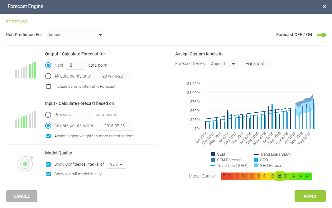
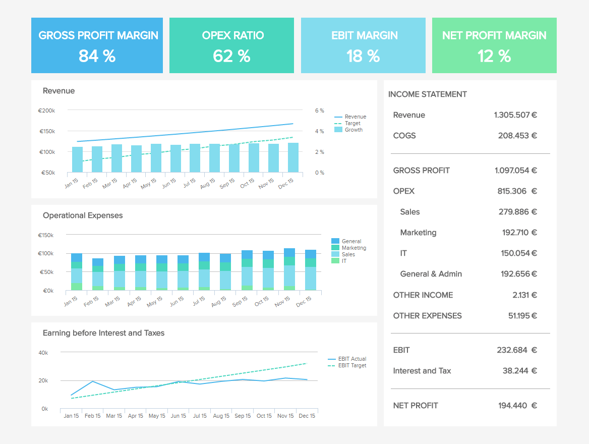
- Easy-to-use predictive analytics tools help to calculate reliable forecasts -
Simply insert your desired points, define the future output, set the model quality (usually 95%), and the tool will automatically calculate the predictions and apply your changes. The visual output will neatly show you what will happen straightforwardly, without the need to perform advanced statistical and mathematical equations manually. Such a true self-service capability and approach eliminates complicated predictive analysis and gives the average business user the power to analyze and visualize the future, and make informed decisions on a level that wasn’t possible until now.
Amongst the valuable features presented in this post, predictive analytics can provide the biggest competitive advantage for an organization. Having accurate forecasts of the future at your fingertips, can not only help in making informed decisions based on potential outcomes but it can also help you spot any potential issues and tackle them before they can affect the business.
15. Duplication and Migration
To fully utilize a business management dashboard software, you will need to take into consideration the possibility to duplicate and migrate your dashboards. This feature will enable you to connect your dashboard to a new, different data source and build a faster analysis process. There are some cases when you don’t want to update the current or older data source as you want to have access to your former analysis and keep the dashboard with previous data. In that case, updating the current data source is simply not an option. To save time, you can connect the new data source and migrate/duplicate the already existing dashboard. That way, you won’t have to rebuild an already existing dashboard but, on the contrary, simply use it with your new analysis.
In essence, by migrating and duplicating a dashboard, you will have the possibility to keep the current analysis, combine it with a new one, and build an even more comprehensive dashboard, without the need to lose any of the current information but, on the contrary, adding more of it. This data dashboard software feature is critical when you don’t want to waste additional time to recreate your visualizations but simply copy them and use them on your new dashboard. Keep in mind that most of this analysis is possible if your new data source has the exact same structure as the old one.
16. Multiple sharing options
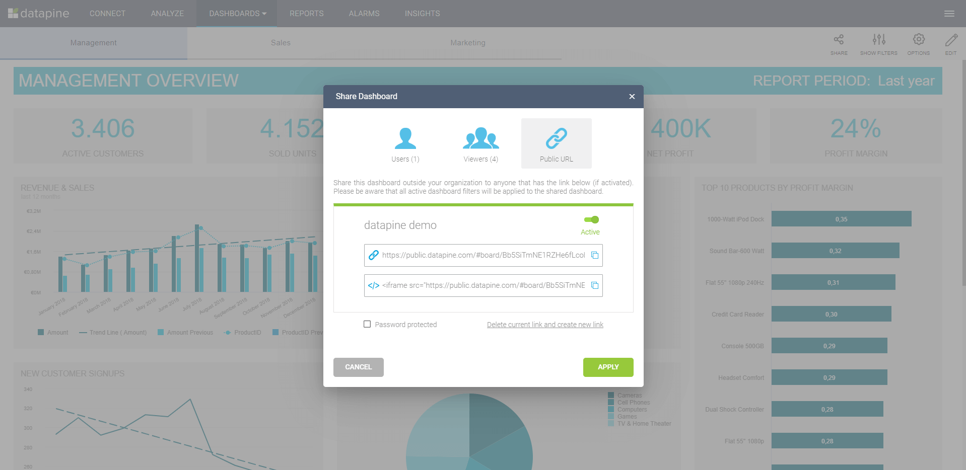
Of course, sharing your dashboard is critical, especially if you need to deliver up to date information quickly and accurately. Standard sharing options include manual exports and email reports that aren’t customizable, but there are additional, and extremely useful options such as customizable email reports per recipient or group. This enables you to set up a customized dashboard to be sent to a specific receiver with selected information and filters, for example, if you want to deliver a report to the regional sales managers only with the data from the past two weeks. A modern reporting dashboard software will enable you to easily select your recipients and deliver automated reports based on specified filters values in any time frame you require, whether daily, weekly, or monthly. Like this, you don’t need to manually export data for each team or dataset you manage.
Other convenient options include sharing the live dashboard directly via a public URL that can be password-protected for extra safety or using a secure viewer platform where you share the dashboard by enabling viewing rights only. This means you can share your dashboards with the level of interactivity you want your readers or collaborators to receive. Dashboards can be shared with a simple read-only feature that enables them to only see the data on the dashboard with no interaction, or apply specified permissions and filters to give them the autonomy to dig through the data on their own but without making any changes to it. Additionally, you should be able to take your dashboards out of the desktop format and share them via a mobile app, this way you make sure that every stakeholder has access to the data on-the-go from a smartphone or tablet.
But that’s not all; while dashboards are extremely powerful when they are live and interactive, sometimes you have to print them out. A printing bounds feature helps you align your dashboard to an export format. This way you can make sure that your dashboards export into a neat PDF or PNG format without breaking any charts or graphs, making boardroom presentations even easier.
17. EMBEDDING OPTIONS
To get the full analytical experience in familiar environments, the dashboard tool you choose should provide you with a fast and effortless way to embed your dashboards into your own application, intranet or website. Like this, you get all the aforementioned features such as interactivity options, filters, exports, and much more without the costs of developing your own dashboard software. This helps in building a data-driven business culture by giving employees access to relevant data at well-known internal touchpoints while increasing user satisfaction within your existing systems. Embedding your dashboards to external portals helps to keep stakeholders, partners, investors, and clients informed and fosters your vital relationships. Additionally, you can generate new revenue streams by charging your clients for new advanced analytics features.
If you have some safety concerns regarding this process, the embedding feature also offers the possibility to restrict the access to data. This means you can deliver user-specific content on all your embedded dashboards easily. Assign filter values to a user, work with hidden background filters, and get the flexibility to deliver a customized dashboard according to your client’s or employee’s needs.
Embedding technologies are enhanced by a white labeling feature that enables you to customize your company dashboard software according to the logo, color scheme, font, or any other visual identity element from your brand or your client’s. This will make your product look way more professional as well as cohesive. A familiar design will help keep employees or clients engaged with the data and enhance the usability of the dashboards.
18. TRANSLATION OPTIONS
Making your data accessible and your processes more efficient is a key goal of any dashboard tool. Translation options give you the chance to adjust one dashboard to multiple languages instead of generating a different one for each language you require. Collaborative work is getting bigger than ever. Due to the pandemic, more and more businesses have realized that working with companies from all over the world is no longer an impossible task and language is not a barrier thanks to this kind of feature.
Dashboarding software such as datapine offers a translation layer that allows admins to adjust any text-related element on the dashboard such as labels on charts, filters, or textboxes into any language available in the system such as English, German, Spanish, French, Chinese, Russian, Italian, Swedish, Slovak, Czech, Croatian, or Danish. Like this, you can avoid tons of manual work on generating a different dashboard for each language needed while also providing an outstanding service to foreign stakeholders.
4) How to select the best dashboard software?
As you learned throughout this post, there is a wide range of features you should look for when deciding which digital dashboard software will fit your business needs the best. Now, while these functionalities are the key to making a tool worth the money and effort, there are other elements to consider before diving into one solution. These elements consider organizational aspects as well as security and usability ones. Let’s dive into 5 best practices that will guide you in choosing the best dashboarding software out there.
Consider specific business needs: Just like with any other business process or investment, the first step is to sit down and define the needs you are trying to cover as well as any requirements or expectations you have from using these solutions. Some smaller businesses might need a solution that offers basic functionalities for a small team, while big corporations might need a wider scope to cover different departments and areas. Organizations that fail to assess their needs before investing in these kinds of solutions risk losing money and time by subscribing to packages that might be too much or too little for what they actually need. For this reason, sitting down with relevant decision makers and building a roadmap is a key way to start.
Assess user interface: After defining key organizational needs, it is also of significant importance to look into the interface of the tool you are thinking of investing in. Again, for this part, it is important to think about the use case this dashboard management software will have. Will it be used just by the IT department or do you expect all employees to integrate dashboarding into their regular tasks? If you want the second option, then the user interface will be of utmost importance. When it comes to analytics, non-technical employees often feel intimidated or scared to dive into the tools and processes related to it. For this reason, the dashboard system you choose should have a user-friendly interface that will make it easier for any user to generate stunning visuals with little effort.
Collaboration features: In today’s context, online collaboration has become a priority for organizations that want to stay competitive. With remote work becoming the norm after the pandemic, considering collaboration features when choosing your dashboarding software can significantly enhance the user experience. Some of the elements that make collaboration possible include being able to access and share the data in an easy and fast way, as well as automating the generation of dashboards to support team discussions and meetings, among others. Going a step further, datapine also offers translation options so that teams from different countries can all understand the information contained in the dashboards even if they don’t speak the same language.
Flexibility: We live in a fast-paced world that requires businesses to be able to quickly adapt to changing market conditions. In that sense, the tool you decide to invest in should offer a level of flexibility that enables you to stay on top of any challenges and opportunities as soon as they occur. For instance, a good dashboard tool should offer the possibility to be integrated with other solutions for a unified analytical process. Paired with that, being able to access your data from multiple devices no matter the location is another function that gives you control over your data whenever you might need it. Something that is not possible with traditional desktop tools.
Data security: Arguably one of the most important aspects to consider before choosing the right tool is security. As more and more businesses make the transition to digital, the risks of cyberattacks become more latent. In recent years, we’ve seen an increase in these kinds of attacks which can significantly damage a company’s reputation as well as its financial health. On that sense, ensuring your sensitive business data will be protected at all times is of significant importance not only for the reasons we just mentioned, but also because security regulations are becoming tighter and businesses that are not compliant can face legal repercussions.
5) Dashboard tools challenges & mistakes to avoid
Once you have chosen the right solution following the best practices we just mentioned above, you are almost set to start ripping the benefits of modern dashboarding. To help you make the most out of the process, we have listed some shared challenges or mistakes organizations face when implementing these solutions and how you can be prepared for them. Let’s dive in.
Data quality: Many organizations that are in the early stages of adopting analytics practices and tools make the mistake of just collecting raw data and using it for analysis. Visualizing this bad quality data on your dashboards and using it to inform your strategic decisions can significantly damage your business. In fact, poor quality data costs businesses across industries millions of dollars every year. To avoid this from happening, implement a data quality management system to make sure everything is set to extract healthy insights from your dashboards.
Data literacy: Data literacy is another big challenge that organizations face during the process of implementing analytics and dashboarding into their daily operations. Essentially, this concept refers to the ability of people to read, understand, create, and communicate with data. Considering that all data-related tasks have been delegated to the IT department for decades, assessing the level of literacy of all employees becomes fundamental to being successful. Many organizations fail in their analytical efforts because their workforce is not prepared to introduce these practices into their operations, therefore, assessing it beforehand and providing help to those who might need it is of utmost importance.
Full organizational adoption: On that same note, making sure the entire organization is involved in the process is often a challenge. When implementing a dashboard solution into your business, make sure every team member from every area is involved in the process and generating their own dashboards. This will lead to the implementation of a data-driven culture within the organization in which every relevant player will be working towards the same goals. Making the company much more productive and successful in the long run.
Not following design best practices: Going a bit further from the adoption side of things, a common mistake that many companies of all sizes make when it comes to generating dashboards is not following design best practices. While most solutions in the market are self-service and require little effort to generate stunning data visualizations, there are still some rules to follow to make the most out of these analytical tools. Some of these rules include not using too many colors or not adding too many visuals to one dashboard as this makes the data in it harder to understand. You can take a look at our guide on dashboard design best practices for a full dive into the topic.
Summary & Next Steps You Should Take
By putting data into the hands of all employees you empower each department to take accountability for their numbers and understand how they align with the company’s strategic direction. With the help of professional dashboarding software, you will open up the world of business analytics by granting everybody in your company access to relevant insights and creating a data-driven culture.
That’s why we have created this list and tried to keep the research as objective as possible, considering also features identified by the biggest software review pages such as Capterra, G2Crowd, FinancesOnline, etc. No matter if you need a small business dashboard software or large enterprise solutions as a perfect partner in visual data management and dashboard creation, these features are a must-have if you want to thrive in today’s competitive environment.
At datapine, we have developed intuitive, automated, intelligent, and affordable dashboard software that covers most of these features and you can easily test our software for free. Try datapine for a 14-day trial today, and reap great rewards tomorrow!
Take advantage of modern dashboard software features today!