Healthcare Dashboard examples
A healthcare dashboard is a modern analytics tool to monitor healthcare KPIs in a dynamic and interactive way. A common example is a hospital KPI dashboard, that enables healthcare professionals to access important patient statistics in real-time to increase the overall hospital performance and patient satisfaction.
Today, healthcare professionals gather a lot of data, but it often is scattered between various departments and compiled on separate systems and documents, leaving all this potential untapped. To help you run your facility smoothly, analyzing healthcare metrics on every division and monitoring the attendance, its nature, and the expenses it generates is a must-do. By constantly improving hospital performance, patient satisfaction levels, and generating insights with the help of modern healthcare analytics and professional dashboards, you can get ahead of the competition but, most importantly, provide outstanding patient care. Finally, automated healthcare reports will ensure you never miss an update in your data and increase your operational and strategic performance as a result.
Take a look at the top 5 healthcare dashboard examples created for different healthcare functions:
Hospital KPI Dashboard - Patient Satisfaction Dashboard - Hospital Performance Dashboard - Patient Dashboard - Hospital Network Dashboard
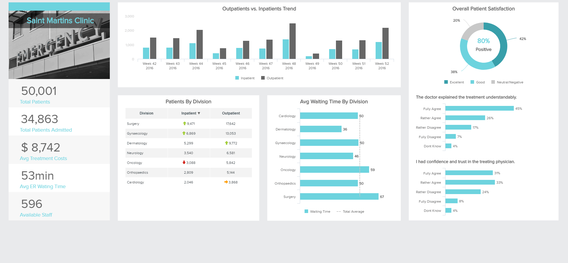
Hospital KPI Dashboard
Open Hospital KPI Dashboard in Fullscreen

A centralized healthcare dashboard can be a great ally in the efficient management of your establishment as it will help you identify where the work is bottle-necking or what kind of trends you can determine over time, adapting that way the assignment of your resources, and generating sustainable development.
This hospital KPI dashboard will give you the big picture you need when running such a complex facility. Giving you the principal metrics on the major category you need, you can track the patients your hospital welcomed over a certain period of time, how much their treatments cost or how long they had to wait in the emergency room before seeing a doctor. This dashboard also breaks down for you the trends of incoming and outcoming patients per division, from surgery to cardiology, and how long it took them to see a specialist of the respective category.
The healthcare dashboard example provided above aims at giving top management a holistic view of analytics data with global insights on how the facility is working, so as to enhance their decision-making process. They can for instance see the total number of patients they admit and how many have been discharged. How much the treatments administered cost on average for each person they took in charge, a global metric important for the finances, and the sustainability of the organization. The aim might be to reduce these costs if they are overwhelming for the general finances of the hospital, but it should maintain at the same time the quality of service delivered: this is why that metric should be evaluated in its context and broken down into different categories (divisions, types of treatments, age of patients, etc.).
The goal is mainly to decrease the average ER (emergency room) wait time, an important metric when it comes to the patient’s experience and satisfaction levels. We can see on this healthcare dashboard the average waiting time broken down by division, which can help spot out which units are facing issues: patients waiting to see a specialist for too long might translate a lack of training for the staff. or an understaffing unit that needs more nurses and doctors. This might also show a lack of equipment that needs to be addressed. You may also measure this indicator according to the hours of the day or days of the week, so as to allocate staff more efficiently, according to the needs.
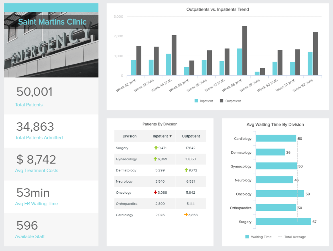
The patient satisfaction dashboard is the showcase of your healthcare facility. It will translate the efforts you put in welcoming and treating your patients, as well as the degree of safety you deliver to them. Unsatisfied patients will neither return in case of a problem nor recommend your facility to friends and family. At the internet age, the viral spread of “bad buzz” can be harmful and hard to contain.
The use of this type of healthcare dashboard can be an asset, especially in communication with your patients. Healthcare is a very specific industry because it is exposed to a lot of human subjectivity and it deals with high stakes, the health, and life of people. Communication and understanding are often cited as an important aspect in the doctor-patient relationship, this is why such a dashboard can benefit your services a lot. Patients like good quality of care, which requires their feedback.
In this healthcare dashboard template, you can also see an example of questions asked in surveys to patients after their stay in the hospital. Is the staff available enough to listen to questions patients might have, do they take the time to answer these questions and explain the procedures that are upcoming? How would you rate your meals? Taking the time to assess their opinions and feelings will not only provide valuable insights on how your facility is perceived, but it will also give them the feeling of being listened to and taken into account, an important aspect of the satisfaction score. All this leads to improved services.
Tracking specific performance indicators with the help of a modern dashboard creator specific metrics on top of patients’ feedback will also help you increase your patient satisfaction score. The average waiting times are easy to measure and, as we have seen for the first hospital dashboard above, they can indicate other flaws in the management of your healthcare facility. These waiting times can measure the amount of time necessary before seeing a specific doctor, before arriving in a bed, or before getting treatment. By evaluating these indicators, you will know the average wait times at the different times of the day and for the different divisions: such insight will enable you to set a target time you would like to reach, to avoid infinite queues and more efficient care.
The lab turnaround time is an important satisfaction metric, and measures the time your laboratory needs to process results. This metric needs to be broken down respectively to each test undertaken, and evaluate how long each one needs - some tests are more difficult to perform and require more time. The purpose should then be to set a time target for each lab result performed and reach it.
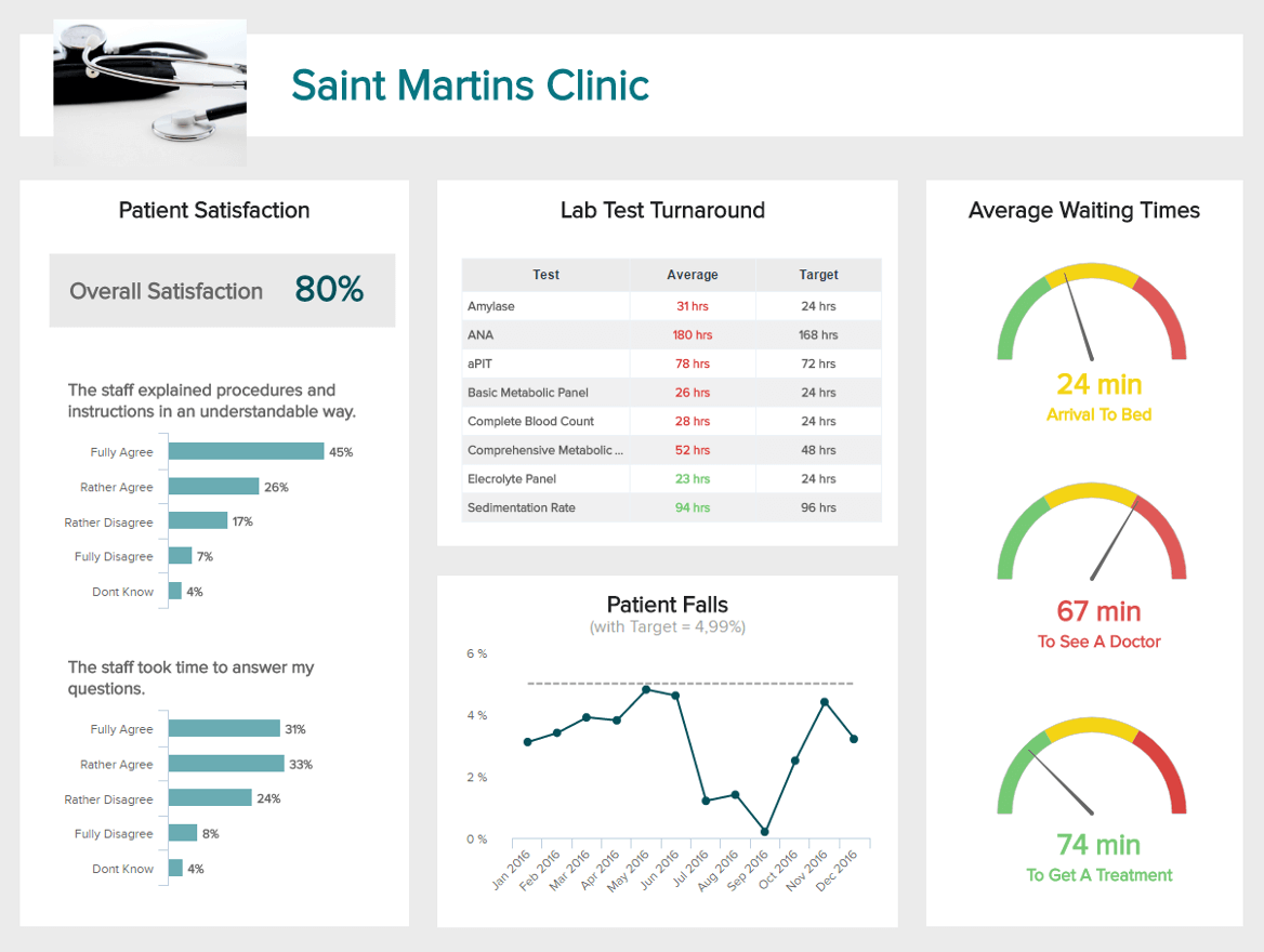
Our next healthcare dashboard example will be the hospital performance dashboard. It uses clear targets and aims to achieve desired outcomes pre-set, putting the information at your fingertips with relevant visualizations of different aspects of your hospital life. Working with such dashboards will help you improve on a clinical level as well as on an operational and financial level. The metrics you will use here must spark action, and answer the question “what response do I take, if it shows underperformance?”.
To help you leverage your information in a complex clinical data environment, efficient hospital dashboards are key. This is why datapine’s online BI software is a great partner in your project, simplifying your data visualization for a better measure of performance. This performance embraces all the aspects we have seen above: patient satisfaction, financial management of treatments, and patients’ attendance.
The first KPI to evaluate is the average length of stay of a patient. This metric will directly impact the costs as well as the workload of your staff. It will also vary greatly according to the kind of stay, as an appendix operation may take longer than a couple of stitches. It is therefore recommended to have further evaluation of this figure in its context, to spot out any emerging problem.
Another crucial metric of this healthcare dashboard template to measure, which can have serious consequences and directly impact your reputation, is the readmission rate. This metric is calculated by dividing the number of readmissions by the total of admissions. Readmission rates are a token of quality of care provided in your facilities, and should remain as low as possible: no one likes to go back to the hospital after discharge. Avoiding readmissions will also help you in cost control and decrease unnecessary expenses. Another KPI related to your patient safety is the HAI (hospital-acquired infections). This is an important metric that if not monitored will not only increase the workload for your staff, increase costs but also harm your reputation as the quality of care delivered by your facility depends on it. Tracking this KPI correctly will help you identify at which part of the care process the incidents happen and adjust your standards accordingly.
The medical dashboard further provides you with information related to the patient and staff management: the nurse-to-patient ratio indicates how many nurses are available per patient. This metric will indicate if your facility is overstaffed or understaffed. Once again, it is interesting to measure it not only globally, but at a unit level: trauma, ER, surgical rooms, rehabilitation, or nursery, and see which ones need to be readjusted. Likely, day or night shifts can be assessed and adapted accordingly.
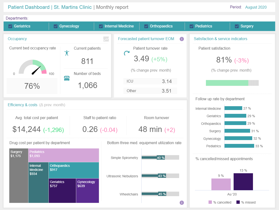
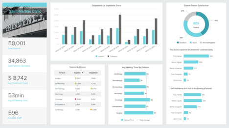
We continue our rundown of patient dashboard examples with relevant patients’ statistics in an aggregated format, visually expressed with neat interactive charts and graphs. This monthly report of a clinic shows data from 6 different departments: geriatrics, gynecology, internal medicine, pediatrics, and surgery. If needed, you can easily switch between departments, and the data on the screen will follow. Additionally, you can add as many departments as needed and directly analyze their information on a single screen.
In this patient dashboard template, we can see that a total of 6 departments occupy 76% of currently available beds which is still acceptable but the manager should keep an eye on this occupancy so that it doesn’t increase to a certain level of concern. The efficiency and costs on the lower part of the dashboard show critical metrics such as the average total cost per patient, staff to patient ration, and room turnover. These numbers, compared to the previous month, ensure you’re keeping control of the costs and resources, or, in other words, having enough available staff and medical equipment available during a month. Drug costs show that surgery has the highest price range, which is understandable, followed by pediatrics and internal medicine. This information will help you decide where to allocate your resources, how many medication orders you need to make for a specific month, how many doctors and nurses need to be at your disposal and, ultimately, plan for the future budgeting process.
The bottom three medical equipment rate shows that the simple spirometry accounts for 40%, ultrasonic nebulizers for 43%, and wheelchairs 45% which can, ultimately, tell you if you need to make further adjustments. This is important as it will provide additional information on the efficiency of the medical utilization that can lead to tens of millions of costs, if not addressed on time. You need to be careful about the untapped economic potential that medical devices can bring and don’t let that expensive equipment sits gathering dust in closets. The satisfaction and service indicators are an essential part of a patient’s health dashboard since it shows clearly what they think about their stay in your facility. In this case, we can see that the satisfaction levels have dropped by 3% in comparison to the last month, and here it makes sense to keep an eye on this figure and investigate further in order to avoid future dissatisfied patients.
Finally, the follow-up rate by the department is depicting the highest percentage from pediatrics, followed by gynecology, and surgery. It means that those three departments had the highest number of patients that needed a follow-up, whether from a significant surgery or other medical procedure and condition that made them require contact with the hospital. Canceled and missed appointments show that almost a quarter of the patients didn’t arrive which can cause significant costs to the facility since doctors, equipment, and planned time is not spent efficiently.
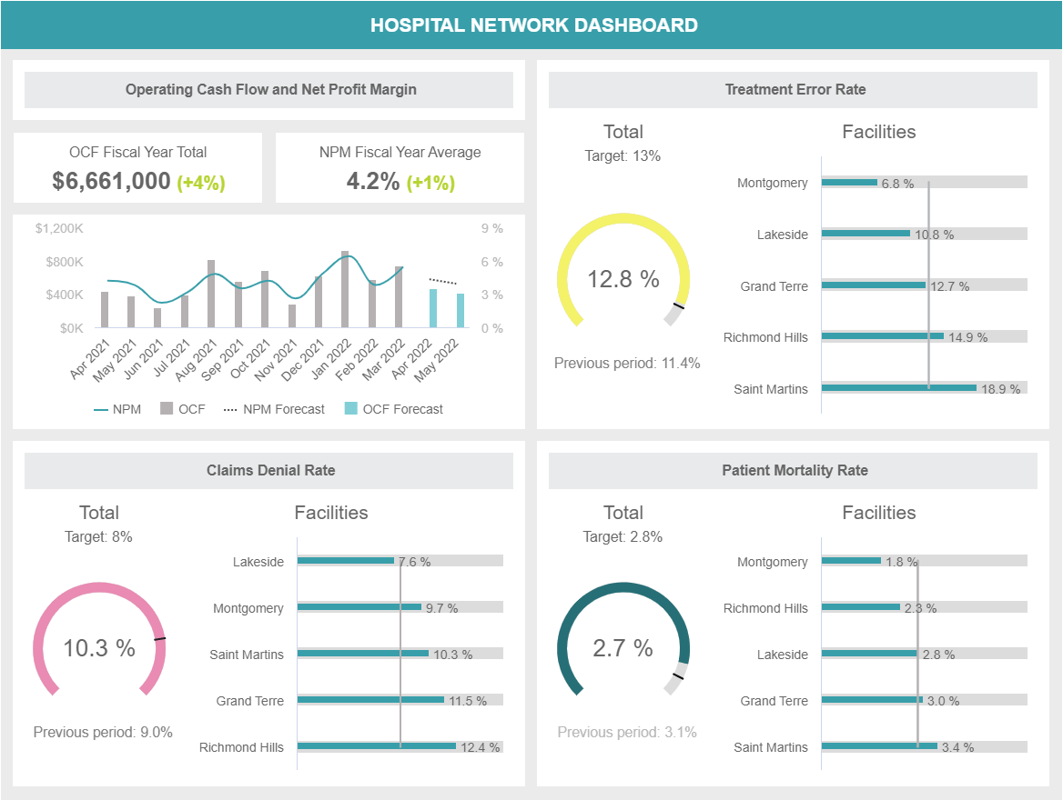
Our final example provides a strategic overview of a private hospital network with insights into multiple facilities. This template has a monthly focus and it allows managers to compare the performance of different clinical facilities from a financial and patient satisfaction perspective. The dashboard can be easily filtered according to the type of medical facility such as long-term care clinics, clinical labs, hospice, just to name a few. In this case, the template is filtered for acute hospitals. Let’s take a deeper look at it.
Starting at the top, the dashboard provides valuable data about the operating cash flow and the net profit margin for the current fiscal year. These two indicators consider the performance of the entire network and are compared to the previous year. Paired to this, we get a chart displaying the development of both financial indicators over the past 12 months where we can monitor how they fluctuated and extract useful conclusions. This information is complemented with a forecast for the next two months. Forecasting your operating cash flow is beneficial as it can tell you if you have enough money to run and grow the business. As seen in the chart, both indicators are forecasted to decrease a bit in the next two months, therefore, something needs to be looked at to avoid any issues.
Moving on to a more organizational side of things, we get a breakdown of the claims denial rate by different facilities. An industry average denial rate is around 5%. However, since COVID-19 hit in 2020, these rates have significantly increased. In fact, according to a survey performed by Harmony Healthcare, 33% of health executives reported an average denial rate of 10% which is considered a “danger zone”. That said, in our example, the network has a target to decrease its denial rates to 8%. To do this, it is necessary to look at the performance of each facility. Where can see that 4 out of 5 have a higher rate than the 8% target, meaning it’s time to look into their processes and implement a strategy to improve.
Paired to the claims denial, the treatment error rate and mortality rate are two other indicators that are fundamental for healthcare organizations. On one side, the treatment error rate tracks the number of mistakes medical staff made during the course of treatment. These errors can include a wrong diagnosis, type of medication prescribed, and dosage amount, among others. The example shows us that this company has met its 13% target. However, it is still 2% higher than the previous month, therefore there is still room for improvement. On the other side, the patient mortality rate tracks the number of people that passed away in the facility before being discharged. Naturally, this rate should be kept as low as possible.
Last but not least, we have patient satisfaction. The claims denial, treatment error, and mortality rates all heavily influence satisfaction levels. Here we can see that Richmond Hills clinic is only at 73% satisfaction, 7% below the target. This is not a surprise, as this facility also has a high treatment error and claims denial rate. It is also the only facility that has a financial deficit in the current fiscal year (open the full version to see). Therefore, it is clear that something is not going well and strategic measures need to be put in place to improve.
With the healthcare dashboards presented here, each point can be easily addressed, monitored, automated with the help of interactive features, and analyzed in real-time so that your facility’s efficiency increases and patients’ satisfaction outperforms your expectations each month. datapine can help you during the process, and offer you a free, 14-day trial. Sign up today and count your benefits tomorrow!
Setup only takes one minute. No credit card required!