Take Advantage Of The Best Interactive & Effective Data Visualization Examples

Table of Contents
1) The Benefits Of Data Visualization
2) Our Top 27 Best Data Visualizations
Data is the new oil? No, data is the new soil." – David McCandless
Humans are visual creatures. A visual is processed 60,000 times faster than any text, and studies show that 65% of the population comprises visual learners. Moreover, 90% of the information transferred to the brain is visual.
Marrying digestible text with striking visuals provides the greatest results regarding the effective presentation of data, making it easy for audiences to understand and retain data. This very notion is the core of visualization.
Recently, data visualization specialists have married information to high aesthetics, taking advantage of humans’ natural affinity for beauty. When choosing the right data visualization type, the most important element to consider is if you’re offering people the opportunity to see insights they haven’t seen or experienced before and wouldn’t otherwise be able to decipher in written text alone.
Creators of effective visuals understand our human predisposition for the visual, taking it a step further by adding interactive functionalities that capture the imagination while presenting critical insights in a way that is as inspiring as it is understandable. By scrolling, clicking, and moving the cursor over interesting data points, designers engage users on a deeper level and enable them to be a participant rather than a viewer alone, adding more meaning to the data discovery learning process as a result.
Studies suggest that those who follow directions with illustrations perform 323% more efficiently than those who follow text-only directions. To demonstrate, here we spotlight 27 of the best data visualization examples from around the globe. Whether static or interactive dashboards, these creative data visualization examples will serve as an inspiration for any data enthusiast. Once we’ve showcased them, we’ll go back with a retrospective glance at the genesis of graphics and explore why it matters today more than ever.
The Benefits Of Data Visualization
Before we delve any deeper into our inspiring interactive data visualization examples, we’re going to look at the primary benefits of using visuals in a business context:
- Quicker action: As mentioned, the human brain processes visual information faster than text-based one, which means that your stakeholders – internally – or your prospects – externally – will be able to digest fresh insights and take swift, positive action on them.
- Finding connections: By displaying data in an inspiring visual format, it will be far easier to spot correlations and find connections between your operations and your overall commercial performance. As a result, you can develop a management report that will enable you to gain the insights you need to make changes that have a positive impact on the business.
- Emerging trends: By curating your data dashboards and presenting them visually, you stand a greater chance of spotting the kind of market trends that you can use to evolve your efforts while boosting profitability and gaining an edge over your competitors.
- Fresh discussions: Among the most beneficial elements of using visuals is the fact that it allows you to tell a story with your insights and, as a result, drill down deeper into specific segments of data. By utilizing your own dashboard storytelling efforts, you will be able to spot fresh insights and spark new discussions based on the growth, development, and direction of your business. Moreover, with the use of inspirational, informational graphics, you’ll engage your target audience on a deeper level, encouraging the kind of online discussions that will boost brand awareness, expand your reach, and help you position yourself as a thought leader in your field.
Enjoy a 14-days free trial and start generating stunning visuals today!
Our Top 27 Best Data Visualizations
Now that we’ve outlined the clear-cut benefits, let's explore our 27 best data visualization examples from experts worldwide.
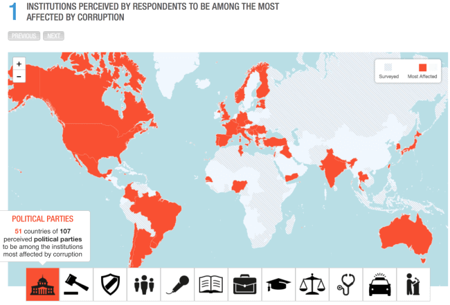
1) Transparency International
**click image for source**
The first of our animated data visualization examples will be this clean, simple interactive diagram that displays the results of Transparency International’s Corruption Survey data. Bold red makes the results pop out immediately. This visual uses icons instead of words to communicate the different sectors included in the survey, making the presentation very visually appealing. Transparency International shows the viewer the relationships between the geographic location of the country and the type of corruption, leaving the audience to draw their conclusions.
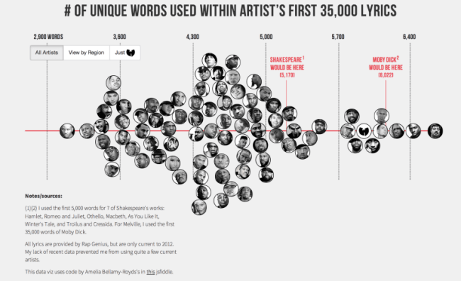
2) Largest Vocabulary in Hip Hop
**click image for source**
Rounding out our list was not an easy task. Instead of going for the super useful, we picked the most interesting: Matt Daniel’s Largest Vocabulary in Hip Hop. Matt explains, “Literary elites love to rep Shakespeare’s vocabulary: across his entire corpus, he uses 28,829 words, suggesting he knew over 100,000 words and arguably had the largest vocabulary ever. I decided to compare this data point against the most famous artists in hip-hop. I used each artist’s first 35,000 lyrics. That way, prolific artists, such as Jay-Z, could be compared to newer artists, such as Drake.” While the result may surprise you, it is a reminder that good online data visualization tools do more than present information – they tell a story.
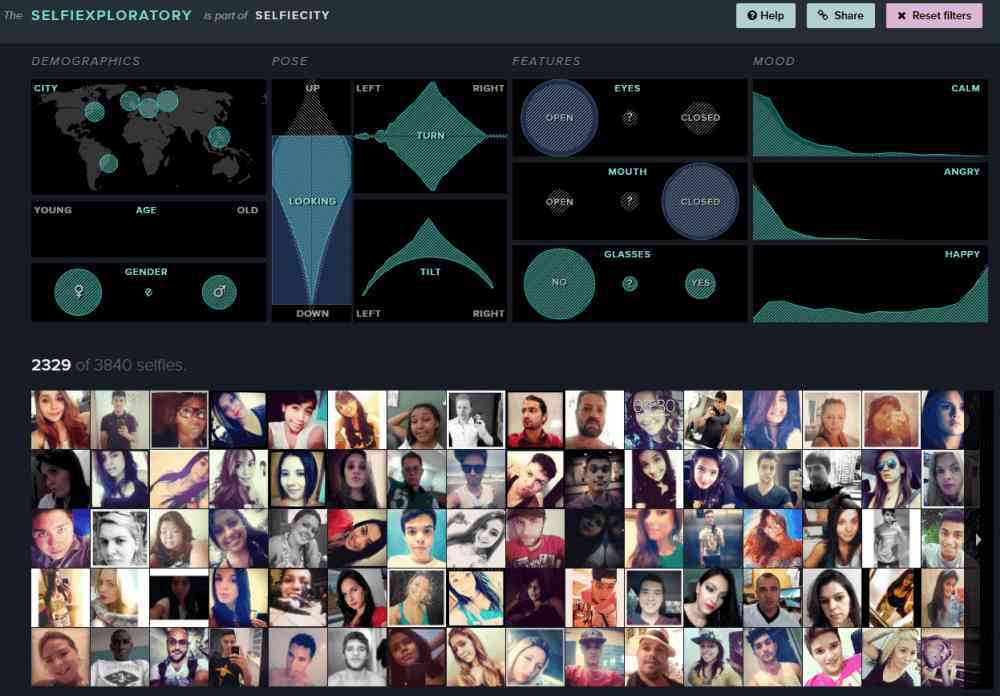
3) Selfiecity – The Science of Selfies
**click image for source**
This project is studying how people take self-portraits in different parts of the planet – over 120,000 selfies from Berlin, New York, Bangkok, Sao Paolo, and Moscow have been analyzed. Are women more likely to take selfies than men? In which proportion? Do people smile, tilt their heads, or crop their pictures? All these questions have been answered, and the results are displayed in very well-made interactive visualization examples. The complexity of the study and the insights found made it a real challenge to expose the results, which they addressed very well, creating cool data visualizations like this one.
4) Pinellas County’s Public School Inequalities For Black Pupils

**click image for source**
Another example pictures the link between the increasing segregation of schools in Pinellas County in Florida and the poor performance of students. The visualization displays the results of an investigation carried out by the Tampa Bay Times based on data gathered by the Florida Department of Education and Pinellas County School District. The results are strikingly accurate and clear. They reveal five out of 150 elementary schools in Pinellas County where students perform exceptionally poorly. The underperforming schools are located in black community areas with the highest levels of social segregation. These insights can move local decision-makers and social activists to take better care of troubled institutions and introduce improvements.
Users scroll, not click, to see charts change and follow the investigation step by step. The scroll action is the new users’ favorite, which is particularly fit for the mobile user. On Facebook, Instagram, or Twitter, we scroll through streams and streams of content. Scrolling engages users for longer and makes it difficult to look away. The view transitions easily from chart to chart, making the story easy to follow and making the data itself central to the view on the screen. The data and results collected are complex and prolific, which made this data viz a real challenge, but they managed it so well and easy to understand that we deem it to be amongst the best interactive data visualizations that we came across.
5) The First Data Visualization to Solve a Deadly Threat

**click image for source**
Cholera is a bacterial infection of the small intestine that causes its victims to suffer from such severe diarrhea and vomiting that they can die in two hours. It’s fatal in half of the untreated cases. When the disease arrived in London in 1832, it was thought to be spread by a “miasma” or bad smell in the atmosphere. There were four major cholera outbreaks in London over the next twenty-two years.
It was during the 4th epidemic that Doctor John Snow began to think that the air contamination argument seemed flimsy. Londoners were drinking water from the disgustingly polluted Thames, which also served as the city’s sewage line. Dr. Snow hypothesized that cholera was spread through the ingestion of polluted water. On August 31st, 1854, “what Dr. Snow later called ‘the most terrible outbreak of cholera which ever occurred in the kingdom’ broke out. It was as violent as it was sudden. During the next three days, 127 people living in or around Broad Street died.”
Dr. Snow set out to track where people died and the nearby water sources. His map not only solved the source of cholera but is amongst the first (and most well-known) visualizations. Dr. Snow simply put a dot on a map to indicate where people died of cholera. He found that almost all deaths had taken place a short distance from the Broad Street water pump. It was discovered that in “houses much nearer another pump, there had only been ten deaths — and of those, five victims had always drunk the water from the Broad Street pump, and three were schoolchildren who had probably drunk from the pump on their way to school.”
Several other anomalies helped prove his theory. There was a pump nearby where only five out of 530 residents came down with cholera – it turned out they had their own well. The seventy employees at a nearby brewery made it through the epidemic unscathed; they were provided free beer and didn’t bother drinking water. The final piece of the puzzle arrived when Dr. Snow was alerted to the death of a woman who had not been in the SoHo area. When the deceased woman’s son informed him that his mother liked the taste of the Broad Street well water so much that she had a servant fetch it daily, he knew his hypothesis was proven. It would take years for the rest of London to believe him.
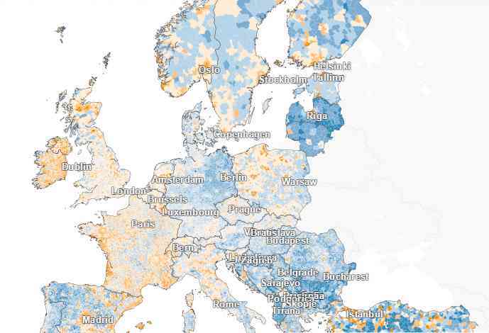
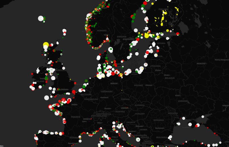
6) Where the Population of Europe is Growing And Declining
**click image for source**
Among the various interactive data visualization examples that we picked, this is interesting when it comes to the huge amount of data it deals with. The Berliner Morgenpost’s EuropaKarte is a detailed map that provides viewers with detailed insights into the population growth and decline in Europe. Countries are divided into fields corresponding to geographical locations like cities or villages with less than 5.000 inhabitants. The fields vary in colors and intensity, with vibrant orange symbolizing the biggest growth and dark blue the biggest decline. White means no change. When you move the cursor over a selected geographical field, you will see a pop-up with data, including the unit's name, the number of inhabitants, and the growth/decline rate.
You can also type the location's name that interests you into the search box and find it easily. Moreover, you can use filters to see which municipalities are growing/declining at the fastest pace in Europe or Germany or view the list of countries with the fastest growing/declining populations in total. The last filter will display the birth rates of every country listed in descending order. This interactive infographic fits squarely into the current trend of geographical map visualizations offered by datapine and other visual analytics software providers.
7) Newsmap
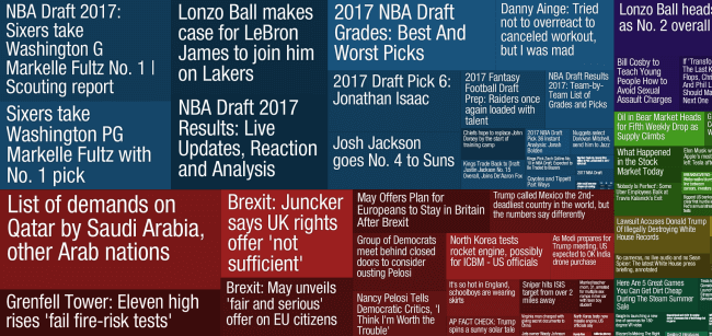
**click image for source**
Are you a news junkie? This application organizes Google News’s top stories into color-coded category blocks. The size of each story depends on the number of related articles that exist inside each news cluster, so users can quickly identify the stories that receive the most coverage. Users can also filter their news by country and category, making it easy to find the stories that are important to them.
8) Interactive Real-Time Map of Berlin Traffic
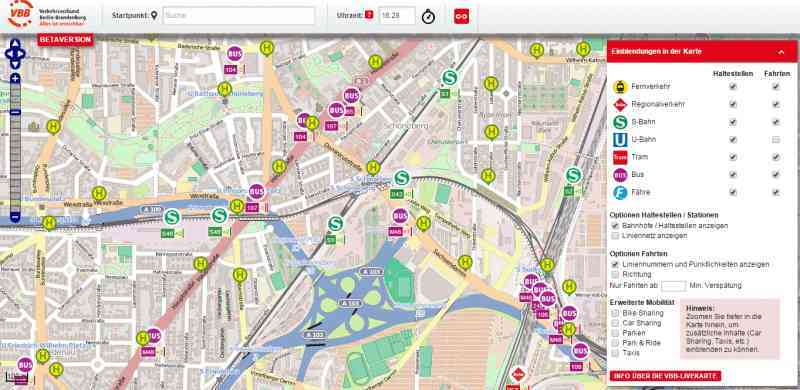
**click image for source**
Another of the good real-time data visualization examples out there shows the location and movement of trains, trams, buses, and even ferries in real time. If you want to look at the whole city from a longer distance, the graphic won’t be useful. You will just see dozens of signs swarming around like angry ants. To fully appreciate this map’s usefulness, you should use one of the filters – you can drill down to a street address, means of communication, lines, stops, or stations to get a clearer picture.
Moreover, if you zoom in, you can also see taxis, car sharing, bike sharing, and parking lots. If you are still not impressed, click on the icons. If you click P on the parking lot, the pop-up will appear with more detailed insights like the number of vacant places or the price. On the other hand, if you click, say, a taxi, you will see the car make, and accordingly, a bus – the whole timetable, same for a bus stop – the timetable of every single bus line that stops there.
According to VBB (Verkehrsverbund Berlin-Brandenburg), the public transport authority covering the federal states of Berlin and Brandenburg, the graphic doesn’t reflect the bus location with 100% precision because the data doesn’t come from GPS but is calculated according to the timetables. So it can happen that a user will wait, freezing at a train station, expecting the train to arrive, but it won’t appear. However, if the train is canceled or it has a serious delay, then it will be taken out of the system. The added value of this kind of timetable is that it can show multiple pieces of information at a glance so that you can decide which transportation will suit you most. The only drawback is that the mobile application is available only for Android systems.
9) The Dawn Wall

**click image for source**
The Dawn Wall is The New York Times’ best interactive data visualization on the astonishing 19-day free climb in Yosemite National Park in California. Tommy Caldwell and Kevin Jorgeson were the first daredevils ever who completed a breathtaking climb up the mostly smooth granite face of El Capitan, widely considered the most difficult free-climb on the planet. A free-climb means that ropes are used only to catch a climber’s fall — not to aid the ascent. Visuals complement the story, weaving organically into the narrative and helping the user to picture the scale of this venture.
10) General Electric
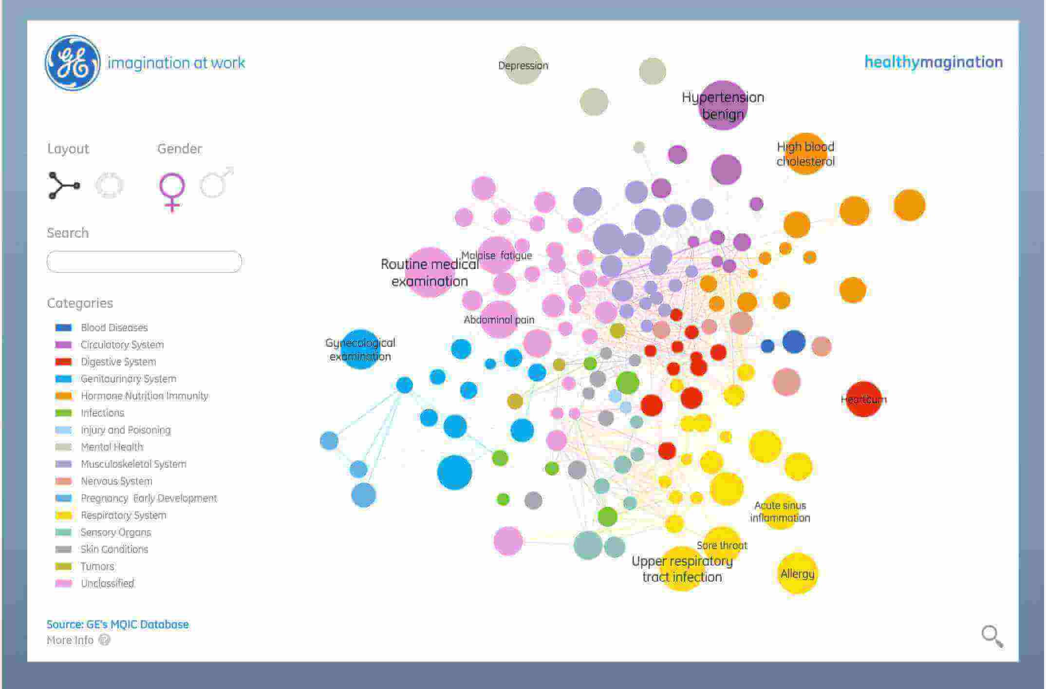
**click image for source**
While at first glance, this health infoscape seems overwhelming, a second look will show that it is worth the bounty of information it presents, making it one of the most effective data visualization examples we’ve seen to date. By gathering data from over 7.2 million electronic medical records, General Electric created an entertaining presentation about the prevalence of health symptoms and the symptoms commonly associated with each other. With pleasing colors and multiple ways to view the relationships, this makes looking at unpleasant symptoms quite enjoyable.
11) The Big Mac Index
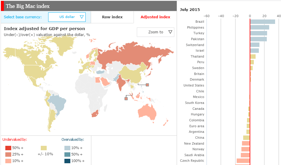
**click image for source**
Big Mac Index, popularized by The Economist, compares the prices of a Big Mac burger in McDonald’s restaurants in different countries. Why this particular product? Big Mac burger represents a standardized product that includes input costs from various areas, such as agricultural commodities (beef, bread, lettuce, cheese), labor (blue and white collar workers), advertising, rent, and real estate costs, transportation, etc., and therefore is representative of the general state of the local economy.
The Big Mac Index is a real-time data visualization example that shows whether currencies are at their “correct” level. It is based on the theory of purchasing-power parity (PPP), the notion that in the long run, exchange rates should move towards the rate that would equalize the prices of an identical basket of goods and services (in this case, a burger) in any two countries. For example, the average price of a Big Mac in the Euro area in July 2015 was $4.05 at the market exchange rate, while in the United States it was $4.79. It means that Big Mac in Europe was undervalued by 4.4%.
The Scatter chart at the bottom displays the local price of a Big Mac (expressed in the current base currency) against the GDP per person in that country. When you move the cursor over individual data points for details, you will see insights like GDP per person and Big Mac price in a chosen currency. When you click on the particular country, the scatter chart will be replaced by a line chart displaying the selected country’s under- or over-valuation against the current base currency over time.
12) Daily Rituals Showcases the Daily Routines of Iconic Famous People

**click image for source**
It turns out that all great minds don't quite think alike, and this is masterfully showcased in this example that uses key insights from the book "Daily Rituals" by Mason Currey. Offering audiences a detailed reflection of the daily habits, rituals, pursuits, and priorities of some of history's most prolific creative minds, including the likes of Benjamin Franklin, Maya Angelou, and Franz Kafka, Daily Routines is one of the most entertaining data visualization examples on our list.
By using a simple color-coded bar chart format, Daily Routines’ creator makes it easy for viewers to compare the daily lives, habits, and rituals of these iconic creative geniuses and drill down into the very pursuits that help these individuals thrive during their lifetimes while comparing one to another.
Simple, striking, effective, and informational, this is certainly among the prime data visual examples in existence, and its message is as engaging as it is informational, offering key insights into optimizing our daily routines for enhanced success.
Enjoy a 14-days free trial and start generating stunning visuals today!
13) A Visualization of Thanksgiving Flights on Google Trends
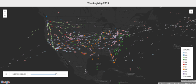
**click image for source**
Thanksgiving is, without a doubt, one of the most widely observed annual holidays in the US, with 54.3 million people traveling across the country to spend time with their loved ones last year alone.
Back in 2015, when around 46.3 million people traveled far and wide for Thanksgiving, tech colossus Google used its internal talent to create one of the best interactive data visualization examples we’ve seen to date. Powered by Google Trends, this aesthetically stunning piece of interactive content offers a glimpse into the flights moving to, from, and across the USA the day before Thanksgiving Day. Not only is each flight color-coded by the airline, but this short movie-style visualization has transformed flight-based metrics into a piece of art that shows the path of each flight in action.
Without displaying any numbers or flight metrics other than the time, viewers can see which segments of the day are the most popular for different types of flights – a testament to the value of effective data visualization.
14) An Insight into ‘Why Buses Bunch’
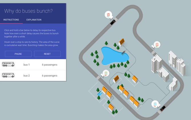
**click image for source**
When considering the best interactive data visualization, it would be impossible to exclude this creation from Setosa. In a bid to show travelers why buses 'bunch,' or in other words – why services experience delays or disruptions that cause several buses to arrive at a bus stop simultaneously, the company developed this almost game-like piece of interactive data visualization comprised of complex data sets.
Upon the realization that telling the story by numbers would be messy and far from engaging, Setosa put the wheels in motion to produce a visual that used the data to give users a chance to cause delays and watch scenarios unfold while gaining an insight into how many passengers are affected by disruptions.
A glorious example of numerical metrics transformed into something accessible, engaging, and informational for everyone.
15) The Internet In Real-Time

**click image for source**
Have you ever taken a second to think about how many people are using the internet simultaneously as you are? The answer is 5.03 billion, spread across 1.14 billion websites globally. These huge numbers are very hard to grasp by just reading them. With that in mind, Betfy created an interactive visualization that gives you a graphical idea of everything that is going on on the internet by the second. Covering different social media platforms and popular websites.
While the visual aims to show an idea of how the internet works in real-time, the data presented in it is not actually happening live. In reality, what you see is a compilation of massive amounts of sources of data that have been broken down by the second to get a grasp of what is going on on the internet daily. Getting a sense of the magnitude of online activity worldwide is easy and accessible with this tool, which can also be adapted to hours, days, or months, depending on what the user wants to see.
16) Interactive Visualization Of The Exponential Spread Of COVID-19

**click image for source**
The COVID-19 pandemic paralyzed the entire world with fear and uncertainty, probably more than any other event we’ve experienced in the past few decades. As a result of the unknown nature of this disease, various organizations created data systems to keep the public informed regarding infections around the world. However, many of these systems were images that were harder to understand and explore. With that premise in mind, Computer Science professor Wade Fagen-Ulmschneider created DIVOC-91, a project that shows the global spread of COVID-19 in a way that is interactive and easy to explore.
Using data from the Johns Hopkins Center for Systems Science and Engineering, this interactive data visualization provides all the information regarding COVID-19 spread. The chart can be filtered by multiple factors, which include country, time, and scale, as well as new cases, vaccinations, total deaths, and more. Among its many interactive features, this visual allows users to hover over any data point to see what is behind it, animate the whole chart to see the information unfold automatically, and generate a report with the selected information. Definitely a great example of how massive amounts of data can be presented in a way that is fun, smart, and attractive.
17) How The US Generates Electricity

**click image for source**
With climate change at the center of public debate, more and more people are becoming curious about how basic resources are produced. One of them being electricity. In that regard, the USA’s electricity system is often called the “world's largest machine,” and our next example explains why in a very interactive map.
The climate change website Carbon Brief published a graphic that shows the different electricity sources in the USA and how each of them is used and produced depending on the state. Paired with this, the map can also be broken down into high-carbon sources such as coal, oil, and gas and low-carbon sources such as wind or solar.
This is one of our interactive data visualization examples that helps to inform the public about the true state of electricity production and the advancements made in terms of more conscious choices. If you want to take a look at the live version of the map as well as an article with insightful findings, click on the image above.
18) A Map Of Lighthouses Around The World
**click image for source**
As you’ve seen throughout this list, there are a bunch of interactive data examples that provide us with all kinds of useful and interesting information. Our next visual is a very cool map showing lighthouses around the globe. Now, you might think, what is so interesting about lighthouses? In fact, the 23,000 lighthouses positioned around the world safeguard maritime traffic with their strong lights, different color combinations, and frequencies.
Geodienst, the spatial expertise center of the University of Groningen in the Netherlands, created this particularly interesting visual. By taking nautical data from an open-source database called OpenSeaMap, these experts created a map replicating the colors and frequencies of the thousands of lighthouses that guide ships daily on their journeys through the open sea. If you go to the live version of the map by clicking on the image above, you can see the different colors and lights changing across territories.
19) An Interactive Map Tracking Ocean Cleanup

**click image for source**
Cleaning the oceans is a task that many individuals, as well as big corporations, have taken very seriously in the past years. One of these initiatives includes the Ocean Cleanup, a project that aims to remove 90% of floating plastic from the oceans by 2040 and become the “largest clean-up in history.”
With thousands of people watching this initiative and bringing more awareness to the topic, the Ocean Cleanup team resorted to interactive data visualization tools to generate a dashboard in the shape of a map that tracks the mission's progress. When accessing the dashboard, users just need to click on the highlighter spots to see the work done on that specific area, pictures of the process, information about the technologies used, as well as the economic impact of it. This is a great way to be informed and participate in this global issue.
20) Where You Fit on the Political Spectrum
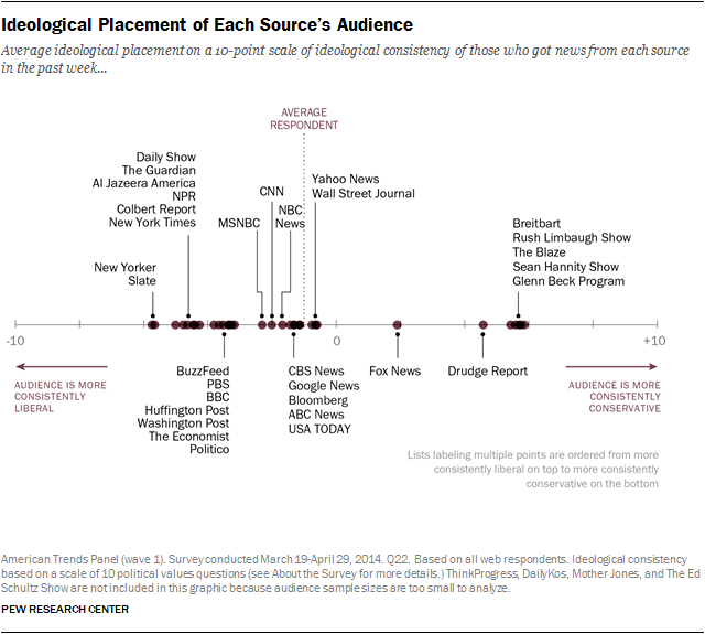
**click image for source**
A noteworthy data visualization example from the Pew Research Center, this brilliantly presented static graphic showcases the current political spectrum and helps the reader to decide where their personal ideologies fit in comparison to the thoughts, opinions, and preferences of different media outlets, programs, and publications.
Not only is the table-style visual neat, professional, and easy to digest, but it also takes a specific set of metrics and offers a great deal of personal value by allowing the user to determine where their beliefs lie compared to others.
21) Data Breaches By Data Sensitivity
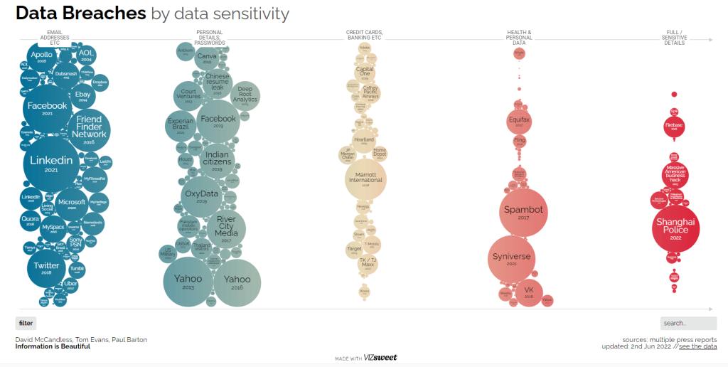
**click image for source**
According to a report by IBM, the global average cost of a data breach in 2023 was 4.45 million USD, a shocking 15% increase over three years. These rising numbers have led businesses and consumers to be more aware and cautious about how and where they share their data as well as how they protect it. From a business perspective, it can bring fatal financial and reputational consequences, and from a consumer perspective, it can lead to sensitive information, such as credit card numbers, addresses, phone numbers, and more, ending up in the hands of cybercriminals and be the victim of an attack. Being aware of the true reality of this issue is of utmost importance to ensure people and companies take the correct steps to protect themselves, which is why we included our next example.
British data journalist, writer, and information designer David McCandless and his team from Information Is Beautiful gathered records about the world’s biggest data breaches, including technology and social media companies like Facebook, Yahoo, and Twitter, hotel businesses such as the Marriot Hotel, and even one from the Shanghai police. The results are displayed in a bubble chart where the size of each bubble represents the magnitude of the breach. Users can hover over each bubble to see a small extract of what the breach entailed, such as if it was a hack or just uncautious behavior by the company or institution. It is an excellent and scary resource to inform people of the dangers of sharing sensitive information online.
22) A Journey Through Every Billboard Top 5 Hit
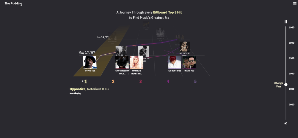
**click image for source**
Our next dynamic data visualization example is more fun and less scary than the previous one. The debate about the greatest musical era in history is a hot topic at many family meals and friend gatherings. Now, we know the answer to this debate is subject to the personal taste of each person. However, data doesn't lie, and the digital publication The Pudding aims to help people determine the answer to this popular debate.
The Pudding is a digital publication that explains the most debated ideas in culture through powerful visual essays that show users “stories they didn’t know they need it”. In this case, they generated the visual “A Journey Through Every Billboard Top 5 Hit To Find Music’s Greatest Era” that allows users to go through the top 5 Billboard Hit songs from the 1960s to the 2010s. What makes this graphic so cool is the fact that users can hear a small extract of each song playing as the years go by. It is an amazing and interactive way to honor music’s greatest hits.
23) A Closer Look Into The Stars
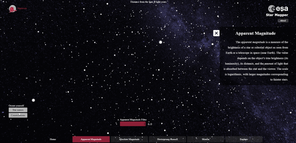
**click image for source**
Have you ever wondered how many stars exist out there? How far is each star from the other? How do constellations look? Well, look no further. The ESA Star Mapper is an animated map that shows 59.921 stars with data gathered from the European Space Agency’s (ESA) Hipparcos catalog. The ESA’s Hipparcos was the first space astrometry mission, which operated from 1898 to 1993. It measured the positions, motions, and distances of over 100.000 stars, and it had a major impact on much of the astronomy research that has been carried out to this date.
The map was generated using two images, one from the northern hemisphere of the Canary Islands and the other from the southern hemisphere in Chile. Users can scroll through the stars with five different filters that are explained during the experience, as well as see constellations and star names. A great way to learn more about the exciting topic of astronomy!
24) Tualatin River Watershed Navigator
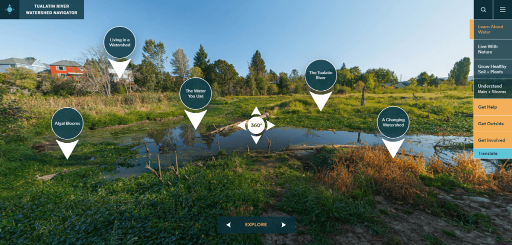
**click image for source**
Understanding the value of water and what it does for our world is of utmost importance, especially for communities that live near rivers or watersheds that significantly enhance their ecosystems. With this premise in mind, the organizations Tualatin Soil, Clean Water Services, and Water Conservation District developed the "Tualatin River Watershed Navigator". An interactive map that helps residents of Washington County learn everything about the Tualatin River Watershed and the big effect it has on the community's natural resources.
When navigating the visual, users can learn about water safety and soil conservation, plants and local wildlife, and answer some common questions, such as where the water they drink comes from or if they can fish in the lake. Paired with that, users can also find other valuable resources, such as homeless relief, local garbage, recycling, and closest farmers markets and parks, among other things. A great animated data visualization example to keep the community informed.
25) Density Designs’ World Languages Graphic

**click image for source**
The next of our best data visualizations, this sensational graphic from Density Design offers a quick, easy, and engaging way to understand the number of languages that exist on the planet, where they're spoken, and who speaks them in different pockets of the world.
Produced for non-linguists, this data visualization example is easy to navigate and simple to break down. It serves up a level of insight that inspires, educates, and acts as an incredibly useful resource for those researching languages in a number of fields and industries. It is an impressive and creative feat of visualization.
26) Charles Joseph Minard, Napoleon's Invasion of Russia

**click image for source**
Next, in our rundown of the best data visualizations, we’re going back a few hundred years to glance at Napoleon's Invasion of Russia. Drafted by civil engineer Charles Joseph Minard in 1892, this is perhaps the earliest recorded data visualization example and still one of the greatest visualizations to date.
Not only does this infographic-style visualization offer vital insights in a digestible format, but this age-old and effective data visualization example proves that we, as humans, are genuinely visual creatures. The pioneering visual is regarded by many as the “greatest statistical graphic ever drawn,” and while such a statement is subjective, it’s nothing short of inspirational.
Combining six data sets – geography, strategic movement, direction, the number of remaining soldiers, temperature, and time – this iconic visualization offers a tangible insight into Napoleon’s push into Russia, immortalizing an important historical moment for future generations to explore.
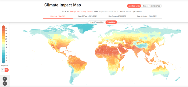
27) Climate Impact Map
**click image for source**
Last but not least, in our list of examples of interactive data visualizations, we have another map that tracks the climate change impact globally. As you saw with some of the other related visuals on this list, climate change is a topic of global concern that is sparking conversations across many industries. Given that information is key when it comes to making a change, a map like this proves to be one of the most valuable interactive data visualization solutions out there.
The visual was created by the Climate Impact Lab on a mission to show the damage that climate change has caused and is expected to keep making in the coming years. The graphic can be filtered by the average temperatures during the year, as well as a historical and future scenario for the world and the US.
Enjoy a 14-days free trial and start generating stunning visuals today!
Data Visualization Today: Why It Matters
As you’ve learned from this insightful list of use cases, good visualizations are valuable in several areas and industries. That said, they are particularly important in business, where large volumes of data must be analyzed swiftly or presented in a clear and actionable format. The rows of numbers alone won’t create a compelling story to catch the audience’s attention. The goal is always to make the data behind your arguments look attractive enough to persuade decision-makers or enlighten your team members. With easy-to-use interactive online data visualization software, more and more companies can create eye-catching animated data visualizations on their own. Interactive interfaces make it possible even for non-technical users to create actionable charts.
The type of visualization you select is guided by the kind of information you are seeking to convey. A fixed image is ideal when alternate views are neither needed nor desired and when publishing to a static medium, such as print. Dynamic or interactive visualizations are better for empowering people to explore the data for themselves. Both have their advantages. When creating one, the purpose should always be to generate a certain level of excitement and engagement with the audience for it to be the best visualization.
Static vs. Animated Data Visualizations
Due to the multitude of use cases we see in our daily lives, it is fairly clear that powerful visuals can change the game when it comes to explaining or introducing a specific topic to an audience. The way you decide to use visuals will solely depend on your audience and goals. Some prefer a more traditional static view of information, while others prefer the power of interactivity. But how can you know which kind is best for you? To help you put the value of these two types of data visualizations into perspective, below we will discuss their main differences, pitfalls, and attributes.
From a user perspective, interactive data visualizations have changed the game. They enhance engagement and data discovery thanks to multiple features that bring information to life and help convey relevant stories. That said, from a technical perspective, interactive visuals are also complex, time-consuming, and more expensive to design and develop. Plus, they can be less portable or reproducible than static ones as they require specific software to be reproduced and an internet connection, in most cases.
On the other hand, static visuals display the data in a fixed format. They help highlight certain trends or conclusions clearly and, most importantly, reliably. They often show a specific conclusion, argument, or trend through a presentation or report. However, compared to more innovative approaches, static visualizations are more restrictive and give users less control over the data. They are also less engaging and, at times, not enough to keep up with the fast-paced world we live in today.
As mentioned, choosing between the two can be hard. You need to consider the size of your data, its complexity, the audience, and overall analysis goals. If you are working with large datasets, then interactivity is probably the best choice. If you are dealing with small or simple datasets, then a static chart might be enough. That being said, we believe that animated data visualizations are changing the world of analytics for the better, and with the help of professional BI software, you should be able to bring your data to life in ways you never thought possible. Some of the biggest benefits include:
Combine Time and Motion to Aid the Audience Understanding
A layer of interactivity enables your audience to connect directly with your data and offers a second axis to track information changing over time. Hans Rosling, a famous data scientist and visualization Ted Talker, is a huge proponent of showing the time as a graphic movement. Check out this video – The Joy of Stats – a perfect example of how combining time with your visualization lets the viewer see trends.
Drilling Down to Extract Meaning From Numbers
A trend we are seeing in all content marketing, not just visualization, is personal attention. Content is no longer a one-size-fits-all solution, from customized white papers to interactive ebooks. Interactive visualization enables you to reach your audience on different levels by allowing you to drill down into the data. Newcomers to the topic can still spot trends and learn the basics, while experts in the field can drill down deeper into the data for more insight.
Engage, Engage, Engage
Content marketing is competitive. There is a lot of noise to push through before you can be heard. The best interactive data visualization is a ticket into the spotlight. Let’s take, for example, USA Today’s interactive story “Behind The Bloodshed.” Mass killings dominate the American media. How can you compete with major prime channels as a newspaper? The USA upped the ante with this piece, particularly the interactive data visualization that enables the viewer to drill down on the mass killing timeline for details. The piece is informative, powerful, and emotional.
Interactive Data Visualizations: Key Takeaways
Our selection of the best dynamic visualization examples above demonstrates creative, innovative leaps that illustrate the changing way we see and interpret data.
Everything is becoming personalized. People want to see how they fit into the big picture and where they stand on the shifting terrain. A real-time visualization example or some of the best interactive visualizations answer that need in two ways: giving the viewers control over what they see and letting them narrow the data down to their personal situation, whether it is age, location, income, or other factors.
This is the beginning of a new phase of data personalization. Instead of abstract headlines and generic pronouncements, readers can project themselves into the dataset. With the right tools, you can prepare the best interactive data visualizations for your business on your own, within a few clicks, and with no advanced IT skills needed.
“Visualization gives you answers to questions you didn’t know you had.” – Ben Shneiderman
To summarize, here are the best data visualization examples:
- Transparency International
- Largest Vocabulary in Hip Hop
- Selfiecity – The Science of Selfies
- Pinellas County’s Public School Inequalities For Black Pupils
- The First Visualization to Solve a Deadly Threat
- Where the Population of Europe is Growing And Declining
- Newsmap
- Interactive Real-Time Map of Berlin Traffic
- The Dawn Wall
- General Electric
- The Big Mac Index
- Daily Rituals Showcases the Daily Routines of Iconic Famous People
- A Visualization of Thanksgiving Flights on Google Trends
- An Insight into ‘Why Buses Bunch’
- The Internet In Real-Time
- Interactive Visualization Of The Exponential Spread Of COVID-19
- How The US Generates Electricity
- A Map Of Lighthouses Around The World
- An Interactive Map Tracking Ocean Cleanup
- Where You Fit on the Political Spectrum
- Data Breaches By Data Sensitivity
- A Journey Through Every Billboard Top 5 Hit
- A Closer Look Into The Stars
- Tualatin River Watershed Navigator
- Density Designs’ World Languages Graphic
- Charles Joseph Minard, Napoleon’s Invasion of Russia
- Climate Impact Map
You can start visualizing your own data by exploring our software for a 14-day trial - completely free!