
Professional KPI Dashboards What is a KPI dashboard and why you need one?
See the best KPI dashboard examples & templates
Table of Content
1) What is a KPI dashboard?
2) What are the benefits of KPI dashboards?
3) 20 real world KPI dashboard examples
4) How to set up a KPI dashboard?
5) Summary & next steps to take
Key performance indicators have always been the most critical part of a company. Without KPIs, a company roams blindly into uncontrollable performance management issues and risks losing its business.
But utilizing KPIs is not the only thing an organization should focus on. Choosing the right KPI and connecting it to others to create a proper data-story is one of the crucial elements that will enable managers and team members to stay on track for reaching and outperforming the company’s goals and objectives.
Imagine having all-important KPIs on a single screen, where everyone can interconnect various findings and react to any given issue in seconds with the help of a professional dashboard software. That’s where the power of modern analytics as well as KPI dashboards lies and provides the most valuable weapon against decreased productivity and increased operational or strategic costs.
But what is the definition of these dashboards, and what kind of benefits do they deliver to an organization?
In this post, we will explain those very notions and provide the best KPI dashboard examples that you can use for your own company or organization.
1) What Is A KPI Dashboard?
A KPI dashboard is a visual tool that provides a centralized view of various data sources for efficient goals tracking and optimization. With the help of metrics and KPIs, businesses can have a birds-eye view of their performance on an operational or strategic level.

Typically, businesses utilize high-level and low-level KPIs that are specifically designed to track, report and visualize wide organizational goals, and daily departmental targets. Therefore, KPIs for tracking a team’s performance will be different than KPIs tracking quarter goals established on a C-level management meeting. That’s why a business KPI dashboard comes in several forms and includes various variables depending on specific business scenarios.
2) What Are The Benefits Of KPI Dashboards?
These dashboards help businesses in providing context, focusing on the bigger picture, and ensuring smooth operational processes.
The most important benefits we summarized below for you:
They provide real-time, interactive data: A key performance indicators dashboard doesn’t contain obsolete data, but each KPI is updated in real-time, without the need to export a file and search for endless information. Live dashboards not only provide instant analytics insights, but the interactivity of the elements will enable you to dig as much as you need, with each KPI investigated with numerous filters and options to get the best possible view of your business.
A modern business KPI dashboard simplifies processes: Traditional forms of monitoring, analyzing and generating insights by using spreadsheets or PowerPoint presentations belong to the past. With intelligent technologies such as data alerts based on artificial intelligence or predictive analytics features such as forecasts or value comparisons, dashboarding can be explored in deep details and predict your business future. The technological advancements such as machine learning and neural networks completely eliminate the usage of static reporting, and empower users to look into past, current, and future data with a single screen view.
Communication between departments evolves and improves: These dashboards ensure that departments don’t have to work in isolated departmental silos, but the integration of functional lines throughout the business will ensure a well-aligned organization, where partnership and sharing are becoming the focus of data management and various digital dashboards become the backbone for making valuable decisions. They can give employees the freedom to make a better judgment, according to strategic KPIs that have been established by C-level management.
All metrics are accessible in one place: As mentioned, these kinds of dashboards provide a single-screen view and enable faster sharing processes. Whether with automated e-mails, viewer area, link sharing, or exporting in a .pdf file, dashboarding will provide you with instant access to data that you can share with your colleagues or other departments. You don’t need to wait for weeks to generate a report, but you can obtain it directly, with all the important KPIs in a single place.
They help you spot inefficiencies: With real-time data as a basis, KPI metrics dashboards allow you to identify inefficiencies in your strategies. By tracking the right KPIs in an interactive way you can spot issues in production, employee performance, customer satisfaction, supplier relationships, or any other, and find appropriate solutions based on factual information. Like this, you will always be one step ahead thanks to the power of data-driven decisions.
Save your business money and time: By being informed on the latest developments in every relevant business area, dashboards allow you to make informed decisions and allocate your resources smartly. Shooting in the dark with your business strategies can lead to a big loss of money and time. With smart solutions like a modern metrics dashboard, you can, for example, understand your customer’s behaviors on a deeper level and offer the best targeted experiences to them. You can also make sure you are taking actions that are working towards your business goals.
They provide a competitive advantage: The last benefit from working with the best dashboards is how they will set you apart from the competition. With markets getting more crowded and competitive every day, the need for a reliable, intuitive, and accessible tool to analyze their data becomes critical. From big enterprises to start-ups, businesses that uncover all the hidden analytics insights in their data and introduce modern dashboards into their decision-making process will stand out from the competition.
Now that you know exactly the definition of these dashboards, and why it’s important to incorporate one (or several), we will take a closer look at the best metrics dashboard examples used by businesses across the world.
3) Explore 20 real world KPI Dashboard Examples
We will focus on industry and functional examples and KPI dashboard templates that can be implemented in your company right away and provide you with a roadmap for obtaining sustainable business growth. Hence, let us start with executive management.
1. Management KPI dashboard
Management needs to have a clear picture of the entire organization and proper visibility of the processes and development (or issues) that arise out of certain business situations. That’s why utilizing modern dashboards will ensure each manager stays focused on what’s most important: the relevant KPIs.
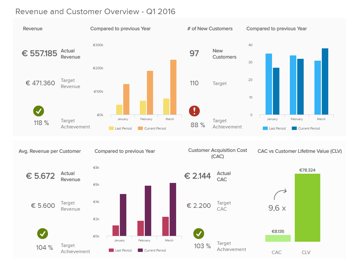
The sample KPI dashboard above provides an all-encompassing view of the most critical strategic KPIs that each CEO needs to keep a close eye on. The revenue is depicted as the actual, target and compared to the previous year. This gives the manager an immediate overview of how the revenue has developed over time and the percentage of the achieved target.
This dashboard performance indicators example focuses also on customers, as they are usually the most critical aspect of any business. The number of customers acquired, the target, and compared to the previous year give an at-a-glance overview of these important numbers. You can see that the exclamation and checkmarks signal if the targets are met or not, therefore, you can look into more details on what happened. Following the total and the customers’ revenue, it goes into more detail on the average revenue per customer, also depicted as the actual, target, and compared to the previous year, followed by the customer acquisition cost (CAC). This way an executive can look into the strategic performance of a company and adjust if any KPI doesn’t meet its target. For more information and detailed analysis of these KPIs, you can see the management dashboard example page.
2. Financial KPI dashboard
Finance is the beating heart of any business, and there is more pressure than ever on managers and employees to keep this beating heart healthy and stable. That’s why a financial dashboard comprising of crucial KPIs such as the working capital, cash conversion cycle or vendor payment error rate will provide insights on the company’s financial state – liquidity, invoicing processes, and budgeting, among others.
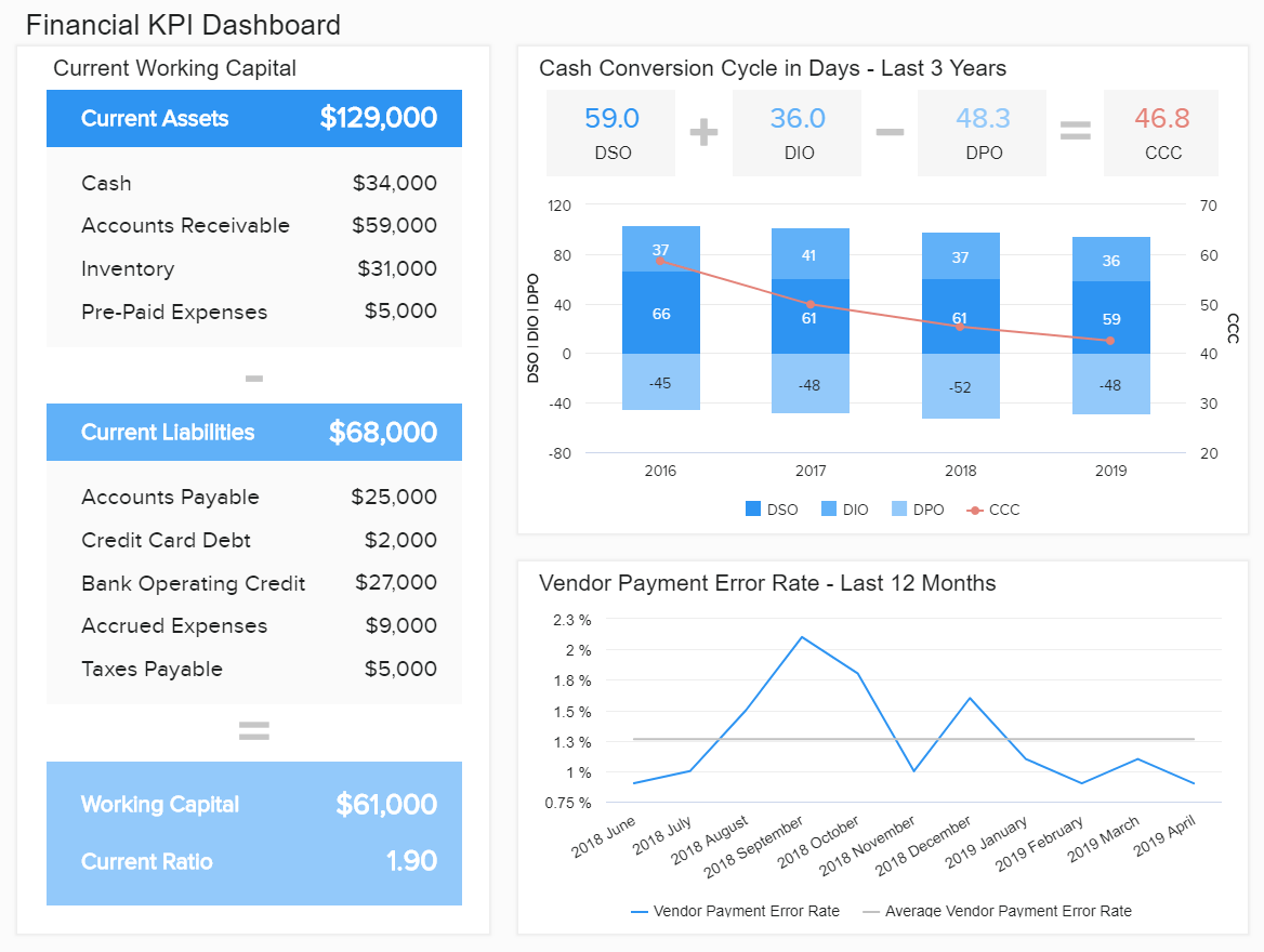
Let’s say you work in a finance department, and you need to make sure the company is liquid, the invoices are paid, and the cash conversion cycle steadily declines over time. With financial KPIs illustrated in the example above, you immediately spot if any of these indicators cause concern or management is on the right path to success. You can even create a comprehensive finance report that will be automatically shared at specified time intervals with all the KPIs you need.
This is one of the KPI dashboard templates that provide you with a data-story, visually depicted on a single screen where you can interact and dig deeper into the data that interests you. Additionally, data is updated automatically so you don’t need to export numerous spreadsheets to generate valuable insights.
3. Salesforce KPI dashboard
This business metrics dashboard puts a spotlight on the effective management of sales processes in a company. With Salesforce being the industry leader in CRM (Customer Relationship Management) platforms, the KPIs depicted in the example below will ensure smooth optimization of sales mechanisms and facilitate better planning.
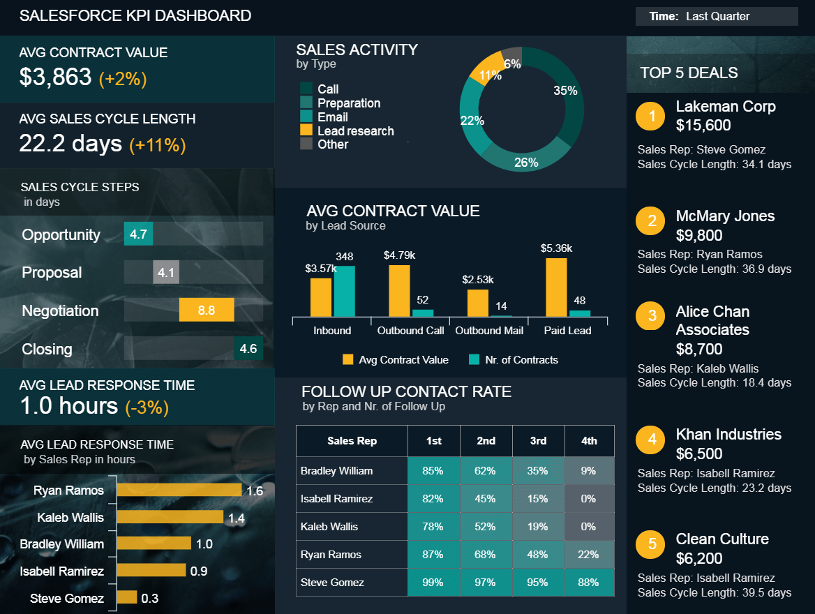
This is one of the most prominent Salesforce dashboard examples of our library as it focuses on central measures for evaluating sales performance. You can precisely evaluate your sales cycle steps, the average lead response time of sales reps, activity by type, contract value, and top deals, among others and generate an extensive sales report. This will enable you to paint a big picture of how your sales department works toward closing deals and, ultimately, generating revenue.
This sales cycle representation serves as a detailed depiction of the entire sales’ performance, and each sales rep and manager should pay close attention to this information. A Salesforce KPI can’t stand alone, and with the possibility to interact with each part of this dashboard, everyone in the sales department can celebrate their strengths and work on weaknesses.
4. Marketing KPI cockpit
The most important marketing KPIs pinpoint the core of any serious business: costs and generating revenue. You can see in the example below how these key indicators give you a single screen overview which you can additionally explore on a more detailed level.
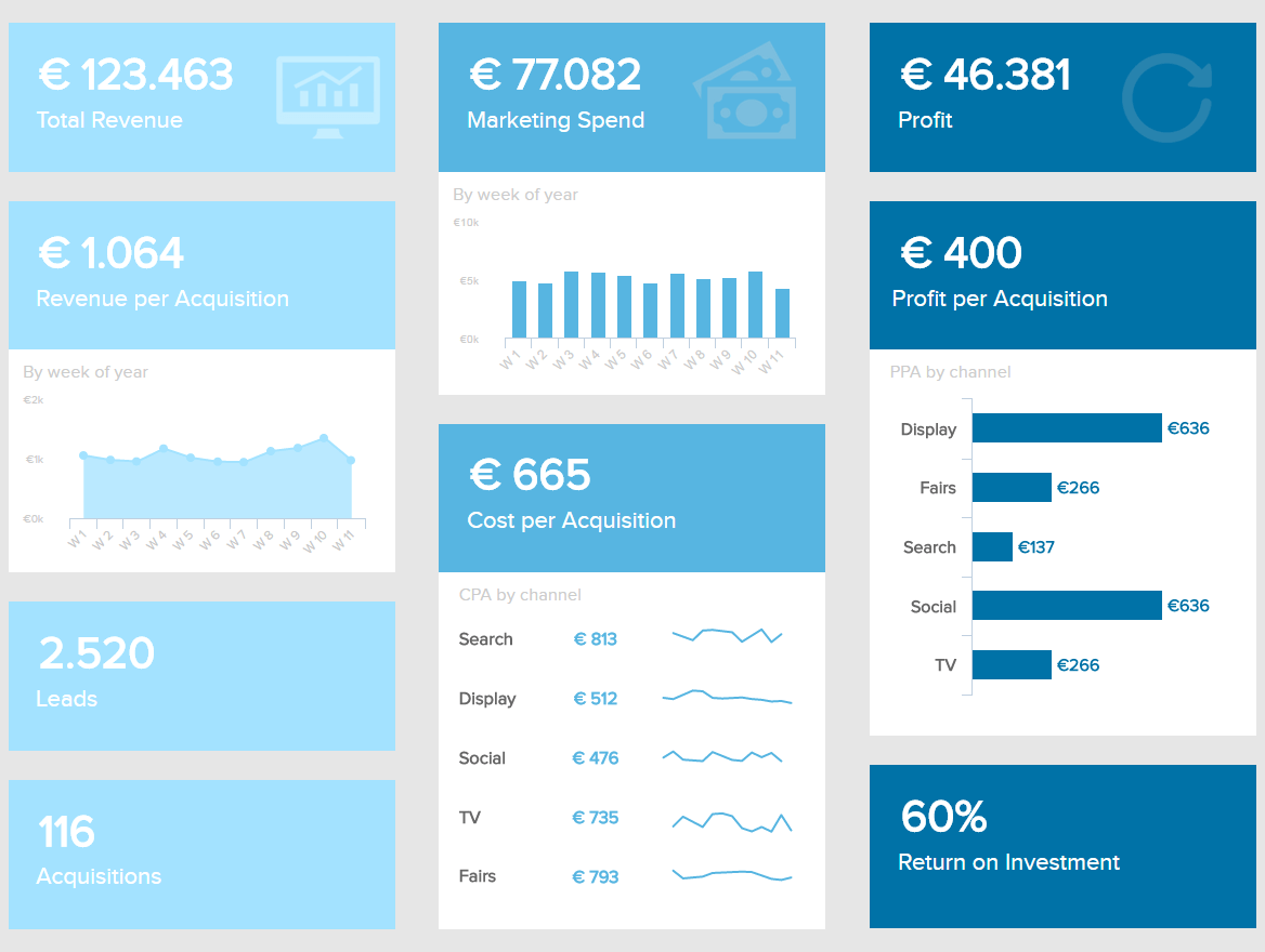
The marketing department usually tracks various performance indicators, but these are specifically selected to give you an outline of revenue and costs related to the promotional activities. You can see the total revenue, per acquisition, the number of leads, how much budget is spent, how much profit is generated, and return on investment, among others. These number-driven KPIs are designed to provide an instant view of the most important parts of a successful marketing influence on a company but also serve as a roadmap to create a thorough marketing report.
A comprehensive marketing dashboard will give you these statistical answers which you can present to your CEO or investors and prove the profitability of conducted marketing activities. If you want to dig to the operational level, then it makes sense to further explore each channel, what exactly they bring to the bottom line, and optimize them accordingly.
5. Customer support dashboard
Customer service is definitely one of the backbones of successful businesses. If you want to build a flourishing company, it all starts with satisfied customers but also with measuring the efficiency of your support processes. In this case, we focus on one of our best KPI dashboards that help managers to evaluate their departmental support performance.
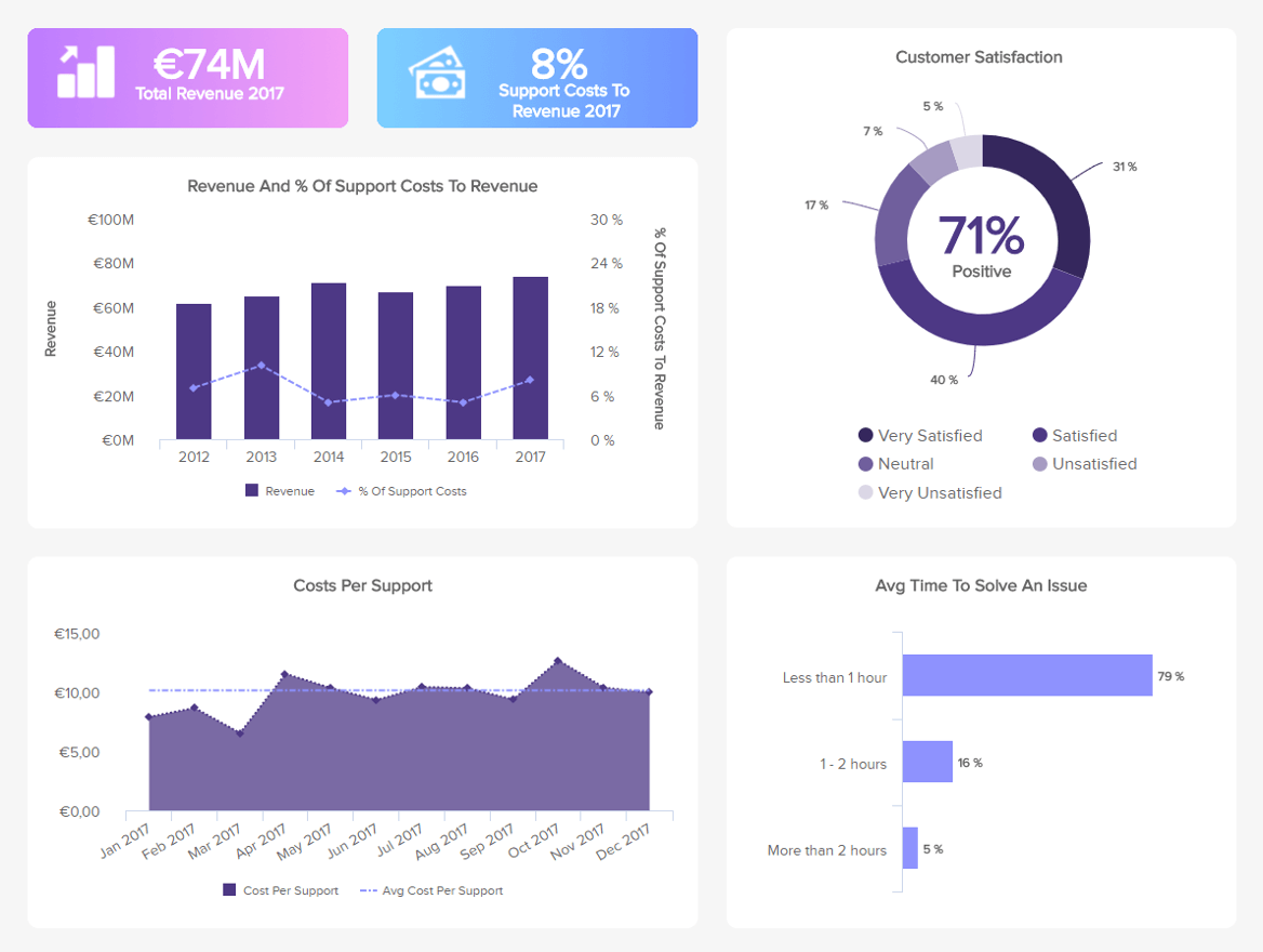
This customer service dashboard expounds on measures such as the revenue and the support costs visualized within a specific time frame. The percentages will enable you to identify how much you invest in the support team in comparison to the revenue you generate. The point is to optimize your costs but ensure a steady increase in customer retention.
Other numbers such as the average time to solve an issue is critical to track since it directly affects the costs – the more time you need to solve an issue, the more it will reflect on your company’s costs. Finally, one of the most important numbers that you can include in your company KPI dashboard, the customer satisfaction, will clearly show what kind of opinion your customers have of you and your service, which will enable you to create a solid customer service report and improve in the future.
6. LinkedIn dashboard
LinkedIn is a network critical for developing business relationships, whether as a person or company. The possibilities to connect with industry professionals, business influencers, build your company profile, and connect with your audience, make LinkedIn one of the best networks to do so.
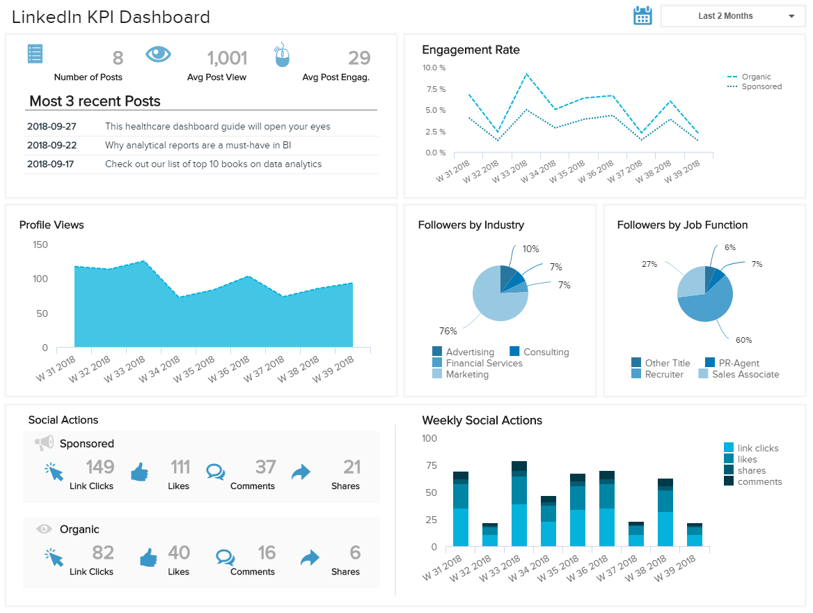
The KPI metrics dashboard depicted above represents a holistic overview of the critical LinkedIn metrics that a company should track in order to effectively manage your social media performance. From a quick overview of the most recent posts, and stats about the average post views and engagements, an organization can immediately spot the results of the recent updates. Additional numbers such as the profile views and social actions are critical for any social media channel, as they will tell you how much interest your company profile attracts in a digital social business environment. Moreover, if you split your actions by sponsored and organic, you can easily compare your content and the results it brings over time (link clicks, likes, comments, or shares).
Finally, let’s not forget about the engagement rate and the followers’ profile. By drilling into this information, you can easily adjust your content based on the people that engage and their industry profile. Of course, you need to consider your target audience so that you don’t publish irrelevant material and potentially damage your LinkedIn efforts. To see more details in action, you can check out our LinkedIn dashboard page and examine it further.
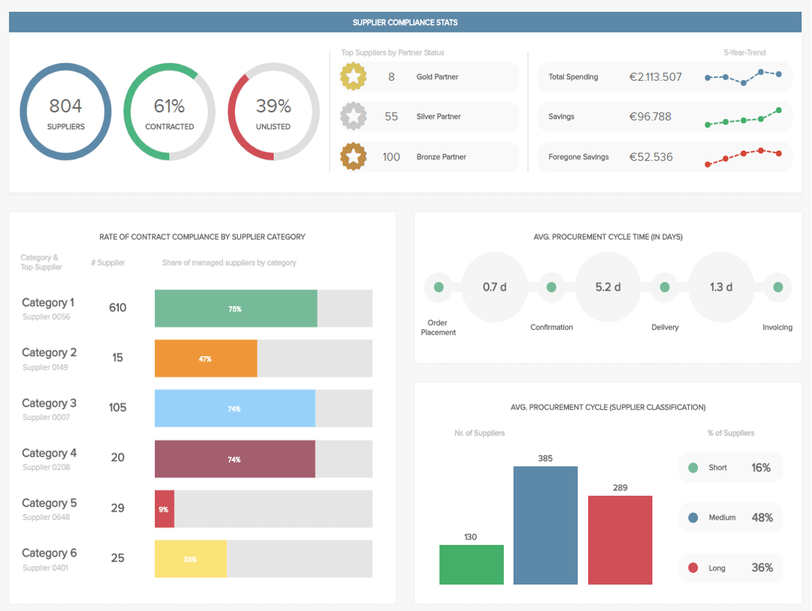
7. Procurement KPI dashboard
The procurement department is found in most companies and represents the link between an organization and its suppliers and/or contractors. It is important to monitor the supplier statistics to be able to set the partnership status and award certain partners (if they work on establishing a good relationship). The procurement dashboard below shows that visually and straightforwardly.
The compliance rate procurement KPI will tell you which of your supplier category performs with the best possible rate, and you can immediately see which company is your top contractor so you don’t have to search for it in a spreadsheet or create a static presentation to show your findings.
This will tell you a lot about the health of your relationships with suppliers and give your top management a safety net in decision-making processes and ensure that you have the best possible information on your top suppliers and the average procurement cycle time which will help you in identifying if any part of the cycle would need more attention.
8. Warehouse KPI cockpit
Warehouse management is one of the most complex parts of the logistics industry and managers need to be extra careful in ensuring impeccable efficiency. Choosing the right KPIs is of utmost importance, and the warehouse cockpit below can provide a thorough roadmap.
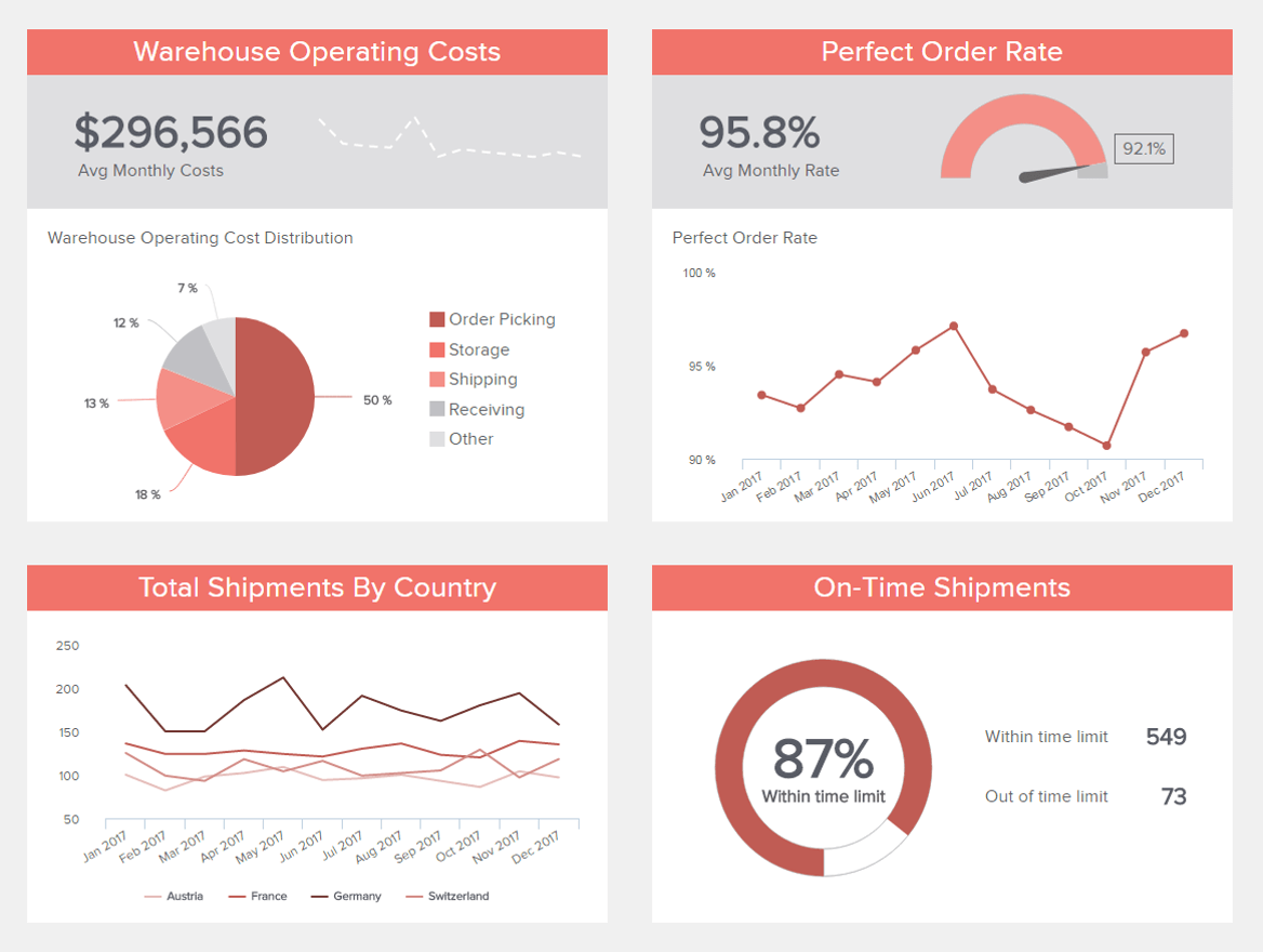
The distribution of operating costs and total shipments by country will tell you information on where your expenses are mostly generated from and how you can prepare yourself better when rush hours in a specific country occur, for example. Another logistics KPI, the perfect order rate, needs to be high as possible so that customers are satisfied and your supply chain efficient.
If you add the on-time shipments KPI, you have a detailed warehouse management story that focuses on better warehouse efficiency and enables managers to reduce costs and increase productivity. By looking at these metrics individually, it would be hard to create a sustainable warehouse operation, but by uniting them in a comprehensive central view, a warehouse manager has better chances to react to any issues promptly and effectively.
9. Talent Management Metrics Dashboard
Talent management has become a critical activity to ensure a business is successful. HR departments not only need to focus on hiring talented employees but also on retaining them. On this note, ensuring a good work environment and growth opportunities is key to success. The metrics dashboard example below helps you achieve that by providing a mix of satisfaction rates, costs, and hiring stats.
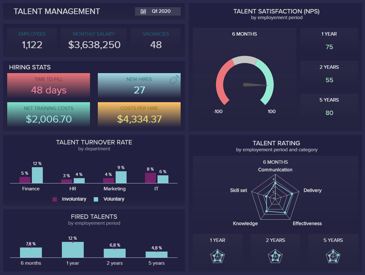
The top section of this visually appealing HR metrics dashboard starts by providing informational key facts about the company’s workforce such as the number of employees, average monthly salary, and vacancies. This is paired with useful hiring stats such as the time to fill, new hires, net training costs, and costs per hire. The talent satisfaction is displayed on the top right corner compared to a period of 1,2, and 5 years, this is useful information as it allows you to understand at a glance if satisfaction levels are improving in time.
The bottom part of this business metrics dashboard provides performance tracking that allow HR managers to test the efficiency of their hiring processes. For example, the talent rating tells you how well your employees developed in categories such as skills set, delivery, effectiveness, and knowledge. Here, we can see that the worst performance over the last five years is in the skills category which means some training instances might be needed.
10. Manufacturing KPI cockpit
The manufacturing industry is heavily dependent on machines and the human ability to optimize their work in order to achieve profit and success. The effectiveness of production processes, maintenance costs, assessing the machines and revenue, are all critical elements of success in the industry. Here we will present a central view in the form of a KPI scorecard, critical for C-level management that needs to focus on strategic initiatives.
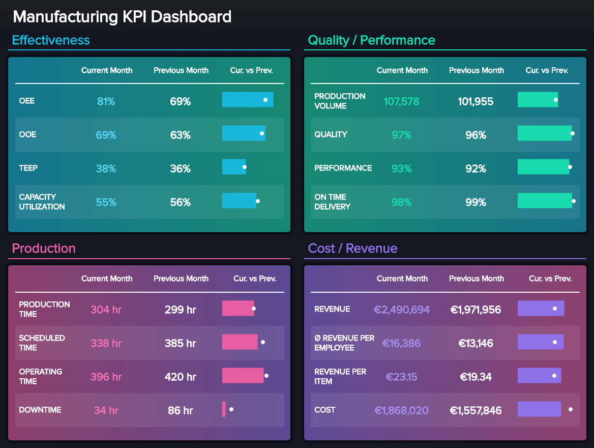
This manufacturing dashboard takes care of the most important KPIs that executive managers in the manufacturing industry should focus on: the effectiveness, quality and performance, production, and, of course, costs and revenue. It will show details about the overall operations and equipment effectiveness, capacity utilization, production time and volume, downtime, and revenue, among other key factors to monitor in order to improve operational performance but keep the manufacturing strategy on track.
These examples of KPI dashboards serve as a focal point for companies that have to manage massive amounts of information at the same time, and need a single point of truth for collecting, managing, monitoring, and reporting on critical business data. Especially in the manufacturing industry, where machines and modern technologies are incorporated on a daily level, helping humans to establish a profitable production process, and ensuring a sustainable growth level.
11. Retail KPI cockpit
Retailers need to have an extensive overview of retail KPIs such as the customer retention, back order rate, the total volume of sales, the number of new and returning customers, as well as the rate of return. For example, you manage an online retail store, and need to consider numerous KPIs that will enable sustainable business growth – high customer satisfaction, and a healthy supply chain. A retail dashboard containing mentioned important KPIs can be a perfect solution.
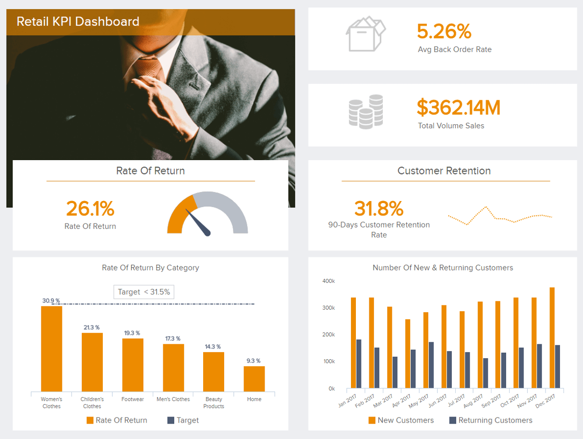
This visual dashboard performance indicators example contains a clear picture of how you manage your online retail store. The KPIs depicted can be interactively explored with interactive dashboard features such as click-to-filter, drill-downs, and chart zoom, among many others. This will enable you to drill into bits and pieces of your processes, identify which categories have the highest rate of return, and take a closer look at your customer retention to be able to increase loyalty and reward customers that continuously return.
As a retailer, you probably work in a highly competitive field and need the best possible retention rate since it will ensure a more cost-effective solution than acquiring new customers.
12. Zendesk KPI dashboard
Customer support is crucial when it comes to providing the best possible customer experience and meeting their requirements in the best viable way. The KPI examples displayed below show us an example of a customer support department that uses Zendesk as its primary tool to optimize its processes.
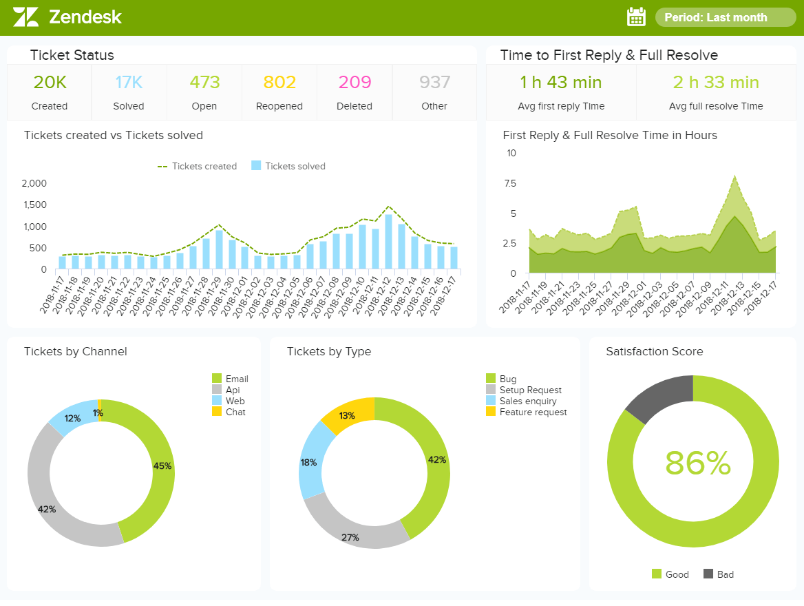
These KPIs are set to yield a long-term, strategic view of the support department and identify trends that will increase the customer satisfaction score. The ticket status, created and solved, time to resolve, and tickets by channel and by type all represent metrics important in a customer support department. It enables the manager to allocate resources more effectively across the team, and look into more detail by filtering a specific KPI on this Zendesk dashboard.
If you see any deficiencies in the customer support procedures such as lower satisfaction score, you can interconnect this KPI with others to identify the exact issues that caused this metric to drop. Of course, this also depends on the industry you work in, so it makes sense to adjust your dashboarding according to your business.
13. Energy Management Metrics Dashboard
Energy plants are one of the business industries that can benefit the most from a KPI metrics dashboard. Dealing with various energy types coming from various sources, the need for a centralized view of the performance of a plant is critical for operational success. This energy dashboard provides an overview of key stats related to consumption, production, costs, and performance.
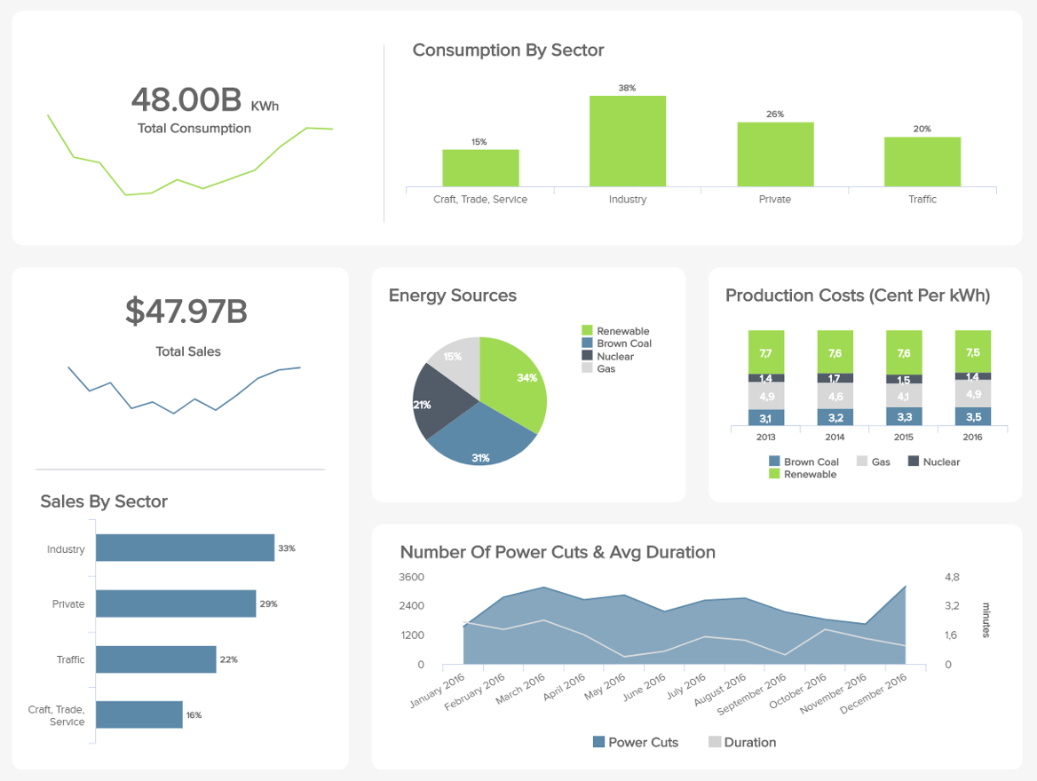
Starting with the total consumption broken down by sector, you can immediately understand at a glance which sector requires the most energy and prepare in advance to cover their needs. You can even go deeper by looking at the total sales broken down by energy source and production costs. Here, we can see that renewable energy is the one bringing the most sales, due to the fact that consumers and big enterprises are turning to alternative energy sources to reduce their carbon footprint. Taking that into account, renewable energy is a great investment opportunity.
Moving one a bit from cost-related indicators. It provides a detailed graph about power cuts and their average duration for a year. This allows you to smartly schedule maintenance work as well as be prepared for any surprise cuts.
14. Product Innovation Dashboard
In this overcrowded and competitive market that we leave in today, businesses that manage to create innovative products and solutions are the ones that will make the cut. Our next example is a market research dashboard focusing on product development, pricing, and innovation.
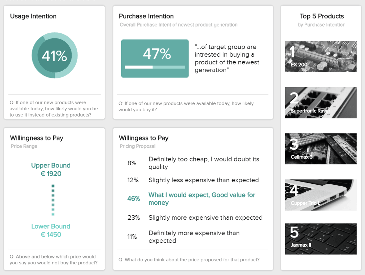
When designing a product for your business you need to think about your target customers and what their needs and preferences are. For that purpose, this metrics dashboard template provides the answers to a survey about customer’s opinions regarding a potential new product. For instance, the usage and purchase intention can tell you if your customers are willing to buy this new product. If this score is bad, it could translate into a lack of added value.
Next, we have valuable information about the willingness to pay. These KPIs are useful as they will guide you in the right direction regarding the pricing of your potential new products. You don’t want them to be too expensive but also not too cheap that quality won’t be trusted. To avoid this issue, the cockpit provides answers about different pricing proposals. 46% of respondents think the price is good value for money, which means you are moving in the right direction.
15. YouTube dashboard
YouTube is by far one of the top social media channels focused on videos and, by being aware of your audience and their profile, you can tailor your video content based on their wants and needs as well as your goals and objectives. To fully take advantage of KPIs and dashboards that you can build for analyzing your audience, let’s take a look at our YouTube dashboard.
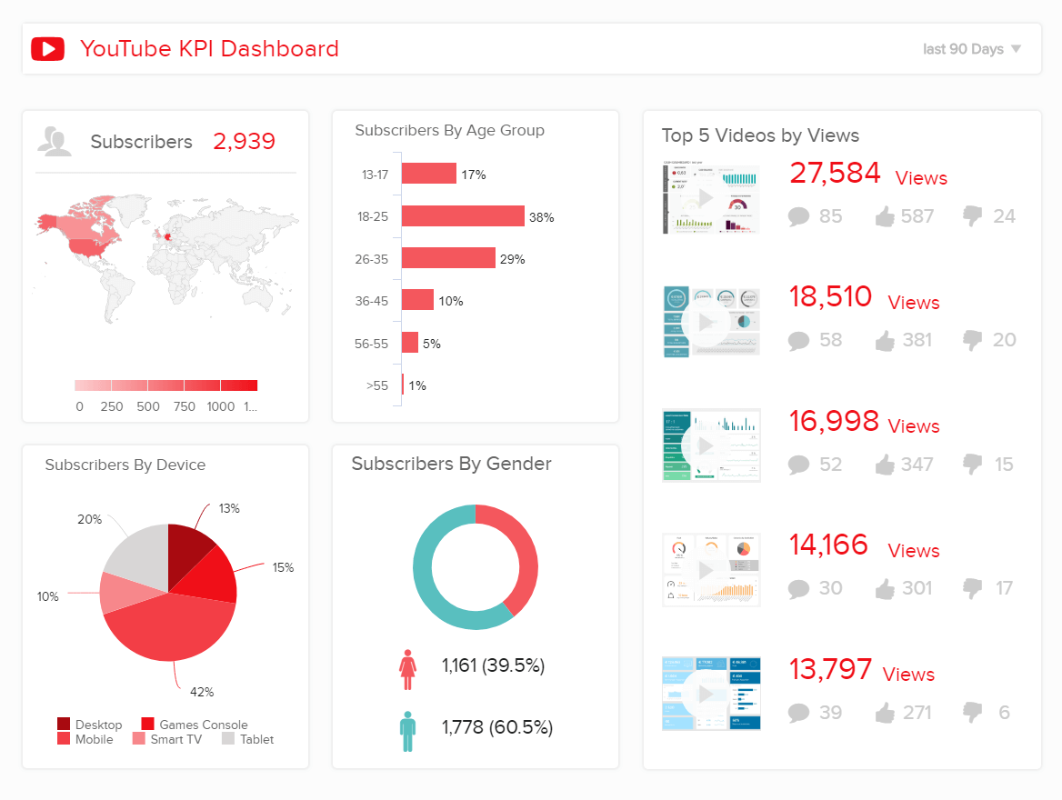
In essence, you need to know what kind of content you will publish, when, and whom are you going to target. In this case, the number of subscribers, their profile by age group and gender will let you know more about their culture, linguistic comprehension, or simply the type of content they might be looking for. Of course, the point is to test different approaches but to also keep in mind where are they located so that you can post at the right time, to the right viewer.
Finally, the top 5 videos by viewers will quickly show you the audience’s response to your published video content through the number of views, comments, likes, and dislikes, critical for building any modern social media report and capitalizing on your social efforts as well as connecting with people through video.
16. Sales KPI cockpit
Sales are one of the most essential functions in a company, whether small or large. While we explained the possibilities that CRM (Salesforce) brings into an organization, here we focus on the strategic importance of tracking and evaluating sales data. Without a healthy sales department, companies aren’t able to grow and develop sustainably.
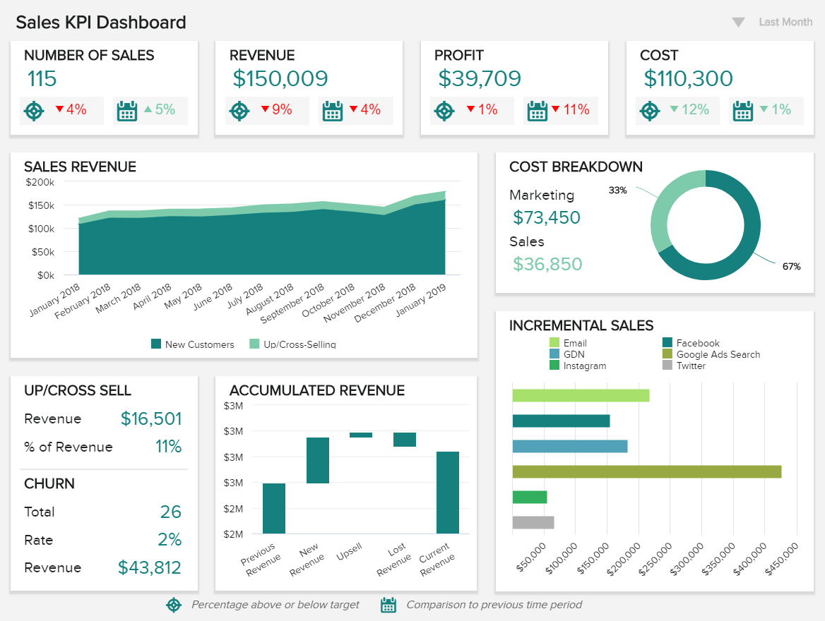
This sales dashboard enables high-level managers to gain a clear overview of the pivotal indicators that drives the department forward. The sales revenue visualized over time will help you to stay on top of your performance and immediately spot if there are issues in the making. Churn, upsell, and cross-sell rates will enable you to quickly compare your results with the affected revenue while the incremental sales are critical when developing a strategic sales report and ensure you invest your resources in the right marketing channel and eliminate the ones that don’t bring positive value.
In essence, C-level management will find these kinds of dashboards as one of the essential tools for consolidating data from multiple sources, ensuring the strategic initiatives are monitored regularly, and managers have the means to react effectively when things don’t go as expected. The point of such dashboards is to find the right information at the right time, and, by doing so, sales results will certainly grow, and the business will experience a positive impact.
17. Hospital dashboard
Health is one of the most important parts of our lives, but successfully managing a hospital is one of the toughest jobs out there. A healthcare dashboard depicting the most important KPIs will help each manager to identify issues in real-time, ensuring the best possible patients’ care, as seen in the example below.
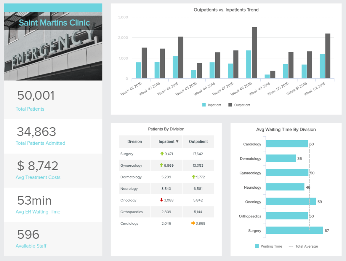
These key performance indicators safeguard the hospital’s efficiency and provide a detailed overview needed to reduce patients’ waiting time, costs, and allocate the available staff more efficiently. Tracking these numbers on a regular basis will ensure the hospital manager has a better sense of which department needs more attention, are there any financial bottlenecks, and get a more detailed overview of patients’ overall statistics. If the costs are cut, the service can be affected as well, so any decisions should be made with extra care.
18. FMCG KPI cockpit
The fast-moving-consumer goods industry requires special attention in ensuring a smooth supply chain. Being fast means operational processes must be monitored in shorter time frames, but a long-term overview is also helpful to get a better focus on the bigger picture. The example below shows exactly how.
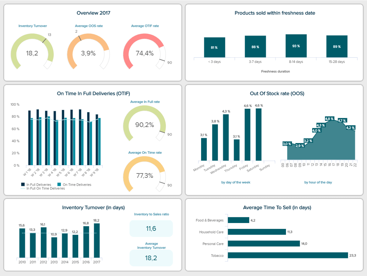
You can see a quick overview of the most important FMCG KPIs which are displayed for a specific year, but each is then detailed with shorter time frames and current situations. It is important to track the on-time-in-full (OTIF) as this KPI shows whether your products are delivered on time, as agreed, with the exact quantity and correct place of delivery.
The purpose of dashboarding in the FMCG industry is simple: implementing all the critical additional metrics such as inventory turnover or out of stock rate on a single cockpit to increase the productivity of the department. Less time will be spent on searching through spreadsheets and intelligent alarms will notify the managers as soon as an anomaly in the supply chain occurs.
19. Facebook Page Dashboard
Arguably the mother of all social media channels, Facebook has its own set of rules and practices to be successful. With more than 2.85 billion users monthly, focusing your resources and efforts on building a Facebook community for your business can be very profitable. The next template focuses on the correct management of your Facebook page, with metrics that will allow you to spot any issues and fine-tune your strategies.
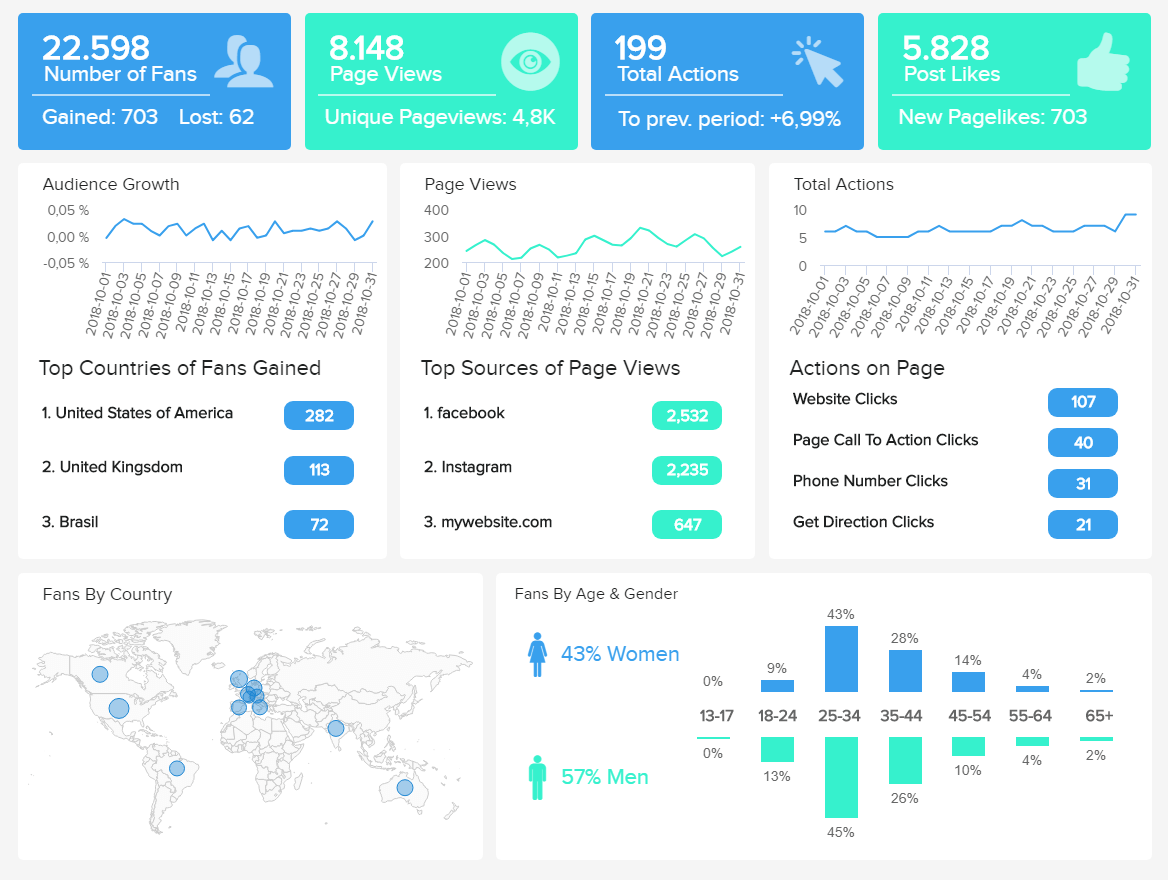
As with some of our other dashboards, we first get a glance at relevant engagement stats such as the number of fans, page views, actions, and likes. Each of them is then tracked more in detail for the last 30 days. This allows you to draw conclusions about your performance and use them to generate better strategies.
Next, we get Facebook KPIs directly related to your audience. This information allows you to understand where your traffic is coming from and generate targeted content for them. For example, we can see that around 45% of this Facebook page fans are women and men around the ages of 25 and 34. This can be complemented with their geographical location and language for tailored strategies.
20. IT Project Metrics Dashboard
Last but not least in our list of the best KPI dashboard examples, we have one for IT analytics. This aims to give an overview of every relevant aspect of the performance of a project. Let’s look into it more in detail.
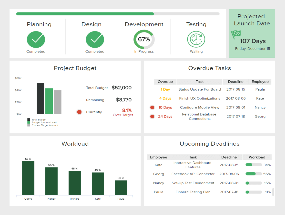
First, we get an overview of the status of the project as well as a progress percentage to understand how advanced the current stage is. Next, the IT dashboard provides some information about budgeting. This allows you to quickly understand if the project is respecting the expected budget or if it’s over the target. For example, here we can see that the project is 8.1% over the expected amount, which means you need to look into the causes and avoid any extra expenses.
Paired to these metrics, we get information about tasks and deadlines. Assigning a deadline to each task is a fundamental practice as it allows the whole project to run smoothly. In our example above, we can see that the “Relational Database Connections” task is overdue for 24 days. This is something that needs to be looked into as it can affect the completion of other tasks and, as a consequence, the entire project. To find the causes you can look into the workload of your team members. In this case, we see that the overdue task is Georg’s responsibility, and he is also the one with the highest workload, which means something needs to be done to lower his work.
4) Setting up a KPI dashboard – best practices
There are some golden rules when it comes to building the best KPI dashboard, and here are the most valuable ones:
Outline your audience: You need to know who will work with the KPIs and what kind of information will they need. Do you need to present your dashboard to C-level management or other employees? Are you creating it for daily operational tasks, or do you need to showcase the strategic performance of long-term goals? Before you start building and compiling the metrics on your dashboard, you will need to define the audience and consult them to see what the most efficient, viable way is to present your information. This leads us to point number two.
Choose your KPIs carefully: When you defined your audience and made sure you know if you need to present high-level or low-level KPIs, it is time to choose the data you want to present. The purpose of a KPI dashboard is, of course, to enable you to make better business decisions and by choosing the right KPIs, you increase your productivity and facilitate a cost-effective working environment. Whether they’re aligned to specific short-term objectives or more long-term goals, the key factor is not to measure everything and overburden your audience with information that doesn’t generate additional value. Start with a few KPIs and grow organically.
Draft your design to create a natural data-stream: A KPI dashboard design should be straightforward, cohesive with an interconnected stream of data that make a logical business story. Before you start, you can create a draft and define the chart types you might want to use, depending on the relationship, composition, distribution or comparison of data. If you want to analyze trends, for example, then you might want to consider line charts, column or area charts. For the composition of data, the most effective results will be created with waterfall, stacked charts or maps. This will enable you to flow your information based on the right data visualization types that you can use for your metrics dashboard design.
Create your own templates: When your draft is finished, it is time to build those powerful visualizations and create your dashboard. Here it makes sense to opt for simple colors, based on your brand (and no more than 2-3). The layout should respect the previous points mentioned for creating a logical dataflow while keeping in mind the audience all the time. It would make sense to ask for feedback so that you’re sure that your dashboard presents the right information. After all, the goal is that everyone gets additional insights from it, which will enable you and your audience to make high-quality business decisions.
5) Summary & next steps to take
We have defined what is a KPI dashboard, provided tips, and tricks on how to create a KPI dashboard, and presented the best examples from various functions, industries, and platforms which you can implement in your own company and create sustainable business solutions that will increase your company’s performance in short and long-term. By using an intuitive KPI dashboard software like datapine, each metric can be easily joined into a successful data-story and give you the possibility to explore numerous features for your own performance tracking.
If you want to experience all the business-boosting benefits that these dashboards have on offer, create your own KPI story, and familiarize yourself with each example we have discussed, professional software like datapine might be the solution you were looking for! You can even take advantage of our built-in templates that will save you time in the designing process, and explore the revolutionary capabilities of our dashboard solutions for a 14-day trial, completely free!
Build your own dashboards within minutes!